i would go for shaded buttons for 3 d painting.

Or simillar icons like scupt icons for 3d painting (vertex,weight,texturepaint)
i would go for shaded buttons for 3 d painting.
Or simillar icons like scupt icons for 3d painting (vertex,weight,texturepaint)
thanks but I don`t have the time nor funds to do this, I need to brush up my portfolio first. 
New icons for me is step into wrong direction. In 2.79 I didn’t need to learn how the icon looked like to use them. I was able to use them because I learned overall shape and the color. In 2.8 I really need to learn exactly how the icon look like to find them in UI. For me 2.8 icons looks too flat. But if this is the will of develop team I guess I need to learn this new UI.
Hey guys,
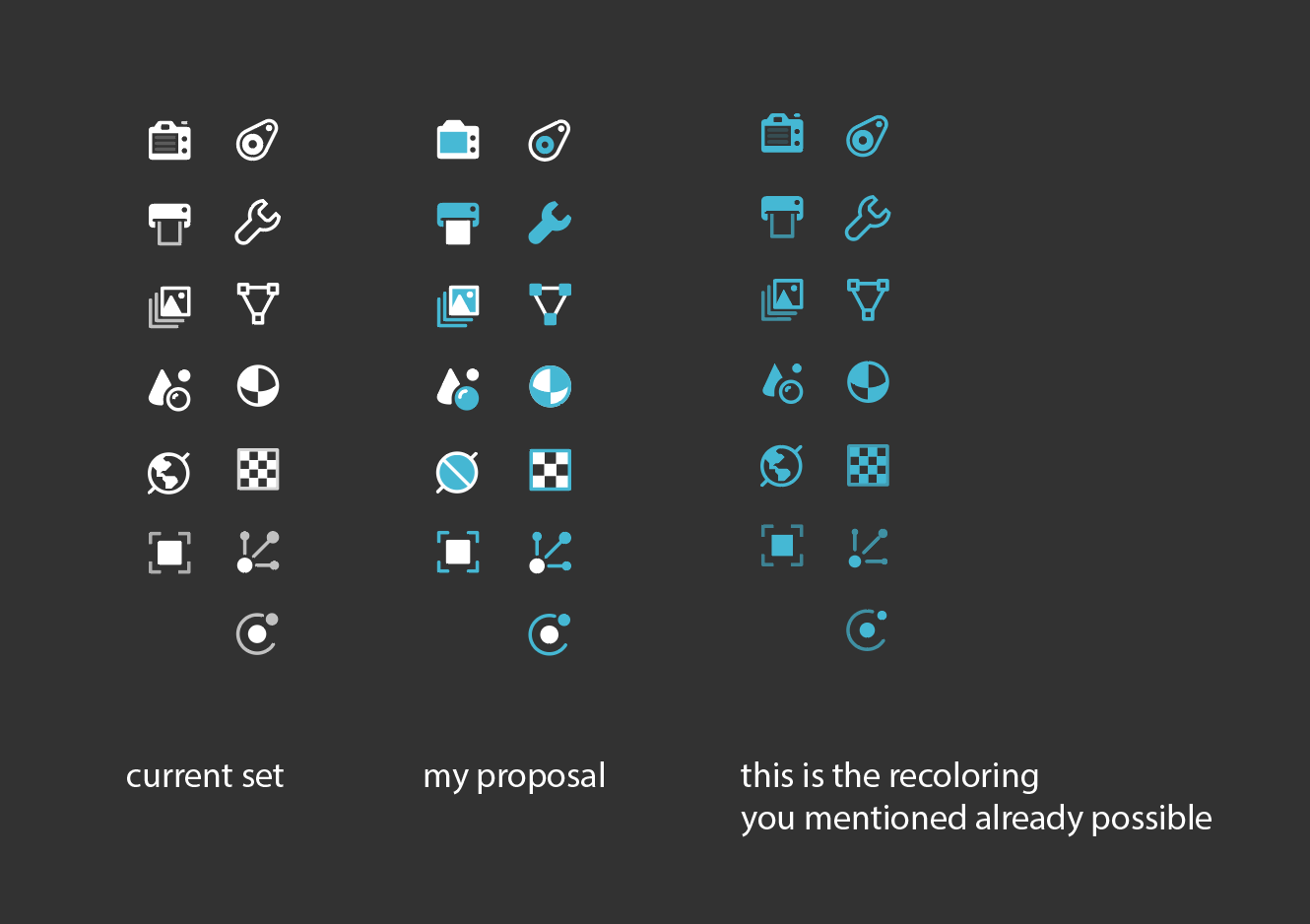
This would be my solution for the Properties icons (and others). What do you think?
I proposed this on devtalk with more details here: https://devtalk.blender.org/t/colour-coded-icons/2281/313?u=kynu
you already can do something similar in theme settings
user preferences-user interface-tab-text.
Nope, that’s not what I talk about. I believe a white (or on light theme a black) base color is a must. And an ADDED extra color helps with identifying icons better.
The big difference in my approach compared to jendrzych’s set is that his basic principle was 1 pixel wide lines everywhere possible and only scarcely used fills. It was very effective for creating a coherent set but it’s not enough for good UX. I’m a big believer in restrictions in design so what I’m proposing is a a branch of his idea, an added paradigm to his original:
yes, I´d like to see a little bit of colors added to the icons… to me, it would make them more readable and memorizable
We really need coloured icons in the properties window. It takes time to figure out what is the icon for, in monochrome.
hey @jendrzych thank you for this is insane effort, to create so many new icons for this new blender release.
i love most of the icons, but i have this small ideas, with 2 specific icons .
the rendered button: i feel like the “hatching” effect is a little bit visually cluttered, and a tad too stylized, especialy if we are aiming for this minimalistic approach. I think maybe re-using the shader-editor icon, maybe a good idea.
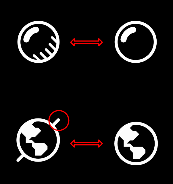
the world-Icon, i think the diagonal line, implying that it is some sort of a globe can also be rationalised away, as it already looks like a world and it does not add anyting to the table, but visual complexity. also
the spikes just feel a little bit unpleasing too my my eye ( but maybe it’s just me)
maybe this is of any help to you and thanks again for the effort your doing for the community.
This is a great proposal i really hope one of the devs see this
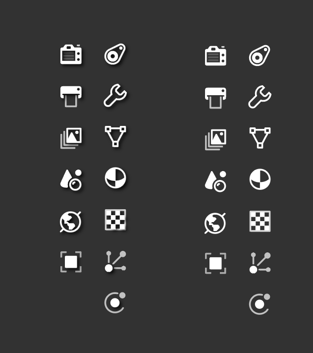
That’s my dream - @William said once (somewhere) it’s not a problem to add shadows under icons. It would massively boost the local contrast and enhance the readability.
The axis spikes were added in order to make the World circle more different from other round icons. The Material for example…
Of course they look better with shadows. The shadows give back one of the things that were removed in mono-design: outlines.
Yes, at the small icon size it would just look like a sphere material with some blotches.
On a slightly nitpicking note: if that is the rotational axis of the earth, then the Equator would go straight through North America.
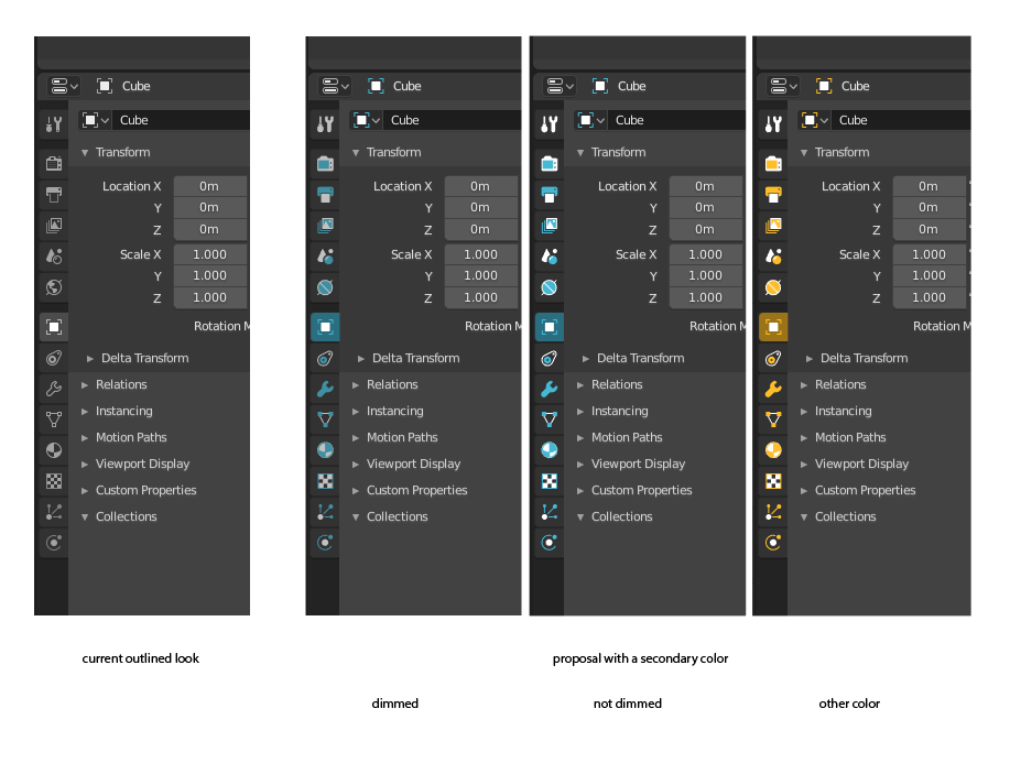
Since some of the proposed icons lost their contrast, for me they became even harder to read. So I can’t see any added value in them. Unless perhaps some of these icons will get their own color (e.g. World in green, Material in red,…), thus making them more distinct. But then the mentioned problem occurs where there are many distracting colours (unless properly dimmed).
I like the contrast and overal look of your variant with gray theme, dark one requires tweaking they are not so distinguishable.
I like your variant as well.
I just want a color distinction between the world and materials tab like before, please. (world blue, materials yellow/whatever color it was)
mix this slight shadow highliting with @kynu’s color highlights and things start to look amazing!