My mistake i looking at something else
A matter of taste. I think modo icons communicate the message better, even if they occupy a bit more space to do it.
2 Likes
I find your icons to be infinitely more readable than the current monochrome set and I like your choice of using 3 colors to get the point across. My issue with the current icons is not so much form but readability for someone like me who has aging eyes. I need readability at a glance. Even looking at your icons at glance I can instantly tell what is what. On top of looking really classy and slick instead of grey blah.
If I had a choice/say your idea is imo the best approach. A few drop shadows here and there for clarity and it would be beautiful.
4 Likes
I agree but those icons seem more complex to make and I think space is limited as it is. I think adding color like @kynu is suggesting to the current set would fix a lot of the issues people are complaining about and still have that slick flat look that the BF seem to be going for. Also, it seems like it wouldn’t involve a lot of work to pull off.
1 Like
I guess you forgot to color the screwdriver’s handle on the first icon:
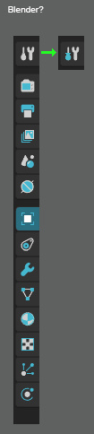
but overall i agree with you icons must be at least duo toned. simple outline icons are too abstract to mean anything.
2 Likes
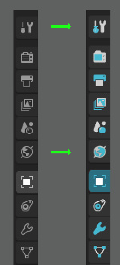
The “World” icon has turned into a child’s spinning top toy…
3 Likes
- Single color icons
- Two color icons
0 voters
2 Likes
I really dig those bichromic mockups ! Definitely more readable, I think it’s an improvement on an already good design.
4 Likes
Haha thanks! And yes, I recognized it later too…
Also I’d color it exactly the way you did!
1 Like
Thanks for the poll, I didn’t know it’s possible.
I offered my help on devtalk that if the monochrome set is kinda final I can spend time on it in the Xmas break to make them properly set up for code for bi-color. No devs picked up it yet. But if many of you like it - keep making noise. I’m still willing to do it.
2 Likes
Bi-colour doesn’t really help, this was discussed in this thread earlier. It turns a sea of white into a sea of two colours.
3 Likes
A bit off-top maybe:
Would changing icon themes/sets be possible ?
This would be right if I’d keep the icons being only lines. But I wouldn’t.
Making them 2 colored shapes is what makes the difference.
Well… yes! I see quite big difference: mine is pretty readable even blurred.
Thanks for confirming my theory with your test! 
8 Likes
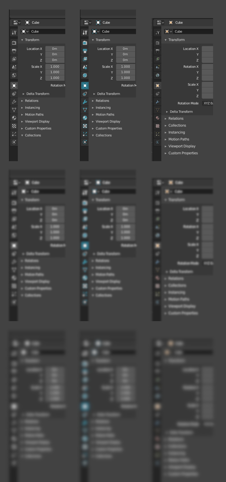
Actually it’s not, I don’t get how you can read them 
That the one colour addition does not add significant readability over the mono icons. Almost all of the differentiation is coming from differences in value, that are also present in the mono icons.
It also shows that the colour selection isn’t particularly helpful, because it replaces a dark background colour with a bright colour that blends with white.
This is noticeable for instance in the material icon turns from a white blob into a blue blob. Except blue means nothing because every icon is blue. You’re still relying vastly on shape or brightness alone.
1 Like
I think the two color icons is a good compromise between colored and monochromatic icons. As for readability i think that will work with two colored icoms two once properties get their own colors.