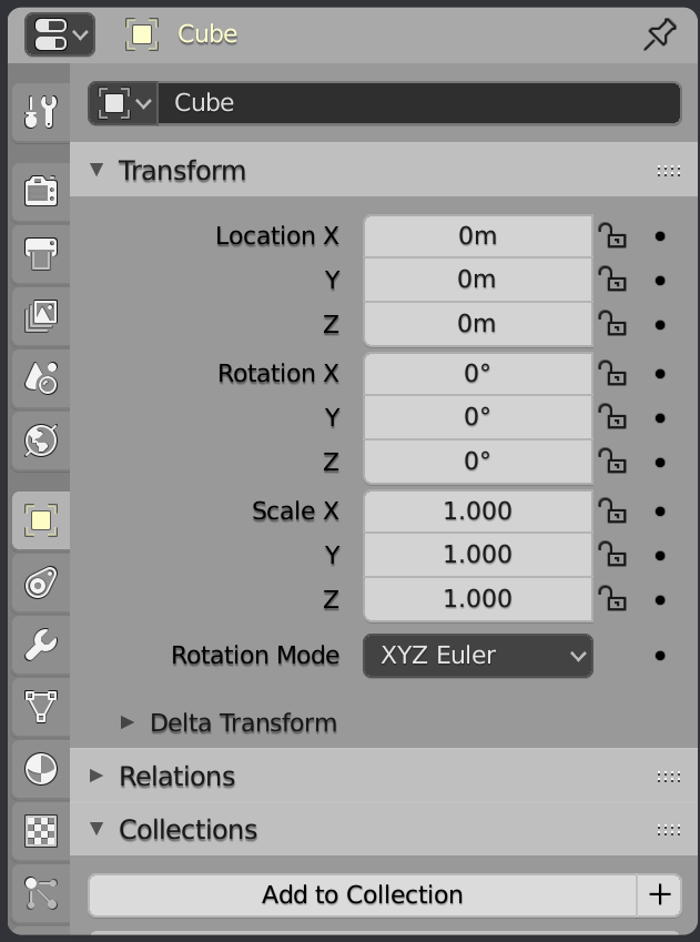
The Save icon’s localization in the sheet is pointed in the changelog under the attached files. It reads BA19.
Right, my bad, I have to change my glasses … 
But this also proves the influence of expectations over perception. I was so convinced that William will never accept the floppy disk icon that I stopped scanning thoroughly the rest of the page once I found something resembling to a save action. Anyway, glad to see the come back of a familiar icon 
I have been experimenting a bit with adding background shadows to icons. I’m wondering if anyone can give me examples of situations where this matters the most. So where you would like to select a certain combination of colors that renders the icons hard to read. This seems to work okay with light colors on light themes so far, although would still need more experimentation and work:
7 Likes
So I am now testing some code that generates icon shadows. But it does so just when the icon is light. When the icon is dark there always seems to be enough contrast. A dark shadow on a dark icon looks like blurriness, while a light shadow for a dark icon looks like a funny glow that doesn’t help.
But when the icon is light a shadow around it really seems to help a lot. The following were taken at 2X zoom. The leftmost is default dark theme and you should see a subtle shadow there. Next are dark icons on a light background and therefore without shadow. The next two are light icons on a light background and shadow should be pretty obvious…
I’m mostly curious about what @jendrzych thinks. He mentioned wanting to see something similar earlier in the thread.
14 Likes
Oh yes. I dream about shadows for icons, although I had something a bit different on my mind - shadows under every fill and line, while Your attempts look like only outline shadows.
Shadows massively boost local contrast so that glyphs look sharper and clearer. For this reason dark icons must get light backdrops instead (if any). Right now Blender supports shadows under GUI texts, and it does great job. I think icons urgently need this!
1 Like
Not quite. For these I have taken the icon, increased the size by 2 pixels and then offset it by 1 all around. Basically it is a shadow that is larger than the icon and centered. So it makes a nice outline for most shapes. But this method does give less of a shadow effect in the middle and more at the edges. And you can get a funny effect on some icons, like the “tool” one shown above where you have shadow on opposite sides of the two tools.
But it does give a nice contrast effect for most icons. It also fits nicely inside our smallest buttons. And works well if the user changes icon opacity.
I tried giving dark icons a light backdrop but the effect wasn’t very nice. Our eyes read darkness behind as a shadow and understand the shape and what is happening. But when it is light it reads more like a glow and is a bit odd. I’ll try to make some samples when I get a chance.
Those shadows are only directly below the text, as if the light were coming from directly overhead. I will try that with the icons shadows too and see how that looks.
Not true - You can control backdrop’s X and Y offset. Besides the shadow can be blurred and the spread of the blurriness is controllable as well - from 0 pix up to 5 pix. Opacity is customizable as well. Check out Preferences/Themes/Text Style.
It all works very well. Icons should get the same set of shadows settings.
Ah… I was looking for that.
We could theoretically get some customization with icon shadows but I think in practice there won’t be many options that works. For example we don’t have more then one pixel in any direction to play with, otherwise we will overflow the small buttons. And, as mentioned, having a light shadow on dark icons looks funny. When below for example they look inset, and when above they look like they are in relief.
But again, I will make some samples of various options and post them here later today or this evening (for me) and see if you like like any of them.
Blurred backdrop gives You more options than 1 pix of offset. Check out how it works with texts and try to make it the same for icons.
What I mean that for our smallest buttons, it is a 14x14 icon inside a 18x18 box. So there is only 2 pixels of padding there. So more than two pixels will overflow the box. But even having two looks bad because having icons in a row will effectively have no padding at all. Think of the “shading type” buttons - there is very room in there.
But again… I will make you samples to look at. As mentioned, what you might think will work in theory might not work in practice.
All I mean is that icons should get a shadow engine, that works the same way as thext shadow does. Setting the best looking option is a secondary thing, when the system is flexible. Even if it allowed You making stupid or bad looking things.
Then sorry, I can’t get you the “shadow engine”. Maybe someone else can do so at some later time.
@William stated once, that a shadow engine for icons is possible, but beyond his skills, so not on the to-do list yet. You said that You’re playing with icons shadows code, so I thought You’re able to tackle it. Pity You’re not 
Or you could, as I’ve mentioned a few times, just wait until I can show you samples of what results I can achieve and decide then if it is better than we have now. Improvements or replacements can always be done at a later time.
“Perfect is the enemy of good” - Voltaire
“Better a diamond with a flaw than a pebble without” - Confucius
“Premature optimization is the root of all evil” - Donald Knuth
3 Likes
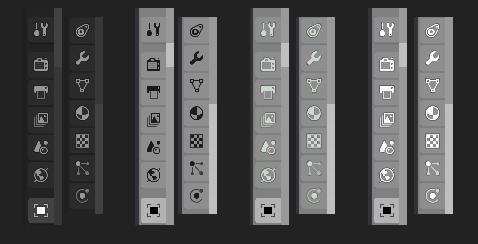
So here is what light icons can look like on a dark background. These are not mockups, but are captures from my copy of Blender (with scale set to a cartoony 3X).
Top section is what it looks like currently. Second section has a shadow that is larger and centered to make an (almost) outline. The third section has shadows the same size as the icon but then with a shift right and down, making a dropshadow. You’ll want to view it full-screen to properly see what is going on.

20 Likes
So much better with shadow! The shifted version is he best, although by default the text has a backrop with just vertical offset.
3 Likes
For what it’s worth I prefer the second. Since the point is adding more contrast, the middle one adds contrast all around and not just on two sides. If it had only a vertical offset the contrast effect is lessened even more. The third section is more consistent though and does add a bit more interest by seeming to give them some depth. But then again, lighting affects like the third row are a bit 1990s…
1 Like
What it looks like with dropshadows on the icons when in 1X scale. I was a bit surprised to see how much shadowing we do on so many interface pieces. I am just not used to looking for them. The effect is lessened as you increase the zoom though as many of these offsets (like the text shadows) are specified in pixels and so are not scaled with the zoom level.
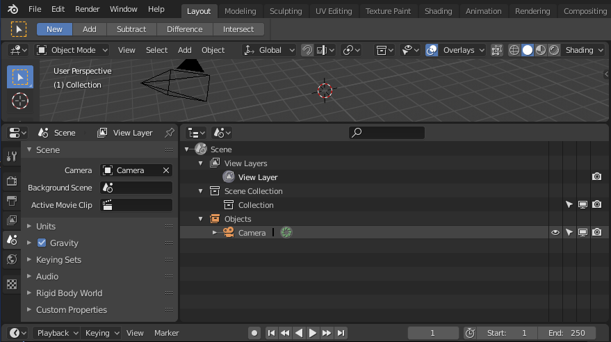
At this small size it can be difficult to see the effect. But look for the “camera” and “scene” icons in the Outliner, buttons on the timeline header, or the “overlays” and “shading” icons.
If you really do prefer the dropshadow version then that does open up more possibilities. This theme (blown up to 2X) is mostly dark icons with some light icons…

1 Like
For what it’s worth I also prefer the drop shadow one - it gives a bas-relief effect and feels like it has some depth. All in all it looks a little bit clearer to me.
2 Likes