I agree with most of your points besides this part of your post. I think if it’s difficult to distinguish between categories or icons without colour, the problem lies in the icon itself and its poor shape/contrast. Color won’t fix that. For example, a sun bleached painting is hard to read not because the hue has changed, but because contrast is reduced. Consider Warhol’s Marilyn Monroe set, which is distinguishable because the silhouette is so strong even though the colours are all over the place and nonsensical. We’ve been reading novels with small type for ages with only black and (off-)white because of the visual cues of serifs. Street signs are made to be legible on different materials and colour schemes. I understand physical materials are easier for us to read than digital screens, but the principles remain the same.
I do remembering hearing somewhere though that white-on-black can be hard on the eyes, so I agree a light and a dark icon theme should be considered.
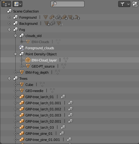
Look at this example in the outliner, with colors we can easily see the distinction between collections and objects. It’s similar to folders and files in file browsers, which also use distinct colors.
If there were only a handful of collections and objects, then just a shape might work well. But we are dealing with many collections and objects, and there is no way for the brain to quickly distinguish the shape of dozens of icons, while for colors we can see at a glance what’s what. Shape and color are not perceived the same way, they each have their own strengths.
That doesn’t mean we have to use colored icons everywhere in the interface, but perhaps the outliner and a few other places should do color coding still.
I imagine, that most of named problems, with no exception for colours, can be cured with vector icons - You’ve got soluion already, implemented in Toolbar icons, haven’t you? Fully colour-customizable via themes, by the way…
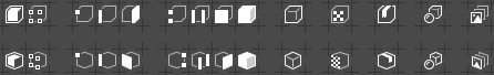
Anyway, the shrinking process is in progress now. Smaller icons have to be simplified further, and for this reason I stumbled against several design decisions. One of them runs on 3D View edition modes. Several concepts has been drawn - some of them inspired by work of @Vklidu:
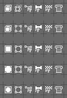
Object end Edit modes form the top row have too much detail for my taste. The Edit mode especially.
That’s why I like second from the bottom the best, but I wonder if the general Object and icon and the Mesh Object icon ( ) shouldn’t be more differentiated visually? I’m not so sure - it may be way too confusing to have similar rectangle and triangle scattered all over the GUI. So my second best set is the one in the very middle; simple yet effective. The Object Mode from the bottom row is qute interesting too, joining original concept of outlined (selected) solid “object” with the way Mesh Object icon is depicted…
Mind the Paint Modes from the bottom row as well - their silhouettes are more diversified, compared with other proposals above.
I think you should wait a bit more before starting to shrink the icons, and talk with William and Pablo about what is necessary to do and what the plans for managing the icons in the future are, if a change will occur.
Also you are still working without actually seeing how the icons look on the interface and it’s difficult to understand where the problems are, what works and what doesn’t.
Here for example I made a comparison between your new icons, already with 2 extra pixels per button, and the old ones (I scaled everything up in order to better see).
Even with the extra space some of them looks too big imo, in this example the 3d view and the object mode ones especially, that would probably need a shape redesign.
What I’m trying to say is that it doesn’t worth it to spend a lot of time in redesign now, the final dimension might need to be smaller than what you’re considering now, some icons may need more work than others, some may need to be redesigned completely, but first you need to see what you’re doing and know what the plans are.
Old design is still too big and there were once plans to change Toolbars icons axonometry type, similar to my current design. Making old design smaller’s will lead to similar dsign problems I fight rignt now.
To see how shrunk icons look against the GUI, I have to make some of them smaller first anyway. So far I base on old, colouful pictograms size, so it should be ok. Will make an SVG, so You’ll be able to build the app and throw some screenshots here.
Regarding fills in the Vertex Paint - It would work until we talk about the proposal from the bottom row (three vertices and paint blotch). The other ones will look way to similar to the Weight Paint. Filled polygons are restricted for selection depictions.
Making things simpler means implementing quite abstract ideas.
Axonometry type that @jendrzych is following looked wierd to me at the beginning, but the icons are crystal sharp and more clear to read the shape = much easier to understand meaning
Object mode - I ended with the same, when I followed your 3D cube
Filled Square with “point” in corners still looks like something pointing to vertices (and looks like inverted edit mode). So simple outline that gives a detail looks fine (simple square was too flat as you already pointed me). 3D cube is still the closest to the meaning of used words, but following to the edit mode goes to much complicated (1st row) and 2nd row (object / edit) visualy doesnt continue.
Yeah, I’m about to get all for reducing use of axonometry, leaving it only for instances, where it’s really needed to depict the idea. I’m pretty convinced, that the Object’s pictogram can do without third dimension.
Yes, definitely the books, bricks remind me of some development related feature, I don’t really know why.
Between the two I like the left one more, it makes more sense to have all of them filled.
About this I don’t know, at the moment that icon is the same one of the object type, and it’s a logic that works well, using a plane for that I honestly don’t think would be a good idea.
Maybe we should start using monkeys all over the place
Stupid idea, but maybe…
1 Like
Regnas
(• I don't speak English "by default", so... )
383
I’d say it’s a good idea. Not because of the icons here, as I’m not a fan of this style, but overall the things are clearer and easier to access with that size. Like the tabs in the properties editor, they are really tiny at the default size.
Can you make an experimental build to let the people test it?
I personally always work with the display scale set to 1.2, it’s less of a strain on my eyes (I use a rather standard 23", 1920*1080 monitor). For discoverability, that setting should probably be up there along with workspaces and interaction mode in the new splash screen we heard so much about.
 ) shouldn’t be more differentiated visually? I’m not so sure - it may be way too confusing to have similar rectangle and triangle scattered all over the GUI. So my second best set is the one in the very middle; simple yet effective. The Object Mode from the bottom row is qute interesting too, joining original concept of outlined (selected) solid “object” with the way Mesh Object icon is depicted…
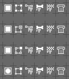


