Interesting, because looks like Outliner uses X17 for Pose Data and I can’t find T12 and X18 in the GUI. But mind that I know nothing about animation.
Hmm, you are right, they don’t seem to be used. Strange.
It’s just a symbol, not accurate, but quite consistent in meaning and visual style - a broken heart fits Orphaned Data very well by my mind and unharmed heart has opposite meaning, so setting a F-User is like adopting Orphaned Data. Besides it brings a bit of humor, which does not hurt 
As I stated above, the fact that a data block has no user (is an Orphaned Data actually) needs much stronger visual underline than the fact, that it has a user, even it’s a fake one.
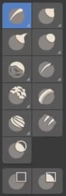
I’m guessing this should be the correct thread for this, but are there plans to modify the sculpt tool icons? I found this discussion from a while back showing users were clearly discontent with the current design.
I bring this up because the sculpt tools icons really irk me when I see them. It may be the color, or the flat lighting, or just the overall designs. The other icons don’t bother me much, but the new designs for the sculpt brushes actually make me a bit depressed to look at them.
We’re going from these…

To these

Aside from losing the visual excitement, I also can’t really tell most of what the new icons really do just by looking at them.
I think my set of four icons is compact and consistent enough and we can get rid of those two orphaned icons.
I also think that these very icons require more work and love.
I agree !!!
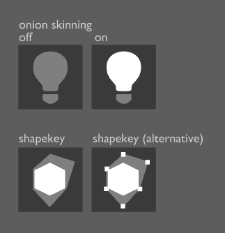
Onion skins:
A commonly used icon for onion skinning is a light bulb since, as any animator knows, onion skinning simulates the effect of paper being lit by a light table.
Being an animator, there is nothing my brain associates with your icon (or with a ghost for that matter).
Shape keys:
What do we use shape keys for 90% of the time? Modeling a smile on our 3D character’s face. And then we blend/morph between those two shapes. Hence the “proper” term “blendshape” or “morph target”. Your icon looks like a random collection of primitive 2D(!) shapes, some are solid, some are in wireframe mode.
I tried an approach that is more centered around the idea of 3D morphing one shape into another which is what shape keys are actually about.

I think the shapekeys icon should contain the idea of morphing, but whe including several shapes, there should be something suggesting that they are the same vertices, or at least emphasis on the vertices. Three shapes take too much space for this, and I would use the simplest possible shape: a square that has some of its vertives moved (the transformation wouldn’t be so clear in a triangle.
Lightbulb is occupated.
Your Shapekey proposal won’t fit 14x14 matrix - I will repeat to boredom: draw Your concepts in 14x14 grid, the way all lines follow pixel rows and each end of line or vertex of a poly is centered in a pixel. Then check it out in native resolution. If it’s readable and crisp, then it will work.
Anyway, I can try to make it simpler.
EDIT
Sth like this, for instance:
![]()
All shapes in my proposal are topologically identical btw.
That shape key icon seems like a good approach. It encompasses the idea of a transformation, which is good.
The light for onion skin is fun, but may be confusing in Blender where we have actual light objects too.
“idea of a transformation”
Yes, that’s what it’s all about.
“confusing in Blender where we have actual light objects”
That is true. I just used what is most recognizable for someone in the industry.
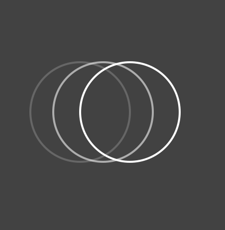
But I guess a row of two or more fading circles or ellipses is also not uncommon.
A number of interfaces are even using onions as icons. You might consider that too much of a joke, but it does work because the word “onion” is so strongly associated with the action. (Maybe also ask for the opinions of Hjalti and the gang if you haven’t already.)
Right - what you are saying is something like this:

Here is 14*14 version:

Could work well too I think.
Yep, but view restriction icons are even smaller - 12x12. That’s why I went the route of rectangles. In addition, the style requires that at least one of the objects was a filled polygon.
I don’t think it has to be 12x12. If we can make a clearer icon at 14x14 I think it’s perfectly fine.
Nope - 14x14 are way to obtrusive there. You get a load of aggresive icons. THat’s why I decided to make them smaller.
I’m not sure why it would have to be filled?
To me the top one reads better:

The size actually fits well:

I found, that a bit of fill indicates “active” more than simple semitransparency. So all of my view restriction icons have two states:
- all linear with 40% opacity = deactivated;
- at least partially filled with full opacity = activated.
Having this in mind, I wonder why icons V17 and V18 (padlocks) are both linear and bigger than CA15, CA16?