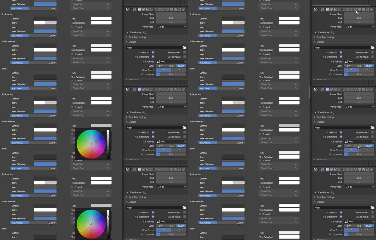
Right one.
btw, anyone knows what happened to the idea to put these icons to the side?
is this still planned?
I sure hope it is, because without it, one main purpose of the single column properties layout - to save horizontal space - is gone.
Pablo said in a blender today vid that they are pushing that to other betas beacause the work required to do that was not worth it since there are more pressing issues to deal with now
How about
Save to pose lib - arrow pointing right into book
Apply from pose lib - arrow pointing left out of book
It’s weird that as a non-coder sometimes you really can’t tell how hard something is. Sure, sometimes you can, but sometimes you really can’t. Changing to these icons being on the side… I guess it all depends on the way it’s set up.
How hard would two lines of icons be?
what does “other betas” mean?
post 2.80?
Most of these are fantastic!
There’s a few I think could be improved.
Swap wave and Ocean
Don’t have Array fade out
I think a flag would be better for cloth
A jell-o for Softbody
Other than that all great!
I’m not really inside the development process but what I understand was post october beta release so maybe ie: 2.80.1 that could come this year or just early 2019… who knows. 
What is certain is that things who don’t really need that much intervention will be postponed to other releases of 2.8.
The new icons have been updated in Blender, Brecht commited it : https://developer.blender.org/rB2ac65f6153a2da2df7cda908689bb7c1865f088d
I like it, however I think that selected elements are not very distinguishable. I like some of the proposals with those colorful square edges starting from here:
Things are still rolling on. Many various proposals were made. I believe it’ll hit the base in the end.
Yeah this is pretty awesome. my personal feeling about this is, anything OTHER that what we have now is better. All the different colored, filled, outlined, etc. versions that people have posted are fine with me. This is already such a huge improvement. Thanks Jendrzych!


Now let’s back to work!

They are already in the latest build on buildbot, however it doesn’t appear that there’s a switch between old and new icon set 
Absolutely stunning work. You are a legend in my book.
People will always have different tastes, but Blender needs to evolve, and as someone who has spent the the last 15 years learning kanji, I find the new sets distinguishable and explanatory, and modernized.
My thanks to you @jendrzych , @William and everyone else involved in making these.
This is not as easily possible as one might think. For one, the new icon set has more icons, so someone would have to create lots of new icons that follow the old icon designs.
But even if someone would do that, the bigger issue is that the new icons are displayed in a different way, using colors defined in the theme. This means that, if you were to load the old icons, the theme needs to be tweaked too.
And lastly, there currently is no interface or system to actually load and store alternative icon sets.
tl;dr: It’s theoretically possible, but in practice it’s a lot more work that one might think.
Many defects and inconsistencies, the system of highlighting content in the Outliner needs to be improved or designed from scratch (proposals are ready - see discussion on devtalk).
But the most beautiful thing is that you can now dabble in colorful icons or set all colors of icons as white and alone, on a living body, check in practice, if actually color coding is needed.
That’s what I did - I opened a very complex scene and I do not have the slightest problem of distinguishing Objects from ObData blocks and other minor items. The content filtering function (limping a bit) helps if it is needed.
I encourage you to try. Really worth it!
The new icons are a little dark than the text their are associated with, and will make theming a little hard.
Like, it would be better to decouple the icons colors from the text of buttons. If you take a look at the radio buttons text for example, it’s almost white, while the tab icons of the properties are barely visible. It’s impossible to control those two different things with just one slider, while they have different brightness.

some of them don’t even make sense like object mode looks like a transformation gizmo which resembles the Global transform and sculpt mode looks like a microphone or something and will they be color or just grayed out!!!