An object is nothong more than a bunch of coordinates, hence the look of the very icon. A close association with transformation gizmo is correct.
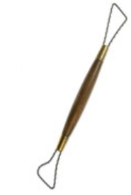
Sculpt… a wire tool - a common thing, that real sculptors use all the time. Quite hard to depict in such small scale though.
No colour with some exceptions, as stated many times in the thread.
well will see if people like them or not, for me without colors they are hard to distinguish/read and with the default theme is even worse.
and for sculpt icon i think this one makes perfect sense.
 )
)
I’m entering this conversation really late in the game and I realise that. My intention is not to inflame any old arguments, but I’d like to ask a couple of questions if I may…
- Is the icon sheet that’s being made here something that any user can replace in Blender without rebuilding? (As in is there planned an option in User Preferences to load a new Icon file)
- Has anyone considered a chain linked / un-linked for Fake User / Orphaned data?
- I know it’s waaay up in the thread, but can I ask about the View Port Manipulator icons? I’m sold on the magnifying glass for zoom, but I find the earlier “4 arrows” icon says pan better than an open hand (Which, and this may just be culturally me, at first glance says “Stop”)
This thread is awesome - Keep the amazing work and discussion coming! Thanks.
I just downloaded the newest blender build and the icons look amazing, very good work jendrzych! Appreciate it!
Nice work @jendrzych, looks neat!
The only thing is that navigation icons have some strange diagonal line. It’s probably not related to icons itself.

Very good job jendrzych, I did not think he would look so good. Congratulations
Lingered around here for quite a long time and observed. I gotta say big thank you for taking this into your hands in your personal time. It’s awesome that this kind of dedication has landed your icons in the new blender. Keep up the great work. Can’t wait to try it out!
Welp… despite all the great work gone into the new ones, I still prefer the old ones much more. They are much more readable at glance. With the new ones, I first have to focus on the content of the icon to decipher it before I click it, because at quick glance, they all are more or less identical. Especially in properties panel. It also took me a while to realize that the circuit board icon actually refers to particle system 
Same for me. I like shape, but without any color it looks same. I like unobtrusive colored icons from Outliner.
Why are such dimmed the icons in the properties panel?
are them deactivated?
![]()
I guess that’s the idea , it’s how radio buttons always worked though, the icons have full opacity on mouse over or selection. It’s probably just a bit more noticeable now.
Ok, but IMHO now is very dimmed, It’s not easy for me to see these icons clearly.
Those buttons will be changed to tabs at some point anyway, so it makes more sense if they are dimmed I think, but maybe they will make something easier to spot at the same time.
Yes, they’re not very clear now, but I’d say that this is mainly a theme problem:


Oh!, what have you done for to see them more clearly now?
I’ve simply darken the radio buttons’ inner colour from the theme settings, I copied the one used for the menus.
Thank you. I am a newbie in Blender.
I liked the new icons a lot, it’s gives me the impression of something professional, and not like a kid’s game,like the old one was ,
Generally Iam big fan of blenders new ui and icons
And i dont know why but somehow monochrome icons are better as do not disrupt my focus when not needed, hard to explain but… Icons itself are very well designed too so thank you jendrzych.
The new icons suuuuuuuuuuuuuuuck! They’re all just noise to me, all light grey on very slightly darker grey. I can’t tell them apart.
Where’s the option to use the old, legible ones?