Well, I like!
For the Vertex Weight once look how jendrzych has handled vertex-paint for inspiration.
Well, I like!
For the Vertex Weight once look how jendrzych has handled vertex-paint for inspiration.
One thing that makes Your icons visualy different from my set is the fact that:
No problem - it can be done. The reason behind two vertices and two edges was to make those icons different from snapping target icons.
I think snapping icons being isometric is enough to diferentiate… you could just use the two vertice thing and two edge on snapping icons… just like in 2.78.
And one vertice and edge selected for selection tools.
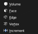
Isometric view is not an option, but swapping icons isn’t a problem.
I am sorry, I said isometric… lol… I looked at snapping icons in 2.8 real quickly and thought they were isometric. Anyway. I think swapping would be better to keep consistency with older versions and so on.
Thanks for the feedback! 
I actually thought that the change of style could be acceptable, since the icons were all localized in the same place of the UI and that their scope was a bit different, but you’re definitely right about the problems they could cause in the outliner.
I’ve tried at first to follow your style and only use 1px lines, but it was way easier for me to visualize and design them with filled polygons.
I’m now trying to “convert” them and it seems to be easier than I thought, probably because the shapes are already there, I’ll post a screenshot later, or maybe directly the svg.
About the dynamic paint one, that was by far the one I liked the least, I’ll try something with the dropping paint. Thanks again!
I just starded making them too.
Here’s the svg if you want to give them a look:

And how they look in Blender:
I agree, to me these are easily readable, as the colourful element highlights what the icon is about, the monochrome icons make me struggle to read them - same goes for new iterations of Photoshop, or Gimp.
I end up having to remember where each tool is rather then read the icon.
The loss of any third dimension is also making me harder to understand the icon.
With obviously varying tastes everyone seems to be having here, the solution to let us theme icons from the preferences panel seems like the most obvious one to me.
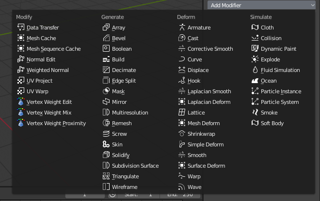
That starts to look really good. Will post my versions of some of those icons later.
Although this set seems quite nice, i couldn’t help noticing this version blends with the modifier names a bit. The icons of the previous set took much less time to discern from the adjacent text, i have to put a certain effort to do that for this one.
I would love to see a flat version of your theme updated for 2.8, looks great with these pretty icons, ui art.
Missed this part, sure it’s still work in progress. BTW noticed a bug in todays nightly build. Saving a theme just revert back to the new dark default theme. Seems like a new bug. But luckely I have saved an earlier version from this month.
Default++ for 2.8 Work In Progress
Download this as .xml from pastebin, and under Theme in User Prefs you guys can install it.
hehehe this color scheme reminds me of the old good softimage xsi grandfather of computer graphics ^ ___ ^
Speaking of themes. I just switched to several of the preinstalled themes which really made me realize the benefits of a monochrome iconset. Pretty versatile!
I hope these monocrome icons stay imo they look better than the old ones. Some might need to be tweaked and im sure color coding will make them easier to read
yes, the yield is actually pleasant, but as someone makes notice, with monochromaticity we lose same information thar make the detection of the tools much less immediate … I think there is a need for a middle ground … that is the possibility subdividing at least by type of tools the coloring of the icons.
perhaps allowing this at the level of the theme setting
I think the way to go is like the tools icons :
They have very simple shapes and silhouettes (like the new flat icons) but also have simple color schemes to make them more identifiable.
Things to note about them is that they have nothing fancy, mostly one color, low saturation.
These flat icons are horrible. It’s all just a big, unreadable mess. Shapes are too liney, too thin, too similar to each other. I hope there will be an add-on that changes icons back to normal.