New icons can’t stay. Monochromatic look is horrible. The same once (maybe stil) was in Nuke, We need colored icons, not monochromatic.
5 Likes
Some comments here are nasty, I’m sure the author appreciate your input guys, especially after volunteering many hours into making Blender that bit more special. Well done.
3 Likes
I thank you for all the efforts in changing the icon design of Blender, but after trying the new build I don’t think it works nice. The lack of colors don’t create any contrast, any visual distinction and direction. The right panel looks incredible cluttered.
In general, I think that the UI looks worse.
Some points, however, looks good. Like the outliner.
EDIT: I think the general impression would be way better if the icons were color coded. Specially on the right panel and like the outliner.
3 Likes
I have to agree with some of the critiques here. I can appreciate the new icons on their own - aesthetically, they look very nice, and I can see a lot of thought and hard work has gone into them. However, in some specific contexts like the properties bar they currently detract from readability.
Color and value is a huge help on icons that small. It’s always a challenge to make such tiny images visually distinct from each other, and by omitting value and color you are foregoing two of your greatest assets. This style works best for larger icons, and even then a splash of color helps, like in the Tools menu.
In example, with the old shaded icons you can quickly scan and register the properties bar as one composition with clear landmarks. Squint and you can still clearly separate them from each other. With the new icons, you have to consciously think much harder to identify them.
On another note, I feel like the icons are slightly too big in their frames, a little cramped. They could use a little more breathing room. Overall, I think making the buttons larger in general would help, as well as adding some color.
As an UI artist myself I can appreciate the effort from an aesthetic standpoint. It would be great to modernize and unify the icons. I hope we can make these new icons work with some tweaks.
Grouping the icons in the properties was a great choice but it doesn’t make up for the disadvantages.
4 Likes
Honestly this looks like a big improvement, and I’m really happy not to have color just for the sake of it. There are a few that are a bit wonky that I’ll give a shot at when I can, but overall really great work! As others have pointed out, the biggest thing that needs to happen is some extra padding, but that’s not on the author.
3 Likes
Just as a note, the size of the buttons didn’t change, Available space for the icons wasn’t shrunk, it’s just the icons making themselves feel cramped.
Personally, I don’t think the buttons should be made larger just for the sake of these icons, the old ones didn’t need this extra space so the new ones shouldn’t require it.
1 Like
I really dislike the new icons. To me they are like visual noise. I have always questioned the design trend to flat and minimalist UIs and I think in Blender it has now been implemented for all the wrong reasons. It’s a big step backwards from the -very well designed- old icons imho.
7 Likes
Looking pretty shouldn’t ever be a primary goal in designing an interface. The primary goal for UI is to be usable and these icons are not usable. The designer is trying to fit into some imaginary standard of “modern” and “cool looking” icons instead of focusing on usability.
I’m a Blender user for years and I have seen people complaining about a shitton of things and icons were never among them.
4 Likes
Loving the new icons. And because we now have monochrome icons I think we’ll just get better at using them over time. For example, we are sometimes crowding them too closely to text which makes it a bit harder to recognize either. We are also not quite lining up the icons with the text vertically which also disconnects them slightly.
15 Likes
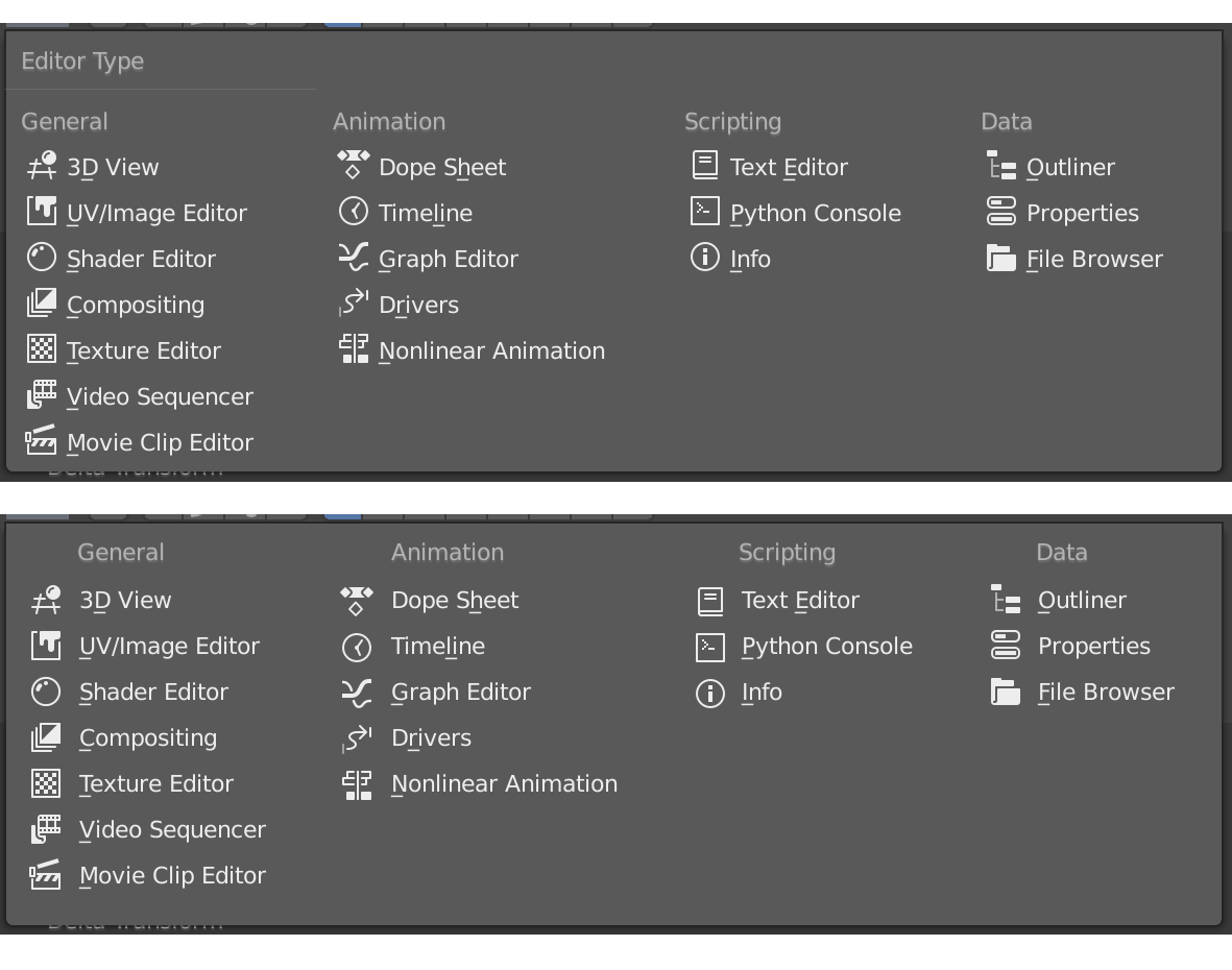
the outliner is perfect, u can read each object very well the only thing i think is to have hide icons bit smaller .if we can have that in the future!

2 Likes
I think there are definitely some issues with how Blender is displaying the icons that isn’t using them to their full potential. They could use more space around them, and the decision to use the text colour is not ideal - they should have their own colour in the theme, able to contrast with the text that’s next to them.
The only place that is really crying out for colour is the properties panel - 13 icons in a row needs every visual cue it can get. I like the two-tone style of the active tool icons - mainly white but with a splash of one other colour, but that’s just personal preference.
3 Likes
Modelled in Blender 2.8 for a couple of hours yesterday. Icons look good. No problems to orientate myself.
I have to admit i never liked the old ones. They where functional, but not aesthetic enough for my taste.
As for the property panels…isn’t it still planed to put these icons in an vertical order? That way the distance in-between them could be increased so the readability might get a little better just by reordering them.
I think some pixels of margin on the right bar would be a nice thing.
I tried a new build today, and I think the icons are great. If there were a way to make everyone happy, then it would be done - however, maybe later we get the possibility of alternate icon sheets for those that still don’t like these. Of course, some of them might want to start work now on adapting the svg for that purpose.
Off-topic - sculpt and 2d animation set ups are super nice  Sculpt reminded me a little of Sculptris too.
2 Likes
There is a way - let people switch that in User preferences… We already have the old icons.
1 Like
Fun fact, I made an theme back in the days called Softblend or Softimage it was based on Softimage.
But this is based on the Default 2.5 theme, it has a base of #808080 I think. Which is more like Marmoset Toolbag.
1 Like
There are three large groups according to what users prefer here: Gray monochromatic, Color coded everywhere, old icons.
But implementing customization possibilities for all tastes, and even making easy the creation and sharing of icons set depends on the resources that developers have to make this possible.
1 Like
Yup, but IMHO there are many more important things right now to be done. Custom icon can came with 2.81 for me. I was using blender 2.8 for 8 hours yesterday and 8 hours today and I can’t understand this all crying. There is a room for some tweaks but I didn’t notice that they slow me down or I can’t work anymore. They work for me.
2 Likes
Wow …
Ok. I would be surprised, if no one rejects the new icon design.
It is sad to see good approaches being pulled down and talked to death by some people. The 2.8 forums are full of resistance against anything new or uncommon.
Imo, jendrzych does a very good job. Thank you for your efforts! Many people value what you do for Blender.
13 Likes
He did an excellent job with the old and the new icons ![]()
4 Likes