Gosh - my fault! I confused Decimate with Remesh! Will fix it immediatly. Other suggestions are vey valuable as well, with some reservations:
Your Warp icon concept depicts perfectly what the modificator does, but somehow do not fit the style of the rest of the set - deffinitely needs a revision, since I’m not pleasted with it too. The same applies to Shrinkwrap;
I made several tries of the Collision icon an wasn’t particullary happy with all of them. Still on the drafting desk then;
the Wave icon with less “ripples” looks way too hollow, while with 100% opacity is too dense. Making every second ripple slightly transparent is a kind of a stinkin’ compromise;
swaping direction of icons is not a problem and it may lead to way better looking both - an icon and the set as a whole. Anyway the reason beihnd swapping direction of the Smooth icon waws to make it look different from the Bevel, but maybe I exaggerate with fears, which often happens to me.
At the moment will leave the Modifiers set as is (with small efotrless tweaks) due to lask of free time.
The filled, thick icons look perfectly professional. There is nothing strange or unusual about them. Their simplicity is perfectly consistent, and they are well differentiated as object-representing icons, as opposed to modifiers, actions, or states.
Can you show an example in the interface where this is clearly exemplified? I have to agree with @rawalanche , frome the very first impression is they look unprofessional. Ones that especially stick out to me are Mesh, Curve, Metaball, Armature, and Empty.
Changing topic again, something like this would probably be the max color coding I would personally aim for:
(don’t mind the terrible color selection, just didn’t have the will to change them and build blender again).
Two colours per icon was something that I had on my scope - mind that many of pictograms are already two tone: pure white / 60% opacity, which can be translated to colours in a no time. The set’s still not finished though, so shapes first.
In the meantime I finished Forcefields icons (two tones!):
Creating a complete cooperative icon set could take a long time. For those who do not like the current 2.8 icon set, I think the simplest option would be to try to complete the template of old jendrzych’s icons with the new ones required by 2.8, trying to follow similar design as those old icons.
Someone interested could open a new thread in the forum. Then when icon set is complete, official Blender releases builds with those icons could be shared.
The mono chromatic icons are harder to read and make it harder to find things. The properties panel is a good example. The file menu as well.
I don’t think anybody is interested in deciphering tiny icons. People just learn and go by color clues, if present. So, removing color directly translates to slowing the user down.
into the “Colour coded icons” article posted above, I’m reading about new icons in the File Browser and I wonder why they should ever change respect to current ones on 2.79 ; this will makes things just more confusing, since colors and detailed icons helps.
Okay that blender has its own way of things, negletting any platform standards, but it seems to me better to make the most use of system icons for browsing files, which users are obviously more used to.
Jend, I was reading most of the comments here and also your reaction.
That some people simply say I don’t like them can be quite normal.
What I as a developer would ask, this is what I as an educator have to ask,
is why do you feel/think this way and not invalidate others negative feedback even if it was first ranting.
To be quote honest I was not even able to understand aka read the new UI.
Everything blended together. At one point I was just reading the text because of icon contrast readability issues.
And I love new things.
I am a professor in design and the UI and how the icons are used show a lack of some basic 2D design principles that are universally applicable.
The look and if an icon makes sense can be subject to taste but readability is a different topic.
Design is always a task about being able to do compromises. I listed below two examples where value and contrast is used to much quicker explain what is explained: like the black details explaining the tool for the grease pencil, or the used color for the modeling commands.
A sufficient example for Black n white are the mouse commands in the bottom area. The mouse commands read very well but the mouse is also a simple object to symbolize vs modeling commands.
I am not here to say you are wrong other are right. But there is a lot of valid concerns here in many of the posts.
I can see the old icons being difficult to theme but the new approach also has its visual drawback - specifically for new users who might not know the old icons / functions and thus have to start from blank.
So I hope the new thread discussion color will help to bring some clarity.
I’m used to criticism because have to bear it everyday in my work. Lots of negative opinions and emotions result from a lack of understanding of the complexity of the conditions that are the foundation of the project. I leave out superficial and emotionally motivated excuses - that’ true - but I do not really understand why I am still accused of not considering negative feedback.
I am considering tips, comments regarding my potentially wrong approach to the problem. I’m investigating how they will affect the goals, whether they fit within the framework and I make adjustments at various levels. Sometimes I go to a compromise, and sometimes the conclusions would require a change in philosophy and start from the scratch. In such cases I suggest that someone else can do it as part of a new project.
However, there are issues that I have no direct influence on - contrast, color implementation method, etc. Most depend on GUI theme, and developing and polishing the composition. I will not do this for many reasons.
To be continued… (writing on the phone isn’t the most comfortable activity)
An icon is a shape in first place and doesn’t need to have colour.
I’m sorry, I can’t agree to this. Color has huge importance to readability. Human has colour vision. Color has high importance in everything.
Look at the best real life examples - road signs.
They are both shape-coded and color coded.
They are intended to be readable at various lighting conditions, at long distance, at high speed of passing by and easily memorable. I am afraid to imagine what might happen if someone decided to replace colored signs with monochrome ones.
I’m a bit tired, so I’ll say it for the last time. The quote reads my initial assumption, but I do not deny the suitability of the colour. I only emphasize that the colour is subordinate to the shape. The colour itself, without shape, contains much less information than the shape itself. First of all we have to get full set of working icons, then time for colour will come.
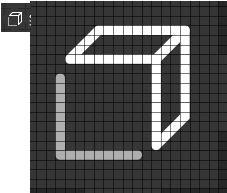
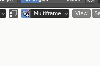
I discovered another icon we need. In Grease Pencil Edit Mode, there’s an option to enable/disable Multiframe Editing. Currently, this uses a Physics icon, which happens to work surprisingly well, but it’d be better with something bespoke.
We also need an icon for ‘Sculpt only Selected Strokes’. Currently it uses the icon for Vertex Select which is a poor choice. We could simply use the cursor icon here though to mean ‘selection’.