Yes, colors can, if used in a consistent and clear way, sometimes add extra clarity.
This is why we use colors in the toolbar icons and also in the Outliner to distinguish the various types of data. So, we are already using colors several places.
Please note though, that colors are now defined as part of the theme and not as part of the icons themselves. This makes it so we can make sure the icons are clearly readable on any theme, and it’s a more flexible and customizable system where the icons now don’t need to display an outline around them. This makes it possible to make more readable shapes and slightly larger sizes, which is a benefit.
We could add several more color categories to flesh this out more. We could add a category called ‘Warning color’, for example, that would make the warning icon red, if the theme choses to do so:
This has to be added by developers and theme makers, and not as part of the icon itself.
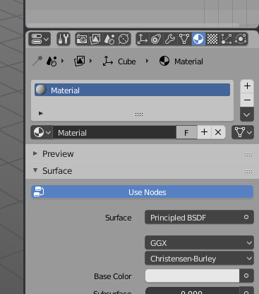
The toolbar icons are done in a different way technically, where each color is defined by a material. The idea is that these parts will be themable too, so a theme can make them all monochrome, or you could swap out the current colors for something else there too.
But smart theming also creates color dependance between UI elements, and increases theme developement time. Also, outlining can be done automatically in runtime. So it is definitely not bad option to have.
Also, if icons are independent from theme, then you have UI elements consistency across all themes, isn’t that good?
You may want to have few themes with different brightness, if you are working in solid color mode and various light conditions in your room. Then you can switch between themes and have the same icons.
Outlines are good for indicating the state of an icon (selected, activated, etc…) but they don’t have to be part of the icon itself, as they don’t add information on what it represents (since outlines don’t exist in the real world).
As for the customizability vs consistency, 8% of males and 0.5% of females have some form of color blindness. Given than computer graphics is (unfortunately) still male dominated, we’re probably closer to 1 in 12 people. That doesn’t seem neglectible to me. Customizability allows to create themes that adapt to all forms of color blindness and take advantage of the fewer colors someone may see.
And if it increases theme development work, once this work is done, the end result will be less cluttered by elements that don’t provide useful information (e.g. outlines), allowing for bigger icons.
Ha! This time I was faster!!!
They’re already in the set, and some extra more (I’ve problem with Blender 2.8, which stops running after last Windows Update, so can’t tell You exact names of icons):
select only points - T15;
select all stoke points - T16;
Multiframe - T17. Its thickness refers to selection/edition modes mentioned above.;
empty icon for blank Grease Pencil ObData in Add menu (this could be utilised in Empty ObData as well) - R7;
a stroke icon for stroke Grease Pencil ObData in Add menu - R8.
EDIT:
Apparently the Sculpt only selected points is a completly different icon - will make it then.
Please develop your affirmation with some proof or insightful explanation.
My reasoning on that is that although reality is devoid of outlines, our brains are trained from a young age to read them because of the overwhelming amount of drawings that our eyes are solicited to read.
That said, going to a more “natural” design should be very easy for our brain to process.