Those bi colors icons are really nice, it the color follows the theme, thatt can be great.
icons of this type, which you have depicted in Your mock-up, functionally do not gain anything after adding colour
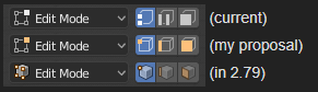
In the viewport in edit mode, selections are indicated by an orange color. Using that scheme in the icons as well helpes making the connection between what you see in the viewport and what you see in the icons (plus adding readability for users like me).
Color is a means of transporting information.
I’m sorry, but icons have many small details that are not needed for quick viewing.
To visually understand it fast we need well defined contour shapes.
Fill it with color in the background.
And the last detail, the shadows.
Example

3 Likes
Guys, is it me, or are the “hide” and “disable” icons the other way around? As in “disable” is now an eye icon and “hide” is the hashtag thingy?
In the Outliner that is
Guys, is it me, or are the “hide” and “disable” icons the other way around? As in “disable” is now an eye icon and “hide” is the hashtag thingy?
Eye is local visibility in the viewport, hashtag global (including linking)
Hi.
I think those icons are good for phone apps that do not require as many icons. They also did not distinguish themselves well in small size. For Blender with hundreds of icons you need details to get variety.
Well, they are not in today’s build. That’s what I am saying. They’re flipped. ‘H’ key toggles the hashtag, not the eye.
I wonder what is holding developers back from not making icon sheet swappable without rebuilding the whole thing?
This used to be possible at one point via replacing a png file in the application bundle. But for a while, icons are stored and loaded as custom .dat files that are compiled as part of the executable. I believe this has advantages for performance and other things. This makes it non-trivial to add a way to swap out the icons.
Well, I have been using Blender 2.8 with new icons and I must say that jendrzych and collaborators work is excellent. Of course good choice colors codes and other suggested changes for better customization are welcome.
Luckily jendrzych is not only an artist, he has a “designer” mind as well. Something that I personally appreciate because an artistic appearance is not enough, icons must be functional and express as best as possible what they are for.
I like Blender 2.8 theme and icons in general. I would like better separation/distinction in some fields/sliders with the rest of the GUI (TopBar fields/sliders for example), some better edge/outline or some inner shadow could help. And for icons a better distinction between selected and unselected icons, especially in Outliner.
Hi William.
Performance is a similar argument that was used for previous versions of Blender when users requested custom MatCaps possibility. Developers have found some solution for custom matcaps performance that can be applied to custom icons? Or was it simply left out of preformance aspect to give preference to request of users about being able to use custom matcaps?
William, is the stuff I wrote about an intentional change?
To be honest I’m not entirely sure why icons are stored this way now. It was a change that happened at a time when I was not so close to Blender development, but I’m sure it was not an arbitrary change for the sake of it. I presume it has to do with performance, but I could be wrong. There may be other ways to store icons that have other advantages.
All I can say for sure is that this makes it harder to support swapping out icons, and that it has lower priority. We’d rather have one good icon set for now, rather than a bunch of incomplete ones, and we have limited resources for all of Blender and the UI.
Yes it’s intentional. But this is something that will continue to be worked on. The distinction between hiding and disabling in the viewport is not very clear and potentially confusing.
Just to make sure we’re on the same page. What I mean is, with new icons hide and disable replaced each other. What was the eye icon is now a hashtag icon and vice versa.
Modifiers had the hashtag, but after the update they have the eye icon
Yes. The ‘hashtag’, as implied by your wording, is not a great icon for showing/hiding in the viewport. As this is used more places and more generally, we flipped them around.
However, the ‘hashtag’ is also not a very good icon to represent hiding either. In some places we use the ghost icon for ‘hide’, we could use that here too.
Or, we could display hiding in a different way altogether, in the viewport sidebar instead.
Oh, ok then. I was just thrown off by the flip-around.
Some of my thoughts on the icons. @jendrzych
I don’t think there should be a rule to make all the icons exclusively monochrome. (The toolbar icons already have multiple colors) I think in most icons one color is enough, and we shouldn’t add multiple colors on them just for colors sake, but in some cases a second color would make the icon more understandable. One example being these three icons ![]()
I really like @zoltanfodor s mockup, and I think his version is a lot more understandable and it highlights the selections more
(by zoltanfodor)
I also think having two colors could benefit the curve icons. Having the control points blue like in 2.7x would (in my opinion) make those icons a bit more easily readable and look a bit better.
![]()
Also having the Blender logo in the top corner monochrome is just utterly stupid.
My thoughts on the modifier icons.
I like the design of them, but I think the iteration with filled icons is a bit better than having thin lines just at the edges. I think the icons would be read more easily in a filled style:
(I like these)
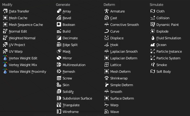
(I don’t like these as much, not as easily readable)
Maybe this is just personal preference, but I think that having more solid icons with clearer shapes are better and more readable than having icons with just the edges.
Then about file manager (Is that what it’s called?)
Having the icons color coded like this would make it easier to separate different file types and make it easier to read, since the icons are different colored from the text.
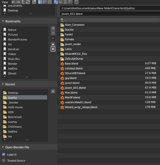
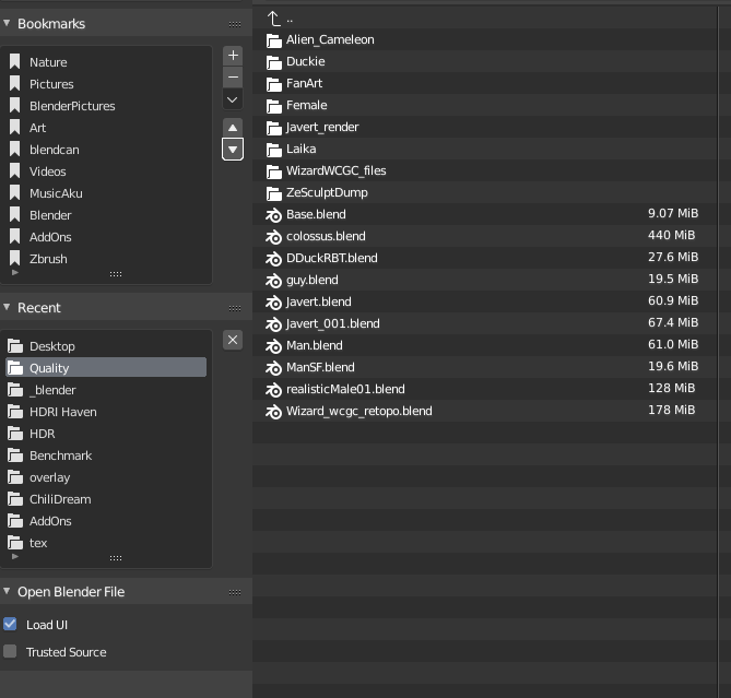
I think with those icons color coded the file manager is easier to scan through, and it’s easier to separate the icons from the text. Or what do you think?
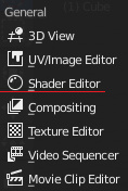
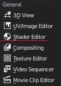
Another thing is about the shader editor. This is a pretty minor thing, but I think it can really make a difference.
I think the shader editor icon should be the same as the material icon. It would make it easier to connect to materials, and might be helpful especially for beginners.
(current)
(my proposal)
Overall I think the new icons look really nice, and with some changes they can get more usable than the older ones. I would have some more bones to pick (looking at you particles icon) but I think this is enough of a rant for now. Also I would want to emphasize even more that it shouldn’t be a strict rule to make ALL of the icons monochrome.
Hope this feedback was helpful, cheers! ![]()
26 Likes
Please don’t go this route. It would make things very hard and complicated.
IMO, hiding should be the "eye ![]() ", and disabling should be a “checkmark
", and disabling should be a “checkmark ![]() ”. Easy enough.
”. Easy enough. ![]()
2 Likes