Yes, we thought of that as an option too. But that makes it seem like you disable the object entirely, when in fact you only disable it for the viewport.
The tooltip should solve that part, no?
No, then what’s the point of icons if they don’t represent what they do. Icons and text labels exist to describe what something does. Tooltips are used for further clarification.
Something that reminds the temporariness would be the way to go IMO,
I drew these two ones some time ago, but they’re quite ugly and probably too big for the outliner
If colored then soft colors have to used like some good samples was above this topic days ago, worst color is strong blue and neon type colors that strain eyes strongly and distract.
Sorry, bad english!
I just realize that the “hashtag” icon is the 3D grid floor empty.
For the disable icon, maybe could use the icon on the left of the show/hide overlays (I forgot that option name, and don’t have 2.8 in this computer =/)
It has a eye and a arrow, I put a diagonal line in it, since when disabling an ojbect we could not select nor see it
That’s the point. Checkmarks represent a lot better disabling something than an eye. And if someone doesn’t know exactly what this is disabling, the tooltip is there exactly for further clarification.
Ofc there might be a better icon to represent it exactly, but between the eye and a checkmark for disabling I’d choose the checkmark. It’s far less confusing imo.
Other options for disabling would be to put the checkmark/eye in a square/rectangle to represent the viewport.
Random files from the net for inspiration:


I think something around those lines would clear the confusion.
1 Like
The checkmark inside a ‘display’ rectangle is not a bad idea. But a checkmark in a square just ends up looking like a regular checkbox? How could we differentiate those? Simply by making it rectangular?
Still, something along the lines of what you posed would probably be clearer overall. Then the eye can be used for show/hide.
The ‘hashtag’ (grid) was never a good icon, so this kind of configuration is almost certainly an improvement.
1 Like
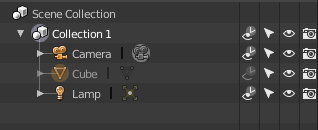
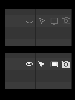
Following on, Enable/Disable in viewport could look like this:

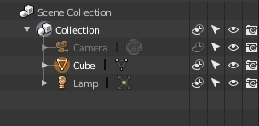
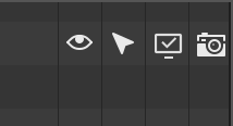
In context here. Show/Hide, Selectability, Viewport Enable, Render Enable:
We could even make it even more consistent by changing the render icon to fit, like so:
To follow Jendrzychs design paradigm, we could also consistently use the concept of filled in for enabled, empty for disabled, like so:
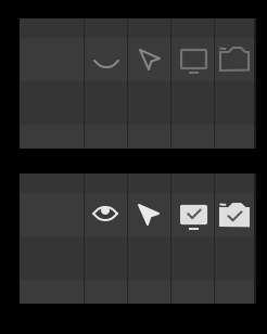
Overall I feel like this would be a fair bit clearer than the current situation with the grid, which everyone thinks is a hashtag anyway.
16 Likes
The problem with this icons 
 is that it’s hard to tell that it’s a render icon?
Also why is the render image icon so different?
Shouldn’t most rendering related icons be somehow similar for consistency?
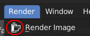
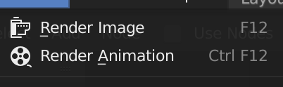
The reason why the Render Image icon looks like that, I think you can guess. Clearly, in that context, it is like that to differentiate Render Image vs Render Animation.
Idk, just feels a bit complicated.
As an example, in c4d, all rendering related icons are based on a clapboard, with additional shapes to differentiate between them, and it’s like that through the all application. Imo it’s a lot easier to understand related icons when there’s a base.
1 Like
Those icons are a lot larger, so that’s probably not going to work in Blender.
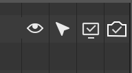
Anyway, as for the viewport/render visibility toggles, they could also just use the hollow/filled in states to differentiate their states, like so:
10 Likes
I do like how the new icons look but I strongly disagree that strictly monochrome icons is a good design choice. Colors help reduce strain on the eyes in differentiating between shapes. A simple colored line or a dot of color goes a long way in helping distinguish between tightly packed icons.
The thing about those design decisions is knowing where the icons will be placed in the UI. You want to avoid similarly shaped icons being placed next to each other and if they do happen to be tightly packed together then colors will play a huge role in helping your eyes differentiate between them. Not all of the icons need to have individual colors or even be colored at all but adding a couple of spots of color to some icons helps break it up a little when scanning over them.
I made a little mockup to help visualize what I mean.
For example in the properties window the “Physics” and “Particles” icons are placed next to each other and have nearly the same shapes so I added a tiny splash of color to one of them so that it becomes easy to spot. Same thing with the “Constraints” and “Modifiers” icons and with the “View Layer” and “Scene” icons. The rest of them are different enough (shape-wise) that no color is necessary.
Oddly enough I’m having an easier time finding the modifiers I’m looking for with no specific icons for each and every one of them. I’ve always had issues finding modifiers in Blender 2.5 - 2.7 and I never really understood why but not having icons to rely on makes me actually read the text and thus sorting through the list alphabetically instead of darting around to find a specific icon I’m looking for.
I think that the way to go is skipping the modifier icons entirely and going for a categorically organized list would be the best solution.
6 Likes
I just want to say I love the new icons. Thanks.
1 Like
I also find the Render icon a bit strange to be honest, I think it’s because of the fact that film is generally used in movie-related icons and so in that context I automatically link it to Animations.
I find this one confusing too:
On the left: the new “Object” icon vs. on the right: “Global Transform Orientation”. Could the former be changed to something more like a 3D object? Like the cube from 2.79 or Suzanne? →  or
or 
8 Likes
I think those 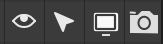 are okay too, yeah.
So how about use that same render icon  in the render image button?
Well, if that icon means ‘render’ or ‘renderable’, then it’s confusing if it also means ‘render image’.
The renderability toggle in the Outliner affects both image renders and animation renders, so tying it to the same symbol used specifically for rendering images as opposed to animations is misleading. Then we would falsely communicate to the user that this toggle is only valid for rendering images, which is not the case.
So no, I don’t think that’s a good idea.
Idk, perhaps with a slight modification?
The current render image icon is just really confusing.