yes, that part there is simply too congested
Vertical tabs are good solution in my opinion. Maybe enlarging selected tab, and adding some bounding line will add more readability

3 Likes
The idea was, that horizontal space might be more limited then vertical space. If you like to see all tabs, it could eat up much space.
But, distancing from this idea, your image works for me, too. Its cleaner then current icon row.
1 Like
I just modified william’s mockup to quick show it.
And what you are pointing out are all just theming options. 
And by the way, why everyone makes vertical tabs on the left side? I would prefer to have it on the right side, it’s less prone to errors/misclicking…
I also think that right side could be better, but we have there scrollbar which is shown after mouse hover, this will be a bit disruptive with icons. Also working with dual monitor setup could probably affect usability.
1 Like
I like this idea. This makes the tabs look a lot more important. gives them a better visibility.
It always bugged me that so many important options were hidden behind these tiny icons.
1 Like
If only there was enough space to display all the icons horizontally without making the properties comically large.
Another display of the categories, more as additional proof of concept that these icons work better with more breathing space:

I cheated here because I omitted the area type selector, and there still isn’t space for all the icons, but it shows how much better the icons work with more negative space.
6 Likes
Still I don’t understand why active icon can’t be ‘connected’ to actual tab. This just have more sens, and behave like tab.
Also with single column layout we will scroll a lot. A LOT. Working with Particles especially. So a little bit more scrolling with nice visibility shouldn’t be a problem. Probably it will be faster than searching trough the noise and precisely pointing to small icon.
Area type selector is not needed. I wasn’t even aware of this before digging into this topic
4 Likes
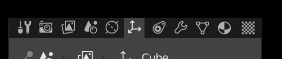
For reference, the following illustrates the padding around the icons that jendrzych prefers. The buttons certainly don’t become that much larger…

6 Likes
I’m comparing the new icons that are being implemented to the old icons, yes. How else should they be compared? What, because they’re not finished, are they immune to someone pointing out issues? I should hope not. Shouldn’t the new icons be better than the old ones? how can they be if no-one bothers to compare them?
All I was saying was that the UI was not the problem. Given the negative space was not an issue until these icons were introduced, deductively I can discern that these icons are likely the culprit, and don’t work as well in the same small space as the old ones did.
I didn’t point out a way to enhance them because that would violate all the design rules Jendrzych came up with for this new icon set. The issue is the monochrome icons have to excessively contrast with their background to be readable, as such, they beg for attention, and without an outline boundary they bleed over into what would normally be negative space. They beg for extra room to take the place of that outline.
I’m not aware of a way you could fix this, other than making the buttons all bigger, just to accommodate the icons. Personally I find that a ridiculous solution, given the problem didn’t exist before, it would waste space, and other (the old) icons have demonstrably worked in the same small space before which tells me the icon design goals aren’t being particularly effective for their intended use/placement.
The fact the old icons didn’t feel cramped in the same space as the new ones is highlighting an issue everyone seems all too keen to ignore and sweep under the rug.
Well I guess you missed a few, then?
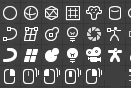
Monkey, both Lightbulbs, The camera, and 4 of the mouse icons.
Note that I personally don’t really care that a few are 15 or 16 pixels tall or wide, I’m not complaining about that, but you mentioned they were all 14x14 and I had a few measured so I figured I’d mention it.
1 Like
Well, this is more up to the users. I myself I like to have my properties reasonable expanded, the default width is too narrow for me.
But yes, that negative space you added helps a lot.
i like this
Took me a while to decipher what you were trying to say, but I think you mean this? That the tab has the same color value as the active content?
Not needed? What do you even mean? Of course it is needed - how else would you switch area types? At least the way Blender currently (and always) works, this is a core part of the UI paradigm.
1 Like

Nice design, but I wish they have different color accents (for example, the vertex selection icon could have the pixel in orange), just to make it easy to identify them.
Sorry, I was thinking about separator not selector ![]()
Yes, this is what I was talking, I’ve made it in my mockup which you liked ![]() (New icons for Blender 2.8 - #1431 by cgslav)
(New icons for Blender 2.8 - #1431 by cgslav)
The same behavior we have in workspaces tabs and I think it would be good to have it here as well. Consistency sake.
So we will need to introduce static scrollbar. I’m against it.
For the screenshot. Multi monitor setup disaster.
1 Like
No no, everything should work fine lol.
As Brecht pointed out, new icons are coming.
The UI gets adapted to the new icons. Currently, UI does not integrate new icons as well in the properties row. Its an adapting process. You can also stack icons by hand, play with different distances. If icons are too close to each others, the same icons do not work as well.
So, blaming the icons for being packed too condensed rather puzzles me.
Atm, if I see (Blender 2.8) properties panel, my mind rather sees something like a granola-bar. So, the mind has to nibble through the granola-bar to find the desired icon. I can understand if you do not like this.
