The icons changed, the UI size didn’t.
Negative space wasn’t an issue before.
How is that not the fault of the icons.
The icons changed, the UI size didn’t.
Negative space wasn’t an issue before.
How is that not the fault of the icons.
Ha! The most funny thing is that new icons are smaller than the old ones - 16x16 pix vs. 14x14 pix.
Lack of the outlines allows for more effective use of available space. Moreover they have constant luminosity, while old varied in this field. Icons seem to fill the button more, while they do not.
The old properties icons vary between 14-16. typically the outline skirts just over to 15px
Looks to me like most of the old ones try and stay to 14px, but some of the aliasing or outline makes a few 15.
Some of the new icons do skirt over to 15px just as the old ones do.
Even if the new ones were, on average, smaller, all you’re saying is that the new smaller icons are having more negative space issues than the old larger icons, even though they squeeze into the same available space (the buttons they sit inside are no larger or smaller)…
Huh … you already answered (while writing myself)
am sloooooooooow 
Padding corner would also make a difference, if icons are stacked in a row (like properties icons row)!
Odd discussion.
Yes, in 2.8 there is an option to change the “Roundness” of the buttons until they are absolutely circles. At that point they will cut off the corners of the icons unless you add an extra pixel or so to the padding. Oh the humanity!
If you were able to do the same thing in 7.9 you would find that the exact same thing happens, only slightly worse…
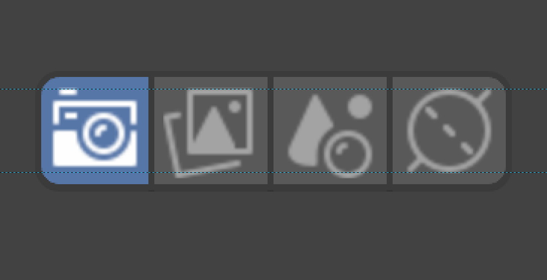
Negative, sir! All new icons, with exception for camera and render layers, are strictly 14x14. The two crosses the border of the very matrix with max. two pixels, if I remember correctly. Both of them can be redrawn to fit 14x14 with no effort (I bet I have such versions already somewhere in archives).
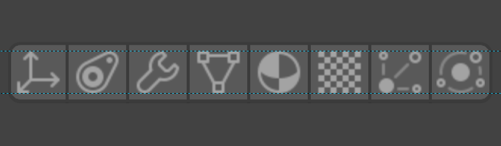
Yes, vertical alignment is a little off on some of the items in the version I am looking at - a couple of days old.
to me, generally, this is the most uncomfortable part of the new set

Are you talking specifically about the properties tabs icons? There there is only 2 I see that breach 14px.
The old properties tabs average out to 15px, there’s a couple at 16, couple at 14.
My point about ‘smaller’ icons needing more negative space than larger ones still stands.
The alignment of icons in the GUIis not the icon set fault.
All icons in general. 14x14 pixels matrix. I’m talking about the latest release of the set - the *.svg is in the first post.
The rest of the icons in the Properties panel line up very nicely. I’d guess that there is some difference in the View Layer and Scene icons…
yes, i know… but i wonder why this part. I too found it strangely out of order
As vertical tabs are pretty ok for me, I want to present mockup for horizontal with much more space to show you that those icons are really amazing. UI isn’t. I do not understand many UI choices across Blender, but for years those ‘tabs’ which are not behaving as tabs are mine biggest concern.
Take a look at this (yes more scrolling):
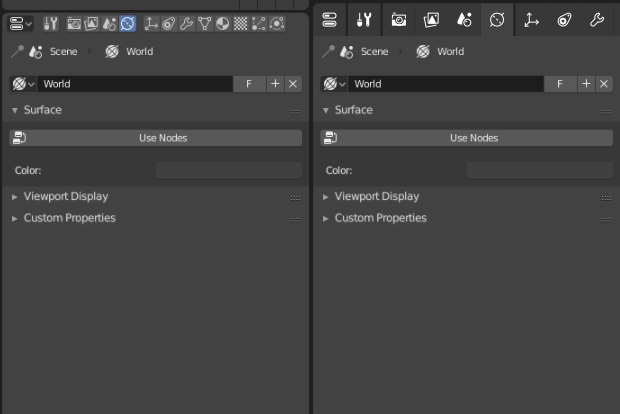
Scrolling is not needed anymore after they implement vertical properties panel, you can shrink that panel alot after that and still see all tabs easily. I admit that this free space around icons indeed makes it way nicer to look at.
Mh … old icons have been embedded in UI successfully. You compare a complete finished project to a project which has to be finished. It is rather not fair, and not constructive.
This approach does not point out how to enhance anything.
I’m aware of that. But for vertical tabs space would be as much needed as here. Negative space is important and we do not have it enough across Blender UI.
Separator between every icon is not needed. Changing color to active icon to something completely different also. Take a look at mine mockup: New icons for Blender 2.8
Same for rounder corners - unnecessary cluttering UI is bad, m’kay?
I prefer small icon version of Properties Editor tabs. Even more, I have a request: when the panel is not very wide and the buttons/tabs do not fit, I would prefer that those buttons are ordered automatically in two rows so that they are always visible and avoid scrolling. If my request is heard, large size of icons would occupy even more space vertically.