Thought the same ![]()
Quick mockup.

Thought the same ![]()
Quick mockup.
Because then it’s identical to the Move tool.
A hand symbol is a pretty universal icon for viewport drag/pan.
Fair enough. Forgot about that one.
I think it can be very slight. Currently the icon is taller than it is wide, so there should be a few pixels extra. I’m looking at some hand/pan icons in a few other apps, and they seem to fit in 16*16 px grid.
That are those extra pixels I was referring to. Sometimes it amazes me, what can be stuffed in such a small space. I do not say no, although I traditionally remain skeptical. I hope to change my mind after a few attempts.
Will the two color icons be implemented? I think its a really good idea
Which is great, because their are related (you are moving the view).
And in some 3d apps when they want to deliberately differentiate between them, they go with this version:

(arrows pointing inwards) which is still much better represented than the hand.
The hand is mostly only used in 2D programs.
Revisited renderability restriction icons and the Rendering icon for Properties editor.
Viewport enable/disable toggle icons based on @William proposal.

EDIT - Onion Skinning will stay untouched. Filled is too aggresive.
If I understand the whole concept of having templates in Blender 2.8 correctly - then templates (with their high degree of customisation) must include the ability to load custom icons. At least when the full implementation of templates is finished sometime in the 2.8x release cycle.
Or is there something I have misunderstood here?
(I can see that the developers have their plate full until the 2.80 release. So it is not something they are inclined to look into at the moment).
As I thought…
![]()
Update in first post.
Great. Though there’s a floating camera icon in the middle of the icon file now, and the Render Properties icon still has the old camera icon. ![]()
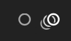
Another (really tiny) detail: The Onion Skinning icon is now identical if on/off. Could you remove the onion skinned lines from the off version? This way the state becomes clear.
So, off/on:
If you fix that I can make a patch to add the correct icons into 2.8.
The new hand icon looks a bit weird  (I think the old one was better).
The hand will always look weird for this, no matter what. But… ![]()
I think the hand works given context
Acting in a hurry isn’t a good thing. I’m already doing it!
In your example the icon provides no information about what it actually does when it is in the off state. It looks like radio button…
Context, my dear. Context.
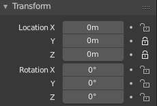
Very small thing: would it be possible to align the closed lock icon with the open one or there’s the need to keep it centred? In my opinion it would be a lot more visually appealing, especially when clicking on the icon.