Nothing stopping there being a future addition to the theme code to use RGB channels as you suggested later. At which point, the theme colours won’t have to be baked in.
On the other hand, I wouldn’t hold my breath on this one. I think we’ve pushed as far as brecht is willing to bend on this (and it’s pretty clear that jendrzych is not interested in going further than monochrome at this point). Custom icons is a pretty big step and given timing + past history on UI changes, I think the best we can hope for in 2.8.
FWIW, when it comes to the UI, good ideas take some time to grab hold in Blender. We’re STILL waiting on that (consistent/functional) left-click select keymap default.
@xrg
Well, I don’t know why ist this way… There should ba a Flag icon. @William what happened with M6 icon?
@Zino.G
The most spectacular use of Dynamic Paint, which I encountered, was “painting” traces on the sand. The choice of the icon was therefore obvious: D
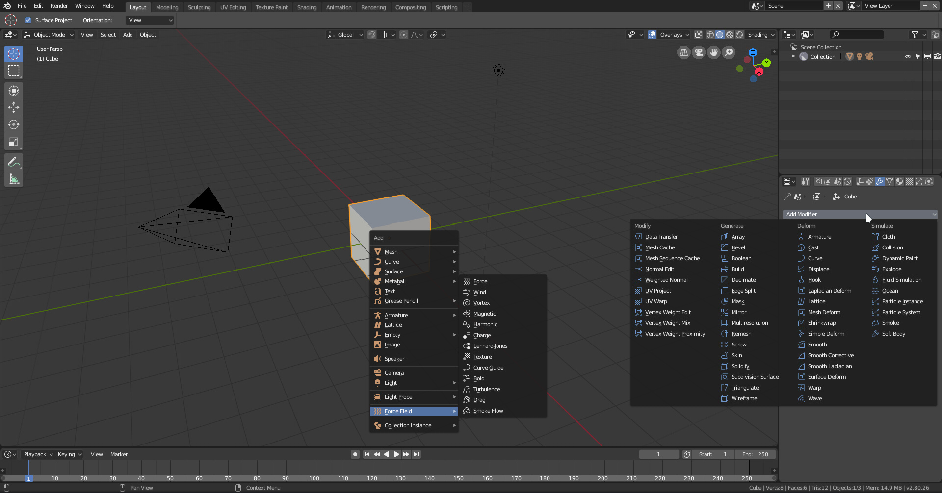
I found a missing icon, maybe you are already aware of that, but juste in case when you add a force field (or maybe just an empty I don’t remember) one of the properties editor tabs uses an old icon
It’s an empty. GUI uses old T1 icon. I made one for Grease Pencil Blank ObData (not in interface yet, but present in the sheet) it could be reused for time being. Or - since the Object icon is bold now - the button may use old version of the Object pictogram. The thin one.
As someone who has never used dynamic paint and didn’t really know what it was, I got a good idea with the footprint icon: an object leaves some kind of textured mark on another one, which can include not only color, but depth etc.
Icons are not meant to explain the functions to those users who are first in touch with it. That’s job for a manual. Icons are meant to be just a visual anchor, logically associated with the represented function.
Can you make it more of a heraldic shield, with a flat top? This one reminds me too much of law enforcement.
Also, how about inverting the symbology here? Instead of something indicating protection, how about something that indicated scheduled deletion? Like a trash bin maybe?
My reasoning here is that no newbie will understand what he’s protecting the data from. The whole fake user behaviour is one of the least intuitive things about Blender.