Not good lookin in such small space (14x14 pix) - tried it. The one I made is a good compromise, I think, even if it looks a bit like a fountain 
I can give the sides some slope (1 pix difference), but overall sharpness will suffer.
Also the middle chunk is very large and raising higher above the rest than yogyog’s proposal
I Find his also more recognizable for these reasons.
If I looked at yours before I saw yogyog’s, I would surely not know what it represents.
Is the one on the left better?
![]()
Same to be honest…
What about a jellyfish instead?
Edit: something like this
![]()
6 Likes
Definitely for me, though I think you could keep the little gaps in the middle lines.
I think the one on the left is more clear
One more tweak:
![]()
3 Likes
I don’t know if it’s because jellos aren’t that popular where I live, but in that I see some sort of cake, it doesn’t give me the idea of something “squishy”.
I’ve updated my previous post with a quick attempt to draw the jellyfish idea if you want to give it a look.
3 Likes
Your jellyfishies are simply lovely!
3 Likes
what about just a ballon? it’s universal.
Not the most squishy thing. In fact a well-inflated ballon is rather stiff.
Yeah that’s a pretty good idea actually. I’m not sure on @a.monti’s execution though.
Looks like a slanted inkscape logo.
That said I’m good with the jello and I think it doesn’t have to be popular in the culinary habits of a country to be easily recognizable.
i was thinking of something more like this.
convey that in a tiny non-moving icon and I’ll think about it.
i am no Icons designer but here i gave it two shots…maybe the others could do better than me.
![]()
This resembles mi the Neverhood in some way… It’s a positive memory, BTW.
1 Like
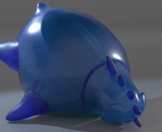
My own attempt
![]()
(sorry… couldn’t resist)
13 Likes
We have a winner here! But wait. It’s 2018, someone could be offended 
1 Like
The … jellyfish is an insult to my feelings, sir!
You are not alone.I had the same association… 
Like them all so far.