Damn it! I knew something will be wrong 
So lets just say that they are transgender jellyfishes. Fixed.
Not yet - BAME transgender. Now it’s politically correct.
2 Likes
That’s how it came out.
![]()
It’s way better than a jelly.
7 Likes
Damn you’re good.
Maybe this is better after all.
ummm after all the work you have put in, I say you just switch the jellyfish icon to your avatar. They almost look alike. lol
My avatar is a sphere with reflection and refraction. When You’ll see a sphere, the jellyfish will dissapear and vice versa - that’s how our brains cheets us.
If there’s at least a slight possibility for those boobs getting into 2.8, you’ve got my vote! 
2 Likes
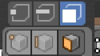
Really liking the progress here! One minor gripe I have is about the material and shading icons.
The look dev one is flat while the rest are rounded, and the wireframe doesn’t quite represent a sphere like the others.
Would something like this (but cleaner) work?

Or if one is flat they could all be flat.
The material icon in the properties tabs has a lot more solid color than any of the other icons in the properties tab, so it stands out a bit too much. It doesn’t seem to match the perspective either - top 3/4 view vs. straight on for all the others.
It could very well be intentional and I’m just looking at them wrong, but those are my first thoughts. Thanks again for all this hard work!
1 Like
Idk if the jellyfish would work it doesn’t convey softbody very well imo

I like your first one. The squashed shape on its own wouldn’t be understood as a squashed object if it weren’t for the 3 lines, so the combination does convey the idea quite efficiently.
1 Like
It’s funny because it’s really just five or six people who reply to every tiny detail with total dislike. They are pretty much discussing the issues with each other and they all agree that they hate it. So obviously, if you come in here and see how many negative reactions there are, it would seem as though everyone hates the new icons.
However, if you look, you’ll see that it’s actually a small group of people. The same group who dislike the general direction of the new UI by the way. In fact, I’m sure you’ll see most of the negativity in most threads coming from these same people.
But you know how it goes. It’s the internet. 
By the way, I’m not referring to simply disagreeing with the ideas of designers. What I’m talking about is when the criticism is purely emotion reaction followed by statements that read a fact without the consideration of others.
6 Likes
Red and green: These options mean ‘enable in viewport’ and ‘enable in rendered output’ respectively. It is consistent.
Yellow: Perhaps, yes.
Pink: It could be more different, I suppose. At one point, @Jendrzych had this as an easel, which in many ways makes more sense than a camera. Because these settings affect the viewport, it’s not so much about developing a film roll, but more about how you ‘render your scene’ - just like a painter decides how to render a scene.
He changed it because many people preferred the camera, but it does create this inconsistency of meaning. These settings also affect the viewport, not just the output render.
Purple: This problem has to do with the way scrollbars have changed. This problem we could fix simply by moving these toggles in a bit. It is unrelated to icon design.
1 Like
Red and green: I think what he meant is that in the outliner, when you toggle either of those, it changes the icon, which doesn’t happen when you toggle them in the modifiers tab. But that was the same in 2.7x, although it doesn’t mean we should keep it that way. I don’t see a problem with having the icons change in both cases.
2 Likes
Ah yes, we could probably fix that, so they reflect the correct state for the modifiers. As you say, this was the same in 2.7x too, but could be improved.
1 Like
To be honest, I loved the easel icon - it was so much appropriate, that I was really dissapointed, when people started complaining about it. I’d say, it should be revisited for sake of consistency.
Here’s a quick mockup with some other tweaks and changes (the bold Object icon must go - it was a mistake):
or
Mind three different icons containing a cone and the sun - if only I had an idea how to incorporate this into the World icon…
And the current one, just for comparison:
I kinda like the abstract World icon (a spinning sphere), but all other icons in this category are quite realistic, so a classic globe is on its place here.
8 Likes
Yes please, let’s have the easel back Looks so good.
2 Likes
Unsure about the easel. Difficult to tell what it is without knowing it’s an easel, especially because the mountain(?) part of it looks like it’s an inverted completion of the “triangle” that the easel legs imply.
I do really like the camera option though.
Also, I love the world icon over the literal globe.
The world icon also clearly reads as a picture of earth, the globe is a bit questionable, especially without the stand and lack of land masses. If you must do a globe, maybe consider a stand like this?

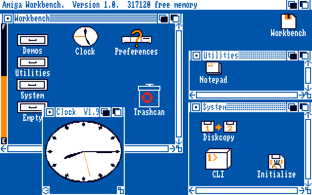
guys, tell me what you want, but I these 3 new icons can not digest them.
do not tell me vertices segments and faces but the buttons of an old video recorder or at most the very old gui of the Amiga of the 90s … and it’s not just the monochromaticity that already creates problems for me …
if I did not know how my pockets blender, and come from another 3d modeller I would have serious difficulty understanding what these icons are …
and if I had never touched a 3d program, it would be the end.
and I did not investigate all the other icons in detail …
asking the question from the point of view of a person who has never seen a 3d program in his life, how would he get out?
I started to analyze the style itself, I admit that for many years of use of professional applications, initially I also let myself be carried away by the “modern” stylization …
but now I have made some reasoning … if I were a kid, who would like to try to use blender, for the first time, what would I have?
and I think, that blender is no longer friendly. nothing from this point of view tells me sympathy, ok now is “among the professionals” but novice people, with these icons and colors come out definitively scared. they say alt, this is not terrain for beginners. It’s adult stuff.
and thinking about this I became very sad … this is not the effect that I first made this program many years ago …
for me it is not a positive thing.
4 Likes