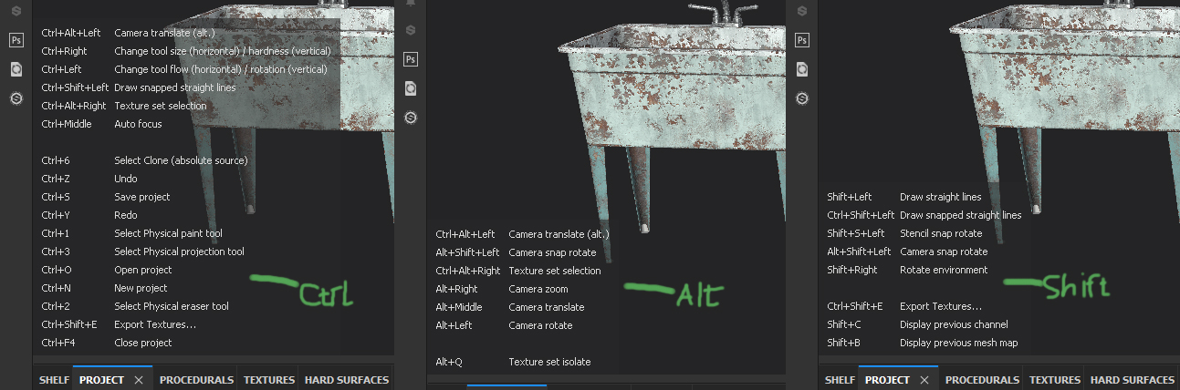
Here is a new video about the new status bar. I think it will become really useful at the end 
3 Likes
The status bar looks good, and it’s shorter (in height) than before which is nice. 
Now I’m waiting to see the tool settings come to life.
William Reynish updated the design task of the status bar, this is going in the right direction I think
https://developer.blender.org/T54861
does any of the developers view these topics? does it make sense to write here something?
If one of the developers reads this, then know that I love you, you are the best, you are doing an excellent job, thank you.
All I’m saying right now is my IMHO.
- The distance between the icons is too large. I need to rotate the head to look from one side to the other.
- These icons and text all the time change when you move the cursor over different windows. they blink. They are visible from lateral vision. They are distracting. although I understand that it’s just because I’m not used to them.
- For advanced users, these tips are not needed. For beginners, these tips are very small, they do not teach them how to use the program.
- You could use this space more profitably. not for tips for the mouse.
- if you want to make useful tooltips, look at the substance pinter. when you press and hold the key Ctrl, Shift, Alt, or a combination thereof, then tips appear in the viewport
sorry for my English
2 Likes
Hmm, it seems that I’m not the only one who has not yet gotten used to Search space bar key changes 
Yes, it will take some getting used to, and hopefully the new quick favorites menu will reduce the need to search for commands.
Oh btw, I might have inspired the name for that menu. I suggested in this thread that the search feature be renamed “quick search” so that we can use the Q key to summon the menu. The Q key can be found on even japanese and Azerty keyboards, and it is easy to press in all layouts.
1 Like
Yesterday the tools info was showing in the status bar like in the video, which was good. Now today it’s back in the 3dview. I hope that’s a bug, otherwise I’m dissapointed.
1 Like
Holy smoke, what they have done??
Things were going in the right direction, there was consistence, and now this??? Unbelievable, I’m very very very, disappointed… No words. 
4 Likes
Agreed. Now blender would have a dedicated space where to put info about key bindings.
Why they decided to scatter this information again is beyond me.
It’s a work in progress, as per the commit message:
1 Like
The status bar strikes me as a singularly bad idea, taking us back to the bad old days of Windows 3.11.
The mouse hints are just completely unnecessary after the first hour of contact with Blender.
The vertex count info is not that pertinent these days and could easily be put into the outliner or a panel in the properties editor. (Memory use, by the way, would be a nice stat to have. I mean on a per-selection basis, detailing the geometry and also associated materials and textures).
And keyboard hints would be much more readable right in the 3d view where they are pertinent, and also where they could have multiple lines of text. See the Box Cutter or MeshMachine addons for a very friendly way to handle hints.
2 Likes
This is not an about face.
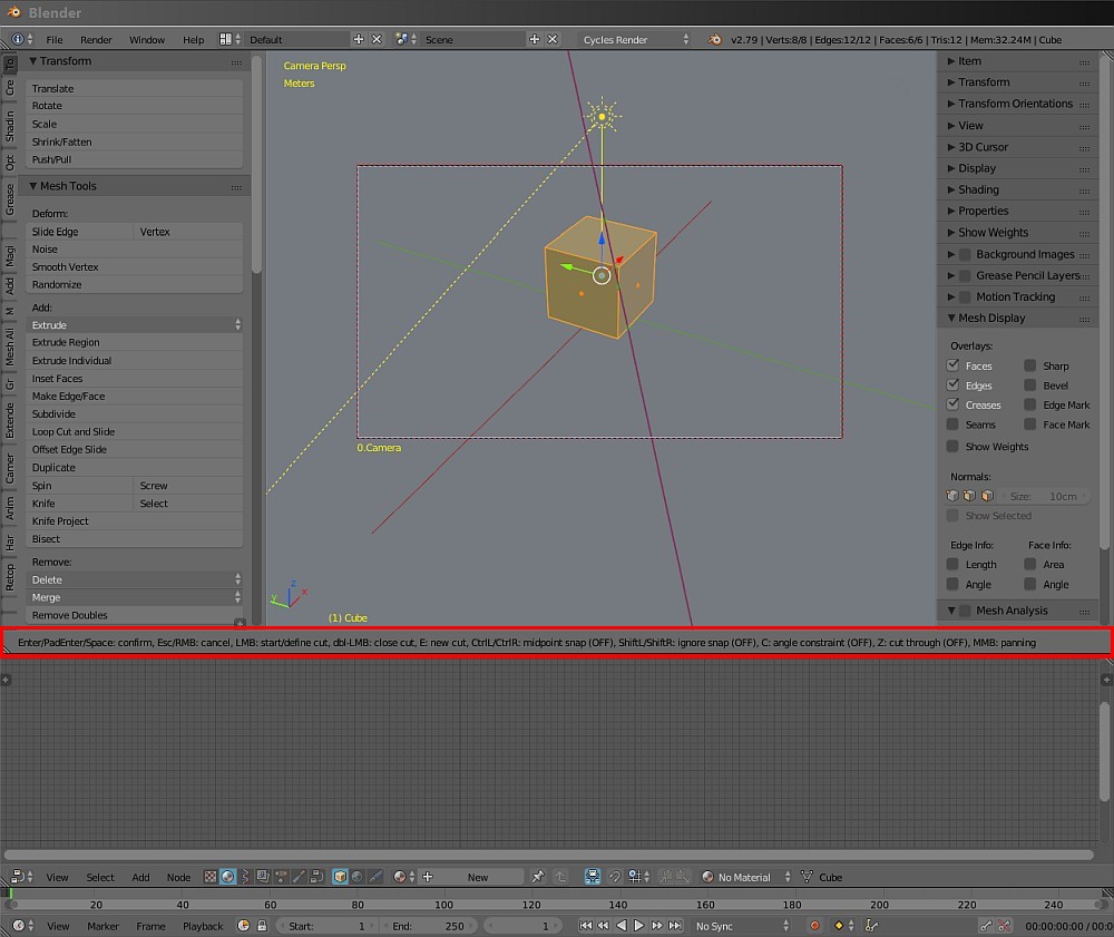
Knife shortcuts are still in status bar. Its message does not contain any value.
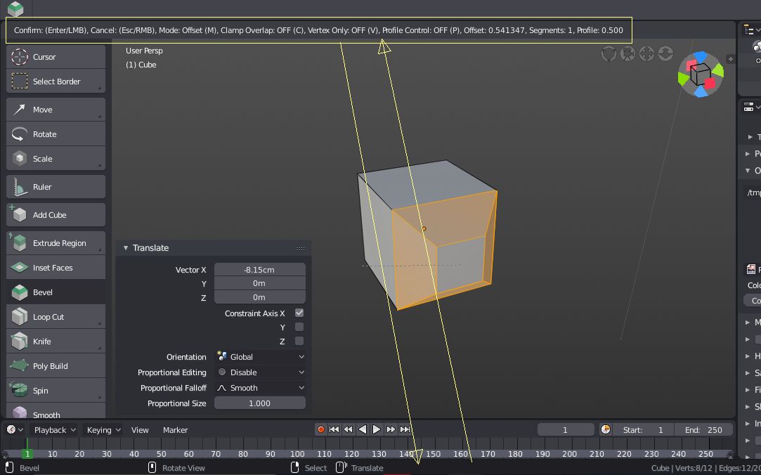
But Bevel tool message is mixing shortcuts and values. It will be split into 2 messages :
-
One containing only values will stay in header of editor, in area where editing is performed.
-
Another one containing shortcuts will go into status bar.
Try to not let our complaints get to you. We do realize its a work in progress. It’s just that people tend to get vocal when they are passionate about something.
As for my opinion, I think it would be best if we used the space in the topbar that holds tool setting for most of the info the new status bar has. While we use a tool, we don’t need to see the previous info about which button is used for the tool. It could display different info depending on what you are doing. Tool settings could be displayed in a tab or bar within each editor.
It would be nice if you could just drag a panel out of existence…
Though that may lead to panic when you loose all your panels, and you’re not sure how to get them back.
The feedback we got from users at the studio is that they want the transform values, pose breakdown percentages, … near where they are editing them. Especially with a big monitor it’s inconvenient if they have to look up or down constantly while tweaking things in a 3D view.
Looking at key shortcuts on the other hand is needed less often, and more experienced users could hide the status bar if they want. Key shortcuts are useful not only for the 3D view, and putting them in all individual editors would not work so well (for example the timeline or outliner).
We have considered adding stats to the 3D view as well, though it is getting very crowded already. Probably the 3D view could have more detailed stats as an option.
For many operators printing to the header likely becomes unnecessary as well, if we can make the Adjust Last Operation panel update its values while using the tool.
4 Likes
Just realised I posted my last post in the wrong thread. :s
Anyhow… I fully approve of this new status bar… it’s really good for things like - when doing a knife-cut I can never remember the keypress to lock the cuts to orthogonals, and I find that things have more options than I think they do!
Yeah, i wonder what made this choice better as this changes are only destroying what was best, better than anywhere else – this was right where you need it to be!!!
Also note that now with all the tools and buttons and menus scattered all over… (and displays/monitors getting bigger) user (with cursor and vision) needs to travel larger distances (left, right, up, down… into the menus & even sub-menus) to do same work as before, making it less workflow friendly, less productive. Do the study.
And a question – is there or will there be an option to disable (preferably remove it altogether) auto opening tool panel (F6 is enough for seasoned users)?
The obvious solution is to put those editing values directly in the 3DView, in a corner. There’s supposed to be a new widget for tweaking those values anyway right ?
That’s what I meant by the Adjust Last Operation panel, the one that’s in the bottom left corner now. In many cases it’s showing the same values, so it would make some sense if display and editing of those values were in the same place.
3 Likes