Aaaaalright my bad, I understand. Centralizing everything in the redo panel sounds good… even tool options actually. winkwink
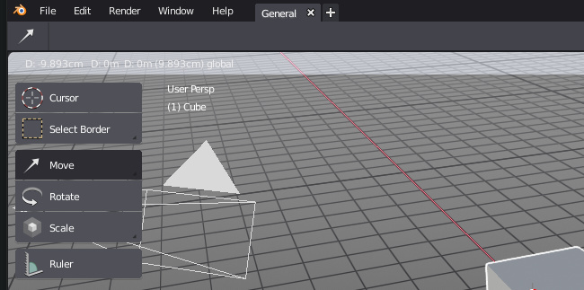
Yeah, I was so happy when all the stuff was showing in the status bar… 
Whoa, this came by surprise, totally unexpected. It’s sad really.
Seriously, when a developer like Brecht take time to develop an answer; you could take time to read it instead of recovering a reaction of misunderstanding.
The same stuff will stay in status bar.
Just transform values will be in 3DView.
Only operators that currently have a mixed message of values and shortcuts tooltips were restored to 3DView header until the message will be clearly split.
My point exactly! It shouldn’t be there either. It was perfect before. It’s just inconsistency to me.
Have a nice day Sir.
It looks like Spring team is disagreeing. It is their request.
Modified values next to modified geometry to avoid eye/head movements.
It looks like a consistent ergonomic choice.
Unfortunately for me then. I’m a sucker for organization, and stuff like this just makes me sad.
Also there’s some kind of theming issue with this. If you’re using a dark theme, bright text (region overlay enabled) and have a somewhat bright gradient in the 3d view, when those infos shows in the header of 3dview, this happen:

I can barely read what’s there, and I don’t know how to deal with that semi transparent bar that shows there… ![]()
![]()
This hurts…
Summary

Indeed! 
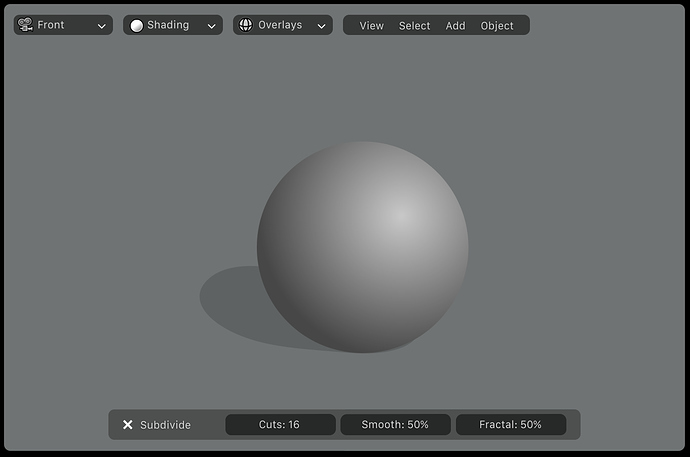
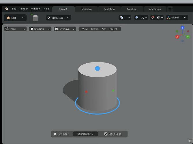
Transformation will go into the f6 menu inside 3d view
Even worse I guess, the status bar was just perfect. This f6 panel that shows in the bottom left corner of the 3dview is something that I want to hide for good. I’m doomed I guess, unless they give us an option to choose where we want this info to show.
Perhaps the issue is that they decided the Spring team would be made up of longtime Blender users instead of Maya and C4D users?
At least that is what this sounds like to me, let’s just ignore everything Brecht wrote and continue with our narratives. Is it any wonder then why the majority of devs. actively ignore this forum?
On what I said, 2.8 does seem to be creating a trend where this forum is seeing a surge of highly acclaimed, yet newly minted UI and usability experts (going with the internet phenomenon that occurs in the comments section of countless articles and news stories).
offtopic
No the don’t, can we retire this little chestnut. Some devs have just never been that active on this forum(regardless of whether people are flaming or not), but Brecht, Campbell, Lukas, Julian, Howard post here often and the have been doing it for years, I am also sure I am missing other devs that are frequent posters
on topic
If the development of the top-bar is anything to go by, let us just give the devs the benefit of the doubt. 2.8 is like a live experiment that we are getting a sneak peak into. The thing you are complaining could right now could disappear in a matter of days.
Sorry man, I’m having a hard time understanding you, and google translate gave me nothing. (non english native here).
I guess I just don’t understand what happend to all those great 2D and 3D widgets in the viewport ideas that were shown before:
https://developer.blender.org/T55039
I was really excited about this particular direction. I feel like the redo panel is stick awkwardly in the corner covering up my work. I think it should be reevaluated. At least give us the ability to move the thing around so it’s not blocking everything. I’m really hoping his is just a temporary experiment.
The one thing I’d much rather see is the utilization of the tool panel tab in the properties panel. More often then not it’s totally empty. I would pretty much exclusively use that if all the tool settings where there like the redo panel.
Again, here’s hoping this is just an intermediate step.
I think it is still the plan to have it that way. This list shows all the stuff they want for 2.80 release. A lot of the tool stuff is being done solely by Campbell. Since there is a LOT of stuff, I think he has been jumping around trying to get things working on a basic level, with plans to polish later.
That’s all I want.
And I guess that’s the devs plan, just not sure why such critical feature was left behind at moment.
2.8 is still faaaar from being ready. Beta is planned in about two months, and final release something around the end of the year, so many things are not ready yet. That’s the story. As @xrg mentioned, you can go to https://developer.blender.org and see the list of things that are planned to be done before 2.8 is released.
For those who want less bars on their screen, you can hide the Status Bar now.
https://lists.blender.org/pipermail/bf-blender-cvs/2018-June/111336.html

