just and idea here but there is another way !
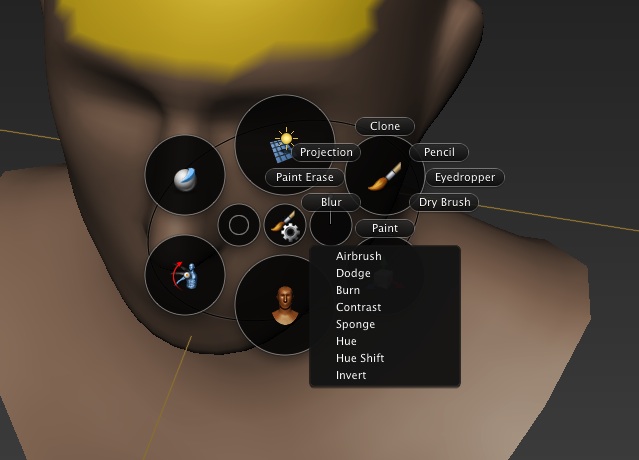
using a pie menu as a pop up instead
I would prefer pie menu instead of vertical text
happy bl
just and idea here but there is another way !
using a pie menu as a pop up instead
I would prefer pie menu instead of vertical text
happy bl
for now get the stuff into logical tabs.
Topology should have a tab of its own. Symmetry is also not something that is for the brushes only. It is a global setting that can potentially affect other things in a sculpting workflow (looking at it in most other sculpting software).
Yet these two panels are inside the BRUSH tab and even placed above the " brush texture" panel- which is at the very bottom.
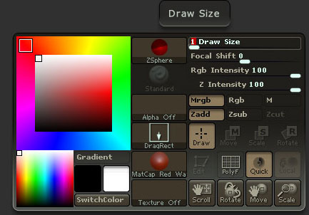
A blender version of this right click brush menu in zbrush:

or this - in mudbox

Is for another UI request.
I agree with everyone here that it would massively improve workflow. At least in theory the user should be able to sculpt/paint and change most brush settings while the toolbar is hidden- in full screen mode.
I suggest we place a mirror xyz toggle buttons in the 3d viewport bar. Both sculpting mode and texture painting modes are not using it in any shape or form atm
What other items (in sculpt and other modes) would be make more sense to have an appearance in the 3d viewport bar?
Getting off topic here. Sculpt UI improvements are planned and definitely needed, but they have little to do with tabs 
Pie menus are still in development (so far as I know).
thank you for your answer ^^
Besides that it it quite important to provide documentation in the app itself,concerning shortcuts
The RMB menu on the panel now shows the function and shorcut for pinning the panel whioch is awesome,but should also do this for all other panel interactions that are frankly hidden for most people
-Zoom
-reset zoom
-open
-Close all but one
-…
And, when ctrl+clicking it does the same as shift clicking (unpins everything).
Ctrl+click should not unpin.
It is reported as bug (because it is a bug, an inconsistency).
@JonathanW
When talking about a symmetry On Off indicator, in sculpting mode, we are not out of topic.
Because it will become harder to have a visible symmetry panel if assigned on a second tab.
Because of the above ctrl+click issues.
for symetry it might be a better idea to keep it in the brush tab for the time being. The topology one could have a tab of its own then?
Idk, it’s just such a waste of tab potential when you have only three tabs in sculpt mode and still a lot of collapsing and scrolling in the one you use the most. Anything non brush related should really not be in there in my opinion.
But it’s up to the devs.
One day we will be able to customize them tabs hopefuly.
There is a more to it than tabs that can be improved in the ui for sculpt and texture paint modes.
I am going to have a thinking about this 3d viewport bar in those modes.
In any case great work so far! 
you contradict yourself, if anything not brush related is something that you use often during sculpting, you are indeed forced to collapsing/scrolling all the time.
So, IMHO, General vs Brush-related is not a valid criterion.
paolo
hopefully this ui thing gonna be a bigger thing,and tool improvment cache… i dont know.hey jonathan is it possible to make the bake sound to f curve as a modifier,with realtime preview.thx
They are on Ton’s Todo list, but he’s busy with Project Gooseberry.
Well, tabs are extremely customizable. I’ve gone in and changed everything around (until it broke:evilgrin:) For instance I quite liked making the create tab be nothing but a grid of icons. And getting rid of the transform panel entirely. Among other things. So it’s a good motivation to try out a little python. But the only problem is that I like to keep downloading new builds and trying them out… It’s too much trouble to paste all that back in every time…
The “F5” Button not works anymore in the last Graphicall and Builbot Blender3d windows builds!? (to change Properties and Tool Shelf-from right to left,or left to right!)WHY???
this is very flexible and cool feature! i get a (scene Refresched) in the Info Panel when i click F5 Button with mouse over the Properties Panel or Tool Shelf Panel!???
tHE hEADERS also not works to flip with “F5” Button!?
@Vassilos: dude you got the amaranth toolset addon enabled. it takes over the f5 hotkey which it uses for refreshing the scene (sort of), disable the addon and test the f5 again.
Hey iceking!..you are right now it works!Thanks
bud in the older test builds from Graphicall or Buildbott it works also when the Amaranth Toolset is activated!!Strange!
for symetry it might be a better idea to keep it in the brush tab for the time being. The topology one could have a tab of its own then?
I think it is a bad idea.
Brushes and dynamic topology. I (we) need to have direct access when sculpting. Keep in mind, such operations take place using a wacom, in most cases.
Sculpt-mode is an artistic tool, among most of the blender tools. You can’t tell an artist how to setup his-her palette, right?
This is why I insist to have ctrl+click as it should be.
There isn’t any reason at all to come to a flame war, on how artistic tools-brushes should be arranged.
It is a very personal matter and a decent UI should accept it.
It surprised me when Brecht replied to my bug report, he didn’t find anything wrong under ctrl+click functionality.
we have to be more careful. It is about the UI, about customization, about consistency.
The problem is that in sculpt mode you will use nearly all the functions regularly, brushes, strokes, dyntopo, symmetry, etc… while sculpting, you’re going to change their settings all the time, unlike by example in Edit Mode in which you’re not going to add primitives regularly so having them into a separate tab is no real problem.
So if in sculpt mode everything starts to be split into tabs, the sculptors will have no choice but to pin nearly all of them to not have to waste time clicking between tabs constantly when they need to access functions that are split.
Bad idea in my opinion to split sculpt mode functions into separate tabs.
@sanctuary
My problem is a little more generic.
As a sculptor I will pin everything (almost) of course.
But, trying to use ctrl+click to have one only opened at a time, this unpins everything. Shift+click was supposed to do this, not ctrl+click.
To decide not to have tabs in sculpt mode is not a nice solution (though sculptors will love it).
As we have tabs now, let’s try for some consistency.
Michalis,
Revision e9fda25 by Brecht Van Lommel 2 hours 13 min ago
Fix T38478: pin panel, then ctrl+click to collapse others incorrectly unpinned panels.
you were right after all.
paolo
Nice, thanks Paolo.
Thank you Brecht.
By this fix TABs become more customizable.
Closer to my UI proposal BTW. I don’t even need TABs now. Pin everything and have the old blender way. :eyebrowlift:
this is exactly my intent
EDIT:
The very problem is that, without the chance to save own defaults, whenever you open/split a new window you get the usual mess.
paolo
Hey Paolo. fair enough.
Save changes.
I wonder, by example, how someone will be able to follow blender tutorials in a few months.
Don’t fool ourselves. Blender UI wasn’t a real issue for newcomers. The tutorials are.
All the rest followed are mostly related to public relations. Not my field of interest.