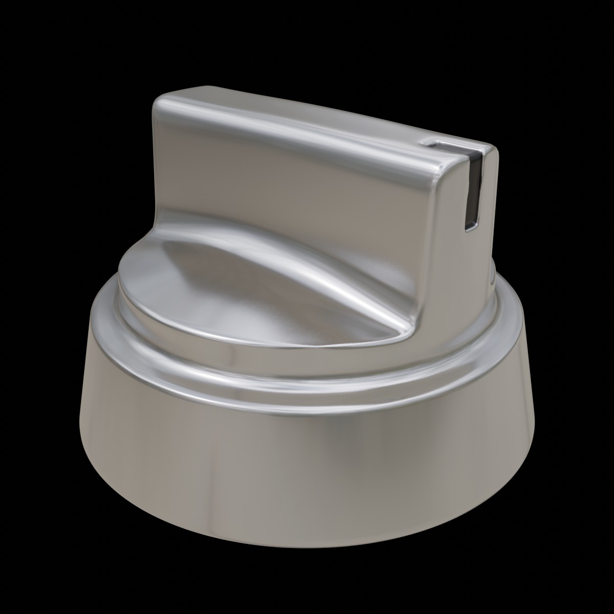
2022-07-11 Hard Surface Modeling: Oven Knob
Arrimus 3D: https://www.youtube.com/watch?v=b_0TVMO0AQs
After finishing with Grant’s basic hard surface exercise, I spent a fair amount cruising around looking at other instructors. He himself recommended several channels, both paid and free. For the time being I decided to stick with free. I’m not opposed to paying but I will always reserve that for instructors I’ve first given a “test flight” and who’re definitely a cut above the rest, and it also depends on whether I feel the free courses are not teaching me enough. I am generally more likely to pay either for a comprehensive introductory course, or courses that home in on relatively small, specialized subjects.
Josh Gambrell I already checked out, so it was on to Arrimus3D. He does a lot of 3DS Max tutorials but has a fair number of Blender ones as well. For this particular exercise he has both, and so I could compare them to see whether I could handle the 3DS Max version on my own (that would expand my choice of tutorials by quite a bit).
So, Arrimus. More methodical than Josh Gambrell, with more directed explanations of the why and wherefore. I had already known that proximity loops sharpen edges, but I had a real a-ha moment when Arrimus showed how the Subdivision modifier can be guided by judiciously placed loops, like around the vertical part of the knob:

This isn’t a good illustration, so I’m not even gonna upload the subdivided knobs, but that selected loopcut of the left knob pulls the subdivision more straight downward than it goes when it’s not there. Let me add a better example to show this more clearly:

The one on the left only has top edges creased to 40 and the bottom to 90, the one on the right has no creases but those two control loops. See how the shape is more controlled?
This was an easy exercise, but I learned disproportionately much from it.

Total aside: could Autodesk product logos get any more personality-free? They redesign them every few years, which is already dumb but possibly understandable because the last redesign sucked. But they just keep getting more and more bland. The most recent one is just abysmally dull:
Music: Adrian von Ziegler, mix. He’s a Swiss composer who combines a lot of different genres into his instrumental pieces.