I am making a space ship. This is a start. Just wanted to get some feedback before I start some serious greebling.
SirMikey
I am making a space ship. This is a start. Just wanted to get some feedback before I start some serious greebling.
SirMikey
yep looks quite interesting … try to add some more details (control deck for example) and just scale the textures a lil bit down or take another resolution for the textures (they are looking a lil bit overstreched ) … but anyways it looks good.
I love it, what kind of texture are you using?
I would make it a little more “aerodynamic” if i were you. (Not that it matters in the vacuum of space, but it just looks cooler…)
Yes, I agree, the textures are nice but too huge for the model. Go to the MapInput pane of the skin texture, and make both SizeX and SizeY about 3.
The mesh is interesting though.
Thanks for the replies. As I said before, I am just getting some feed back on the overall design before I start adding greeble. I don’t think that I am going to change its look much. Yeah, you guys are right the texture is too big. I will post another update later.
Nice little ship!
One thing, what are the “wing” panels doing? The struts are very small for the size of the wing.
I don’t know what you mean by “wing panels”. But if it is those big things under the backside of the ship then they are for defense. I think I am going to put something underneath it and those panels will protect whatever is underneath.
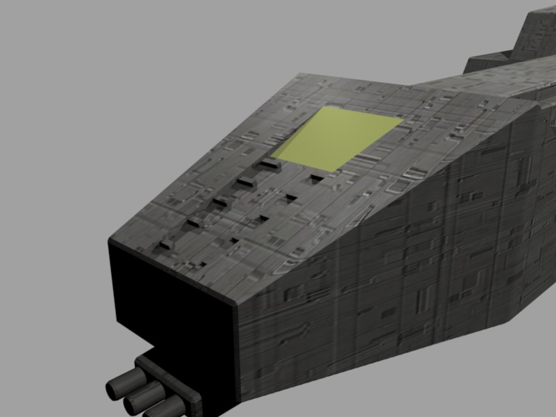
Here is an update. I have started working on the front and will work my way to the back. I am not sure how I like the bridge yet. Which do you guys/girls like better? I like the yellow one better. I don’t know if I am going to use either though.
SirMikey
hum…i like the texture of the black semicircle better than the yellow but i like how big the yellow is compared to the rest of the ship’s head.
Kinda looks like the eurofight typhoon 
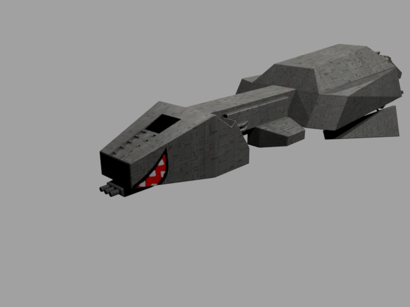
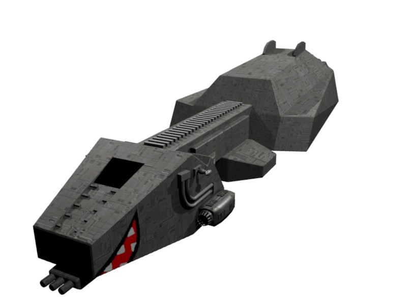
Here is another update. I have added some torpedo tubes on the side and some greeble on the top of the thin section. What do you think?
SirMikey
Oh, the mouth was a nice touch! Douglas Adams-ish – love it!
I think the greeble should be less perfect. Take out a couple here and there, it reminds me too much of a CPU pin side.
What do you mean less perfect?
The mouth was kinda neat but it isn’t very space-ish.
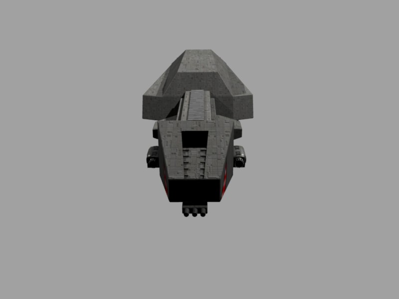
I have added the top gun but it is just a start it probaly wont stay the same.
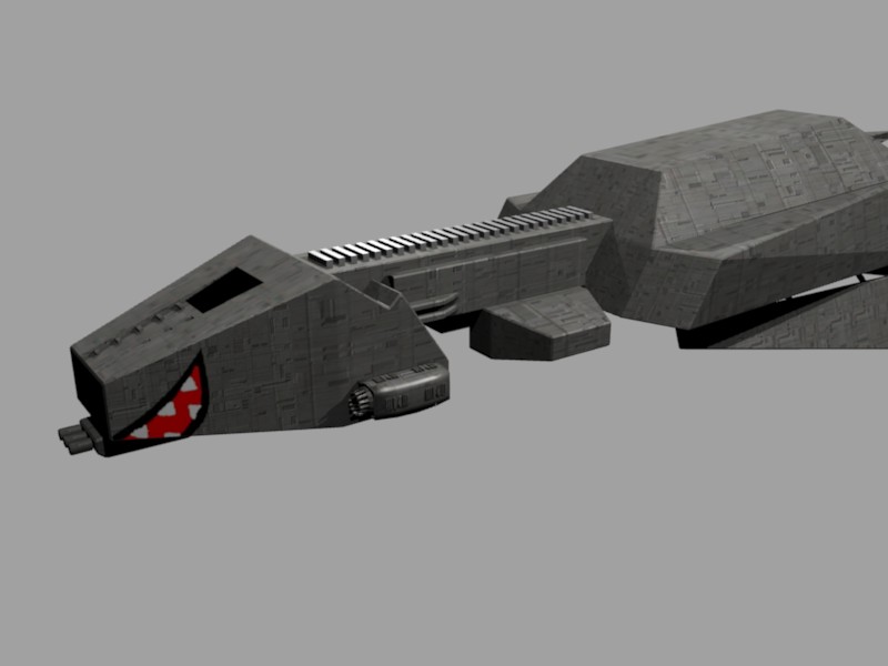
That texture is kinda cool, but it needs some Nor mapping to sell the surface.
Do you know where I could learn Nor mapping? I am not that good with all those “special effects” with Blender.
Here it is with the Nor slider to 5. I hade to move the image because it was UVmapped and I couldn’t do Nor with the UVmapping on. But it still looks good. I also got rid of those ugly pipes. Hows it looking?
SirMikey
That looks pretty good. I think beveling some of those edges might help a bit.
cool the teeth did look horrable