Hello everyone, I’m new to 3D and I’m loving it so far!
I spent a month learning and working on my very first render. I would really appreciate some feedback on what I should improve on.
71 Likes
wow. so mad this was your FIRST render. incredible. rethinking my life.
4 Likes
That’s amazing. I can’t think of anything that could be improved.
1 Like
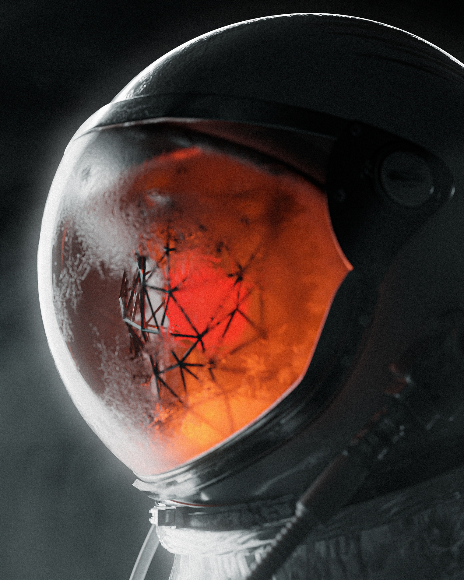
Great work (not only a great first render). I like the lighting with the contrasts (color contrast to the inside of the astronaut and also the intensity contrast due to outer space).
The only thing I noticed is, that the upper frame of the glass has bit too few polygons. There are some thinker and thinner areas along the boundary of the metal to the glass.
Keep up the good work and I’m already looking forward to your second render 
1 Like
Hahah thanks I’m flattered! 
Thanks for the comment! I’m pretty sure there’s always something that can be improved.
Thank you!
I see what you you mean about the polygons.
I really struggled to get the shape right for that one because I used a boolean modifier and it messed up the polygons (especially with the subsurface modifier). I will look into that to see if I can work them both better together for future renders.
Thanks for the feedback though! I really appreciate it!
Makes me wonder what happened to him? An alien abduction? Some kind of space disease?
No one knows for sure now haha but I do like the idea of a space disease.
First render, holy crap! You obviously have some kind of prior art experience.
It’s a wonderful piece, full of mystery, and avoiding the cliches of a lot of spacemen shots. My critiques are mostly artistic/storytelling ones. What exactly is happening is a bit unclear, and yet that’s part of the appeal! I wonder if some of the metal on the outside hose could get some of the firey light coming from inside, ridged metal can give some kickass reflections that kind of frame the scene here. Maybe the black isohedron shape coul dbe more intracate and draw the viewer inward to find out more. HArd to say.
Greta work, look forward to more!!!
1 Like
Haha! Thank you
Yeah to be honest, I should’ve made the shape inside the helmet a little more obvious.
Will keep these in mind for my next one. Thank you so much for the feedback!
I featured you on BlenderNation, have a great weekend!
1 Like
Woah! Thank you so much Bart!!
1 Like
You’re welcome. I hope it counts as a critique 
1 Like

That’s awesome! Thank you once again Bart!
Great Work, the only thing I want to critique is something of technical nature.
The metal part of the Helmet on the right side as well as some of the glass are pretty noisy. On a closer look I noticed the whole image being noisy. Definitely turn on denoising if you haven´t already. When Cycles is selected as renderer you find it under view layer properties in the properties panel (easy way), or you add a denoising node in the compositor (more complicated way).You may also turn up the samples (render properties, sampling) and use branched path tracing. I guess this render took a lot of time already, but all this noise just kind of ruins the image and makes it worse that it could be just by checking a box. While more samples add render time, denoising doesn´t really, so use it.
1 Like
Thank you so much for the critique!
I actually did use a denoising node in the compositor. I think it looks noisy because I added a post grain effect to the image. I thought it was a cool effect at first but now the more I look at it, the more I get what you mean. 
Definitely something I need to think about in my next one 
1 Like
just use more samples to eliminate noise.
An interesting idea, good luck in up skills.
1 Like