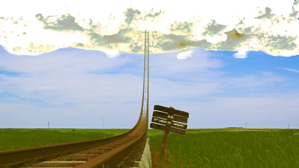
How can i make this better?!!! there seems to be to much negative space and i can’t find a good background so any help would be helpful, thanks! Also let me know what you think of the concept

Interesting concept. Maybe extend the scene with some rolling grassy hills. Typing ‘rolling hills’ or ‘railroad track’ into Google image search might give you some ideas. Other than that, the lighting is a little flat and the clouds could use some work. Railroad tracks are usually shiny on top from use(maybe these aren’t used anymore).
Agree with jwatson: Any track in use has a shiny top (because it is worn smooth by passing trains). That said, abandoned tracks are usually brown and rusty all over. Are you going for a deserted track to heaven or one that is currently in use?
one thats never been used and I don’t know how i can improve the clouds because they’re mad e with the cloud generator but yes lighting sucks  OH and what’s really weird is that my defocus node is not working and i don’t know why
Don’t know why without .blend. I made this .blend so you could check. It works for me.
defocus-depthoffield.blend (524 KB)
I’m using 2.57 and it seems they’ve changed a lot of the simulator stuff, if you look closely at my picture you’ll see the grass is all zig zagged and jaggety and that the lengths are generally the same because randomize size doesn’t work, and I’m also using the stratus clouds because i didn’t like the cumulus or cirrus. I won’t give out a .blend because it’s pretty big and high-poly but i will take a screenshot of my setup and put it on here
The best way to do this is to look at the visual effects and try to write down “what feels wrong.” For instance, right now I think it’s the clouds, which are a very solid texture, very white, very sharply-defined. Also consider the relative absence of “3D visual cues,” which make the image seem uncomfortably flat. Deal with issues one at a time. Use compositing to build the picture.
kinda of topic but an working on a song, freight train to heaven , no one left behind . thanks for the post.
alright thank you and also just to work this out, here is the screenshot:
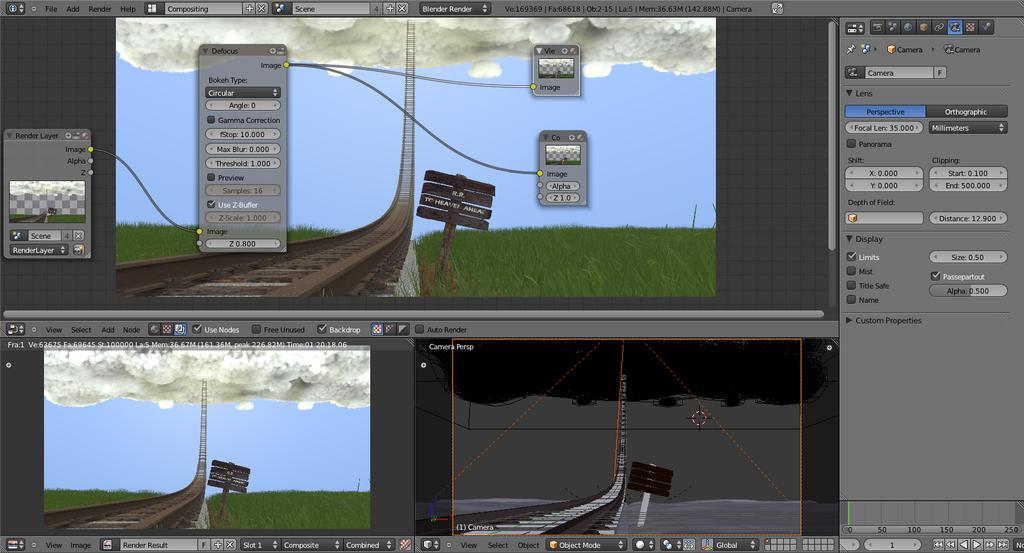
I have the camera DOF distance set to the sign and I also tried putting the sign object into the object bar and had the same effect so please help me somebody 
Connect render layer z to defocus z.
Cloud gen outputs this type of cloud for me. Everything default. Added a little bit more light to make them look more friendly.


AHH i feel stupid now, can’t believe i missed that! thank youand what cloud settings was that??
I think mine looks the way it is because it’s all multiple objects combined into one object (otherwise the domains cut each other off) so it has less particles to spread around than with a single object
This is actually a pretty cool idea your just not executing it right.
Your Blue sky background looks fake. The clouds look fake.
The textures on the tracks and wood look fake. There aren’t any trees, no train and no people.
Step 1 Fix the Clouds. The more real they look the better.
Step 2 Fix the Sky. has to look good.
Step 3 Add a tree or trees. And no they don’t have to be super photo real and up close.
Step 4 Get some good rust and wood textures.
Step 5. Add a train. If you can’t do one that looks acceptable to you up close
then do one far away so that at least it looks like there is a train going to Heaven.
Links
At those 2 links there is enough to improve your scene by x100.
Funny and nice idea. I like it a lot. It reminds me some of my old project that i ever not finished because i did not like what it started to look like. Maybe you can get some ideas about this:
http://dl.dropbox.com/u/5904620/kaupunkii.jpg
I would definitely make the lighting of this more dramatic. A good example would be night scene with the clouds glowing a yellowish tint (or whatever colour you want), maybe with a train powering along (and these lights illuminate the sign). It would make the scene appeal much more.
Having a train on the tracks would also add that crucial human element, appealing to the viewer much more. But it really depends on how serious you are on the project and how much work you are willing to do.
The concept is great, and so far it looks good.
@JDA, thanks for your help I know i need to fix that stuff and you can see me trouble shotting earlier in the thread but you’re right about the needs more stuff and the wood is from ccgtextures, it’s just the angle that you can’t really see it/ recognize it
@Arman, there’s no better time to finish it well now i feel like a hypocrite because i hardly ever finish my projects sadly.
@Sam M, I was thinking aabout a night scene but i really don’t know how to light one other than the train and cloud lights
@GjAnders, then “welcome to the team”. I am like you, I start lot of things and then I get bored to the idea and start another one. 
I love your image and concept, i just feel small things like colours could be improved.
firstly, i actually adore your clouds, but maybe you should turn down the step size a tad?
I did a 60 second mockup where i added a background and changed th colours a bit. hope you don’t mind…
don’t copy the clouds because the colours have been a bit blown out by the correction, but can you see how lighter grass and a bg image lift it?
@Casio23, I like your idea a lot! I’ve been trying to add a background so i can use environment lighting but whenever i do, the ground area is way above the ground so it looks weird and for some reason i can’t adjust it
Wait i just got it to work, woo!
