Hi there,
i’m currently working on this one…
any tips, ideas, critique?!


cheers
Wow. This is excellent. How long did it take you to make?
Wow, that is huge!!! Amazing work!!! No critics from me. Hope to see the final image soon.
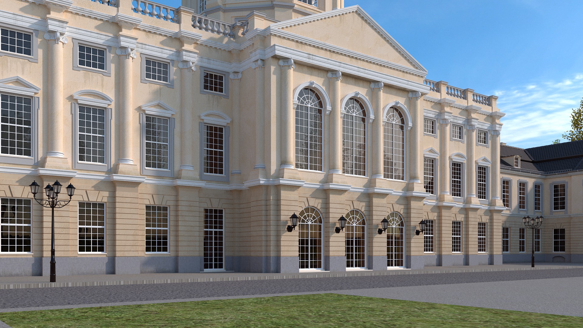
There are three glass doors into the main hall and two side doors. Obviously this entrance gets a lot of traffic. However, there is almost no pavement outside the doors to accomodate people as they mill around, get in their vehicles, talk to each other. If vehicles unload elsewhere and people walk to this entrance, there should at least be a wide walkway coming across from the fountain area.
Thank you all…
Here’s an update…
I’ve added grunge and other stuff!
I’m not getting a good result with that fluidsim fountain stuff at the moment! ![]() Tried a looot of different settings!
Tried a looot of different settings!
As always please give me some feedback, tips and critique! ![]()
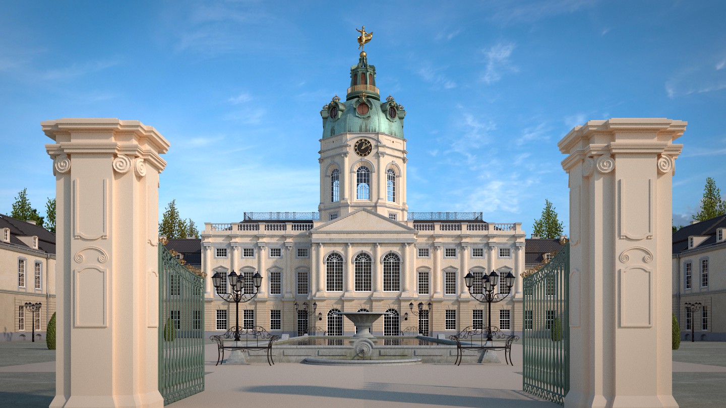
You just did really an amazing work. Strange that you did not get more comments on this post. I usually do not like to use the vignette but you used it well. Just two little things and that might be just me. The statue at the top of the building catches the eye a bit to much, not sure if it its material or it being too big. The pool around the fountain do you think you could use a higher res texture for it, its less neat compared to the other textures you used.
How many lifes have you spent working on it?
I’m so impressed with this project… I have a real appreciation for arch viz (I’m working on one currently) and this is a great example on how to do it right. The only real fault I can see is you have an UV unwrapping problem on your curbs. It’s visable on the first image of post 5. I’ve had the same issue before.
The grass looks good in most of the images, but on closeup renders (like in that same image), I wonder if you shouldn’t seek out a different image texture to use that is more appropriate for that perspective.
But the modeling and texturing as a whole is first class. I really like the tower detail you put in.
Hey, thank you all for your comments… i’m happy to hear that you like it.
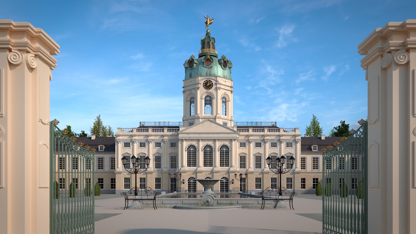
I’m thinking about putting something in the foreground. It maybe puts the focus more to the middle/building.
What do you think…
First, second or none?! ![]()
Well if you go for the first option, I think you need to add a fence on the outside of the pillars. (whats the sense of having a gate if you can just walk around it)
If you go with the second option (which I actually like better) you don’t need to worry about that. I like the second one because it does kind of draw you eyes visually into the main scene elements.
I like the first, but add some noise to the pillars, and of course, it needs a fence going along the outside.
If you want the fountain to be active, you’d need a very high resolution fluid sim, with particles to make it look realistic (do you have 16gb of RAM?).
The clock looks a little flat.
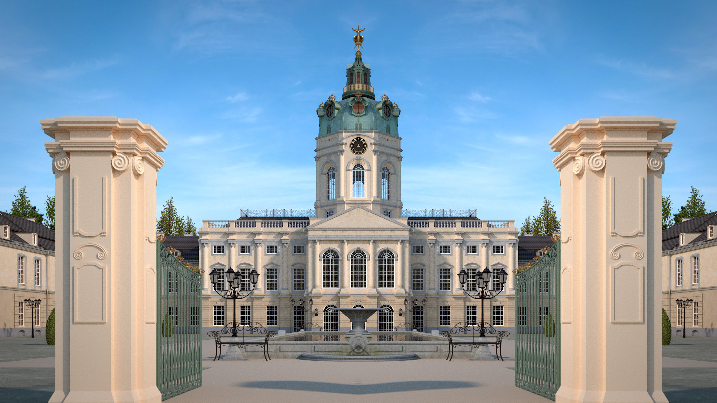
You might want to add a little variation. Look at the below picture, which is a version of your first image.
The only change is that I copied the left side of side of the picture, flipped it, and put it on the right side. That is, this is perfectly symmetrical. Symmetry is pleasing, but boring; so it depends on what your goal is for the image. Shadows appear to be different, but a little more might be good.
Really lovely. Did you base your model on an actual building?
The windows in the tower somehow rub me the wrong way, they give the impression of wide open emptiness. Perhaps try to make the glass a bit less translucent.
Great job! Wonderful modeling. My only critique is that the building and ground should look a bit more dirty. They look unusually clean right now. But, once again, great job!
Nice stuff !
I like the second one in Post #9.
The grass looks to flat.
It looks to clean all in all, do we have a dirt Shader already ?
Did you model everything in Blender ?
GPU or CPU rendered ?
How mutch RAM does it take to render ?
Kind regards
Alain
wow, that dome. I still think you could work some more on the other materials(floor and grass mostly) and lighting.
I would go for the second one but you do lose that sense of “Hugeness” that your first proposal gives.
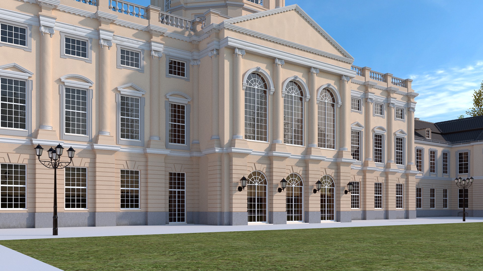
The cupola is nothing short of sensational. Photorealistic to the degree I doubt a photographer would be able to tell, certainly at first glance.
Your building walls suffer from a very smooth material. In real life these surfaces are all very rough, even if they are painted with a gloss coat. Also the ground desperately needs some kind of a texture.
Otherwise this is a very impressive piece.
Thank you all! ![]() Happy to hear that you like it!
Happy to hear that you like it!
Yes it’s called Schloss (Castle) Charlottenburg in Berlin. But i made some changes. ![]()
Here is a little update… i think i’m getting to the final stage soon! ![]()
At the moment i’m not really happy with that fountain… ![]()
I thought it looked kind of familiar. Though I missed Schloss Charlottenburg, but now that you mention it, the Prussian architecture is clearly visible.
Hmmm, does anybody have an idea how to add more realism!?
Sooo, i rendered some different views. What do you think/like/suggest!??  (without Subsurf and grass particles)
In the final i want to make about 3 or 4 images.