RGB values

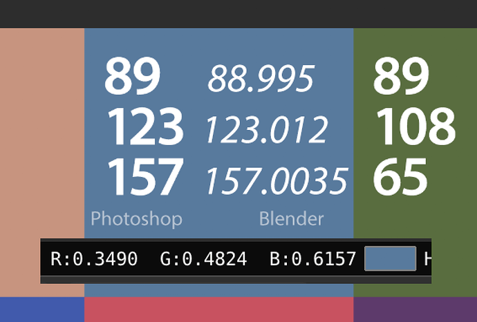
when i set the values of RGB in Blender how does it relate to other values of RGB that you can find in other software!

i’m having some difficulties relating the colors
Blender is 0 to 1 other are from 0 to 255

Is there a special wy to deal with these valuies

Tanks

Basically, the number from other software/255

So, if the rgb color in GIMP is:
160
88
88

Then Blender would be
160/255 = .627
88/255 = .345
88/255 = .345

To add a little to what OBI_Ron pointed out, Blender uses normalized RGB values. These make it possible to do blending operations like multiply. Other programs will convert these internally at some point for color arithmetic.

The normalized values also make it intuitive to support higher color ranges, as a channel value of 0.627 could easily be representative of 8, 16, or 32 bit channels.

Blender does give byte representations in the color picker, but they’re given in hex notation.

I dont think I will ever understand this.
The way it is we have to type a “.” (period) EVERY single time we enter a value.

All bow to the mighty “.”!!!

I know it is only 1 wasted keystroke, you must enter almost every time, just that day after day it really starts getting to me. Plus I have arthritis, so sometimes it gets pretty painful when I am too lazy to go eat an aspirin.

Here is an idea! why not just add a static “.” in the GUI? That way we wont have to type it every single time… if we need a 1 , then we just type a “.” !!

This is super anoying for people who work color controlled. Why dont they add an option to show either normalized of regular method?

Who the hell is going to do the math on each value each time, that is time consuming. Luckily we got hex option but still that should not be needed

1 Like

There’s no need to do the math by yourself… you can just type ‘val/255’ in each color component field, and blender will do the math for you.

You can even convert an hexadecimal value in the component field; just type: ‘int(‘FF’, 16)/255’ and you’ll get the normalized value for the hexadecimal.

maybe have a look at this thread

and the correct calc from the dev

In what compenent? Because when i add that i adjust the already blender value.

I mean i want to see RGB values so that mean val*255 than i have the RGB value. But thats is exactly what i mean, why do we need to calculations. There should be an option to just show RGB values as is, no calculation needed.

2 Likes

Because it makes more sense in a linear workflow. In other situations like digital painting, 0-255 makes sense as it is a hard limit. In CG rendering, however, you’re often working with values beyond screen color space, in which case 0 - 1 (or 0% to 100%) becomes a soft limit, with values sometimes reaching in the 100’s or even 1000’s

A pixel from a light in your scene, for example, might have an RGB value of 250, 250, 250. You immediately know that this pixel is 250 times brighter than a white pixel. That same value with a 0-255 range would read as RGB 63750, 63750, 63750.

The problem is that integer based colour encodings are absolute garbage because they don’t represent anything.

So, what you are seeing with a float, is the actual colour ratio. Bear in mind that for things like emission, there is no such thing as “normalized”, hence the floats extend up to infinity.

TL;DR: The internal reference is float. The sooner everyone understands that colour as integer, or worse, hex, is absolute tripe, the sooner everyone has a more solid understanding of the core concepts.

True!

False! False! False!

The internal representation is float, hence converting to integer is actually completely backwards.

PS: Full marks for this!
image

1 Like

Well I know you’re the man to talk to when it comes to color spaces, so I believe you!

However, what I mean in more of a general sense, is that if the input sliders had a range of 0-255, then values beyond that space would be human-non-readable without a calculator.

Indeed!

And totally bunko! That is, there are a number of things going on here that are actually greatly improved when trying to communicate concepts simply by enforcing floats everywhere.

Folks go out a huntin’ lookin’ for dem hex codes, or some arbitrary value. The muddling commences.

As you rightly pointed out, sometimes the value is 0.0 to 1.0, and other times it could be 0.0 to infinity, or -5.0 to +5.0 or who knows what. The net sum is that numbers are contextual.

If we start muddying the waters with integer, now folks don’t have a clue if 2000 is an integer normalized value, or 2000.0 units of emission colour intensity, or 2000.0 units of depth. By simply presenting and offering the pixel pusher the internal representation of the float, we level the playing field, and force people to think about the media itself. Is it a colour? Does it represent a percentage of reflection as with an albedo? Is it an emission? What the hell does an emission mean anyways?

Which nicely loops back into the other Devtalk thread that I was trying to highlight: Hex codes are garbage. They create the illusion of some sort of meaning, but all they are are ratios of something.

In the case of a slider in Blender, if you set an albedo value to 0.5, you are declaring that 50% of the incoming light will reflect back. What colour is the light? What the hell colour is this “red”? Are there other “reds”? Is it linearly or nonlinearly encoded? If this is an emission, how is 30,000.981 a legitimate value? How can I input 2172.721 if I need to? How do the pieces snap together?

Slowly, we can help each other learn and understand these things. Falling back on horrible and meaningless hex codes doesn’t help anyone past these slippery questions.

3 Likes

It’s the measure of Ton-ness a given pixel holds influence over it’s surrounding tangent space. :smile:

This all reminds me of a decade ago or so when “linear workflow” was the hot buzzword in town, (“PBR” of it’s day). I remember reading a Siggraph paper about it and going, “…Wait… there are colors beyond 255?!” HEAD EXPLODES)

I can still tangibly recall the various steps of utter confusion regarding colour so well that I do my darndest to try and keep an empathetic grip on that feeling when trying to explain various bits to others.

Language and concept muddling is at the core of so much of the rot. The legacy “comfort” of broken mental models help none of us. It is remarkable how a carefully chosen unknown term such as “scene referred” can shake just enough discomfort for someone to rethink how their mental models are constructed and arrive at a much better comprehension.

As silly as it sounds, the very same thing applies when I say hex codes are garbage; it is a helpful push down the rabbit hole of beginning to unravel firmer understanding.

Very true! And it’s not just limited to our tiny universe of digital content creation. Look at all of the display manufacturers with HDR, for example. Not only is that industry divided on a standard, but each manufacturer has a different implementation (Not to mention marketing buzzwords that are incorrect/obscure).

Then we have the content meant to take advantage of this technology. Aside from a select few videos on Youtube and Amazon Prime (Top Gear: Grand Tour looked amazing!), most of the “HDR” stuff I’ve seen seems to show a fundamental lack of understanding about having an extended color space.

So if you find a random texture you want to use, and want to make sure it adheres to a pbr albedo cheat sheet, what would be the correct procedure? Assume the sheet cheat is listed in either sRGB or Linear, rather than both as here.

If what you’re asking is along the lines of; You used a color picker on your sRGB texture and got value S, and you want to make sure that matches your linear cheat sheet’s value L, then look up the formula for converting from sRGB to linear. Convert your S to it’s corrisponding L and see if that matches your table.

EDIT:
( (S + 0.055) / 1.055)^2.4 = L

So given the first example in your link, let’s assume the sRGB value was’t listed, but you used a color picker on your texture and got the value 148.

148 / 255 = 0.5804
( (0.5804 + 0.055) / 1.055)^2.4 = 0.3
Yep, looks like it adhares to the table.

Ooopssss! :wink:

I do understand that for editing in certain ways this makes sense. But if im looking at textures say in UV editor or a render and i want to check color values and compare this with other software, im screwed. I need to do calculations all the time or copy/paste the HEX. I think it would be useful if we can read “regular” RGB values when picking them in the, say uv editor.

I dont think there are a lot of people which can read and understand color values in float numbers? Im a graphics designer i look at colors in CMYK, RGB or HEX, not in float :slight_smile:

I come from a graphics world where the limits dont go passed 255. How far do they go with other bit images than? Because in 2d software they are still read as 255 limit, white wont get passed that 255-255-255 limit.

PS what is that for calculation you put in the end @cgCody

( (S + 0.055) / 1.055)^2.4 = L

Edit
I should have done a google search first

http://entropymine.com/imageworsener/srgbformula

In CG rendering, there is really no limit, and values are only relative to the context in which they are being used. That is why having an integer range from 0 - 255 would make the already confusing subject of a scene referred system even MORE difficult to grasp. Troy put it best in post #12. Research the subject of “scene referred space” if you really want to dive into the deep end.

About that equation. That’s really only helpful in rare situations like CarlG’s where you want to make sure an sRGB value matches an expected linear value. In day to day usage, Blender is automatically converting your textures to linear color space. This is what that drop down on the image texture node with the options color and non-color have to do with. Non-color is used in cases where you don’t want the color space converted (eg normal maps, roughness maps)

What colour space are the code values in?

See the problem?

Hex codes literally mean nothing, nor does “CMYK”, nor “RGB”, without coupling them to a colour space.

In the case of RGB for example, are the lights sRGB / REC.709 or are you reading the values on an Apple MacBook Pro as are very common in graphic design? The values in each case here are completely different lights, and as such, the ratios between them mix entirely different colours depending.

Even within Blender in the default state, are the RGB values sRGB nonlinear? Are they scene referred linear? Are they Filmic code values from the Base Log? Are they aesthetic values after the contrast? Do they represent a reflective albedo, an emission, non colour alpha, non colour depth, non colour normal?

CMYK? More meaningless. Is it Fogra36 code values, US Web Coated V2? Any one of the other many CMYK ink / paper combinations in the world?

As you can see, integer based encodings don’t tell you anything, despite folks thinking they do, and hex is worse. It really is high time to let them die, where they belong, so the fewer people get confused. Sadly there are already too many confused people out there who think hex codes mean something, and doubly so mean something in a compositing / rendering pipeline.

1 Like

How are hex worse? They’re just base16 of base10 integers.

these number represent proportion !
does not matter if in HEX binary or base 16 ect…

happy bl

They are mainly “worse” in 2 fashions:

  1. the 0-255 is a hard-coded limit in hex notation.
  2. Hex is generally not human-readable (without extensive practice).
1 Like

there are converter on the net not a problem!

happy bl

Express float ratios such as an emission of 1022.9171 in hex, or the linear nit output from ST2084 in hex. In normalized integer domains, trivial values are impossible to represent.

Further, hexadecimal notation only took root due to people fundamentally misunderstanding pixel management. Some people actually believe that if you copy hex codes, you get identical colours. Or identical precision floats for that matter. This simply is not the case, and is extremely nonsensical in a rendering environment. This has nothing to do with hexadecimal representation and is a broken conceptual model.

Use floats everywhere, and learn why.

HEX
2 years ago I think there was like a bug in the color picker
the only valid value was from HEX representation
other were not the real value

I think this has been corrected by now
but have not check it in a long time

the use of HEX or Octal or Binary has to do more with how program are written I think and how you format your output
it could be anything but require some formula to show it

and there are also the fact that color space between Printed matters and Computer screen are not the same
Printed matter use Negative color as Screen use positive additive colors
and also color space is not the same between RGB or CYM ect…
so it does complicated things

it is not an easy and simple subject !

happy bl

Sorry, I misinterpreted “integer based encodings” as the classical 0-255 range, which in hex is the same as $00-$ff range and where encoding was just the icc tag. I’ve been using only floats, since ever (1990’ish, so a while). Although back then they didn’t go above 1 :slight_smile:

I dont get the harsh response every time. HEX does mean something for big part of designer, perhaps not in your world. I dont think it will be dropped.

I know the values are depended on which color profile is used in Blender. So i would guess it will be possible to output RGB value as there as well.

Not everybody is interested in post production values where you perhaps need more control. I get the feeling you dont understand that part.

This has nothing to do with post production.

If you consider a normalized float representing a typical colour expression, say 0.5, 0.5, 0.5, does anyone here know what colour that is? How about 0.1, 0.0, 0.0? Can anyone identify that colour?

If your answer isn’t a question, you missed everything that I tried to express above. I’d encourage you to re-read it.

Changing those two simple values to hex codes, doesn’t change them, it simply makes the basic problem more obfuscated, and it certainly doesn’t add to meaningfulness in any way.

Hence, again, hex codes and integer representation are hot garbage. :wink:

PS: Respect for your answer on the Devtalk forum, you stinking cheater. LMAO.

1 Like

The key thing to remember, I think, is that “that hex stuff” is an output encoding. It’s intended to tell a [stupid …] display device exactly what to do. “Image files” and “movie files” are directed at devices. They might need to consider gamma, color profiles, compression, and other characteristics (and limittions) of devices. You think about these things when you’re ready to prepare your render to be seen on some specific (or, generic) device, or devices.

Up to that point, the render information is really quite abstract – it’s just “floating-point numbers.” They’re normalized so that you can meaningfully work with them using mathematical operations, but it’s perfectly okay (at this point …) to have a pixel that is blacker than black or whiter than white, because it’s all just digital data. The OpenEXR and MultiLayer OpenEXR file formats are specifically designed to represent this sort of information, one file per frame: loss-less, accurate, and of course, big.

Execute your entire render sequence to produce a “final print” that consists of OpenEXR files. Then, and only then, concern yourself with producing the various presentation-files that you require. Each presentation file is generated, separately, from the same “final print” master source, never from one another. Encoding, color mapping, compression, and so forth is decided individually for each presentation.

I would think that when i use sRGB in scene > color settings and also sRGB in image > texture > color space that these numbers should be correct.

I’ll think i do some test on this see if the numbers are the same as in other apps. See if i can find logic in this

You could say that the first color is “mid-gray” and that the second is “dark pure red,” and there are certain standard color-spaces so that we’re not completely speaking-in-tongues. Displays including Blender’s own display logic will use color-space information to determine what you see on the screen. But digital intermediate files during a multi-stage render might contain data that doesn’t [yet …] meaningfully fit into a standard color space – and, it doesn’t have to. (It’s just data.)

The doc files are pretty good on this: https://docs.blender.org/manual/en/dev/render/post_process/color_management.html

Here’s a file i tested and calculated. using that value*255 its near in most cases. Probably because i only see 4 digits of the float. If i could see more then it would be more precise?

Perpaps ill try to make an addon orso. But than i would need to figure out to combine it with the color spaces i guess.

It would be nice if Blender had more profiles. I use an external render engine which outputs images with ColorMath RGB or RGB color space. Its a bit vague which one it is. The devs them self so no space is applied, but i can only get the same image when i open it using either ColorMatch RGB or Apple RGB.

Problem is blender cant show these images properly :frowning:

i think that in the most cases,if you colorpick from a photo in the web ect,they are sRGB colors.because they are gamma corrected for the monitors.even most cameras have some rough gamma correction,iirc my old sony had a gamma of 2.5 as default.

if you colorpick from another software,you have to keep in mind,what you see is the result of a render ,and the color in the render, must not be the value, the material has in the nodes for example.
but in most cases you see sRGB values on screen.

and if you import a image tex, with the color option selected,then blender treat the colorvalues as sRGB too, and makes it linear for you.

so in most cases ,you can colorpick a value from a photo and asume, that the picked color is sRGB.

if you want to get sure,then you have to know, what the color is representing (sRGB or linear…)

It’s remarkably close to entirely speaking in tongues, more so in software similar to Blender.

The main issue is that folks forget that RGB is a model with no inherent meaning other than “it’s three lights”. XYZ, for example, is also three lights. Don’t expect the mixture to look anything like skin tones when dumped through an sRGB display without a transform though.

What colour is the mid-grey, for example? Is every RGB encoded image R=G=B for an achromatic value? Does 0.5 represent a mid grey in Filmic? A Filmic image? An albedo?

Key points, in order to be an additive RGB colour space according to the ISO, it must define three characteristics:

  1. A clearly defined chromaticity for each of the three lights.
  2. Transfer functions (EG: The sRGB OETF)
  3. An clearly defined achromatic colour (aka White Point)

If we can’t identify all three facets, whatever it is, is not an RGB colour space.

What happens in a render? As an albedo?

What was the reference space in Photoshop? What happens if you are in Adobe RGB? ACEScg? Do the values have absolute meaning?

It can display them just fine, assuming you have the configuration set up accordingly.

Are you sure about that? What if it is a photo? :wink:

not completly sure but i guess :grinning:

here someone has written,its based of encoding.hmmm

Photos are (usually) encoded with an sRGB gamma, so yes, it always converts from sRGB to Linear if you have the ‘color’ option checked.
As a test, if you save your photo encoded with another color space (ex: Adobe RGB), then the photo will look weird in Blender.

Are you sure? :wink:

The answer of course is “No this is entirey false” and segues down a deep rabbit hole. The TL;DR is that on a photo either a pure 2.2 power function or inversion of the sRGB OETF is not taking it to linear.

has a image some information data stored,like a header data or what encoding was used? some photos have this exif format.is something like that stored in the images,about encoding used ect?

i guess the answer is no,because the pixel dont know it was manipulated

Correct. There are many ways to pixel management, and sadly ICCs etc. can’t solve this.

The problem is that folks texture hunting are looking for data, not a “pretty picture”. Every photo online isn’t data, but rather some goddamnidiot’s idea of the aforementioned “pretty picture”.

It doesn’t take a rocket scientist to realize that an sRGB OETF or pure 2.2 power function encoded image is not even remotely a path to getting to linear; aesthetic images are mangled up beyond recognition. Further, the sRGB OETF / 2.2 power function approach is strictly for display referred encoding, so it can never deliver proper linear data.

This is why log transforms exist. And DPX. And float values. And…

That was actually the system flagging it, i cant see why, i will make sure to look into it.

Is idiot a flagged word? :smile:

That answers that. Haha

1 Like

You figured it out.

Also, I quote the message I received:

Multiple community members flagged this post before it was hidden

I’ll say. The website filtering is a bit too sensitive, and overly dramatic with the PM (which I also recieved.

Too late, multiple members of the forum all disagree with you.

I actually agree, ive removed it from the list of flagged words, but that is not a reason to use it. Careful with context, dont use it to harass other people

Thanks, master!

Haha sorry had to go there. :smile:

Edit: now thats just sneaky! :joy:

2 Likes

I’d probably slap a caveat into the default message that multiple members of the community haven’t flagged it, and rather that the filternet caught the post.

I always use sRGB for my tex when rendering. Blender will show other spaces not correct if they are not in one of Blender spaces. Atleast as far is i have knowledge of this

All set to sRGB, i know how to properly do that, thats why the numbers are close. It will show my textures properly. But it wont show my render properly from the external render engine i use. As noted earlier, this one outputs images with RGB space. When i open it in Photoshop i either use ColorMatch RGB or Apple RGB.

Good on you for spotting this. That is, the light ratios are expressed using the unique ratios of the particular space. You can of course transform most spaces into other spaces, if you know how. If you have something you need, feel free to link it and I’ll try my best to get you a solution.

This is fishy given that “RGB” isn’t a space, but rather a model.

If you know the details, and your engine dumps a float framebuffer or whatever, it should be almost trivial to get it working properly.

I can say with a degree of speculative certainty, that ColorMatch or Apple RGB is completely wrong. We should sort that out.

Funny, how much more comprehensible it all was in the analog days.
While today most can’t even grasp the fundamental difference between a photo, digital print and digital information for a machine to represent.

“Am i screaming, saying it loud enough?”

As mind starts twisting thoughts out of control it plays trick on own personality… why i love my sexy eyes, no matter what numbers say. I have intentionally couple of decalibrated displays (one never knows all the clients perks). If it looks good on all, then CC/tone mapping is fine.
Discretion and accepting, knowing that tolerances are just a part of getting the work done, are well advised.

Keep up the spirit, next generations will love reading this.
:hugs:

What exactly do you mean by “completely wrong”?

When can use relight which is a light buffer but this output is in a certain file type. Im not sure you could decode this.

Good on you for spotting this. That is, the light ratios are expressed using the unique ratios of the particular space. You can of course transform most spaces into other spaces, if you know how. If you have something you need, feel free to link it and I’ll try my best to get you a solution.

The engine uses this lib to save its images, http://freeimage.sourceforge.net/
Ive did try and ask around there i believe on time. DId really got far there, https://sourceforge.net/p/freeimage/discussion/36110/thread/a4ee3cff/?limit=25#0eb7

One of the devs in the su version stated nothing is added. But i need a profile otherwise it wont match the profile or preview as it looks in the engine. They say the engine use linear settings, but never really got an answer what display space it uses

Ive attached a psd file, in the info it doesnt contain a profile. So im really in the dark what the proper method is opening these files. For years im opening them as ColorMatch because they than look just like in the render engine darkroom.

Vacuumbottle_thea-v2_8bit.psd.zip (4.9 MB)

Exactly what I typed; completely and utterly wrong.

Hot stinking garbage. Unsurprisingly, your output is broken.

That sure sounds like clueless developers. I would run far away from whatever you are using that is using it, and any of the wisdom the developers are offering.

If it were “doing nothing” to your image, the linear encoding would be maintained in the file, which clearly isn’t the case if slapping a broken profile on top of the junk appears to do something correct.

My guess is that you are noticing a difference in the transfer function, which means the clueless library is completely mangling up the output.

Just speculating here, but I am now sadly too well versed in untangling absolute crap that some random developer of some random file library has done to colour encodings.

Can you do a clean render of a very high intensity scene with values that hit scene referred 16+ and dump a TIFF out from this godforsaken dumpster fire?

Still not sure what you mean by wrong… I open the file in PS using that profile otherwise it wont match the preview in renderer.

Im not running away from an engine ive been using for 10 years… Sorry to much time investment here.

Can you do a clean render of a very high intensity scene with values that hit scene referred 16+ and dump a TIFF out from this godforsaken dumpster fire?

By 16+ you mean 16bit i guess or not. I can only save tiff in 8 bit. we can save EXR in 16 bit or HDR. But both of these look different as well but thats normal for the HDR case than in photoshop.

I can use a different app which can load the light buffer and save out a 16 bit psd. But that would not be any different that the earlier 8 bit i posted. Both dont have a profile attached

Here’s an EXR image. it opens as 32bit file. I never use EXR because it opens with different toning in photoshop. Ive also attached and PNG which is converted to sRGB which has the proper toning, this is open as ColorMatch RGB and than converted to sRGB. I resembles the same toning as the preview in the render engine.
Vacuumbottle.exr.zip (3.4 MB)

Did you render using Colormatch RGB primaries?

If not, then wrong.

Now on the upside, the Colormatch primaries are close-ish to REC.709 lights, but with a transfer function of 1.8, which means you are seeing the transfer function differences.

So applying an incorrect profile on your data to adjust the transfer function is the wrong approach. There is a more appropriate method, including getting directly to an sRGB encoded image.

No, I mean checking the scene referred values. In the UV editor you can sample the values via mouse click. When you do so, the left side of the information panel shows the reference space values that extend from zero to infinity. The right side show the after-colour transformed values.

I suspect your software is broken and only using some hard coded transfer function. Perhaps that can be tweaked and we can use a more appropriate transform for you.

First I would need to see what is going on with the file encoding. To do this, I would need:

  1. An EXR with large exposures in the scene referred domain
  2. An “untouched” display referred output version. That is, a PNG or a TIFF at 8 bit in addition to the EXR.

Just make sure that your test has high exposure values that extend upwards to 16.0+ or higher.

Second, can you test this profile instead of Colormatch RGB or Adobe RGB. In theory it would seem this would be the correct profile for the way the software is mangling up the work, but hard to be certain.

Not sure which panel you mean. I only see the color picker info at the bottom and the scopes. Dont know which info i should see on the left?

Ill try that profile and see what this does.

On the render itself. Then you see values in the black bottom bar. On the left: scene refered, on the right after transform.

That what my image is showing, i was referring to this text.

No, I mean checking the scene referred values. In the UV editor you can sample the values via mouse click. When you do so, the left side of the information panel shows the reference space values that extend from zero to infinity. The right side show the after-colour transformed values.

And then you can click in the picture and you see the values changing. If not, I must understand it wrong.

The problem is you are using an already display referred image as a reference, which is already mapped to the output referred domain.

Load your model in Cycles, and increase a light intensity. You will see the left values as @anon72338821 has pointed out, extend from zero to infinity.

Those are the actual scene referred values. Only an EXR is capable of revealing the actual scene values easily, assuming the rendering engine isn’t mangling those up.

Im not sure i get this part though. Where should i be able to see those values, in those scopes or at the bottom. The bottom always shows so i dont think that is the one. But than the scopes always show info when i open an image.

PS that Elle profiles comes close, but it looks flatter in darker parts. The vibrance was almost the same but some of dark/materials are less dark. The Elle sRGB look a bit creamy, sort of dreamy (not sure how to explain it better)

EDIT
It seems they are about the same. I noticed some difference in images when i saved out a PSD. They look different as well. So i guess something is happening there as well.

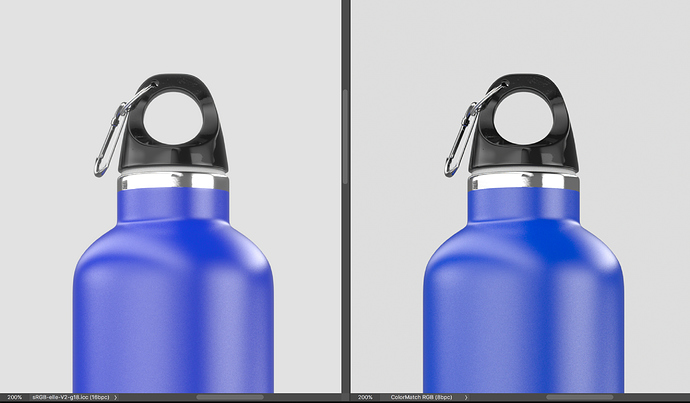
Left opened as sRGB-elle-V2-g18, opened as ColorMatch RGB

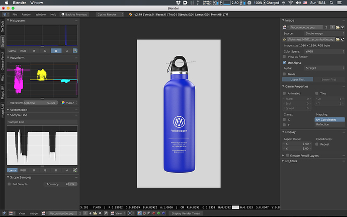
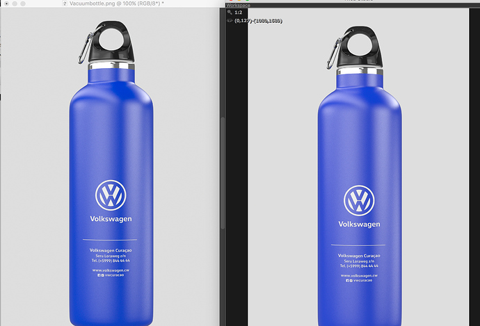
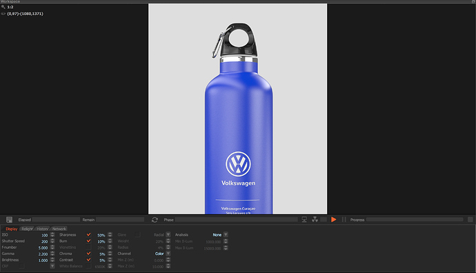
Below is screengrab of the application with a loaded image buffer.

Let me be very clear; this isn’t an aesthetic option. Incorrectly tagging your imagery to overcome broken output is not an option.

Aesthetic choices are intended to be made during a grade, not via profiles which define the colourimetry of the encoded values.

What it seems like is the software is entirely broken, and the output is being encoded to legacy Apple standards that specify a 1.8 transfer function. I haven’t evaluated the process yet however, so I can’t state with certainty yet until I get the sample EXR. Hopefully we can solve this broken pipeline and avoid the incorrect tagging. The Elle 1.8 is a transfer function of 1.8, with appropriate primaries. It is essentially identical to the completely incorrect ColorMatch profile, without the incorrect primaries.

Make a default scene using Cycles and render into the UV Image Viewer. Left clicking will reveal the black bar along the bottom, and show the sampled RGB values from the scene as per previous descriptions.

Yes i got that part, i alread showed that in earlier images. I though you meant something else.

PS what is so bad about the ColorMatch RGB profile. You make it sound like its something really bad. I read some where its kind a outdated or so.

PS i did add an EXR earlier, isnt that one any good?

It isn’t how the values are encoded, so it describes an alternate colour encoding entirely. We need to root out exactly why your rendering engine is rendering whack values and find the appropriate method to get it to render proper sRGB values.

The easiest way for me to diagnose what is going on is to have a reference render of a high dynamic range scene, which your bottle is sub optimal. I would need a render of both EXR encoding and the TIFF with no mangling through other software. Directly from the engine.

There is a good chance you can improve your renders by a not insignificant degree by sorting this out.

These images are straight from the engine. Yet i cant tell or know what is done to them. We have a so called Darkroom where we can set all kind of camera settings like iso, f-stop, gamme etc etc. So this is post work and thus the images are probably altered there.

i dont know much about what is done exactly at that point. There is reversed gamma correction applied i read. The workflow is done linear and that is all i know.

Just jumping in to say that if you mean the CIE XYZ colorspace, that’s not correct. X, Y, and Z in CIE XYZ don’t represent primaries. They don’t even directly represent the spectral responses of the cones in human eyes (although XYZ is derived from the [EDIT: no it’s not, see troy’s correction below] CIE LMS colorspace, which does).

Also, just for kicks, I’ll point out that doing rendering in any RGB space is technically wrong. Tristimulus values aren’t how color works, they’re just how human color perception works.

To do light transport correctly (in terms of color, at least), you need to do spectral rendering. Not even for fancy spectral effects, just for proper color handling. The paper “Physically Meaningful Rendering Using Tristimulus Colours” by Meng et al. covers some–but not all–of the issues with RGB-based rendering. In short, when you use RGB for rendering, you’re pretending that light spectrums behave like human color vision, but they absolutely don’t. It is in many respects much like confusing scene-referred and display-referred color.

Thankfully, in practice RGB-based rendering still works well enough for most purposes–at least when the goals are artistic rather than simulation-oriented. But since we’re going down rabbit holes anyway, I thought this would be fun. :wink:

It’s a three light system. They don’t represent physically plausible colours, but it is a three light system nonetheless.

False. The Wright Guild experiment is they basis for the CMFs which derive the XYZ to spectral response connection. Heck, it is called a spectral locus for a reason.

sigh

It’s me Nathan! Hello!?

Sorry, I didn’t intend my post to be confrontational, rather as adding some fun additions to the discussion. The rabbit hole goes very deep, so I wanted to peel back another layer. Apologies if I came across otherwise.

You’re confusing XYZ with LMS. I did the same for a long time, it’s an easy mistake to make. In LMS the three values directly represent the spectral responses of the human eye’s three types of cones (sensitive to “long”, “medium”, and “short” wavelengths of light). You can easily transform between XYZ and LMS, and they both represent the entire range of human-visible color. But XYZ is not a direct representation of the human cone responses like LMS is. That’s what I was getting at.

Well… so this is interesting: you actually can realize lights with emission spectrums that match the spectral curves of X, Y, or Z. But (as I understand it) it wouldn’t be especially useful to do so. Which is what I meant in more precise terms. This is in contrast to e.g. the Rec709 primaries which are not just physically realizable, but are also useful to physically realize because they produce the intended colors for a human viewing them (which is precisely what sRGB displays attempt to do).

We may be speaking at cross-purposes, though. I think we might mean subtly different things by “three lights”, so this is likely a terminology mismatch (which I may indeed be in the wrong about), but unless you also disagree with my paragraph above, I don’t think we have any disagreement of substance on this point.

Yes Troy, I know! I strongly recommend reading the paper I linked in my previous post, if you haven’t already, as that’s the main paper that started me down the rabbit hole about the shortcomings of RGB (or tristimulus in general) in rendering.

EDIT:
Having said all of this, I was indeed incorrect in saying that XYZ is derived from LMS. It was derived from CIE RGB (or rather the CMF’s, as you correctly noted). But CIE RGB also doesn’t directly represent the cone responses.

If anything, it was me. I tend to come out a little terser having had to wade through this stuff for too long. Apologies.

I’m not!

While LMS as they exist in our eyes are indeed the receptors, that isn’t how XYZ is modelled. That is, the CIE 1931 outlines the approach based on Wright and Guild’s famous experiment, that was indeed with three lights. The CIE generated the Colour Matching Functions off of that data, and then modified the data according to a few specifications, including making the XYZ non-negative. It literally is the modified CIE RGB light data, plus some calculus to bend the basis vectors around luminous flux IIUC.

The LMS domain you are likely referring to in relation to XYZ is the spectrally sharpened positions for chromatic adaptation. They are however, not at the root of the XYZ model; the CIE RGB lights are, as well as the experiment’s standard white bulb.

See above. When we are utilizing an RGB model of additive light, we are indeed realizing the values as lights. Whether it makes sense or not to refer to lights that don’t actually exist is another matter, but for all intents and purposes, everything built atop of XYZ is essentially three lights.

I would make a point that it is indeed “especially useful” to do so given that every RGB implementation is mounted directly on top of that XYZ model. Use a MacBook or watching HDR television? You are using that useful model! In some instances, even imaginary lights are useful to use them as such. A case in point might be the linear ACECcg under AP1 combination. AP1 are the recommended manipulation lights for ACES, and indeed one is imaginary!

If you follow Colour Science or such, you’ll see that a few of us have been following spectral upsampling for quite some time. That said, spectral upsampling isn’t the issue here. The XYZ model is indeed essentially a three light model underneath the data.

Bingo!

Now granted that I am not in any way a colour scientist, and therefore can’t speak to the various nuances of colour science any more than I already understand, I can speak to attempting to educate folks who push pixels. Under this lens, I can say beyond a doubt that helping pixel pushers understand what they are doing is aided tremendously by reducing the model to a three light model.

As confusing as it seems, folks push and pull RGB data without ever considering what those values actually mean, as we can see via the confusion over ColorMatch etc. above. That is most easily explained, anecdotal evidence what it is, as manipulating three different coloured lights as compared to sRGB.

I agree that it is possible to reduce meaning and lose some nuance, however, for the large part, understanding all of RGB (and it’s corrolary of CMYK) as manipulating light under a three light system has vast upsides to comprehension. In fact, it is a great way to understand that a spectral renderer is essentially simplistically a more than three light system.

Also, for those who don’t know, @Cessen is the awesome author of the spectral renderer Psychopath, so if you have any interest in spectral rendering, check out his work!

2 Likes

So I did a little bit of analysis in my window of time here and what it seems is that you are applying an incorrect profile to adjust the look. This is ill advised, and what I’d encourage you to do is adjust the image in the Darkroom mode of your software, and leave it as-is so that it renders properly encoded sRGB based values.

Here’s the image as the linear ratios exist in the EXR, dumped directly through the sRGB OETF. This is essentially a display referred range of the data. That is, this is the 0.0 to 1.0 range of the scene referred data dumped directly through the sRGB OETF 0.0 to 1.0 range. This is as close to “as intended” the internal ratios display, if you are on an sRGB display.

In the interest of illustrating how renders can be potentially improved, is to reveal the dynamic range that you are artificially operating under via the software imposed limits. That is, despite you lighting to try and keep the light under the artificially imposed ceiling of your software, some values are moving quite a ways beyond that:

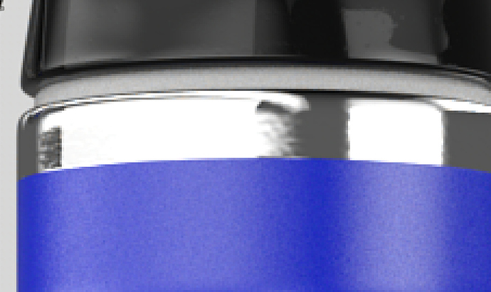
See those scene value ratios? Those are taken from the highlight region. You have clearly tried to keep your lighting at a given level given your limiting view transform, yet there is some potentially useful data that has been hard cut out of your image. This can lead to unwanted posterization and colour skew. Here’s a close up of the naive sRGB OETF impact on the data:

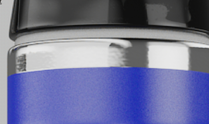
And here’s a simple version under Filmic, that uses those values:

Here’s an A / B slider version, that I can’t seem to embed in here:

The difference is that you have more dense data in those regions to grade later. This can have a rather tremendous impact on your final image, and will frequently solve many problems that occur under naive camera rendering transforms long before they manifest.

Anyways, the TL;DR is that, if you want to have less heartburn:

  1. Use the default 2.2 power function or sRGB OETF if it is listed in your Darkroom, and adjust to that.
  2. If you are not seeing the first image, then your software settings are wrong. Don’t try to fix broken settings by applying incorrect profiles. Fix the settings, and help yourself by saving time and energy.

If you have more information, I might be able to sort it out further. I’d also strongly encourage you to try better camera rendering transforms if your software allows it, but to further that, I’d need more information.

Hope this helps…

Thanks for looking at it. I also did try Filmic, but i tend to find the image very flat for these renderings. I cant view them correctly because of the issue with the profile or no profile attached.

The scene is lit by an HDR only, ive adjusted camera settings to get a look i liked the most.

I cant set any profile in the render engine, that is the case and big issue. Ive requested this again and hope they let use have more and better control.

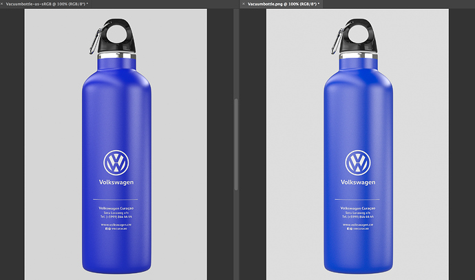
The image you show, when opening it as sRGB does not reflect the how the image looks in the render engine. Its more vibrant when opened using sRGB color space, the blue isnt that vibrant.

Ive attached the PNG which is first opened as ColorMatch RGB than converted to sRGB. This one matched the look the best when i view the image in the Darkroom of the render engine. Ive zipped it because it seems this forum converts the images to JPG.
Vacuumbottle_sRGB.png.zip (2.1 MB)

You need to grade the image. More than a few folks have used a similar approach for high end products. It works, but a render is an entry point, not a finished product in many instances. Similar to photography in that respect; grading is expected and mandatory when product brand identity colours are required for example.

That is then either:

  1. Your Darkroom settings are futzed in some way.
  2. The software is horrifically broken.

Stop doing that. You didn’t render in ColorMatch RGB, and applying the profile is absolutely the wrong way to go about this. You are further breaking things to try and work around a broken process. I assure you that applying the completely wrong profile is not matching the render. It may be “closer”, but still absolutely incorrect. We can get to a perfect 1:1 by solving the core issue.

Fix your software and this issue disappears. Are you able to post your software rendering options in the view you are trying to match?

1 Like

We dont have any options to set display settings. That is the shitty part about this hole thing. Ive asked many times about this and the only answer i got was “there is no profile attached to the image”. But that doesnt give me a proper solution for this issue.

This is comparing the shot in Photoshop to the render darkroom. Image is opened as ColorMatch RGB. This is the one which matches the preview in the render engine the closest.

We dont have any control over what the output is. There are no options to choose a Color Space or whatsoever. We only have the options you see in this image, to alter the image.

Here you can exactly what you previews also showed. When opening the image in Blender the sRGB is applied. It will show exactly as the left image does in Photoshop. The blue is more vibrant. On the right is the image opened as ColorMatch RGB. That matches the best comparing the prior image which compares the image open in Photoshop vs the output preview in the Darkroom.

Turn chroma and contrast etc off. Show only gamma.

Are you on an older Mac by chance?

im on a Macbook Pro Mid 2015

Ok. Not the late Retina version?

If you could demo a render with only the “gamma” setting on the render software, that would be a help.

A few questions:

  1. Does the “only gamma” JPEG or TIFF match in Preview?
  2. If you change the “only gamma” to 1.8, does it match in Preview?
  3. Have you made any adjustments to your MacBook Pro in terms of settings? In particular, any changes to ColorSync?
  4. Have you made any changes in Photoshop’s colour management settings?

I strongly suspect a broken setting somewhere.

Start with Preview, as it is the most direct path. Does 2.2 match? 1.8? Etc.

yes this is the Retina version

Im not sure it will make a difference, everything i change in this darkroom will also be changed/added in the image i save from there. I will not matter, because the difference will still be there.

1 the image will be saved with the settings you see in that darkroom. So if i change anything it will be visible in the saved file.
2 What preview do you mean actually? The preview in Blender or Photoshop opened as sRGB?
3 Nope all standard, i dont mess with that because everything will look different than.
4 Depends on which settings. I most of the time use Adobe RGB 1998 for RGB and than one for CMYK. Im a graphic designer and these are my standards. I’ve check color profile mismatch so everything i open and which is different than those i can chose to convert it to the workin ones or use the embedded profile. I always use the embedded profile in case of a mismatch and than make a choice whether or not to switch to Adobe or keep in the embedded profile. I only use color proofing for print files or when i need to check if my design will keep its colors in some sort of way when i convert to cmyk. But that workflow is not for my 3d work. Unless it needs to be printed.

What do you mean by this, this darkroom starts with basic presets. Ive adjusted these to get better lighting using this HDR image.

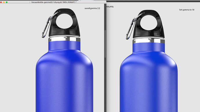
Using gamma 1.8 does make the preview look more like the sRGB when opened with the profile. The blue tone looks as vibrant as like the preview in Blender and Photoshop. I saved the image with gamma 2.2 than set the preview to 1.8 when i than open that image in photoshop using sRGB it does look about the same.

When i save that preview with gamma 1.8 and open that as sRGB it gets a bit darker again.

Perhaps i would need to add some reference card with colors. Than it would be easier to see differences i guess.

Ive attached an image with the gamma set to 1.8 all others are off. Also one with gamma 2.2, only the 2.2 will look the same as the preview as i set that down to 1.8 and han open the 2.2 as sRGB. But the blue does look a nudge more vibrant though.

saved-2-gammas.zip (3.9 MB)

Sorry in advance for the long post. Starting to think I should write a blog entry about my current understanding/mental model of color science, because there’s a lot I don’t think I can reasonably cover here. (And, specifically, I would love for you to comb over such an entry, Troy, to help tease out areas I may be misunderstanding still.)

No worries! It happens to the best of us. You should see me get riled up about misconceptions around quaternion rotations (they’re not normalized axis-angle, people!).

While LMS as they exist in our eyes are indeed the receptors, that isn’t how XYZ is modelled.

Right, that’s exactly what I meant when I said that XYZ doesn’t directly represent the responses of our cones.

That is, the CIE 1931 outlines the approach based on Wright and Guild’s famous experiment, that was indeed with three lights. The CIE generated the Colour Matching Functions off of that data, and then modified the data according to a few specifications, including making the XYZ non-negative. It literally is the modified CIE RGB light data, plus some calculus to bend the basis vectors around luminous flux IIUC.

That’s my understanding as well. I think I’m just getting hung up on the “three lights” thing. I’m taking the word “light” too literally. The experiments were indeed conducted with three lights, but that doesn’t make the color space representable with three actual physical lights (I know you know this, I’m just stating it again for continuity). So from my perspective, it’s just an abstract representation of human color response, because it corresponds neither to physical light nor directly to the cone sensitivities of the retina.

The LMS domain you are likely referring to in relation to XYZ is the spectrally sharpened positions for chromatic adaptation.

Well, yes and no. When I was referring to LMS before, I was under the wildly incorrect mis-impression that the way these models developed were Wright and Guild → LMS spectral responses → XYZ. But as you rightly corrected me on, that absolutely isn’t the case. So the model I was thinking of doesn’t exist as such. However, a bit of googling reveals that there are models that attempt to represent the actual spectral sensitivities of cones in humans. So that’s what I would have been referring to if I wasn’t so foolish. :wink:

Well… so this is interesting: you actually can realize lights with emission spectrums that match the spectral curves of X, Y, or Z. But (as I understand it) it wouldn’t be especially useful to do so.

I would make a point that it is indeed “especially useful” to do so given that every RGB implementation is mounted directly on top of that XYZ model. Use a MacBook or watching HDR television? You are using that useful model!

I think this is probably the main point upon which our respective mental models diverge. I don’t think they necessarily conflict, but it’s a different spin on things.

I view XYZ as being one representation of a human colorimetric observer. LMS and CIE RGB are also representations of the same, and though they are encoded (for lack of a better word) differently they are equivalent. You can define any of the RGB color spaces using any of those models, because they are actually the same model.

So from my perspective, although pretty much every other color space is specified in terms of XYZ (or usually xyY, IIRC, but that’s a minor point), their meaning actually comes from the model of an “average” human colorimetric observer, independent of the space (XYZ, CIE RGB, LMS, or otherwise) used to represent it. If that makes sense.

In some instances, even imaginary lights are useful to use them as such. A case in point might be the linear ACECcg under AP1 combination. AP1 are the recommended manipulation lights for ACES, and indeed one is imaginary!

Absolutely. Again, I think my perspective is just a different way of looking at the same thing. I see both AP0 and AP1 as belonging to the class of “abstract models”, much like I see XYZ. That doesn’t, of course, mean that AP1 isn’t useful for color manipulation. It obviously is!

If you follow Colour Science or such, you’ll see that a few of us have been following spectral upsampling for quite some time. That said, spectral upsampling isn’t the issue here. The XYZ model is indeed essentially a three light model underneath the data.

Ah, sorry, when I suggested the paper again, I was jumping topics. Specifically, I was referring again to RGB rendering just always being wrong from a color standpoint.

RGB spaces–or any color space defined in terms of human color vision–will be useful to greater or lesser degrees for manually manipulating colors, because those manipulations are also in terms of human color vision. But when you step into the realm of light transport, using those same models for lighting calculations starts to break down, because that’s not how light works.

You can argue that for RGB color spaces with physically realizable primaries, you’re treating light as a combination of three box functions on the light spectrum. And that is technically physically plausible for rendering, even though it’s very far from how light spectrums in the real world look. But then for spaces like ACES AP0 and AP1, they’re just not even physically possible.

Now, that doesn’t mean that RGB rendering isn’t useful. It obviously is. But from a color standpoint it puts you in a world where there often isn’t a “correct” thing to do with the resulting renders any more, there’s just “correct-ish”.

Now granted that I am not in any way a colour scientist, and therefore can’t speak to the various nuances of colour science any more than I already understand,

That makes two of us!

I can speak to attempting to educate folks who push pixels. Under this lens, I can say beyond a doubt that helping pixel pushers understand what they are doing is aided tremendously by reducing the model to a three light model.
[…]

That all absolutely makes sense to me. I’m all for mental models that help people understand things “well enough”. I don’t think artists generally should need to have a deep grasp of color science (any more than quaternion rotations). But they do need a mental model that’s consistent with how it practically works in their domain of usage. So… yeah, high five! :slight_smile:

To fix this, you’ll have to at least try things that are suggested. Hard for me to find the broken part of the pipeline otherwise.

The Apple Preview application. The default image display application.

You aren’t listening to what I asking. Your issue is transfer function. I need you to please test what I am asking as your pipeline is broken.

I’ve done print runs and such. Well familiar with graphic design. Even have a Bachelors of Fine Arts degree that took four years. You can’t just say “these are my standards” if they are being applied incorrectly.

May I ask how you are setting things to Adobe RGB? Is this your working space in Photoshop?

The only real option is to listen to the embedded profile unless it is improperly tagged with the incorrect profile. This should rarely if ever happen, but sometimes folks embed the wrong profile to their encoded values.

How old is the rendering software? If you haven’t touched your MacBook Pro ColorSync settings (good!) the software may well be making awful assumptions about your operating system. Legacy Apple products used a transfer function of 1.8 as they were used extensively in the print industry. If the software is encoding 1.8, that explains why your two evaluations suggest that 1.8 is the correct transfer function.

So please, take a reference image and turn all the hokey crap off and set the power function to 1.8 with no other tweaks. Does it match when loaded in Photoshop as an sRGB generic image?

Indeed. Some colour sweeps from black to white and zero to full intensity would help quite a bit here, instead of the sharp image missing gradations.

Ignore what you think you are seeing regarding vibrant. We have already seen incorrecty tagged imagery, So evaluations at this point are pretty speculative.

I don’t quite understand “I set that down to 1.8” as it makes no sense. How are you achieving this? In Photoshop? In the Darkroom software?

I strongly suspect the software is godawful and encoding assuming a 1.8 power function. That’s broken because modern Apple displays don’t use that, and instead use the sRGB transfer function which is close to a pure 2.2.

So again, please:

  1. Using the Darkroom software, encode using the 1.8 “gamma” setting and no other options. If possible, please try a better reference image with sweeps.
  2. Explain how you are “taking it down” from one power function to another.
  3. Clarify how you are loading the imagery into Photoshop. As sRGB?
  4. List your working space. Using Adobe RGB as a working space on an sRGB display (the 2015 MacBook Pro is not Display P3, but merely sRGB) can cause other issues here given Adobe RGB uses 563/256 for a power function. This can cause problems both in the shadows, and differences in the colour rendering.

Thinking of XYZ as three light intensities is pretty solid here. That is, the lights act as “tensions” to their positions via the xyY normalized XYZ map, if you will. Increase the intensity of a single light while the others remain at zero, it doesn’t move the resultant chromaticity. Increasing opposing light(s) after one is set at a given intensity (or many lights in the case of the spectral locus hull) and it pulls the chromaticity towards the increasing source(s), in a straight line. Heck you can even calculate dominant wavelength this way!

The way the XYZ model, and the more useful scaled model xyY behaves, means you can think of them all quite easily as “positions” of the primaries in terms of chromaticities. It gives meaning to the classic (albeit deceptively linear) chromaticity triangles. Same goes for REC.2020 primaries, ACES AP0, ACES AP1, five spectral lasers, a dozen spectral lasers, etc. and even XYZ itself; Just positions of lights on a rather useful map.

REC.2020 are essentially lasers that exist on that 1931[1] hull line. It is indeed essentially spectral, albeit minus all the benefits of many lights; the way the chromaticities move within that xyY plot, or even the more perceptually uniform Luv plot, is not much different between three lights or many. Try it via the amazing Colour Science Python toolset!

[1] I state 1931 here because the more recent refinements won’t locate certain chromaticities on the hull any longer, as it has shifted slightly in the later experimental revisions.

thats what i was thinking all the time i follow this thread.

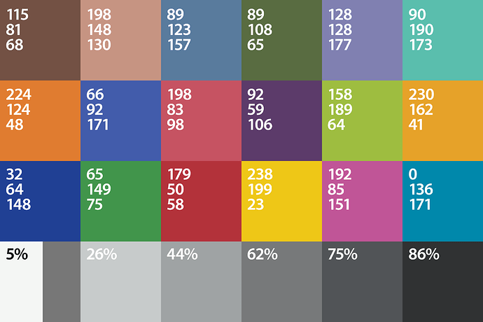
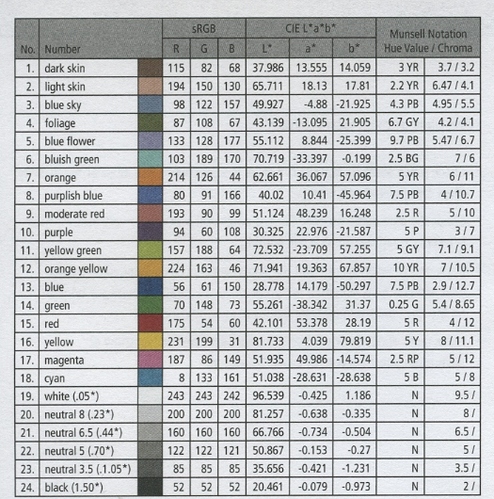
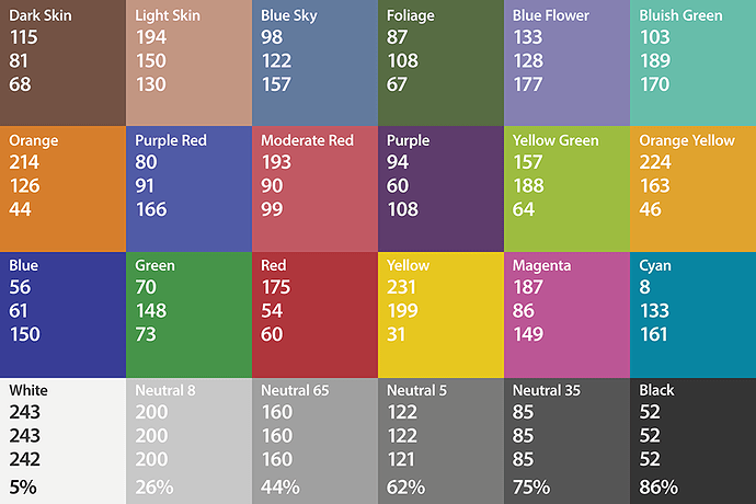
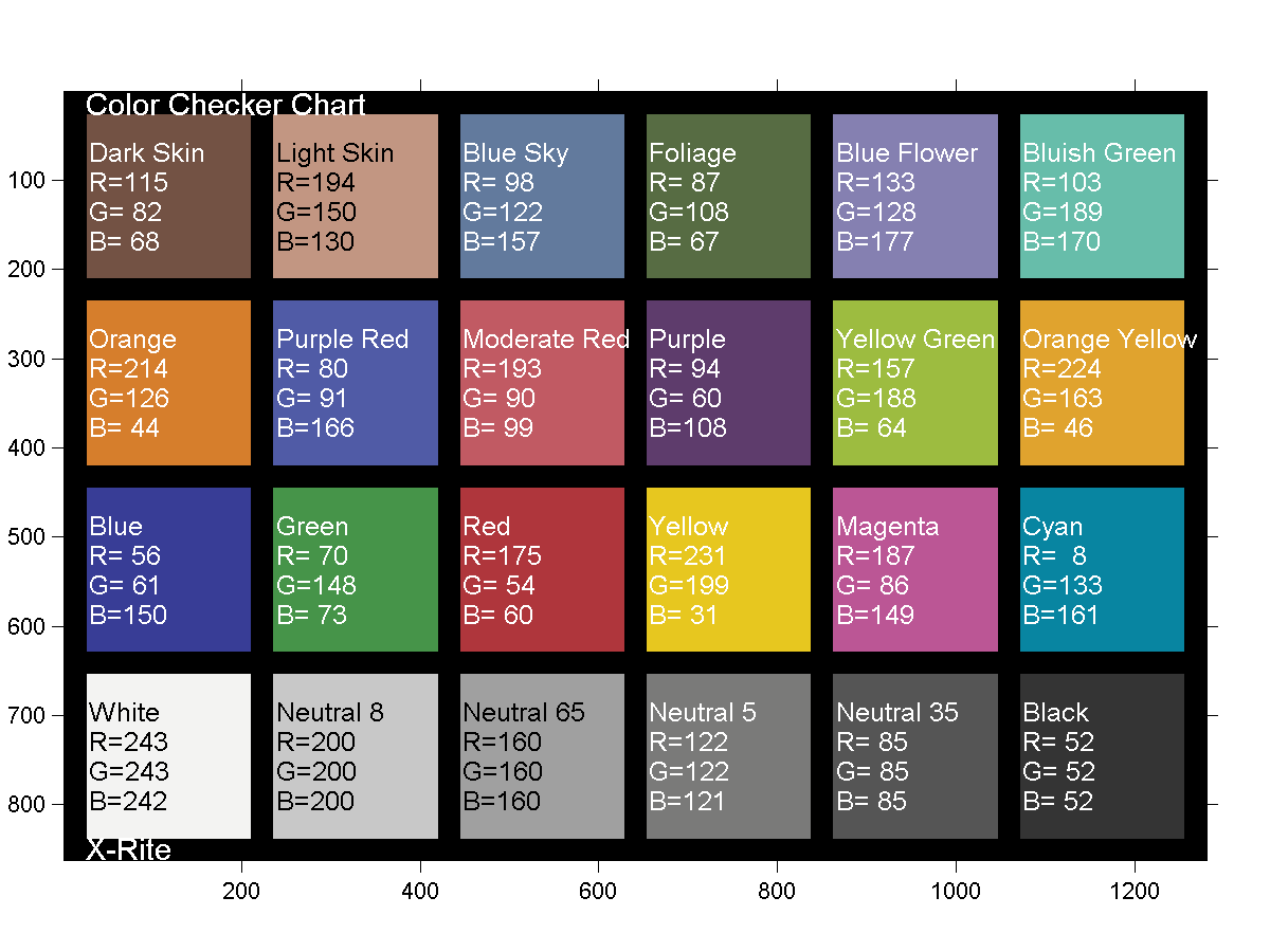
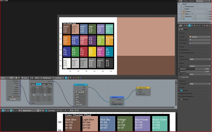
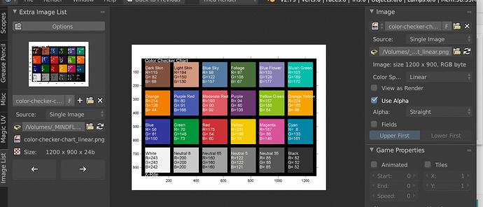
whats about this colorchart, it has precise values.

then put that file into your software ,and lets see whats came out.

Sweet thank, i had these kind of cards already. Last week i did some test with these, when doing check i went crazy picking the colors and checking the original numbers. So i added the RGB numbers as well.

hahahah then you link some likewise now… So i wasnt stupid :wink:

Though i see there numbers are slight different. I found mine on the web and picked the colors in Photoshop.

I see your link has the same numbers as a different file i got with the exact same numbers

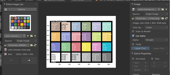
For those who can use it, here’s a 3000x2000 px PNG with names and numbers. Attached image is low res preview. Zip contains the file.

Macbeth-ColorChecker-Chart_sRGB.png.zip (276.8 KB)

oh i forget to meantioned that on the page i linked,and you click on the colorchecker thumbnail,it opens a png version from the file.

here it is

Funny how two reference charts can’t get their numbers to match, eh? :wink:

Stupid integer crap, and they don’t match against a reference card. I love it how a thread topic nicely loops back to exactly the issue…

these are exact numbers from x rite chart,whats wrong with it?

please post a better reference chart then

I am watching this thread frequently. Don’t give up, little by little I start to understand a bit more.
Glad to see my values like: nodes[“RGB.005”].outputs[0].default_value = (0.0231534, 0.0343398, 0.0241576, 1). Well at least it’s not an integer.

because integer is the devil :japanese_ogre:

So you state that the whole print industry is crap, thats a bold statement.

that was me,cant resist

the funny thing is, a integer/max value in this example(int/ 255) then you get your float number.and visa versa

I was just commenting that even when values have concrete grounding to absolute values, you’ll find variations.

I’d strongly encourage sweeps of values, in scene referred ratios. By sweep, I mean a smooth gradation of steps so that you can see transfer function differences at the various points of the sweeps.

This is a sad 8 bit display referred sweep. Ideally it would be a float sweep, with a dynamic range that extends up to 20+ scene referred.

I’ve used plenty of reference charts. I can assure you that the print industry isn’t incorrectly tagging their encoded files, so step back a little and realize that I’m trying desperately to illustrate the futility of b****hit code values, where more often than not, the entire scope of the context hasn’t been presented to the poor person trying to use them.

It starts with bad information, and cascades down to the poor folks just trying to get work done.

this could easy done within blender

Not sure as there isn’t an OpenColorIO transform node, so it would be challenging to get precise code value increments I believe. If you can manage it, I’d be interested to see.

Ah.
If there were displays that could generate such a dynamic range, 20+, many more would realize this.

i havent tryed,but its basicly a gradient from 0-20 ,i am not sure how to store it,which format is best.and what settings should be in CM to not altering the result.

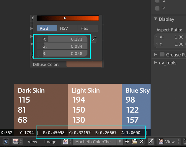
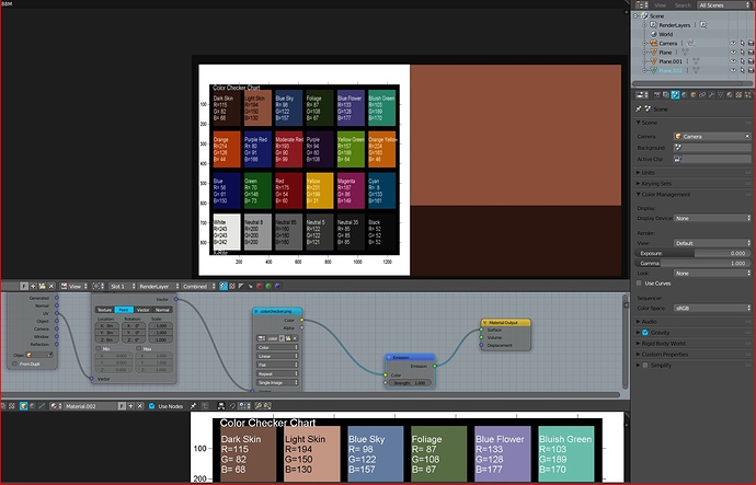
One thing i dont understand. When we use sRGB for display settings. What are the color inputs using than? When i do check the RGB values in the UV editor of say the Dark Skin, its complete different than when using the pick in the color input?

I somehow thought when we adjust the scene display settings, the inputs would be correct. Because when i change the display device the color changes. However the values are different than what the UV editors shows compared to the color input and user the picker?

the values below shows you the float value,(your int/255) (float sRGB)
the value above seems a gamma corrected float value of 2.2 or something.i assume its the linear float value from the sRGB (linear float RGB)

example the red from dark skin is 115 int sRGB

115/255=0.450980…
(float sRGB)

edit,yep.0.450980 power 2.2 = 0.17…
(float linear RGB)

edit,i have to say,you could in theory pick up every color,it must not be sRGB,it could linear non color data.
but in this example you know that the chartcolors are sRGB.

so the below value are (val/255) = float val
the upper value are (val/255)power 2.2 =float linear val (linear if correction from sRGB to linear).

if you pick up a linear value,then it gets a correction thats not needed(upper screen),in this case the value below is allready linear float.

The HDR display class can. Even where a display can’t, those values have a tremendous impact on the resulting image.

Those depend on the context of the reference you are working in. Sadly, the colour picker uses hard coded sRGB transfer functions in the HSV mode. On the positive side, the RGB inputs are normally linear, and you can input scene referred values as required[1]. Remember too, those values are reflected light values from an albedo or other such facet.

The proper approach is to let the pixel pusher select the appropriate transform at the UI.

Because those values are post-camera rendering transform. A good rendering engine doesn’t just dump a dumbass power function or the sRGB OETF onto the data and call it a day. Those values are derived from the transform from the scene referred reference space to the chosen camera rendering transform chain. The values on the left represent the floating point scene referred values, according to the colours of the reddish, greenish, and blueish light in the reference space[2]. Again too, remember that the values that end up encoded in the image are the byproduct of potentially complex lighting interactions in the scene; even a simple albedo reflectance value isn’t entirely trivial.

[1] As with an emission, some depth formats, etc, which could have ratios anywhere from zero to a theoretical infinity.
[2] In many instances those lights are radically different to the lights in a standard sRGB emitting display, and as such, when dumped without a proper transform, they will look very possibly not reddish, greenish, or even blueish.

like HDRIs?

I lost it now… I need to do some reading and try to find understandable info on this i guess, if available. My thought the inputs would be altered so the output has those numbers as well. Si if i wanted RGB values from a texture i i color picked i need to some calculation to it first to get the proper output after the its rendered. Left asside what happens when HDR, light, reflection, structure, roughness etc etc is added.

You haven’t lost anything. The only thing is a collision between your mental model of learned experience and what you are facing now.

When you are in Photoshop, you are setting the intensity of the three lights that literally get emitted out of the display. This depends on your working space, so if you are setting the Adobe RGB working space lights, they will be different to what your smaller gamut sRGB lights need to emit to mix the same colour.

With a rendering engine, it is not direct emissions from the display, but rather a synthetic beam / beams of light are projected into the display of variable reddish, greenish, and blueish colour. If the beam hits an albedo diffuse surface, a portion is reflected. If it reflects back at the display, a buffer is stored. That buffer accumulates the light based on complex things.

This is an unfortunate expectation. You have to remember that you are photographing a scene that has light being bounced around from zero to an infinitely high value. That is, even if you painted a car a perfect colour and used some spectrophotometers to analyse the paint, the light that gets reflected off of it is subject to some complex stuff! How reflective is the top coat? What is the absorption of various things? Is it bumpy? What is the colour of the light hitting it? Is there an indirect light source such as a bounce hitting it?

All of those factors and many more are what yields a resultant pixel being emitted from your display. Further still, if you didn’t use REC.709 / sRGB rays projected into your scene, the resultant buffer would need to be transformed such that it is encoded properly for whatever output you are hoping for.

Even in the simple case where you are using sRGB values and sRGB lights in a raytracer, the value of a printed piece of paper in the scene will never emit the exact values you place on the texture; that depends on the camera shooting the scene. In a raytracer, this is the camera rendering transform, which can be anything from bunko pure 2.2 power functions to the sRGB OETF all the way up to complex camera rendering transforms such as the ACES pipeline.

That’s about as simple as it gets. Think in terms of a camera shooting the scene, and it will begin to make more sense. Take baby steps, and don’t panic.

Also, triple check what folks are telling you. While I’m relatively confident that my information is stable, you don’t know that and I might be talking out of my ass. Check things with sources you trust, and most importantly, ask questions until it makes sense!

There isn’t a one size fits all education approach for these sorts of things, and everyone takes a different route to cognitive snaps.

Perhaps the most important thing to understand is that all of pixel management comes back to lights. That includes printing and painting. If you can understand that your display is projecting one set of three colours, that your scene is a large set of ratios of potentially different sets of lights, it will begin to make more sense. Look outside your window, and light is being bounced into your eyes. Look at your display and light is being projected into them. While the scene outside your window is physical, the one inside your computer is just a model. The same concept applies to understanding pixel management.

Thanks, i understand that the albedo color is the objects color and that all material properties do influence this color. I noted that in my other post. So if i get it right if want that dark brown color (top left cube) i should use the picker in the texture. Than after the render it should look close when nothing else is added to this material, taking aside the influence of the environment lighting ofcourse.

If i understand it correct that when i think i input a certain color it comes out quite different because of the input being linear RGB and not RGB as i though it was.

In the case of albedo, it literally is how much of each channel is reflected off the surface. So 0.5 is 50% reflectance for example. In this instance, there is a subtly complex relationship between the linear reflective value we want, and how we describe the code value with the colour we are trying to describe.

If we projected 20.5 units at that diffuse albedo, an overly simplistic example would be that we would get back 10.25 units. If you use Filmic, that bounced light value would be encoded for the display at some high 0.0 to 1.0 display referred value. It would definitely not be even close to changing values according to the sRGB OETF and projecting them directly out of your display. Nor do you ever want this in a rendering scenario.

Once you realize that the code values are literally encoded values, you have to decode them. That is, for the sRGB OETF, you have one decrypting code. For a pure 2.2 power function, you have a subtly different decoding mechanism. If you save a Filmic Base Log encoding, another decoding scheme. Your camera file? Yet another decoding scheme!

That is, each of the above examples use a different intensity mapping as well as potentially different coloured lights in their encoding schemes. Hence why, again looping back to the start of this, you can’t make assumptions about encoded values without knowing about how they are encoded and the context that you are using them in. An albedo is different from a direct Photoshop emission from a scene referred emission to… you get the idea.

1 Like

please take a look at this,thats explanes alot.especialy scene linear color space.

https://docs.blender.org/manual/en/latest/render/post_process/color_management.html

Be careful! When you read “linear space” you can be almost certain that the document is typically garbage. It’s a good warning that the person writing it wasn’t terribly clear about what was going on. YMMV!

what???whats garbage,whats wrong about it?

Linear is not a space. When folks use the term “linear” they are frequently confused as hell, and it adds to the layers of confusion.

Linear alone isn’t anything. When we are discussing colour, it has a very specific meaning; a value is considered linear if it is expressed as a radiometrically linear ratio with respect to some other value. That is, linear tells us a small piece of the puzzle as to what a value means, but not nearly enough about it.

The best example of this is your display. We can linearize the encoded nonlinear value that we are feeding into it if we know a little bit about your display. If it is a standard sRGB display, the hardware has a low level digital chip that takes the signal, and nonlinearly bends it back to the proper voltage to emit linear light from it. That is, if we apply a X^2.2 to the nonlinear code value we are sending to the display, we get back a linear ratio of the light that will be emitted more or less.

But what about things that aren’t your display such as looking around the room you are in now? There’s a light over there, a light over here, a dark patch over there. There’s no maximum and no minimum! Just scene ratios of light, or scene referred ratios.

So in this sense, we’ve pinpointed the fact that we can have two types of linear encodings. We could have scene linear or display linear encodings. Great! But sadly even that isn’t enough to describe what is happening in your display, and therefore we’d need more information.

If we flick a droplet of water onto your display, it would become a magnifying glass. Each pixel we would see is made up of three unique emitting lights. Those lights have a colour filter on them. For a typical sRGB display, those colours are attempting to be a colour science based absolute colour. That is, your sRGB display has a unique set of three colours of light that make it “sRGB”. If you had a MacBook Pro in front of you from 2016 on, the three lights in the display are entirely different colours compared to sRGB, known as Apple’s Display P3.

That means that, since the three colours are different, if we had a ratio of three lights in the sRGB display, we’d need an entirely different set of ratios to mix the exact same colour on the MacBook Pro. It’s very much like having three different paint mixtures and trying to mix the same colour. Or a guitar with an alternate tuning and trying to play the same chord. The measurements of paint or fret positions change between the differing contexts.

This is why the ISO 22028-1 Standard lists an RGB colourspace as being defined by three mandatory facets:

Those three facets are a terrific way of figuring out if you have enough information to decode an RGB triplet. Simply turn each of the facets into a question. Can you clearly identify the primaries from the information you have? The white point? The transfer function(s) in question? If not, you don’t have enough information to do it properly.

Most importantly, if you don’t have all three facets, you don’t have a colour space. That’s the essential problem that happens when people indiscriminately toss around the term “linear”; it creates a sense of meaning of colour when in fact it is equally ambiguous. :slight_smile:

2 Likes

Ive seen that page, havent read it all though. yet its all talk about textures and nothing is said about pure color inputs. If i understand it well the all color inputs are linear.

yes if you have a image texture,then you left the selection to color data,the blender makes it linear.
if you have data textures like height maps ,normal maps ect.then you select non color data,so blender dont touch it,and left it as is.

as input you mean you colorpicked data?it is gammacorrected afaik.like you see on your sceenshot.

troy,i think you overcomplicate this things.or better saying its sometimes confusing to read.i know what you means.

beside that macpro (i dont know much about it,only that is had years ago a gamma of 1,8 for its displays?)

in most cases if you know the color/non color data thing,and that the renderengine works linear,and that in most cases we uses sRGB gamma for our displays,you are good to go.

of course the postpro transformations like filmic ect are another topic.

If you found what I said confusing, there is likely a good reason for it. Did I over complicate things, or did you perhaps, oversimplify things?

Your pick…

to be honest,i dont know all,ofcourse.but who knows?.but i think is enough ,to get my rendersettings together.

what i want to say is,that i think we dont need allways the complete colorsience.keep it simple and clear as possible.but just imho.

dont get me wrong on this,i hope you understand what i mean.

Reading through threads like this makes me slowly understand better, and shed some light onto this complex topic. So thanks to everyone that contributes to this, this is highly educating!

I have a question though, in Nuke for example, what does “linear” mean then? It’s only one of the three aspects of what describes a color space, right?

what of the three facets is blender then using? i assume D65 whitepoint,with CIE 1931 chromaticity diagramm,and sRGB OETF/EOTF ?

@troy_s, will you stop goofing off in this thread and go write a book on this subject, already! And maybe @cessen can co-write. You can have a little back and forth banter to keep things interesting. :smile:

In Nuke default project, linear means that inputs are linearized by reversing their transfer function. Nuke uses pre-calculated 1D LUTs for this (which can in some cases cause problems, like clipping). It does not change gamut though, so for example if your input is in Alexa Wide Gamut with Alexa LogC curve, linearizing it will produce linear Alexa Wide Gamut data, which is obviously wrong from technical perspective (you most likely view it on sRGB display, but viewer transform also does not change gamut).

When OpenColorIO is used for color management, OCIO transforms control the color transforms and in case of ACES for example, also perform necessary gamut transforms both in IDT and ODT phase.

1 Like

That makes sense, thanks for your answer kesomnis!

Full marks to you. It is indeed only one of three, and it isn’t telling you much about the type of linear. It is a default from an era where scene referred thinking was quite a distant future mark.

That is, Nuke decided that folks wanted to put their sRGB / REC.709 encoded images into a compositor, and see a perfect 1:1 out. This made sense historically.

However, we learn quickly that from the 1D transform in Nuke, and a quick evaluation of the configuration, that the transform for sRGB is only the sRGB OETF transfer function, inverted. This means that it doesn’t change the base primary lights, and they remain REC.709[1] and the camera rendering transform / view, is the opposite direction, which is the display referred sRGB OETF that Blender uses as default. As almost everyone around here knows now, it is a sub-optimal choice for a transfer function when dealing with photographic / synthetic imagery of a scene.

Great questions. @kesonmis has already more or less given you the answer. For clarity:

  • Blender, under the default configuration, assumes REC.709 primaries
  • The REC.709 / sRGB specification white point of D65.
  • The transfer function labelled “Default” is the display referred sRGB OETF. If you flip to Filmic, it is a completely different scene referred transfer function, with a sweetener.

For folks reading, the camera rendering transform / view can transform the lights properly, as required. The default Nuke configuration assumes you are properly transforming the input to REC.709 based lights, and therefore doesn’t do a transform on the output side as it doesn’t need to. If you look at Filmic master branch, I tacked on a set of transforms for Apple’s Display P3 viewing that does just this. Sadly Blender’s file encoding is absolutely awful, and you end up having to contort yourself to save an image in that scenario correctly.

I try to stick close to my roots and remember why I got into this in the first place years ago. Helping people wade through the reams of misinformation[2] out there, and as a result feel confident with their work, is challenging as hell via a one way document. As silly as these threads seem at first, working through an iterative discussion, complete with the questions that I now have forgotten to ask, can be immensely helpful. It is a terrific method to get the core concepts down.

Having had the privilege of sitting in front of and explaining colour to folks who push pixels, and coming from a place of clueless stupidity myself, I participate in these threads because I know how valuable they are to the folks who were like me. It is very hard for folks lurking to ask the questions. Give credit to @rombout for asking in the first place; it takes a certain kind of courage to dig past our scabs of broken models.

You can also see a tide of people like @kesonmis and others pitch in and help others, which is even more important than one rambling idiot pushing rope up.

[1] The REC.709 specification predates sRGB’s, and as such, the colours of the lights are reused from the REC.709 specification.
[2] While I hope folks can keep their brains straight, if you Google “sRGB vs AdobeRGB”, the top two hits were complete misinformation the last time I looked. It is a fun exercise to read broken blog posts and try to figure out where they are going wrong. A good example is here, but again, be careful, as the post it utterly lost. Complete garbage from someone peddling tutorials. Be warned, and pick it apart to sharpen your own weapons. The very first image of the red strips is a great place to diagnose just how wrong the poster is, and why.

2 Likes

My guess you will hardly see the difference between the colours and those 2 profiles. Atleast “regular” eyes would hardly see the difference. Perhaps he added as a simple example so people would understand better?

I didn’t list any profiles in the ICC sense. What are you referring to?

dont forget,albedo is the diffuse whiteness of a material - (minus) the reflection.
it is a dimensionless value (0-1)
most scanned materials,like megascans ect uses cross polarizer filter to remove the polarized reflections. what you see in the pbr albedos are only the diffuse colors,without reflections.they are normalized from black to white(white and black points).to get a consistent range between all materials.

i was referring to that link you showed on that photography site, it showed sRGB vs Adobe RGB

That link is totally broken misinformation. It’s not how colour works, and the author is a dip***t, as evidenced by their awful attempt to demonstrate how little they understand.

Pixel management tries to make things look the same. If the process is done properly, those two sets of strips would look identical on the smaller gamut display. On a wider gamut display, the colours would have the same hue, but one would be far more saturated.

https://webkit.org/blog-files/color-gamut/comparison.html

One thing though, that red square isnt not saved properly. It is not saved with sRGB profile attached, so hope they wondering if that original Profile was sRGB.

Also in photoshop i do see the difference,the p3 is 16bit so that really doesnt show in browser (chrome) also the browser is sRGB. So in photoshop they dont look the same.

Edit
After better checking chrome, i do see the difference there as well. Would not have expected that actually.

PS sorry to get back to the Color Input. Why isnt the input actually in sRGB and than in the back converted to Linear before it goes into render engine?

Would such a thing be possible? That could mean easier control over color input and perhaps results which come closer to wanted colors.

One square is sRGB, one is P3. It is saved properly. It’s the WebKit site. :wink:

If it is rendered properly on a wide gamut display, you see a pattern. If you only have an sRGB display, they are identical. This is what it would sort of look like if you had a wide gamut display. It won’t be exactly what folks with wide gamut see, but it will look something like this:

image

If you see a difference, you have mangled up your colour pipe and loaded the file completely wrong.

Chrome is not colour managing properly on your computer then, unsurpringly.

Because that would end up with broken manipulations. If you manipulate in nonlinear models, your output ends up completely crap and busted. Try a red star in Photoshop, at full intensity on its own layer, over a cyan background (full green and full blue intensity) and blur the star. See how busted it looks?

That would yield garbage, and busted up values. You can’t model a physical reality using non physical energy values. Even if you did this, you’d end up with different ratios anyways. PS: There was a time not too long ago where rendering engines did this. The results were pretty busted up, so everyone moved on to more physically accurate models.

i did a quick test
first i colorpicked, from a rgb input node within blender,the two skin colors from the checker chart which i opened in the image editor before.this colorpicked nodes ,has stored the colorpicked sRGB colors as linear RGB colors.you can see the RGB linear converted values in the node, with same colors, as i calculated before from your screenshot.if you click on the render result,the left side shows the same values,which are values without CM applied.

then i made a third material with the color checker as imagetexture,with color option selected ofcourse.

the color appearence is exactly the same, as the picked up colors.since we know ,that blender converts the sRGB to linear,and we see that it stores the picked color as linear too,we know it behaves the same.

edit,further testing.
if you put in sRGB hex values,in to the rgb color node,the hex values stays as sRGB,but stored/converted as linear too.
the HSV values are stays showing as sRGB float too.

the RGB is the only thats shows the linear float value.

and the little colorpreview shows the color,depenting if CM is applied or not.with CM it shows sRGB,without linear.

the screen below is with deactivated color management .you see the render result colors linear,without CM.


Well they are opened properly, i respected the added profiles. The p3 is 16bit so has more depth. I see this effect in chrome as well and that uses sRGB as i believe.

Because that would end up with broken manipulations. If you manipulate in nonlinear models, your output ends up completely crap and busted. Try a red star in Photoshop, at full intensity on its own layer, over a cyan background (full green and full blue intensity) and blur the star. See how busted it looks?

Not sure i understand that properly. Now the input is linear as well, where as textures are converted to linear before/at render time. Why cant such a thing work with color input?

But is that correct?Is that image adjusted to Linear as well than? Should that texture be set to sRGB?
Perhaps they are treaded the same, im not sure what your display color settings are in this case.

Because when i use linear on that image is washed out, the profile is sRGB i believe or you changed it.

if you set the color option to color,and not non color data,then blender make the image linear for you,as in this test.so yes blender has adjusted this sRGB to linear.
you can use every sRGB tex.if you set the color option to color,then blender makes it linear.

what profile do you mean?you can see my CM settings on the screenshot

But in your node setup you have set it manual to linear, i think that image is sRGB.

When i double check see what happens. I save that image with sRGB and with linear RGB in Photoshop. Than in Blender in the UV editor i set both to display as linear. See how the sRGB is washed out, would that show in the render than?

Image with Linear applied > display linear

Image with sRGB applied > display sRGB


Edit
Ow there is only linear i see now, sorry i never use Cycles. I thought there was a sRGB option there

Its also means nothing else than sRGB must be used on images. When i input a Linear RGB texture it renders much darker

i havent used Blender internal since ages,it should be the same,i dont know ,if the CM coding is different in BI.

but it should not look that washed out.

i have uesd this CM testsettings to not alterings the result with Filmic or other transformation applied.only with sRGB display and without.

correct

or if you have linear colorimages then set the color option to non-color data.then blender leave the texture as is.

but for simplicity,if you load pbr color maps in the net ect,they all sRGB.so with color option,blender makes it linear for you.

remember the simple thing, that blender engine work linear,so it needs the inputs linear.

Perhaps i wasnt clear, i was talking about opening them in the UV editor and setting Color Space to the textures

Not sure what this is?

the internet :wink:
if you load textures from the internet.
here for example,then the albedo colormaps are sRGB

if you load textures from the internet.
here for example,then the albedo colormaps are sRGB

Dont take that for granted, that link roy showed from the webkit was probably setup as sRGB but it did not contain an Color Profile. But i guess if they provide maps, im sure they are all have been set to sRGB before the export. Than they choose whether or not to add it in the file.

this webkit site is just a comparsion between sRGB and wider gamuts.

afaik wider gamuts are only interesting for printing.or if you use a monitor that can display wider gamuts.

you mean in photoshop from sRGB to wider gamut? could be.
for print usally someone change it to CYMB subtractiv colors,because in printing no RGB colors(the printing devices) are used.

It is a deeper bit depth but the colours when properly rendered to sRGB are identical. You will see that the red patch in the P3 and the red patch in sRGB will yield 1.0 / 100% red intensity in sRGB. That means they are identical colours.

You don’t really “set up” images. You set encoding values and set their encoding tags, which loops back to the misuse of ColorMatch I might add. If the image is untagged, the system should assume sRGB. If it has a tag, you properly transform. That’s how those images are set, and that is why they render correctly on reliable browsers.

If you saw the pattern, you broke the loading of the image, or your setup is broken.

In Photoshop, if your working space is set to sRGB, the P3 image will be properly converted and the solid red will appear. If you are in a wider working space, your monitor must be set correctly, and the solid red will appear. If you are using something other than this, the pattern will appear and you are in a broken pipeline.

That’s all there is to it. Chrome is relative garbage on this front I might add, if you have been following the colour management side of it for any length of time. If you are on an Apple product, use Safari for evaluations.

I don’t understand this at all. It is how proper management is done, unless I am misunderstanding you. Input colours must be correcty linearized and aligned to the reference space lights. “Correcty linearized” of course is much more than simply applying a 2.2 power function or the sRGB EOTF in many cases.

You realize almost every Apple product from late 2015 on is wide gamut? I believe every flagship phone certainly is from Apple, Google, Samsung, etc.

False. It is a demonstration of proper encoding of wider gamut imagery. Note there are several different encodings supported on that page.

The world has been gradually shifting away from sRGB. A gabillion pictures a day are being captured in wider gamuts. That webkit site is exactly how those images will be encoded, with profiles attached for the wider gamut variants typically.

i have noticed that :roll_eyes:

no problem to me,but i think beside that the gamut gets wider,in the future we see new image formats used for materials.for example HDR for albedo for a better light at higher dynamic range.

The image formats are already here.

Albedo is a measurement of reflectance, so all that you can change is the bit depth. EXRs are ideal for this, even if you want to represent a surface that reflects a physically improbable more light than it receives, such as an albedo value of 1.3 or something.

Bit depth doesn’t impact the gamut limits, only the precision of representing it. Think of a gamut as being the result of three flashlights; the gamut is the volume of colours that can be represented based on the colours of the three flashlights. Bit depth is merely the number of increments a flashlight has on it; changing the increments doesn’t change the colours of the base flashlights.

exr hm.could be.now the grafikcards haveing to less ram.it could be doable even today,but you have to start makeing new content and a new fitting engine,that support hdr albedos.but in theory it should be not problem.

EXRs have been in use for a long, long time. While they are ideal for post production pipelines, as you can see from the WebKit demonstrations, it’s perfectly fine displaying wider gamuts using other file formats, and has been for quite some time.

There’s no such thing as “HDR albedos”.

do you not understand what i am talking about?

No, I clearly don’t given that “HDR albedos” don’t really exist. They are simply albedo ratios, which represent ratios of light reflected. Normally, in physically plausible worlds, that is 0.0 to 1.0 representing 0.0% to 100% reflectance. If you would like, you could absorb more light than is physically possible, like a black hole, and set the albedo to 0.0. Or optionaly, you could reflect more light than the incoming light has, and set the albedo value to 1.3 or 2.9.

None of that is “HDR albedo”, but just “albedo”, and there are file formats that hold data very well and have been in use for a long, long time. EXRs are one such encoding format.

aha with which resolution ?

Sorry, resolution is typically used for spatial matters. It doesn’t really matter.

You can have a range of albedos from any value to any value at any resolution. It works just fine.

ok lets say you dont have a Filmic management in your render.why are the colors are clipping with higher dynamic range lighting?because the materials arent HDR,they are LDR.the albedos are 8bit LDR.with HDRs you dont need Filmic anymore lol.

I think you are misunderstanding how the light transport works? A physically plausible rendering engine always generates and operates in the scene referred, 0.0 to infinity range.

No matter how hard you try, you will always need to transform from the scene referred domain to the output / display referred domain; the devices we are viewing things on are always limited by a maximum intensity and a colour gamut.

You always need a camera rendering transform, which in turn means you must always pay attention to the destination contexts of gamut and intensity. Does that make sense?

we will see…

When? You are implying this is somehow in the future and we are speculating.

HDR displays are here. The above outline I’ve provided also applies to them; you always encode from the scene to the parameters of the output. You can’t simply display a scene referred EXR on an HDR10+ / Dolby Vision display, for example, just as you can’t simply dump sRGB code values to them.

You can go out and try this if you have the hardware. Even some cellular phones offer a very limited HDR display experience, and can display HDR display content if designed correctly.

@pixelgrip it sounds to me like you’re probably confusing HDR with bit depth…? HDR/LDR is about the range of brightness that can be represented (or displayed, in the case of a display), whereas bit depth (along with some other things) determines accuracy/granularity within that range. You could theoretically have an 8-bits per channel HDR image, you would just have awful quantization problems.

(I mean, heck, you could have a 1-bit per channel HDR image, with even worse quantization! HDR Floyd–Steinberg, here we come!)

In practice, HDR goes hand-in-hand with higher bit depths (and very often some variant of floating point representation), because you generally need that for acceptable accuracy in HDR images. But conceptually they are distinct.

I’ll also mirror what @troy_s said: I think you are misunderstanding what albedo is. “HDR albedo” doesn’t really make sense–certainly not in a physically based rendering context, at the very least.

They don’t have to. Filmic (kind of) does tonemapping, which we could always do in post. But instead of local adaption/others, it allows more “brightness levels” by reducing saturation, expanding the ability to preserve details in the top end. In digital, it’s generally better to underexpose than to overexpose, because details will be lost/clipped. In film, the opposite is true - more details are preserved in the top end. Check this for a film vs digital exposure test. I don’t want to pretend I know this stuff, but given the behavior and the name, I think filmic is trying to simulate film emulsion (might be completely off here).

hm maybe my idea was too prematurely.
i had i mind,that if you look at todays movies and watching tv,it allways looks to flat to me.the latest OLED tech makes this a bit better at the blackpoint,but if you go outside and look around,you intermediatly knows that the image quality and display tech isnt there.
sure, it has made a big improvement over the last years,but if you read some articles about display tech and image formats,they all come to the conclusion that the human visible perception, doesent need that much colors,or the colors are enough.the lack is the flat light dynamic range, that the human perception is much better with.
now, if you can catch today HDRIs with cameras and use it as Image based lighting,and if you can simulate the physics of a camera or even better the human eye perception,then we should be able to render images that are more natural.
and my idea was,if we have the IBL and Camera/Eye sim,then the shortcomings are the surface/materials what we have now.if the shader are physical plausible,like fresnel ect,thats fine.thats left are the textures.and thats was the idea coming from. but maybe it is enough what we have now.of course for a higher light range, we need HDR displays.maybe the biggest improvements would be in the renderengine self.

but even on a say average Monitor, you can see the better images of HDRs, because you can shot a series of images (old method, to make one hdr in hdrshop for example) and has a broader range(all shadow,sky and midrange details) vs one shot that is clipping.

and before someone come with ,you cant display the sunstrength on a display,i know.

Bingo. That’s why high dynamic albedo doesn’t make sense. It’s high dynamic intensity that matters.

If we had high dynamic color, we’d be seeing X rays, Ultra Violets, Infrared, and microwaves. I personally wouldn’t want to stare into that monitor unless I was looking to melt my beard off.

haha,but to be serious, fluorescents for example would be nice to have.