a lot has been done yet and the more is still to be done. But I’m posting this here to catch some new ideas and to fill the remaining holes in order finish it off.
Just let me know what you think
Thx in advance,
The Moonman
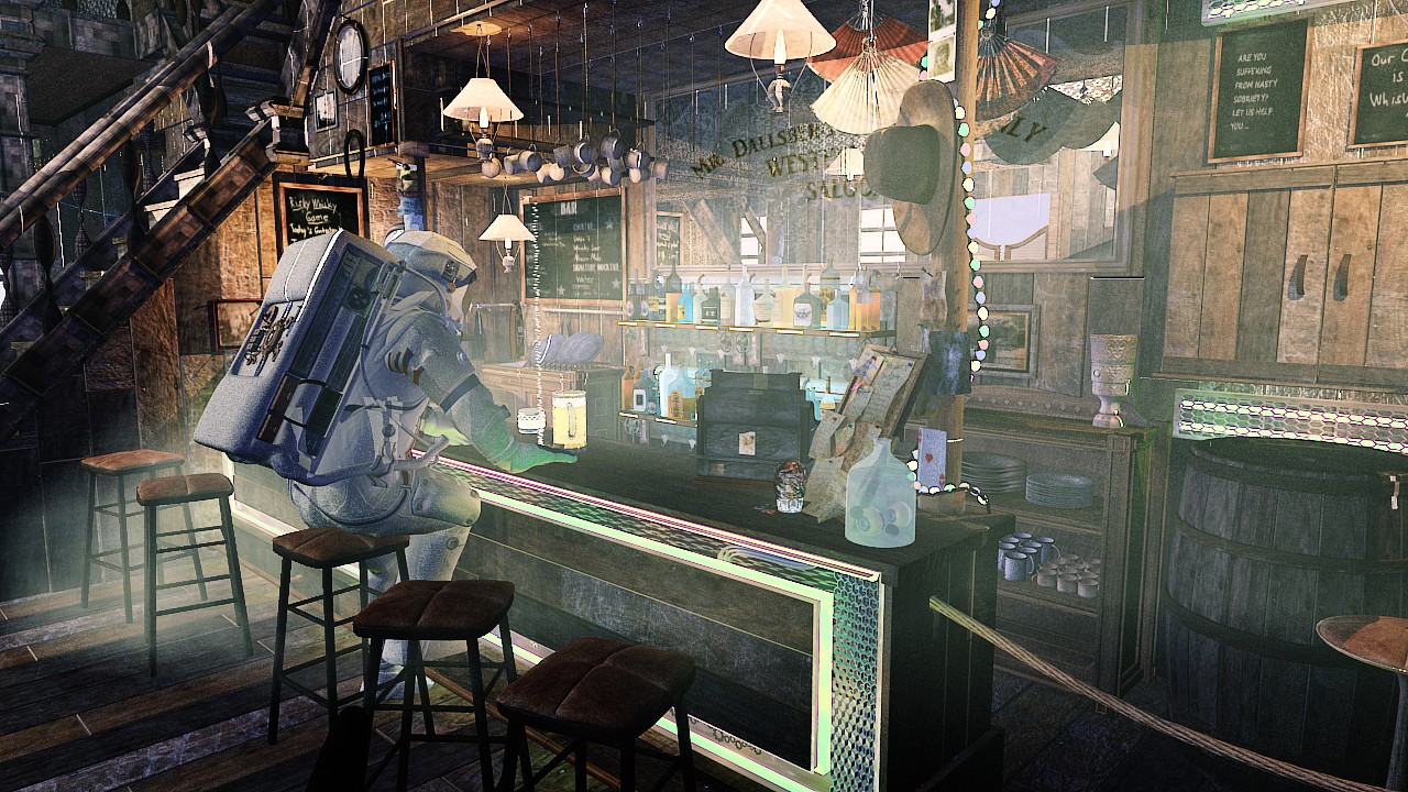
Update (17.08.14): Today I posted my WIP on G+ and Facebook, and mostly got some good feedback on this. Also the Youtube-Subs went up nicely (To all subscribers: BIG. TIME. THANKS!!!). Let me know what you think blenderartists! And if you want to see the animated version once it is done subscribe to our channel here: https://www.youtube.com/channel/UCq1Yeg9HQwsnQZwgv7du-kw
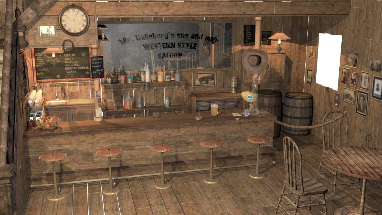
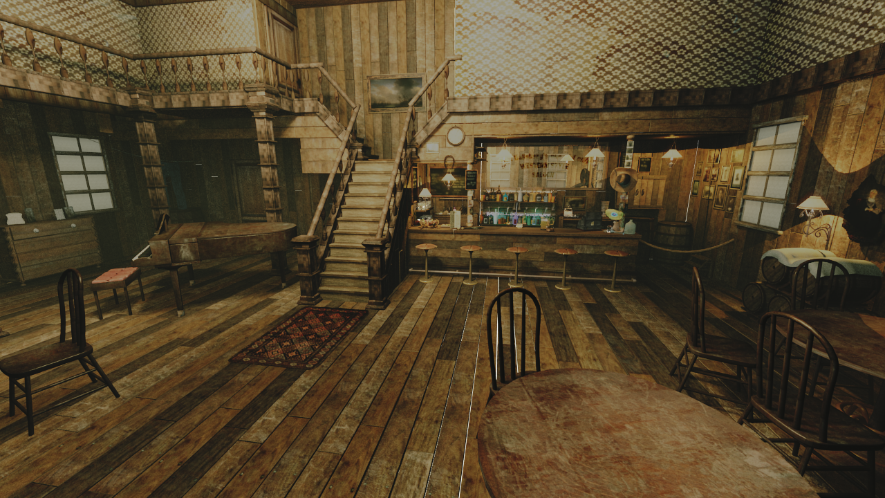
I really like the idea behind this project, and I’ll look forward to your watching your progress. I know there was limited materials back in those days, but maybe some more contrasting variations in the wood tones would help the overall image.
I agree with the variation in hues in the wood tones. Also consider changing the color of the stool posts to a dark metal.
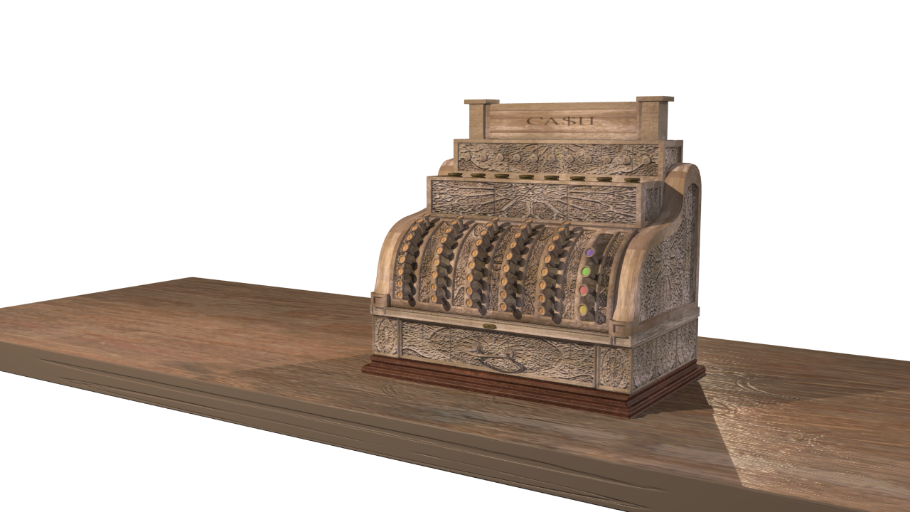
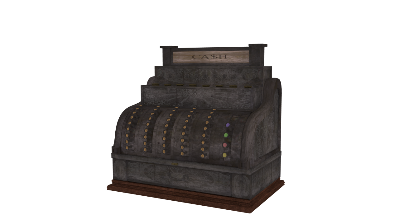
The cash register is great, but if I could make a suggestion - change the color to a semigloss black with the scrollwork in a white metal. I’ve seen the real thing, and I think that would help it’s overall look.
Also, the typeface on the mirror isn’t really “period” - it would look better with something from that era. Google posters from the late 1800s to get an idea of the types of print used in those days, then go to fontsquirrel or dafont to download something more appropriate if you need to.
Yep I will work on the material and try it out again. The Font pages is a really good sugg. Saloon will be in a mix of future and old-western style when it’s done
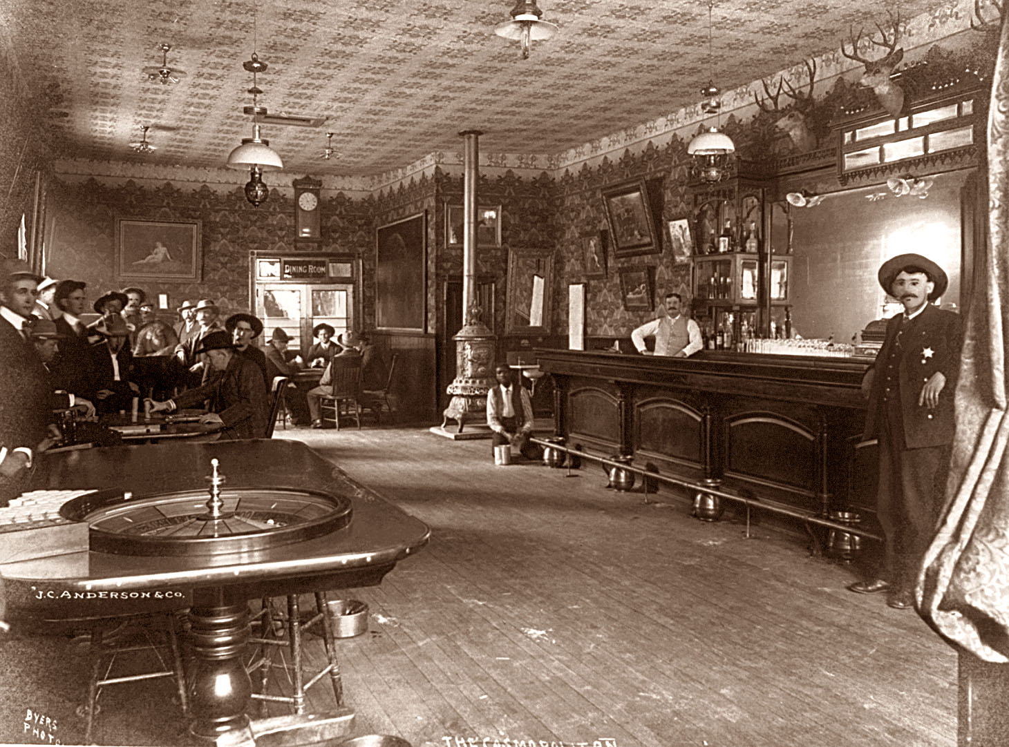
Really great idea, and I agree it need more contrast as others have said. Also, those old saloons had a few spittoons where the barstools are, but not many of them had barstools at all, just a rail and spittoons. Just a thought, and here’s a couple pics:
Great job, and I’m looking forward to seeing it finished!
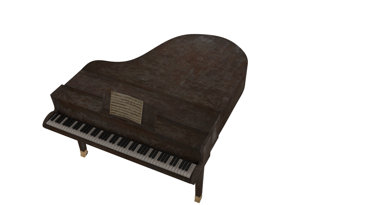
Just a quick observation. The grand piano seems out of place here. Most saloons would have an upright, with dingier keys.
Keep it up though, nice so far.
This is turning out really well. I think the fog is a little too much though. make it more subtle. Also, try working on the composition of the image. Right now I don’t know where to look.
It’s going to be animated in case you mean the positioning of the camera Therefore showing various Renders at times.
Hope I got you right! Thx for your comment also