Hey guys.
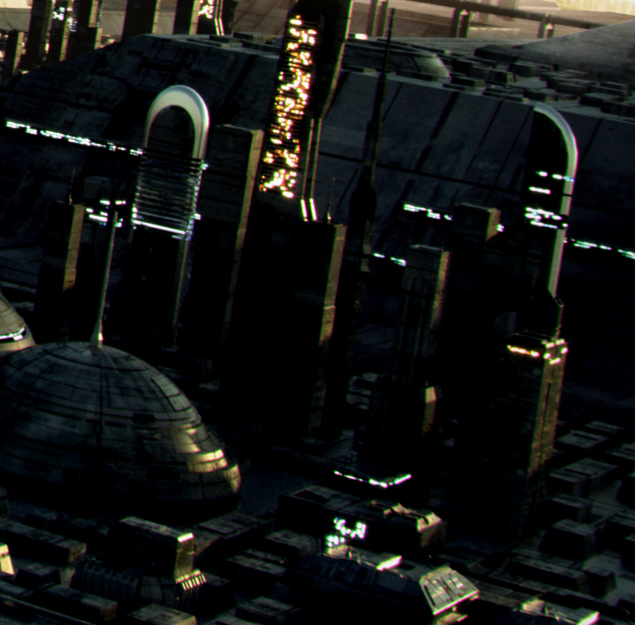
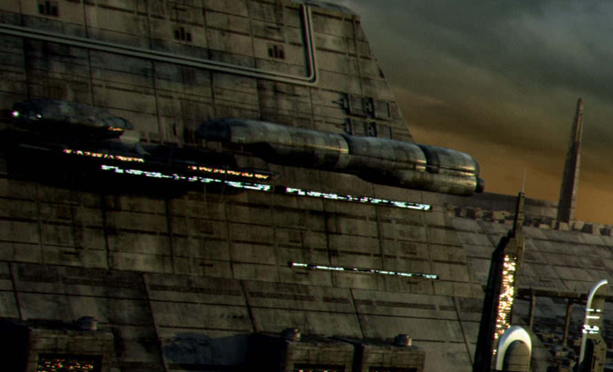
Thought I’d post this one, together with a few full-res crops.
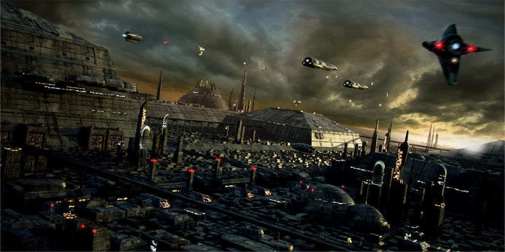
My first serious 2.4.6 work, rendered in Indigo 1.0.9.
Some minor postprod work (colour+contrast, motion blur).
Happy to hear your comments, criticism, insult and injury.
B
very nice indeed.
mood is a bit too dark (small splash of lighter places would lighten the piece a lot), but it also a matter of taste and artistic decision
Very nice. No doubt it’s going in the gallery…5 stars! I actually think the dark lighting in contrast with the setting sun gives it an erie after the rain (in the evening) feel.
Star Wars tastic! I love the clouds and the little motion-blurred ship on the right really gives the whole scene a sense of depth. It makes me want to see an animated version of this.
Oh my GOD! That is just insane. Now I just want to quit blendering. Its just soooo goood compared to anything ive ever done. If you ever have time. id LOVE a 1680x1050 version of that top left picture. For wallpaper usage purposes Thats some pretty crazy work you got there.
Whered you get the textures for the buildings and such?
BbB you’ve outdone yourself yet again… you are a rendering machine! This is up there in my favorites you’ve done. Stick to Sci-fi, I think it’s your niche man!!!
Atmospheric perspective: give this image depth so it flies off the screen.
A number of the smaller buildings in the background lack detail, especially windows.
Image is dark, this can be good and bad. Depends on how much you want to show off your textures and modeling. I think it could use another notch up on the power and still maintain the same mood.
Yoda, Lukep, Sanguine, Anayo: Thx a lot guys. Much appreciated!
Borgleader: Cheers man. Check your pm
Cyborg Dragon: Cheers!
NeoBloodline: Thanks mate. I know how you feel about interiors I like a bit of variation: one day a swimming pool; next day some sci-fi; next day a little ZBrush sculpting. It’s a good way to make sure I’ll never get REALLY good at any of those :-)))
KevinW: Thx for your comments man. Maybe you’re right about the detailing. The buildings in the foreground have a lot more details than those in the background, but yes, overall this is actually a pretty low-poly scene. I wanted to give it a dark look to emphasize the sunlight reflections on the wet metal. One problem is no two screens have the same settings, so it looks totally different depending on which computer I’m working on (here at work, it seems a lot darker than on my workstation).
By the way, there is some atmospheric scattering. It was done in post. That’s where BI comes in handy. I render a ZBuffer image and use it as a mask in PShop to apply lighter colours and lower contrast to the more distant buildings.You can do physically-correct atmospheric scattering straight in Indigo. It’s actually much lighter for light rays and such but it really slows down render times quite a bit!
I don’t like the motion blur (or try with radial blur instead of linear?), or the chromatic aberration at the edges. But that may be just my preference, I like vistas as crisp as possible, with maximum depth of field, whether photographed or painted or cg.
One suggestion to fight global warming has been to paint the roofs of all buildings as white and shining as possible, to reflect warmth back into space. Here is done the opposite (of course, if this is Mars, you want to increase waming, so then I guess it’s ok).
Nice, great detail, . But there are a few things bothering me about this.
.
If you hadn’t mentioned that you used indigo torender it, i would have thought it was an internal render because the lighting doesn’t look right to me. It appears to be very flat, there aren’t enough highlights and bits of detail being showed off either, plus large parts of the city seem uncharacteristicly dark, given that the sky seems to be quite well lit.
Perhaps its that the picture just doesn’t work at medium detail, but it just looks lacking in detail at that resolution, adn the shaders look internalish, not necessarily in a good way…
.
I think when you resize it down to a smaller resolution you will need to made it as sharp as you can get away with, the close ups are awsome, but overall it doesn’t work which is a pity because you must have put alot of time and detail into this.
Animal: Yes, I think the small render doesn’t do justice to Indigo’s work on this. Which is why I added the crops. There you can see how the highlights get picked up by the metal, which is not really apparent in the downsampled image.
ElAkimein: The ship on the right uses radial blur (zoom) since it’s moving away from the camera. Interesting point about global warming.
Very nice!!
I’m glad that this is still a wip because i think you can get muuch more out of it (not that it isn’t already kick @ss).
I think the coloring needs some attention. The sun is really close to the horizon so i would expect an more orange touch.
You can see really big distances so you would have some atmospheric effect. The shadows are just to dark, makeing them slightly blue might do the trick.
The lights look awsome. Very good distribution of color and brightnes. But the reuse of the same texture is too obvious on the big building on the left.
I LOVE the half spehere buildings with the highlight on it at the foreground.
Some smoke/steam out of some chimneys could look good.
The straight think at the foreground that looks like a rail or something could use a futuristic speed train :).
When the smaller buildings would get some lights…duuuude
The square building at the back would be perfect for a sky harbor with open bays and some singnal lights.
And i hope that you will spend some more time so it will be suitable for a BIG resolution (double screen wallpaper style ;):D)
I’ll let this one rest for a while. But you suggestions are all very good (I like the train and sky harbour ideas very much. Smoke would be trickier). I’ll bear them in mind when I return to it. The scene is neither poly-heavy nor long to render so I have no problem giving it a bit more effort.
Great work, I’m getting a massive urge to whip out my Blade Runner dvd from watching this, in fact I disctinctly heard Vangelis soundtrack in my head when looking at these shots :). Not much to crit from where I’m standing.