hello to all blender users, addicts and moderators! this is my second post here in blender, i want to improve this little piece so suggestions, critics and comments are most welcome.
am planning to make some changes (a dramatic image for an instance) and to add an empty cigarette box… for now this is a tentative project, not a final image, yet. am just a beginner so bare with me… don’t be too harsh, harhar.
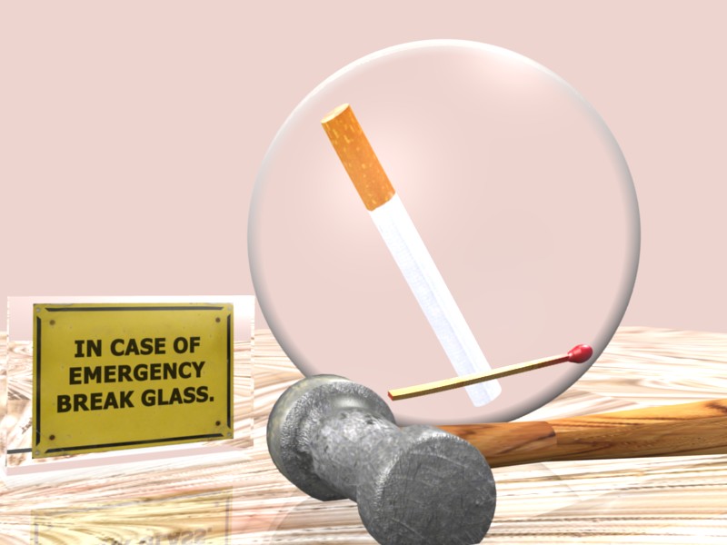
here in the Philippines 8 out of 10 people smoke cigarette (according to survey), am not campaigning anything, just a simple reminder that smokin’ do NO GOOD at all to our health. (am not running for president or senator) ahihi.
maybe i’ll try to put the image into a more complex background like a beggar longing to have a cigarette then suddenly decided to break the glass… need more tweaking and remodeling. i need some c&c.
Yes and no… And advanced background can make it more distracting, now i think it makes you wonder what you mean, and i still dont quite get it? Is that stone thing meant to break the glass?
Anyways that stone thing needs UV mapping, or more correct UV mapping, you can see the seams, the wood and stone thing need more definition, normal map perhaps.
A perfect bubble like that, isn’t that blurry in refraction?
ok. i see your point. the background is postpro in photoshop just a simple blur actually…
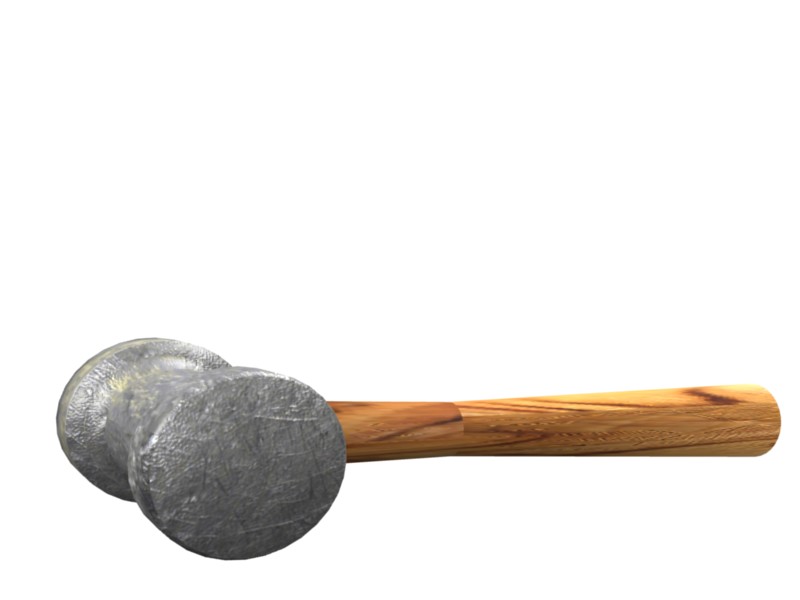
that’s a stone hammer, but am planning to change it to a HAMMER, yep its meant to break.
right now am still learning how to use UV mapping, all the applied texture are just pure texture no UV mapping was made at all.
that’s just a simple sphere then i just applied raytransp.
Hi, your idea is awesome :yes:
What I’m gone to advice it’s what I would do, I’m not saying that I’m right, or that Is the better things to do
Weight:
The first thing you need is a ambient oclusion and/or shadows to give weight to the objects. I would also reduce the reflection on the table or make it more blurier… it’s too glassy you see, wood even with vernish looks more rough I think.
Texturing:
The secound thing is that you need to do a better texture maping in the hammer itself, the handle looks good; the cigarret it’s good, the tip of the match needs to be more rough. to rough it a bump map should do the trik. Add a noise texture on top the color one and make it afect only the bump by pressing ‘nor’ and adjust the ‘nor’ slider.
randomness:
The third thing is that you need to make things “dirtier”, don’t exagerate but a litle of random dirt here and there makes all less CG. You can dirt your scene by aplying on top of the textures another texture with the “dirt”, actually model the “dirt” or, because this is only one image, you can simply paint it in a 2D paint program like Gimp.
Compositing:
For a final toutch you should play a little with the RGB curves node in the compositor to give it some ambiente color. You see… now things are a litle “white light only” and that bring us to CG stuff, but if you meticulosly add only the essential amount of color… it will make it look real. Don’t give it too much color or it will look CG again
On top of everything, still in the compositor you can add a circular gradient texture (white in the midle and black at the outside) in overlay mode to darken a little the corners and brighten the midle, to simulate what happens in the real film photo machines… but only a litle, no more then 0.20 value in the mix nodes or will look fake again.
That’s all, hope it helped somehow.
Your Idea is awesome, I’ll try to keep an eye… but when you finish it, please say something
wow you really helped me A LOT, your advice, ideas and suggestions are very inspiring, can’t thank you enough just THANK YOU ROGPER, yah, i’ll let you know once am done with this piece, i’ll be revising this project. i’ll be changing the scene, add more dramatic details.
i’ll keep in mind all the suggestions you’ve made…
@andystudio29 thank you to you too, both of you actually really inspired me to push further, both of your works (ROGPER & ANDYSTUDIO29) are really awesome!
i’ll be posting another image once am done with the editing stuff
BLENDER ROCKS!
just a little update bout’ what am doin with this little piece…
hammer with uv mapped and bump map.
i’m still learning how to use UV map…i actually did it! harhar, thanks for the online tutorials and some links and also for the positive advices i received…
Hi!
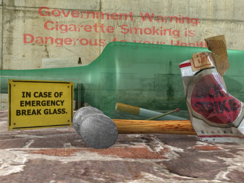
Well, the texture in the hammer looks better, but now in the handle there are some hard cuts that ruin the ilusion. In the acrilic board that says “In case of emergency break glass” the green botle should be visible behind it … don’t know if this the problem but check if you pressed the Ztransp option in the links and pipeline panel in the material buttons.
You need to work it a litlle more
here’s another render, i don’t know if am done with this little piece, but am still thinkin to add something or to tweak it more… i think there’s still some flaws…
well, am just a beginner so bare with me guys…
been busy working as always…
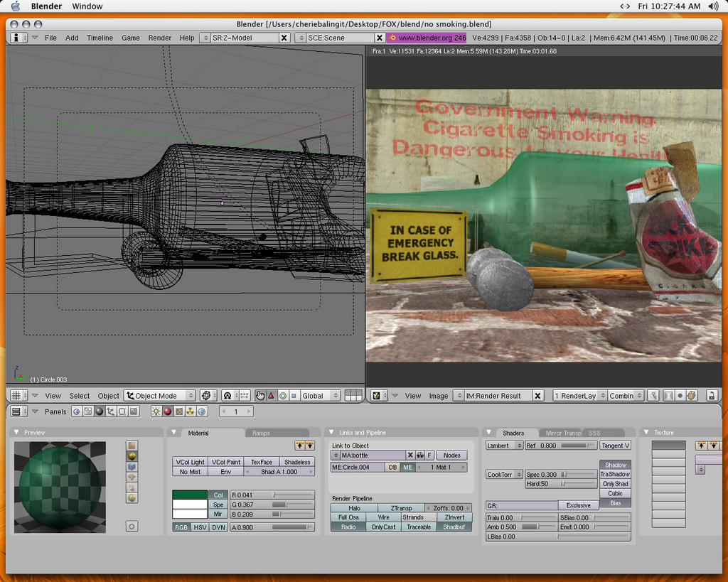
anyway, software used: BLENDER + PHOTOSHOP (all made in blender, rendered with BI with AO, postpro with photoshop)
i do hope u guys like it… i really enjoyed doing this project… well it’s my second project but am very much happy with it…
oh yeah, i didn’t noticed that… harhar, silly me… thanks for the suggestion Meta-Androcto. i’ll repost another render today…
good day. and thanks again…
That bottle needs work on the transparencies. Using Ray transparenies would do a much better job then z transparencies. also a bit of raymirror wouldn’t be out of place.
Hi blahblahken, your picture is looking good so far, I have a few crits about it though :
you should add some mirroring to the bottle, the ground texture would benefit of turning bump mapping on.
The hammer handle looks odd, I didn’t get was it was at first sight, I’d see it more rectangular or bigger.
The overall picture lacks shadows, maybe you should try to add a sun for stronger contrasts.
You’re not far from a good picture, I like the concept. Keep up the good work.

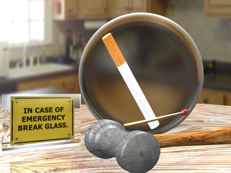

 Is that stone thing meant to break the glass?