►So, shall we hold the meeting at 3:00 PM GMT on Thursday? Can both of you come?
It may be tricky, but ill try
Fine to me.
For me, the best Gameblender tutorials site is http://www.katsbits.com/
Almost everything you need there 
Ho, thanks for the input! I’ll make sure to check this once I have some time.
A much needed update!
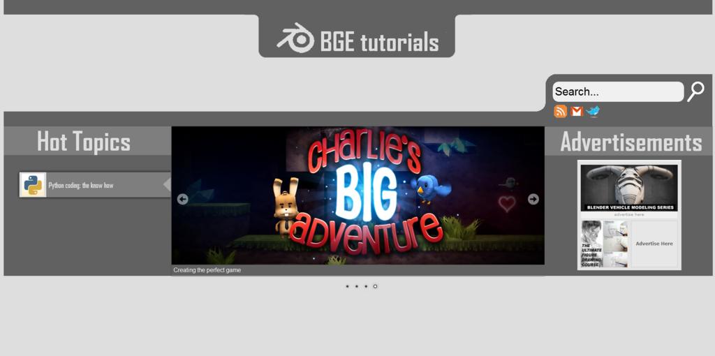
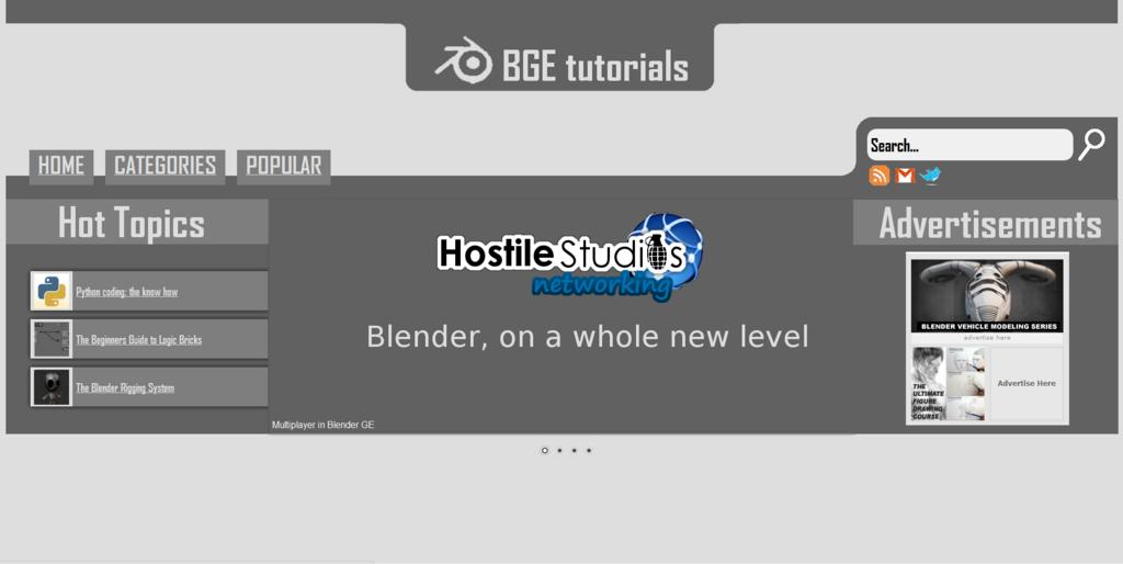
Here is the sample i have made for our website.
http://hostilestudios.com/bge/
Just had a look - I like it. Simple color scheme, brings the eye straight to the colorful window in the center. Two little comments - you might make the tabs’ font color something more, well, colorful, or something to lead the eye to them - as well, the Blender icon is a bit funky looking.
Other than those nitpicky things, it looks like a great start.
Oh, one technical problem, using FF7 in Ubuntu, unless the window is maximized, the center panel (with the picture switcher) covers the side panels. Meaning it doesn’t resize when the browser window does.
EDIT: I meant to add that I think the font is a great choice.
Thanks Tauricity!
I’d realised that, the images are all set sizes, and as my monitor is 1920*1080, i have a relatively high res
The site starts with really large zoom. I do not know why.
I tested with chrome and IE8.
Just looked at it.
Half of the site is covered by the advertisement. This is covering half of the center image. The center image on the other hand covers 100% of the left menu. With this zoom all icons look … you see by yourself.
With a decreased zoom you get gaps in the center image.
Just to let you know
May I suggest to think about the categories. From wiki.blender.org I know it is not easy to define matching categories.
One problem is that most tutorials cover several topics.
Another one is that it is not easy to find categories at all. Categories are created from a specific perspective.
E.g if you look at a table you can split it into rows or into columns. Both are valid, but it makes no sense to mix rows and columns.
Here is my suggestion:
Organize the categories in perspectives (or viewPoints):
Difficulty:
beginner, normal, advanced, experts
Version:
2.49, 2.5, 2.6
Workflow:
Modelling, Material, Texturing, Rigging, Animation, Sound, Logic, Physics, Postprocessing, Special Effects
Engine Parts:
Physics, Logic, Sound, Render, Shader
Logic:
Sensors, Controllers, Actuators, Python
Game parts:
GUI, Scene management, Save/Load, Network, Multiplayer, VideoTexture, Physics, VehicleWrapper, Character movement, States, Pathfinding, LOD etc.
Game Concepts:
Shooter (FPS), Role Play, Strategy, Puzzles etc.
I hope it helps somehow
Ok, some more progess:
I’ve reworked the stylesheet to allow for resizing.
It will most likely be too big for your screens still ->the images are at the correct size for my 1920*1080 resolution monitor, and thus are likely to be too large for yours.
I’ll make the images smaller later on.
I need to apply the new template to the categories page.
Also, the categories:
most users don’t want to search by version; they should be using 2.5/6
Mouse users don’t want to go through a whole series, instead, give them categories and rate the articles by difficulty
Additionally, i might add that these are not finite ideas, just placeholders!
Try have a look at the html coding and make the images resize automatically (according to screen size) by using something like percentages.
Avoiding the use of Adobe Flash (except maybe for the videos themselves) should be the best way to go. That thing can eat your RAM in no time if it’s left “alone” (flash can also slow down system performance by a big amount, too).
Still, this is only the beginning:yes:
P.S. - that rifle kinda’ looks like a very cool water gun to me (mostly due to its materials and the way those green cylinders look)
My two Pennies put in.
Categories like the Versions can be useful Information, but Lists of Articles should not be split, that counts for all Categories.
So, if one would have to go to a Page for a Category just to be led to another Page with a List of Categories (to find yet another List of Categories) then the User is annoyed.
User wants a Tutorial and looks for a Keyword, and then the User wants to see a List of possible Tutorials. Imagine a Keyword Search like on GraphicAll.
(It’s like: How often do you actually search the Categories on Wikipedia instead of just usin’ the Search Function?  )
)
Besides: On one Hand I agree that the Users mostly should be usin’ 2.5/2.6 and that this is to be expected, but there are many People out there who have several Reasons for rather workin’ with an old Version. And if that Point is not strong enough: Everyone is annoyed when findin’ a good Tutorial on something just too find out it was made for a particular Version different to the one oneself uses – several Buttons et cetera may be replaced or even not there anymore (for Example the F-Curves that are now converted to IPOs – which also annoys me a Bit, it changes some of the Workflow I got used to…).
So at least it should be a given Information which Version is used and that also should be a valid Search Tag then.
@Christiani:
You cannot do that with the layouts, because:
- positioning would mess up
- CSS background images don’t allow percent scalings properly
That slider isn’t flash 
Also, i’m reworking it for a generally smaller look:
what do you think?
The font of the topics is hard to read (small) compared to the menu font.
Sorry, it was a poor screen capture!
Could you guys compare the two sites
http://hostilestudios.com/bge
http://hostilestudios.com/bge2
which is best 
I know that on the homepage of site2, the contact us link doesn’t work, i think it’s a z-index issue or something
bge2 fits much better on the screen.
I still get gaps in the pictures (horizontal and vertical lines.)
I’m not sure if it is a good idea to have this “large” picture in the middle. If it is just a slide-show, it could be handled like a banner. The news could start below it.
The center should contain the information for the reader.
Well, have you seen websites like blendercookie?
Anyway, here are some more screens i’d like to compare, because it’s menu sizes.
I also like more bge2. But I get problems in FF. It adds a scrollbar vertically.
I really like the large text size for the content title. But perhaps I would even structure the site with subcategories to have a better overview.
By the way, I don’t like the design of blendercookie. It’s way to overloaded.


