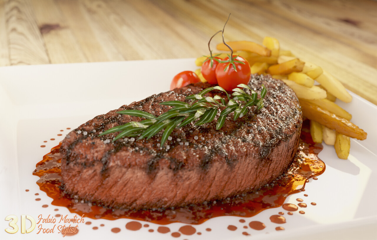
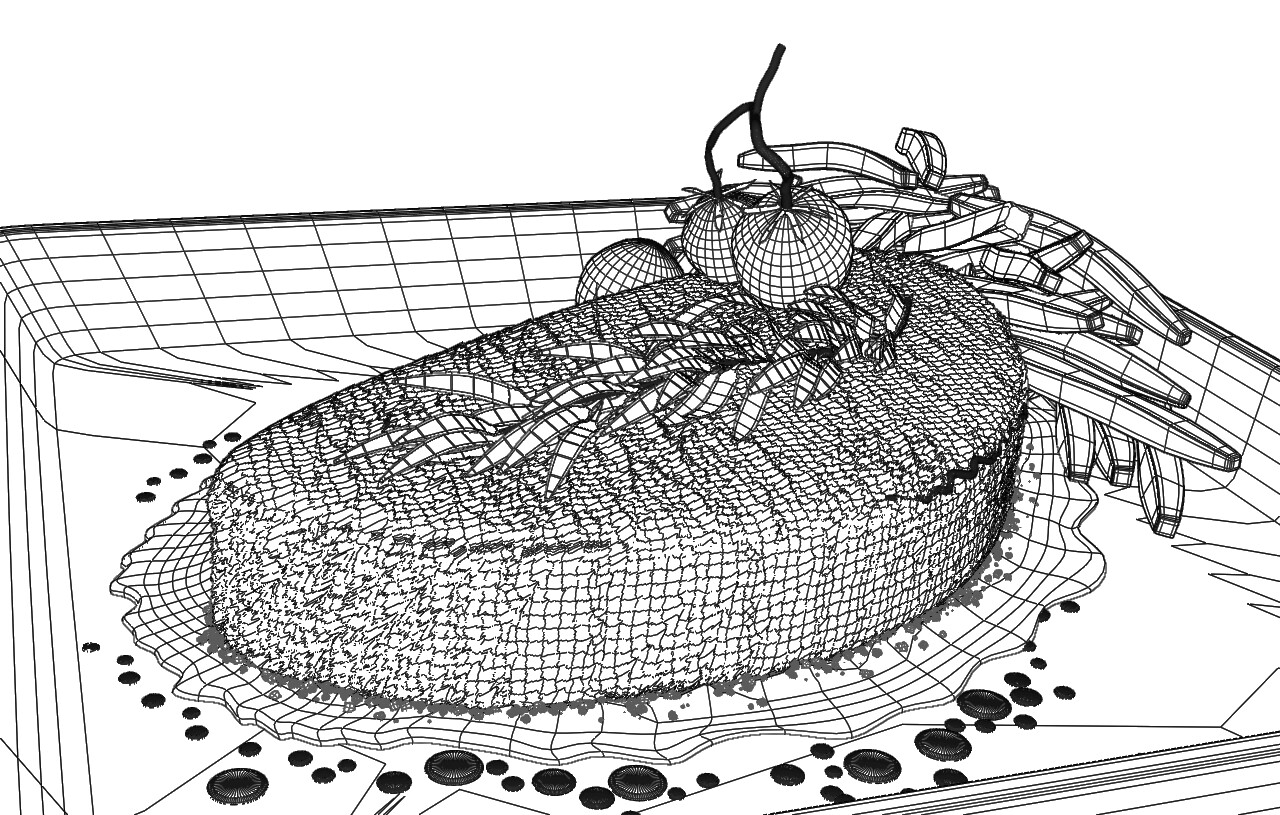
For the meat texture, I use bitmaps in the bump, normal and displace, everything else is procedural, even the mark of the grill. Wood is bitmap too. Did not use texture paint
Fron now on I will use watermark.
I was contacted by someone on LinkedIn and advised that in Fiji someone was delivering portfolios with my work inside
Yeah, unfortunately, if you are as good as you very-obviously are, people who aren’t as good as you are will sometimes try to pass-off your work as their own. (Which backfires, of course, as soon as they try to produce something for an unsuspecting client!)
This beautiful piece is a testimony to the saying, “first, you eat with your eyes.”
I don’t think you should worry about other people using your work in their portfolio, it’s bad for them it’s flattering at worst for you and it’s probably a very small percentage of people.
Well, I hope so, but I got quite angry, I don't know how the employer realized the deception and contacted me, but the thief was saying that I was his student and that he had taught me everything I know.
1 Like
MichaelColina
(The "Mr. Polygon Punisher" is your)
10
bueno la proxima ponle marca de agua a tus renders bro, un saludo…
Wow. Very nice work Fabio! Digital theft is pretty low but it’ll catch up to them in spades. Especially when you’re featured here. I imagine we’ll be seeing a nice “behind the scenes” write up on you. Cheers. Stay safe.
Delicious work… And again I must attack refrigerator after looking on your work
Pheh… I don’t understand people which which simply put someone work in his portfolio. Like people say: Lie have short legs. But this is more and more case these days. Not only individual artist, some studios also steal other work or plagiarize design.
No, it looks almost perfect! Keep in mind that you don’t see a cut, so you cannot see how rare or done it is on the inside. For me and on first glance it looks like it is between medium and rare, maybe a tad more medium than rare.
Edit: split into separate replies to moony and fabio1
@fabio1 Tasty! Now I’m hungry!
Now, concerning C&C:
The fries seem to be too even, and a bit soggy. That can be realistic if they are slow-fried or if they are oven-fries. However they are also tapered, so the ends should be slightly darker.
There’s too many droplets. I realise this might be to show “showoff arraingements” by the kitchen, but it still is too much. Kitchens would use fewer droplets and/or might use a trail of droplets, or even a continued line. Often they might even use black aceto balsamico for this, as it usually matches quite well with steak, adds a little bit “freshness” and contrasts well with the other colours.
The herb (sorry I know exactly what this is but I couldn’t remember its name) is too even. There should be like one or two leaves that are slightly brown or nicked. Also you might want to slightly brake that reflection. These leaves slightly fold inward to the white line in the center having most of the surface-deformation within half of the white line to its left or right. You might be able to pull that of, just by using the saturation (or the inverted red) for the bump.
Also there’s something up with the tomatoes, but I couldn’t say what. Usually their fruit-leaves are 5 or 8, but that’s not really fixed so 6 is ok.
Very, VERY tasty-looking, and it joins my desktop-wallpapers slideshow. Good work! Keep it up and coming!



 Cheers. Stay safe.


