Struggling to get a feeling of realism

Hello,
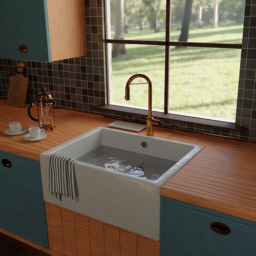
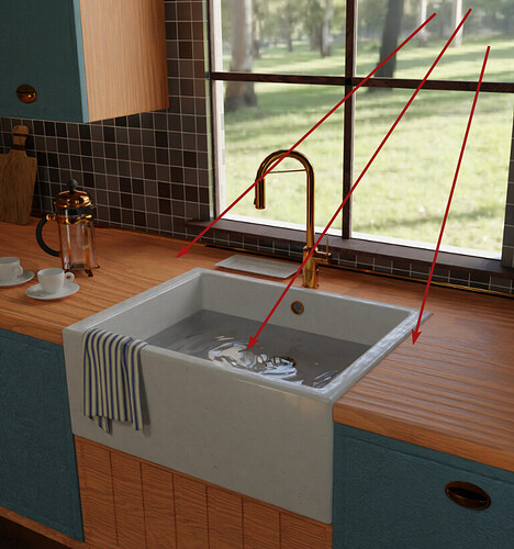
I am still very much a beginner at Blender but I am trying to get a feeling of realism to my scenes however they still come out looking flat and fake. I feel it may be lighting so I have moved to HDRI instead of placing lights in the scene and I have worked on textures a lot but elements such as the kitchen cabinets still come out looking flat and unreal.
Any tips would be gratefully received (and don’t worry about hurting my feelings, I know it’s not good :slight_smile:

Neil


received

2 Likes

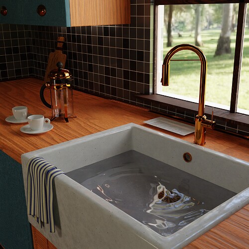
Got some feedback to increase the contrast, it does help but still not a true realistic look.

2 Likes

I am going to rapid-fire off everything I see, so forgive me if this comes across as terse.

There should be a slight separation between the sink and the counter- double the width of the crack, I’d say (or if it’s a cheap house, 4x)

Your water looks… gelatinous, I’m not sure why it has waves but I think it would look a lot better without them (or with much smaller waves)

Your wood countertops, as they currently exist, would be a disaster. Real wood countertops like this would have a clear lacquer waterproof clear coating. You should add clearcoat into the shader, or even add a plane with a tiny amount of thickness and give it a clear lacquer or shellac finish.

On that note, the displacement on the wood is too strong- grain worn that deep would take at least 50 years of heavy usage. Your wood looks more like the floor you’d see in a 70-year-old house than a countertop. Turn that displacement way down.

Your tile looks really good, no suggestions there :slight_smile:

The window sill should have dust on it (no one dusts window sills frequently, and they collect dust very quickly)

What is the blue, carpet-looking thing on the front of the cabinets? Is that a dishwasher? It doesn’t look at all like a dishwasher if so, it should be plastic or metal. A different metal than your brass, it’s unlikely that someone would have perfectly matching cabinet knobs, sink hardware, and coffee pot. I’d say the dishwasher should either be chrome or off-white plastic.

Why is there no soap in the soap dish? At the very least, there should be soap crumbles or residue.

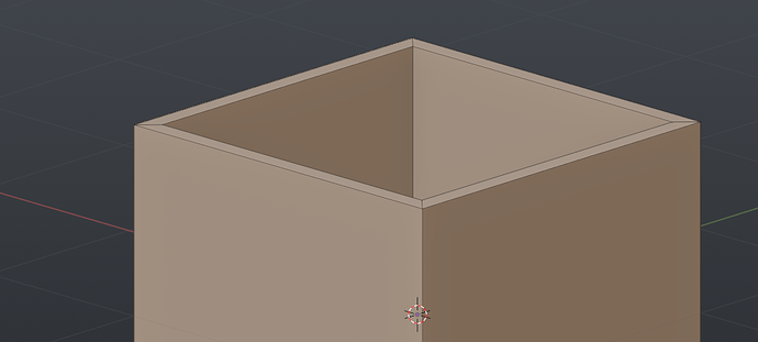
The sink needs visible edges- that is to say, currently it looks like it was cut out of one solid piece of marble, which is possible, but highly unlikely. It’s far more likely that it would be glued together from flat slabs of marble, so there should be beveled cuts on each corner. Like this:


And those cuts should be reflected in the texturing.

The cloth jumps out as wrongly scaled- I think the cloth weave texture you’re using is too big, scale that down quite a bit. At the same time, you need a stronger weave- scale your displacement up, but the overall texture down- if that make sense.

Why are there slats of wood in front of the sink, but the rest of the wood is smoothly cut? It feels disjointed- I think that would look better as a smooth piece of wood.

With all that said, you’ve done incredible work already! I would absolutely accept this as a Finished Project if you labeled it that :slight_smile: Your brass material looks great, and you did a nice job with the window and blending in the background.

4 Likes

IMO the main thing is the bump on the wood countertop, which is far too strong. Also, the blue cabinet material looks kind of ambiguous.

3 Likes

The main things that stand out for me:

  • displacement on wood is much too strong
  • that blue cabinet material is also bumped too much
  • the water should not have waves – if you really want an effect, your tap needs to drip and make ripples, but personally I wouldn’t do it at all
  • the faucet needs more smoothing; I can see the poly edges along the top arc

In general, modern kitchen materials are pretty smooth and somewhat shiny, even if they’ve got a satin coat.

The sink is fine – farmer’s sinks like that are ceramic and fired in one piece, they don’t have mitered edges. I’m not 100% about the material, it looks good in the 1st pic, but in the 2nd the increase in contrast makes it look weirdly splotchy. But I am no ceramics expert, maybe you got the texture from an actual sink. And this is on the nitpicky side.

Despite all the criticism, this is already a pretty good scene!

3 Likes

I suspect some tweaking of lighting and materials would go a long way, as others have suggested, as the overall proportions look decent.

One giveaway is the view out of the window - just guessing that it’s the HDRI used for lighting? Nothing wrong with the view as such, but the low resolution draws your eye towards it.

I’ve struggled with interiors; one of the things that hit me is that sometimes real life isn’t actually all that interesting! To that end, you might need to add some lights inside the kitchen to exaggerate certain features or reflections. Not saying this is best practice for true photorealism but photographers often use additional lights or reflectors to achieve a desired look.

Keep it up.

2 Likes

As you asked for it, here we go… :sweat_smile:

The outer wall is to thin… if it should be the wall of a house…
Imagine it would be 30cm and you immediately get another setting for you window.
Concerning the window I’d suggest to check some more references there’re great indoor window closeup renders out there. It’s harder to get a window right than it seems…
Which lastly brings to the question of you glass setup. It’s more than important for good hdri lit interior renders…
See here eg https://youtu.be/dLZEmfqob7k

1 Like

There are a few things that jump to my eye that other people don’t seem to have pointed out yet.

1-The layout and proportions of the scene feel off (at least compared to kitchens where I live, my apologies if this is based on a real place). If you haven’t, you should mesure the size of similar objects in real life, or search for it on the Internet. Each object is pretty well made on its own, but if I compare them with each other, the size of the cups tell me that the sink is huge and that the counter top is super deep. Also, the window seems to have a strange shape, size and placement (those things usually respect standards).

2-The window’s frame is too thin and minimal. Real window frames are usually much more complex looking, thick and detailed than that.

3-The cupboard doors are not necessarily wrong, but their style clashes with the rest of the kitchen: with everything being solid wood, I would expect their engravings to be much deeper, complex and more ornate.

4-The scene is rather empty. If the sink is in use, I would expect the scene to have way more objects than this. Right now, the emptiness makes the scene feel fake and constructed just for this image.

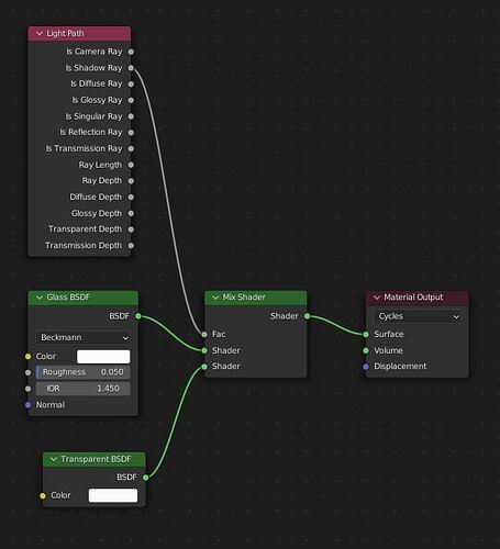
5-The water material could be improved. In Cycles, glass and water shaders struggle with their shadows at this time. There is a workaround:


The transparent material can now be used to control exactly how much of a shadow the water will cast.

2 Likes

Thank you so much for taking the time to reply with so many suggestions. Lots for me to work on here. Just making dust is going to be a challenge :laughing:.

I agree with so many if the comments, the window needs work, the ripples in the water should calm or go, the water itself needs work (thanks for the shader info, I’ll use that). The cabinet doors just need a completely different texture.
Not sure how to improve the view, it was a PolyHaven HDRI so I’ll look for a higher res one maybe.
I never even noticed how thin my walls were :man_facepalming:t3:

I’m off to learn how to do dust, water, soap etc.

Really appreciate you taking the time. Thank you.

3 Likes

Agree with other’s suggestions. Also, the interior lighting doesn’t seem to match the background. You have bright sunshine outside with sharp shadows, yet the light inside is quite muted and diffuse (what are your clamping settings and world tab map resolution set to?)

Also - maybe add some camera effects like depth of field or perhaps a little bloom in compositor on your bright highlights (like on the coffee pot).

3 Likes

Thank you very much for this, I’ll definitly look into it…
(he says while he scuttles off to Google “clamping settings” :laughing:)

Also depending on how strong the light is (this is not always the same) you would want to have a “strong” light coming from the window maybe with volumetric shadows and a light inside to match it since so far I can see the light and where it hits however I believe it’d look better if you had volumetric fog showing the god rays going inside towards the already well lit areas.

Plus I also believe the whole light from outside towards the inside does not match, whereas you got the well lit grass and strong sun, inside your light is dimmed and faded, could be good to match them together.

Other than that I believe everything else looks great and you did a really good job on the overall setup regarding the cloth, colors and scene as a whole.

2 Likes

Basically what moony said!

1 Like

Thank you. I’ll definitly give some volumetrics a go… :+1:

1 Like

Your water tap has not enough subdivisions, I can count the loops, 11 for 180° is not enough.
The HDRI in the background has a way too low resolution, I can see pixels, it immediately shows that the image is CG.
If you want more realism you need dirt/dust and other small imperfections, especially variations in roughness.
Also why has the water tap, the coffee pot and the closet handles all the same material and color?

1 Like

good eye on the tap.

2 Likes

Thanks very much for all the ideas, I have incorporated many but still need to sort lighting etc.
Just live this forum


for truthful and really skilled comments thanks for taking the time

5 Likes

It’s looking a lot better already :slight_smile:

1 Like

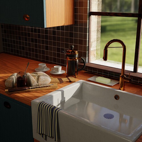
Much improved! Love the bread crumbs and the marmalade smear along the rim, those are nice touches. Well done.

(The faucet still shows its edges in the top bend, just in case you forgot that.)

1 Like

Ha yeah I did forget about that thank you. :+1:

1 Like