In the past, I have been VERY critical of 2.8, after using it’s new UI for several hours on projects. I found, and still do find, the UI very annoying and asinine, but I needed to use eevee for a new project, so i had to become accustomed.
All of my previous complaints still apply, so I will just give a bullet point list of what I like and what I dont.
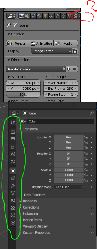
#1: Controls are moved to the top and aligned vertically. I dislike this. Previously, everything was on the bottom, which made it easier to select as you didnt have to move your mouse as much, and all the menu selection was horizontally. (for example, in the sidebar for materials, renders, etc.) this is now all assigned vertically. For someone whose mouse is more sensitive horizontally than vertically (and I like it this way!) This was really annoying. Not to mention, the change seemed to have no reason, other than to trip old users up. Seriously, what was the point of that change?
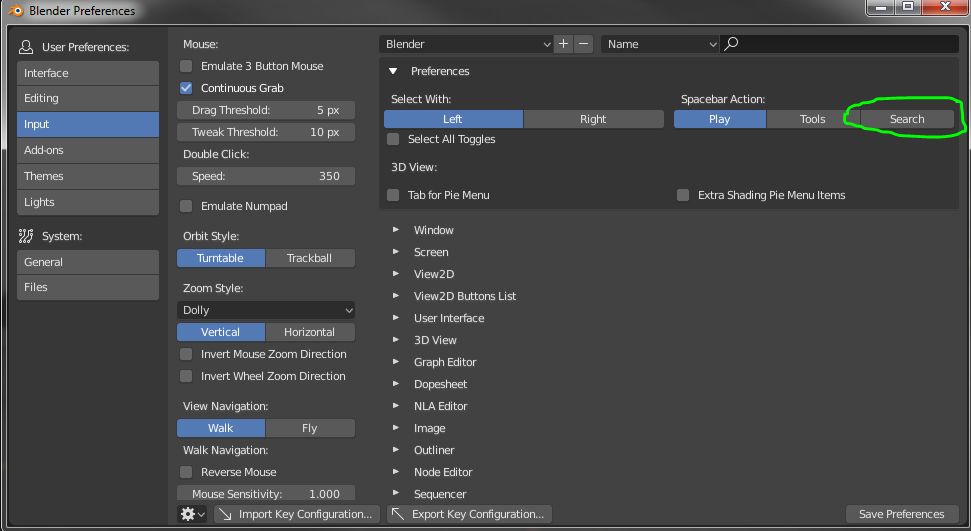
#2: Useless quick favorites/pie menu assigned to space. Dislike. Previously, the menu search button was assigned to space. This was REALLY helpful for quick actions that you do not do frequently, like bridge edge loops, auto clean up, or even UV unwrapping (I almost never used the U menu in 2.79). The space function was thereby very useful, if in doubt as to where a command is, just press space. It helped streamline my workflow massively. It is now assigned to f3, which on my my keyboard requires fn+f3, and space is now assigned to a very annoying quick-favorites pie menu, which sort of is against the point of the space feature, which is quick selection for commands that are less used.
#3: The fact that when you do any command or operation, you need to click a drop down. Dislike. Whenever you, say, extrude, there is a small menu in the bottom right that tells you how far you went, what direction, and allows you to edit said values for more fine-tuning. Now, that menu is in a drop down. This is not a big dislike, but is still not ideal.
#4: The different layouts for different modes. I am mixed on this. On one hand, it is very useful to have specialized layouts for the different edit modes, and it is much easier to switch and edit than previously, where tab just switches between edit and object, and there is a dropdown for the other ones. On the other hand, there is no quick command to switch between tabs, and it ends up being a mouse-movement fest. Not to mention, you can still switch modes normally, which leads to confusion when modeling is in object mode and vice versa.
#5: The new icons. I dislike this. The colors are now monochrome with some teal, not orange and easy to find like before. Seriously, it takes me twice as long to find any icon or command now.
These are my thoughts on the 2.8 UI, after having used it for a while. It is still very much beta, and I will not use it for anything other than Eevee until most of these are fixed.
 Usability improvements and Eevee are getting a lot of attention. Grease Pencil seems to be gaining interest in entirely new markets. It’ll be interesting to see what happens in the next few years. It’d be nice to get some full time development on some of the weaker areas of Blender.