[Theme] A neutral grey Blender theme (and a problem with the passepartout)

Hi!
Did you know that the color of the UI, and in particular its lightness, can influence your perception of the contrast of what you are creating? If something is next to a dark color, you tend to perceive it as lighter than what it really is. This means that a dark UI, while cool, makes you, generally, exaggerates the contrast of the works you create.

Here is an example of this illusion. As you can check by yourselves, A & B are exactly the same color. And yet, we perceive B as lighter.

When creating images, of course, this is important! This is why another popular opensource software, Darktable, ships with a grey theme, for example.

Blender’s default theme, to this regard, is no good, even if it really looks fantastic, in my opinion. For this reason, I’ve created a neutral Blender theme. It is based on this theme by @TheRedWaxPolice , but with a few changes:

  • no dark grey as much as possible. Borders are clearly defined, but the contrast is reduced as much as possible
  • no colors. The theme is just grey, with a few exceptions, where it makes sense. For example, the XYZ gizmo should keep its colors, as it helps to navigate the 3d space. Or object selection distinguishes clearly between active and inactive object. Or the node editor still has node colors. But in all cases, the colors are fairly desatured and light.
  • updated for 3.2

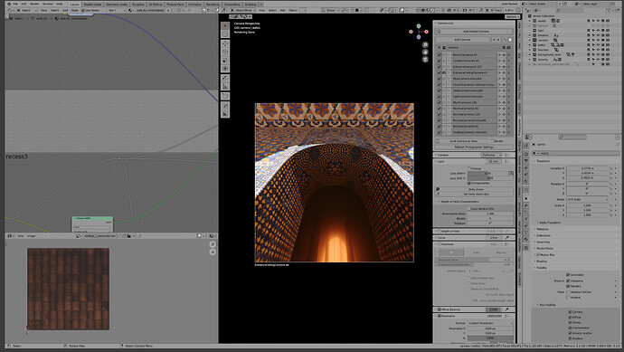
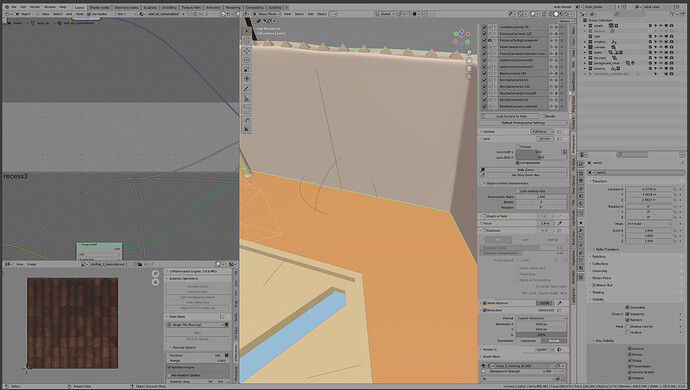
Unfortunately, there is a very fundamental limit, and exactly where it matters the most: the passpartout cannot be themed, and thus it is just black. This makes my theme not so useful, as the passpartout will stay black in any case:

To this regard, yesterday I’ve created a Right Click Select post to propose a change to this. I do feel that the most effective thing would be to write a patch and make the passepartout themeable, but I’m no coder. Would anyone be up for that? That would be amazing. Or even just an upvote to the RCS post might do something, who knows.

Notwithstanding all that, you might like this neutral grey theme, so here it is. I’d like to polish it more, as I’m sure that there are many problems with it, and if the passepartout thing will ever be fixed, then I’d like to possibly submit this theme for inclusion in the official branch, as I think that having a neutral grey option is quite useful. This theme is not meant to be used all the time, but I think it’s a useful tool in the final stage of work, when preparing to render a scene.

Download from Blender Extensions

9 Likes

I also prefer to use a brighter interface because black texts on a gray background are much less tiring to my eyes than in the case of the default dark one.

2 Likes

Yes, I remember reading a study on the superior readability of black text, in general. Myself, I tend to prefer dark interfaces, as brightness tires my eyes much more. But choice - and having options, is fundamental, and luckily most OS/software are going in the direction of providing such choices.

I hope to be able to submit this theme for a possible inclusion in Blender, as I do think that it provides a useful option, and it would be another light theme that is offered by default. However, without the possibility of also theming the passpartout, this theme is completely useless, for now :frowning:

Oh man, I really need to update that theme one of these days… :smile:

1 Like

heh, they are realy the same color. just checked in photoshop. :slight_smile:

1 Like

They are! It’s quite impressive how blatantly our senses can be wired to trick us, sometimes.

1 Like

That checkbox picture ALWAYS FxxxS WITH MY MIND !!!
I have to bring it into a program to isolate a patch of that square and move it just to prove to myself and EVEN THEN !!! My mind “couldn’t take it”.

1 Like

Hi all,
I’ve done a little update to the theme. Mostly a few small fixes after dog fooding it for a while:

  • changed the info box color
  • removed color from the timeline frame “scroller”

The passpartout issue stays unchanged, and I’m afraid that until there are news on this front, there is not much else to do.

Neutral_Variant.xml (47.0 KB)

Updated:

  • changed the transparency grid colors

Neutral_Variant.xml (47.0 KB)

Hey !
It’s an interesting experiment !
I think blender’s UI needs first to be easy on the eyes because we spend a lot of time in front of it.
Of course, having it neutral helps on lookdev / lighting.

About the passepartout, I like it black, it’s more a cinema/camera thing to me.
When working on colors I tend to have a full screen windows on a second monitor.

When I’m getting serious it becomes an iterative process. I tend to do a first pass in blender.
Then export the render with passes and mask, and adjust/refine in PS/Krita , then go back to blender to propagate these changes.

Then on top of that , there is always a final grade, either in comp or when it get serious in a grading environment with a dedicated software.
Of course, in the meantime every mistakes is better fixed right in blender : Better fix a too reddish material and re-render, rather than fixing that red on comp, especially if you’re dealing with several shots.

If you consider blender as an application where you do everything from start to finish , a neutral UI makes more sense. If it’s where you do most of the work, but some other steps are needed, then UI isn’t
that important (at least to me).

If you go that road , you may also thing about the lighting in the place where you work.
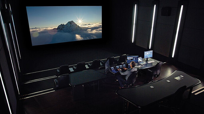
For cinema grading is done in an environment similar to a movie theater :

When it comes to something more generic, like an architectural render, it’s a bit more tricky.
Is having a pure neutral interface is so much relevant if your work place is lit with standard tungsten light bulbs ? Having a good calibrated monitor and workplace takes time and knowledge too, and it’s easy to mess up if you don’t have the tools/good knowledge.

Don’t get me wrong, I’m not saying I’m against what you did, but it’s always a bit more complicated to me. It’s kind of a rabbit hole…

2 Likes

No worries at all! I do agree with most of what you say, but I disagree with one point: that this is useful if you do everything in blender from start to finish.

Having an accurate perception of contrasts is useful even when the image is not yet rendered. It allows you, for example, to accurately calibrate the intensity of a light. Of course, you can change that in the compositor later (in Blender or using another software). That’s for sure, but you might need or want to use a physically accurate lighting setup.

But I do agree with what you say. I, myself, find the default theme to be more pleasant and I also agree with you that a black passepartout looks better. But it also skews your contrast perception.

In the end, the use I see for this theme is to be enabled, if needed, just when setting up the lighting, in order to make decision in real-time with a certain accuracy. It is not meant to be used all the time.

And same for the passepartout: what I’d love is to have the option to set it to another color, not necessarily to have it be neutral grey in the default theme, as I do agree that black looks better!

1 Like

Cool ! Quite interesting !
I should give it a try and see if that works better for me.
Probably because I use a second monitor for rendering it may not be that useful to me. What do you think ?

But I get what you say. It’s some stuff that I know I should care more but didn’t take time to properly look into !

Thanks !!

1 Like

Absolutely, I think the second monitor is the best possible solution for this (and something I should look into myself, when I can)!

Perhaps the only thing that this theme could contribute to this setup is by having a lighter grid for when the film is set to transparent. But yeah, I agree with you :smiley:

1 Like

Just to provide you with another powerful example of this, see this tweet:

https://twitter.com/troy_s/status/1544485469391654912

You can see how deeply the background affects your perception.

Given the recent contribution by Damien Picard, allowing the passpartout color to be set by the theme, this theme actually became useful! Now, if you want to do any color sensitive work on Blender, this could be quite useful. Have fun!

Neutral_Grey.xml (47.4 KB)

I will propose it for inclusion by default in Blender, by the way. Let’s see!

4 Likes