Hy,
I’m helping a friend of mine who is an architecture student.
They gave her this assignment:
They have to create some houses around a very famous castle in Belgium called “het Gravensteen”.
I wanted to make these renders for her.
I already have the models and most of the materials.
I’m using blender 2.49 because i wanted to use yafaray for this one.
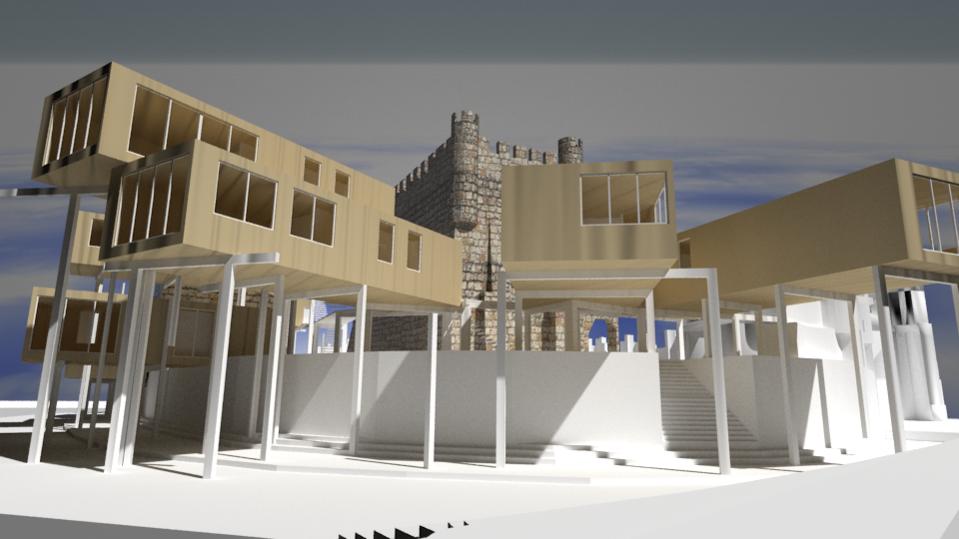
This is what I got so far:
It doesn’t really look very photorealistic to me.
I’ve found somethings myself such as:
-the bricks of the castle are way to big to be realistic.
-the material on the houses should look like wood, but that’s not really it.
-I wanted it to be more like a cloudless day in the afternoon, but now it seems like it’s going to rain.
Can anyone give me some more tips on how to make it more realistic.
Because I doubt that the things I just mentioned are going to do everything.
Here are some tips I’ve found to give realistic renders. I use Blender Internal, but most of these would work with Yafaray, and in any event you can get great results in BI with these.
Ambient Occlusion: Use “Approximate” for noiseless resuts. You’ll lose a little bit of realism, but your render times will be much shorter.
Global Illumination: Another good one. See above.
Use an HDR map for your sky and set the Global Illumination type to “Sky texture.”
Bevel all sharp edges in your model. I would recommend doing this manually; the modifier ca screw up.
Add image textures to all your materials. If you have any skill with UV editing and hand-painting, add scratches, scuffs, and other junk. The #1 problem with most 3d renders is that they look too perfect.
Add a sun with an “Atmosphere.” Play around with the settings- this can really kick things up a notch.
If you’re animating, add vector blur.
Focal blur is a must if you’re going for a photographic effect. You may also want to explore color grading and lens flare.
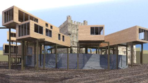
That concrete(?) wall under the stilt-houses looks very fake, too smooth and the shadows make it look almost reflective. Try using a “hard” clouds texture on a normal map.
Also the texture for the stilt-houses looks odd. It looks a bit like wood, but couldn’t be due to the sheer size log necessary to make that size building in one piece. Try using planks, or some other texture.
Ok, here are some questions:
-How do I set lens distortion?
-How do I set global illumination and ambient occlusion in yafaray? (I found it in blender, but not in yafaray)
-I don’t really know what HDR maps are, and how to set them XD
-I do know something about UV mapping, but these models where imported from AutoCAD, and they are really horrible to work at.
I don’t know if this is something with the importing or just the modelling.
I tried most of the other tips and I will send you soon a new render.
// edit
Another question, what method of lighting should I use? photon mapping, pathtracing, or something else?
And in the previous renders I hadn’t set any windows. Now that I have set my windows, all the insides are dark.
The material is set to glass and the transparency is a 100%. The preview of the material doesn’t show anything.
Why is my inside dark?
okay,
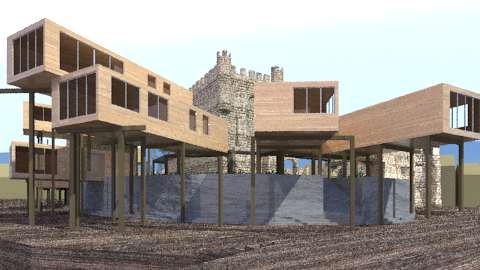
another update here are two new renders. The first one is photonmapping, the second is pathtracing. I’ve seen that pathtracing goes way faster, but maybe it’s not that realistic.
It’s again much better, but still mind the questions of the previous post because I couldn’t solve those.
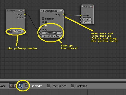
i dont know much about yafaray, but can it go back through blenders compositor?
if not do the following:
press Ctrl+left arrow in blender
choose use nodes
Press Shift+A
input>image
open your rendered yafaray image in this
Shift+A
distortion>lens distortion
connect them up and connect that to composite
then render an empty scene to trigger the compositor
about the glass, if your transparency is set to 100% it means it is completly invisible (hence the preview) to make it look more like glass, add some small reflections.
if all your isdes are dark, set shadows to raytrace, or add some lights inside the building
but i have never used yafaray so i wouldnt know .
for easy texturing, select the face(s) you want to unwrap, view them front-on
(press space) and search for project from view
sorry if i was too simple, i just dont know your skill level so im playing safe.
As jrboddie1 said, Pathtracing is generally considered more efficient for exterior renders, and it is unbiased so there is potential to create very high quality images. Direct Lighting is much faster to render, but there is no GI.
Here are a few idle thoughts from the “for what it’s worth” department:
Remember always that “a photo” is not “realistic.” Both film and video are much more limited in their ability to resolve light-and-dark levels, and color, than is the human eye. Every image that you see is more-or-less contrived to work within the (rather extreme) physical limitations of the medium. When you say “photorealistic,” you might be saying, “looks like a photograph.” But, you’re not saying, “realistic.”
You should always be working in a linear workspace. That means, using the Blender 2.5 series with “color management” turned on.
The two most-important considerations in a real picture are (a) exposure levels, and (b) color balance. A curious but important artifact of gamma-curves is that midrange tones are much more “expressive” than any tones at either end, where the gamma curve takes on a more pronounced slope. So, you need to first be sure that the light-levels are more or less consistent throughout the entire picture. The histogram tool, and the chroma vectorscope (both available in Blender 2.5), are very important to “tell you if you’re in the right ballpark.” You should “get there, first,” and only then fine-tune.
I can tell you now that if I were shooting this scene in real life, I would have a large bank of reflectors shooting diffuse light into the underside area of those buildings, to bring the light levels up. And I would have a radio-controlled strobe flash pointing to the ceiling and walls of every one of those rooms. And, if this is morning, I would shoot in the late afternoon, or vice-versa, because there’s no way that you’re going to get clean visual separation between those foreground buildings and the stone walls behind.
In fact, I would probably scrap this entire point-of-view after taking a few test Polaroids (oops, am I dating myself again?) because there’s just no way that I’m going to be able to deal with opensky blasting through right next to the dark shadows underneath those elevated rooms. The contrasts are bound to be at least five or six f-stops apart, and they’re literally adjacent to one another. The magazine printer would have my head.
Ok, this is all very interessting , and I would love to apply all those tips, but I just heard that I need to get these renders ready tomorrow.
That’s not really what I expected, but anyway.
So I’m going to try to use your tips, but a lot of them seem difficult, so I don’t think I will get these.
Thanks for all the help, and I will send you the definite renders when they are done.
Ok, the 3d models are rendering.
It’s taking a long time, but it looks nice now it’s in high resolution.
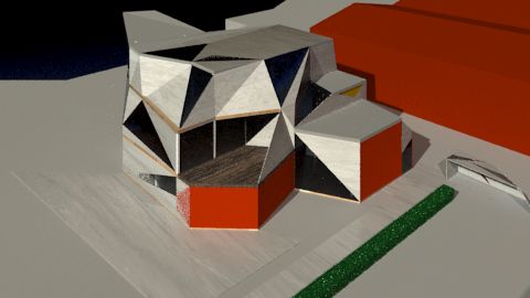
In the mean time I borrowed another pc to start working on a second project for the same architect. I tried allready a few things, but I still got some questions:
-the dark blue spot in the upper left corner is supposed to be water, but as you probably noticed it’s not that convincing xp
I gave it a glass material with IOR around 1.5
-Inside the houses it’s again dark? I really want it to show light and dark like in this picture: http://www.yafaray.org/sites/default/files/images/tutorials/guide/sun.png
and ofcourse there is probably alot more to do, so give me all the tips you want.
It, unfortunately, needs to be done in a short amount of time, so please no really complicated stuff, because I’m still a beginner.
(Although you can send all the complicated stuff so I can read it later for education purpose).
Hy, thanks for the tips.
I used them all, except for those with direct lighting because I use path tracing.
This is what I got so far:
The water hasn’t changed at all even with a IOR of 1.33
And I’m also not sure if my lighting is good. It looks quite realistic, but I don’t really know…
I have used a sun light directed to the house (in an angle) and I have setup a sunsky.
Is this good, or are there other settings which might make it better?
it looks like it’s made from card? i dont know if that’s the style or not.
the floor texture has a tiling problem, maybe you could try and lower the contrast?
maybe a more interesting camera angle would benefit the scene, and maybe let us see the building better?
Hy, thanks for the reply.
First of all, no card style at all. At least that’s not my intention.
Here is a render from a diffrent angle as you asked.
And as for the floor texture: which floor are you talking about? Because there are 3 diffrent floors.


