Small update:

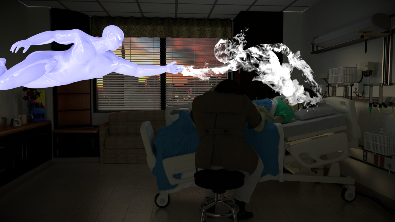
So I rendered this overnight and came out with this:

I closed the blinds, but the spirits head is still a little washed out. Hmm, perhaps Ill have to do more compositing. I also think I need to keep working on the room because it looks lacking.
Please I would love critiques or comments on how to improve anything from colors to composition to even materials! I really want to make this one stunning, but it’s not quite there!
Alright here are my thoughts…
-first thing I think to move forward your going to have to address the lighting in the room. Although you have put in a lot of work on the details I think your best approach is to darken the entire room and have a single light source comming from the ceiling over the kid. This light would also be dim but enough to get the focus of the scene in the right place. Open the blinds back up a little and have some light comming from out side, it could be dusk or dawn so red-ish orange light and put some angle on it so you get some intersting shadows on the floor which is dead space right now. Think of this moment in time as sureal and angelic not so realistic as far as lighting goes.
-second now that the lighting is refined I think the spirit should have a slight emission value to glow a bit and maybe be more of a hyper blue-ish color.
-third I think the smoke texture on the spirit isnt quite right. I’m thinking something more ghosty and maybe with some streaks comming to the base at the boy maybe like this
-fouth you could also add an additional stark white foreground light comming from behind the camera not super bright but just enough to show the detail of the mother.
These are all just suggestions…I just think I can understand what your trying to convey but right now its not quite there, not with the modeling, but with the lighting. I wouldnt add any more detail to the room until you have the lighting closer:)
Good luck and Happy Blending!
try using a different shader for the skin, it’s not very realistic right now. I think someone posted one in Tests.
Thanks guys,
DerekG: I have a particularly hard time with lighting, but I guess i’ll have to learn  Do you think a red-yellow or a more purple evening would be more appropriate?
Kemmler: I’ll check out the skin shader, thanks for the tip. Its pretty difficult in Cycles.
I hear ya…it is definitely a fine line to walk…lighting is alway difficult but it makes all the difference. Think of it like another texture over all the others, you can add interest or take it away.
Since your scene reminds me more of “nothing ever really end” and “another chapter” I think a early dawn “new day” would fit nicely with the theme. So maybe a nice orange red sun and I would think that if you add some glow in the compositor at the end the blinds would look amazing and you wont even see the buildings outside. The only thing the cycles doesnt do right now (in trunk) is god rays which would be cool comming from the blinds but I dont think they are a deal breaker.
Also on the skin shader there are some great threads on Blender Artists for cycles SSS so give it a search or google it. I did for vegitation and found a pretty easy shader mix with transparency & translucency & diffused. But for sure you could render the SSS in BI and then composite into cycles render. Mostly right now I think the color is just off and almost a velvet look where skin actually has some spec and texture. I’m sure cgtextures has a skin texture you could start with.
Anyway hope this helps:)
Happy Blending!
I worked on it a little, but did not want to entirely render, so I just did this in the view port. I wanted the light and shadows on the kid, but that means that it couldn’t be on the floor at the same time. What else do you think I need to do to get that “supernatural” look? There are sadly few references online. I guess I’ll go and check some examples on CG Society.

Edit: I just realized that this looks like evening and not morning. Hmm…
Seems a like there is quite a bit of ambient light. Do you have another light source? If so, I’d get rid of it. If not, i’d lower the emit on the outside texture/map.
Rendered overnight:

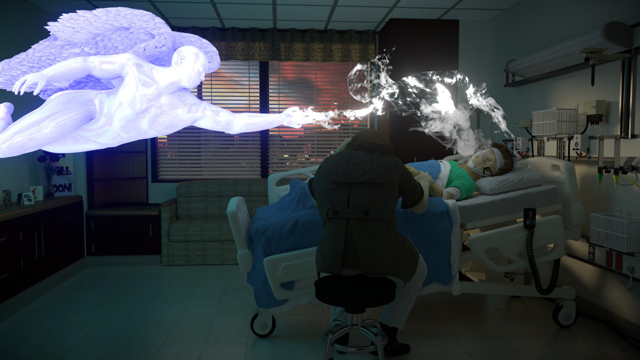
Thanks DerekG, the lighting helped a lot. Not quite there yet, but a lot closer!
Great job so far! But that rainbow-colored book on the left is really distracting from the main focus, and I think it would be better for the ghost to be coming out of the kid’s chest. The pillow could also use being more “deflated.”
And I don’t know if you have this already, but if you look out the window, the left side is yellow while the right side is pink. I understand from earlier posts that you put a pink light outside, but what about a yellow light at an angle to shine in more towards the main focus? I think that would help light it better.
I think you should change the background image because it looks like it’s been taken from the ground with a pretty wide lens while the scene itself has a different focal length and probably isn’t on ground level. See how it almost looks like the buildings are falling? EDIT: Seems I accidentally missed a page and you already changed it. My bad.
I’d also work more on the boys face because that’s something people will primarily look at. Also it looks like the woman has pretty wide shoulders.
As for the pose I’m not exactly sure what you want but there ought to be some good references if you use the right “search phrases”. https://www.google.fi/search?hl=fi&q=reaching+out&ix=sea&ion=1&bav=on.2,or.r_gc.r_pw.r_qf.,cf.osb&biw=1920&bih=1066&um=1&ie=UTF-8&tbm=isch&source=og&sa=N&tab=wi&ei=aH5XT8jqJ6Ld4QSQuomZDw
Looking better but it still seems like the camera placement and lighting could changed to bring the scene to life and convey the story. I hope you dont mind I put together a mockup or your scene and played with the lighting and the camera angle. The problem is that the window is drawing all the attention and in my opinion should just glow more with less background image and that be the golden god rays calling the kid home. I know you have detailed model objects along the wall on the left but I think they could be rearanged to still be in the scene.
Also if you look at the lines of the walls with the room narrowing visually towards the back wall where the window is, everything is telling the eye to focus on the center of the image which is the window. By breaking that angle you eliminate that issue. I also widened the camera angle quite a bit to like 25 or 20. The sun light is from a sun lamp and I played with the size and the intensity. I had to reduce the size a lot to like 0.002 but it depends on your scene scale, reducing the size will better define the shadow of the blinds on the floor.

It’s still very grainy but I hope it helps with the lighting:)
P.S. I havent been able to work on my scene at home with my computer power supply being toast, but I plan on taking your suggestion and changing the camera angle a bit there to help the viewer see the grave stone again. I hope to post something soon:)
Happy Blending!
Ah, well I see there was a slight misunderstanding. My bad. I had not finished what is an essential part of the composition. I just rendered the angel and pasted him on top so he stands out and is not invisible at all right now, but this is just to get an idea. I can see how that could throw you off a lot, and make it seem lopsided.
I am working on the wings, they are super hard to get to look decent!
Gordax: the stuff on the left are get well cards, and I may tone it down. I actually don’t have a pink light outside, but I need to change the environment lighting so I will keep that color in mind. I really don’t understand what you said next; the yellow light is shining faintly on the kid right now.
Ben: Thanks for the references, it does help, and I will try to fix the mom, I never noticed the shoulders.
Derek G:I see how if I didn’t have the angel I would want to change the angle, but what about now? I feel like too much of an angle would be odd. I may add the “God” rays, but I think it may be distracting. I want the focus to be on the two spirits almost touching hands, so the focus would be a little above the middle of the scene. Also I think I will combine both types of texturing of the ghost.
Sorry for not putting this up earlier, I know it changes quite a lot in composition. Also once I have everything posed right, then I will go in and sculpt the nasty deformations out so don’t mind those right now.
That’s going to work much better, didn’t know you were adding an angel.
About the wings, I just modeled and am rigging wings for a bird to be able to fold them in. Real pain to be honest. If you need any help I might be able to give some tips. Good luck with that! 
I did a little work on the lighting. I don’t want it too dark because Andrew is always saying how making something dark does not improve the mood. I have heard him say that so often I am leery of even this.

Geez, I feel like I’m constantly working on this, but I still have a ton to fix and there’s only about a week left.
So I did the wings, but if you have an idea how to make them look better please share because it is incredibaly difficult. Also I changed the ghosts material a tad, so please critique that as well.
The backround in this is not updated, it is only for use in the angel’s reflections.

Any comments? I need to finish this up next week because it will take about 2 whole days to render cause my computer is slow.
Maybe give the angel and the ghost some transparency?
So I think I just about finalized the ghost’s texture. I will primarily focus on the angel for now, for some reason his transparency in not working quite right.

Hmm, I tried one more lighting thing, this one where the spirits emit a little light, so they look more incorporated in the scene. For some reason the light gives the boy a weird forehead shadow, so I need to work on that. Which one do you like better? I assume I could bring it out a little more in post pro. so try to see it from that angle as well. I tried to make it a tad brighter, especially for Andrew Price:eyebrowlift:

Thanks for all the help, I need as much as I can get:o
Edit: I just noticed I forgot to turn reflection off on the characters, so ignore that.
Alright, we’re finally getting somewhere!
I have 1 week to tidy this up and this is my to do list:
Make the boy more pale and the mom more “rosy”
Give the angel transparency
Fix the little specs on the wings
Add a few more things to the hospital room like a failing hear rate monitor, a Bible, and a ceiling trim.
Make the ghost’s transition more smooth.
Apply armatures and sculpt out bad deformations and add more detail into the angel, boy, and mother.
Anything else I am missing? Critiques?
Thanks,
Jonathan