This was first sketched, then painted with a wacom in photoshop. Let me know what you think.

looks pain full the way he’s got his fingure but its not a bad cartoony picture, only crit would be the nose
Thanks for the comment. Yeah, I would probably agree about the nose. It is supposed to be cartoony though (hence all the other distorted proportions).
I’d work on it more, but as you might imagine, the digital painting learning curve is pretty steep right now so I’m moving on 
This is way better than my first try at digital painting. Probably doesn’t help that I can’t draw to well hehe. I like this, I say you should use it as a concept and model it!
I dig it!  Haha, made that just for you.
Thoughts:
-
Theres a little too much contrast in the shading department. Not like shadows and highlights, but its a little odd how the bottle is very shaded, but the shirt looks very flat. Things like that can throw the eye a bit.
-
Now that I look, a little more contrast would definitely help(since there appears to be only one light source). However, if you want to keep it a little lighter, a soft blue or green tinge to the back side of the man(the parts that are in ‘shadow’). Basicly like a fill light.
3.Use a sketch as your base, but as soon as possible, turn off the sketch layer(its best to use lots of layers, because that gives you more control, far more than just undo. A lot of folks say that its better to force yourself to learn without layers to up your skills, and I do that from time to time, but the major artists all have no problem using layers, even on speedpaints. Its just smart) ha, that was a long parantheses thingy. Anyway, turn off the sketch layer, and finish up the painting. Its a little shocking how much better it can look without the outlines.
Really fantastic first image, man  Looking forward to a sketchbook from you!
nfollmer: Thanks, but I don’t know about modeling this guy! Maybe this summer…
free_ality: Hehe, thanks for the ‘dig it’ smiley.
-
Very good point about the bottle/shirt problem. I’m tempted to try adding some deeper wrinkles to it now…
-
I already have added a bit of fill light, just not too noticeable. Maybe some more would help, especially on the shirt.
-
About layers, I’m already overloaded:rolleyes: so I don’t have to worry about that. About the sketch layer, unfortunately it looks way worse with that enabled. I need to outline it manually I guess, to give it a cartoony feel. But yeah, lots of the detail is really in the sketch layer.
Thanks for all the crits!
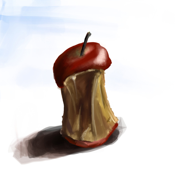
Here’s a quick one of a rotten apple core on my desk. (I have a really clean desk.)

Nothing special. Just playing around with blocking out colour etc.
I like the apple. Doesn’t look like it was made with a computer. Very painterly.
Thanks That’s always the aim, isn’t it. The apple was done in painter, by the way.
That is true. I wonder if there are painters that try to make their work look like it was made on a computer?
Ha, that would be funny. Never would have thought of that. Could be the basis of a one-panel cartoon.
Yeah. You could have the artist with his easel setup with a computer model set up.
Umm…this one one sorta…more like a photograph

Well that’s just unnatural… not sure I believe that one…:eek: Where’d you find it?
Updated version of the apple. It’s pretty dried out by now. Interesting to paint :rolleyes:
It’s is ligit. There’s a website documenting the 3 guys who did it. It was in some big art magazine (I forget which one) but I dont think they’d put it in a magazine without seeing the painting first…
Thats pretty darn impressive!
@Blenditall: Nice work on that apple, looking very good! Add some texture, texture is key to a good image(as Ive been told, been seeing, and am trying to employ). How is painter in comparison to photoshop? Ive heard artists swear by both, so just wondering your opinion…
Oh yes, sorry…very nice paintings! I just tought myself basic digital painting with my new project (link in my sig, the '08 one). The apple has some very nice basic colors, excellent shading and now just needs a little blending and detail imo. If you want it to have that “blocked-in” look, excellent! I’m a big promoter of having your own style in art.
Wow, it is legit. It may not be digital, but still. :eek: Cool book project by the way, .:|shADoW|:…
Free_ality: Thanks. I can’t technically compare painter to photoshop, because I have photoshop CS3 extended and painter essentials 3. So that version of painter is pretty basic. Having said that, I must say painter is pretty amazing for this. It’s much more like real paint. Brush strokes really look like brush strokes, paint mixes with or slightly smudges the colour below it as you paint, you can use watercolour, oil, acrylic, etc, and they all have accurate looks, you can build up thick layers of paint, etc. You can really feel the paint coming off the brush and onto the canvas. You really have to try it to realize how good it is.
I get the feeling photoshop can do some of this stuff too, I just haven’t explored that aspect of it because I haven’t really been into digital painting. Time to google.
Here’s what you might call a quick ‘layerless’ paint:

That was done in painter.
I think I’ll try to do the apple in photoshop now, just to see how it turns out in comparison.
Im pretty sure Photoshop can do about everything that painter can, but the smudging is questionable, so you have to get good at blending via opacity contol on the brushes.
If youve ever got any questions about painting in photoshop(technical questions, artistsic questions etc), feel free to pm me or post here or whatever. Id be glad to help
Apple!!! Nice apple. That cliff looks a little undetailed. The brush strokes are very square too, so it looks almost pixelated at the trees.
Wait, so is that photo real picture digital or traditional?