This is part of my longstanding journey to find a proper emulation of the 90s render stlye from things like the POVray render challenge 1995, ninentendo promotional renders for DK etc and eventually the prerendered background of MYST and Fallout1. See here: Starting a new 90s shader thread
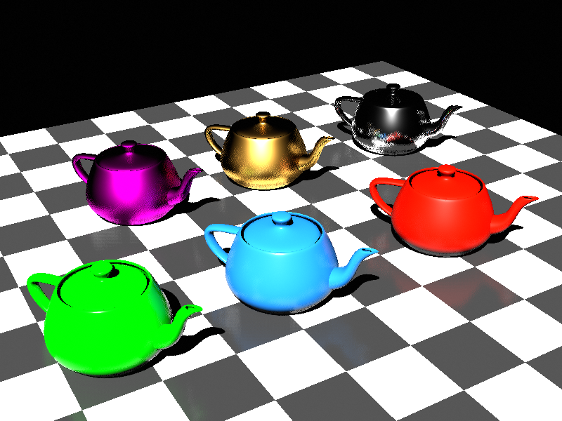
#1 This one is Eevee, no world, 1 sample, max shadows
Materials: Principled BSDF, Specular 0.5, different metallic and glossy levels
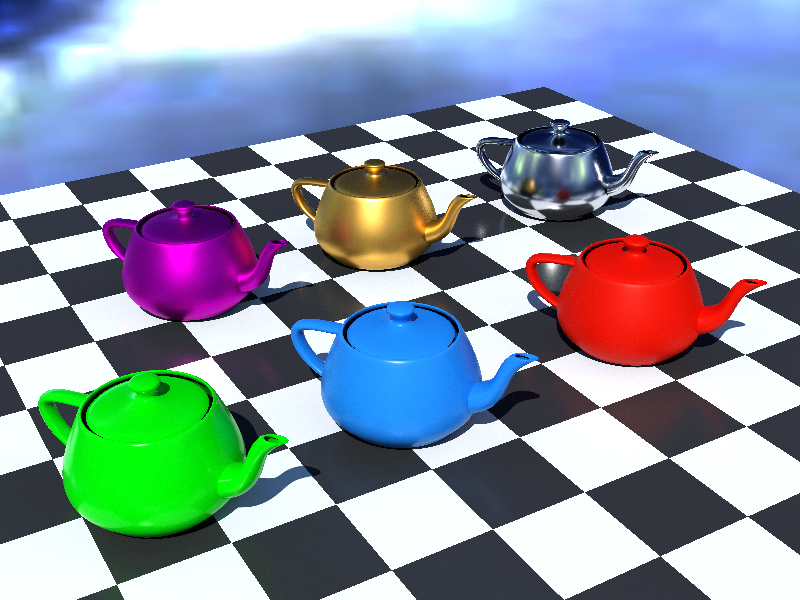
#2 This one is Cycles, generic PNG on srgb world, 5K samples, raytraced shadows
Materials: Principled BSDF, Specular 0.5, different metallic and glossy levels
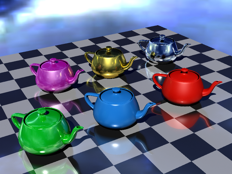
#3 This one is my previous setup, I called it V3.1 or Renderer97
Cycles, generic PNG on srgb affecting only glossy, 5K samples, raytraced shadows
Materials: Diffuse + (Glossy GGX + Glossy Sharp), anisotropic for metals, different glossy levels
Of course for full immersion, limit to 256 colors and dither will be added in post!
At request I can once again share the files via google drive. Please let me know what you think. If you say that my current setup is doing what it’s supposed to do I can finally rest.
I think the last image is the most authentic. In the 90’s, materials rarely used rough reflections, as they were too expensive, so your sharp reflections in that image are accurate.
Rough materials were faked with blurry speculars layered on a diffuse base, which looked a lot like your blue and red teapots.
Using an HDRI is fine, as long as it doesn’t affect the diffuse component. Reflective objects were often faked using cubemaps, so this is close enough.
3 is the closest, but I agree with Etn249 - your reflections in the floor are too nice.
Also, I see you’re trying to reproduce the jagged lack of antialiasing, but one should keep in mind that on a screen in that era, the render often didn’t look as jaggy as you have there. The screen itself wasn’t razor-sharp LED pixels, and as a result the image tended to soften out a bit when viewed.
So - yeah, technically the non-AA is correct (at least maybe with POVray, not everything lacked decent AA control by the mid-late 90s… and POVray was never something we held as a high standard in the first place, compared to most anything else), but it looks a little too … emphasized.
Yes! That’s exactly what I’m going for, I’m so relieved. You might notice that shiny things have two types of reflection. One sharp and one material based, made by mixing a glossy akshim-sherley with a glossy sharp. I copied that trick from when I tried to recreate a POVray image in blender, called Teapot2.
The HDRI does specifically not affect diffuse, that’s something that can be turned on and off in cycles world tab.
Cube maps I have tried and they are way too clumsy for my liking. I’m glad to be close enough, my journey might have finally come to a close. Thank you
I hear your criticism, luckily that’s something that can be remedied through multiple different techniques, such as using AA or in post (I’m adding the dither in post as well). I’m so glad to have finally reached something we’re all happy with. Thank you