I am ALWAYS impressed with your work, Vicky, but those are some HUGE floor tiles!
Hey, the lady likes big boards in her hardwood floors and I see here big tiles. But, then I’ve been told it’s my eye. LOL Looking good, Vicky.
@Frobenius.Edge: Thank you much! 
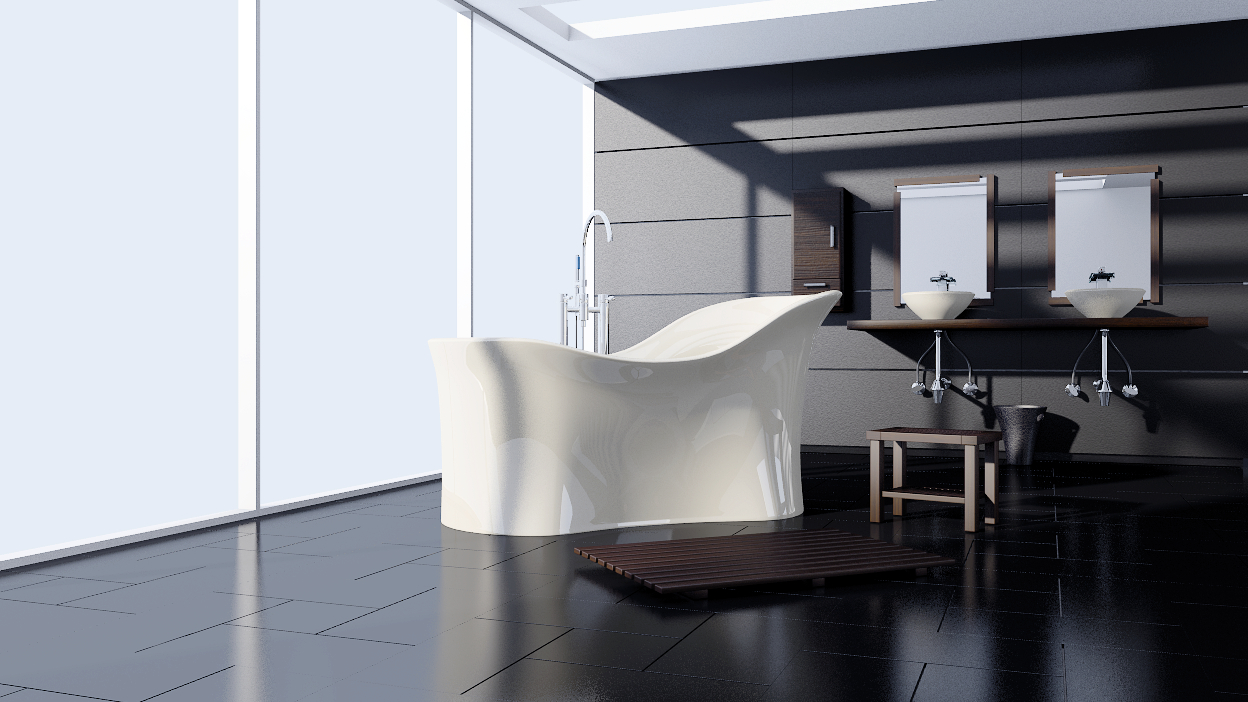
@Longaly: Thank you!  The tiles aren’t really that big: http://www.pasteall.org/pic/72661
@theoldghost: Hehe! Thanks!
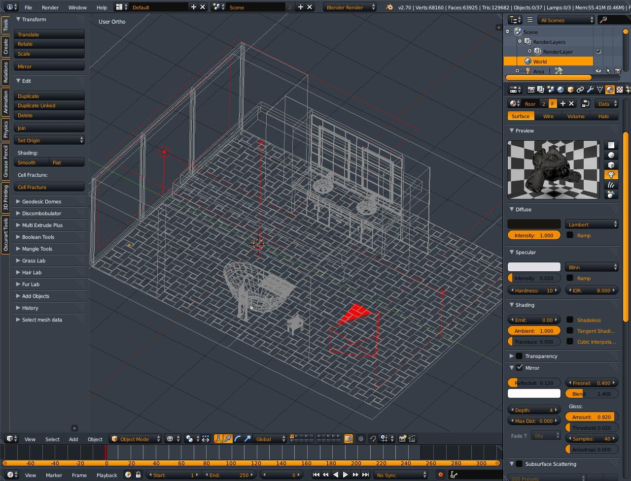
Little update, changed it up a bit. Rendered with crap settings, so don’t beat me up! I am playing with different mats now that I changed the lighting, this might look totally different in about an hour :eek:
Attachments
Very nice looking cab work.
You’ve made some interesting changes Vicky, must have been a tough decision to cover up all that sink plumbing you worked so hard on. As Anthony mentioned, the cabinets look nice, and I think adds to the scene overall.
Thanks guys! Yeah, I hated to cover up that plumbing, but I have it saved for a different shot
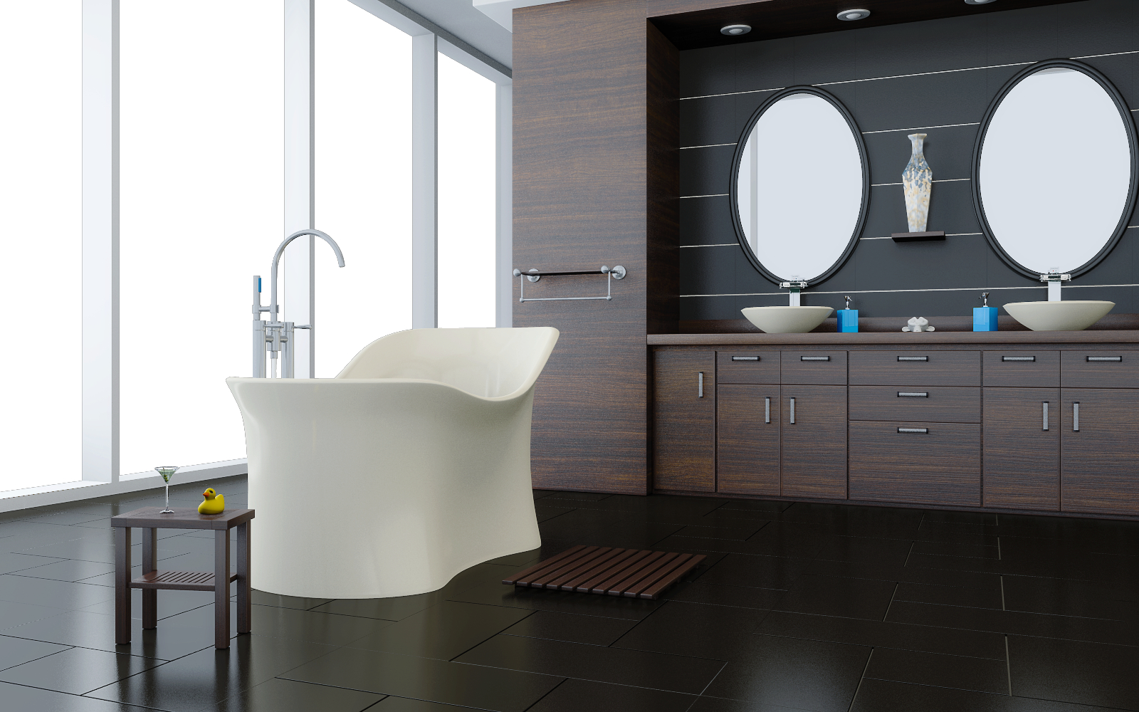
I cleaned up the cabinet material a bit, and rendered it with decent settings:
Another new shot:
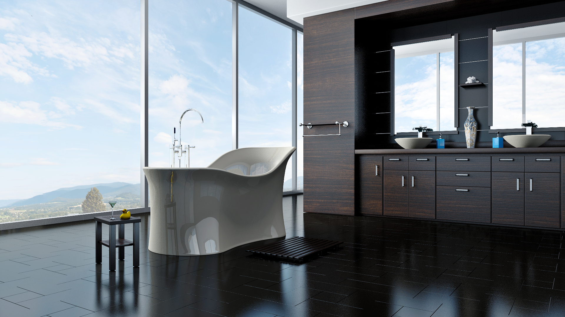
Got a couple of more things left to do, towels, and some lighting stuff. I’m going to probably bring back the slightly larger tiles from #43. If it would stop storming it’s butt off in Atlanta, maybe I could work on it today and actually finish it 
I see you have added some nice additional details with the soap containers and martini glass. I feel like the tile size would be fine as in #43, but your very early posts, the tile sizes were probably too large.
I wouldn’t want to be your plumber… you keep moving that tub all over the place 
Hi.
I noticed you already put a lot of work into this, the modeling and materials look good so far.
On the lighting though, I know you pride yourself in making simple BI renders look like they could’ve come from Cycles, but the light rig setup here is going to be a bit more complex as you would need to take care of the dark regions as well as the lack of color bleeding (if you don’t want people seeing it to immediately single it out as a BI render).
Though you said yourself that the lighting is incomplete so I’ll reserve judgement until you get that part done.
@harleynut97: Thanks! 
@Ace Dragon: Thank you! Yeah, it still needs some work, especially around the cabinets. I haven’t even used an AO pass yet, and the lighting isn’t set in stone, so we’ll see how that goes
I thought I once saw a compositing setup long ago that gave a ‘colorbleed’ effect in the AO pass, but it’s pretty deep in the archives so I’m not sure if you will find it.
You will need to note that AO added through compositing will not apply it to areas being reflected. If you want to have precise control over how the AO is applied to your materials and have it reflected and refracted, you will need to turn on the material nodes and use the extended material node to edit data that’s input into a second dummy material (since it provides an AO output and a diffuse output which doesn’t give AO).
Hey, Vicky, I’m following this thread again for a while now. Awesome work as always.
I also like the bigger floor tiles better than the smaller ones. My 2 cents at the moment would be the bump on the cabinet’s wood which is a tad to strong in my opinion. And there are some shadows on the inner side of the window framework, which are surely artefacts from lighting. They are good to see in post #47.
@Ace: I’m going to composite in GIMP, with a simple AO pass
@minoribus: Thanks very much! The shadows on the window frames are actually reflections, they have been blurred out since. The bump has been tamed as well
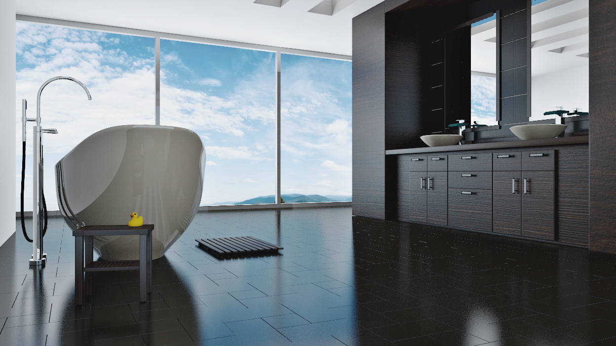
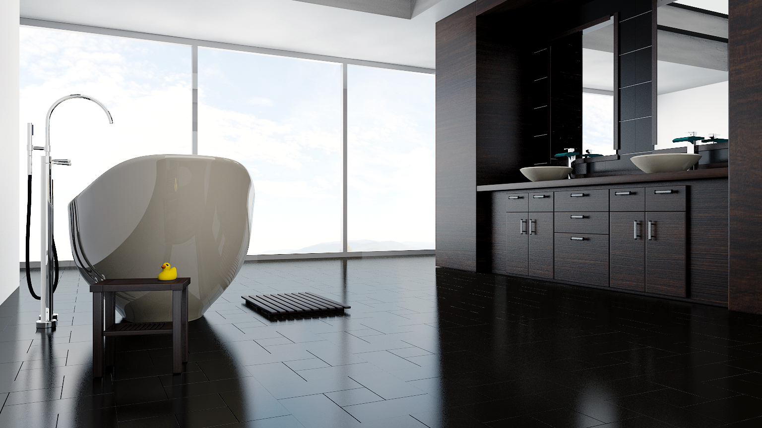
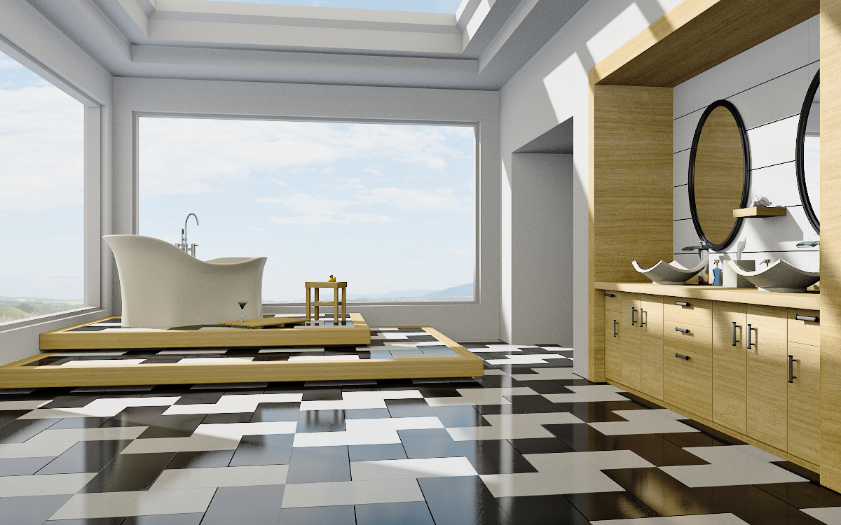
This was a test using no background or environment map, just a white sky, and I don’t like it(reflections are too plain) I’m going to introduce a sun and environment today, and make the towels, then see where this goes. I see the repeating textures on the cabinets, that has been changed already
I like the duck, scrap the rest and start over. 
@AnthonyC: Ahahahahaha! I just might do that! :eyebrowlift2:
The switch on the mirrors looks good, I kinda of like those oval ones, but I agree, you need your environment back, it seems like the mirrors ( at least at this last camera angle, seem to only be reflecting the plane white background.
@harleynut97: Thanks, and I agree too! Here’s a new approach, only sun _ Env. lighting right now, crap AA settings, and no gloss on the wood for this test. I also have to change some of the textures on the doors again, I had to rearrange them so you can fix the plumbing if you had to 
I think the platform idea is a real nice touch. One thing I would think seriously about doing, is changing your grain pattern on the wood to run vertical rather than horizontal… On the bathroom cabinet side panels.
Now just when I was warming up to that darker wood…BAM…she changes it:) Did you first try the darker wood with the new design?
The new skylight and resulting light looks great Vicky.