Yes, that was my proposal (see a few posts above) 
A second thought about that: the current topbar behaviour could also be kept, as a hardcoded preset. And an option could set icon/text look, so also @Regnas topbar could be easy to have
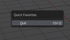
The favourites menu is a Godsend. Thank you Campbell!
Having said that, does anyone else think the new menu arrows look tacky compared to what we had before?
![]()
Bring the double arrows back!
They expand downwards so why should it be double arrows?
Edit: Well I just saw that the ones that expand upwards also have arrows pointing downwards - so yeah that probably will be fixed.
We talked about this before… the double arrows was getting too noisy as we have too many of this stuff together on the interface now… the single arrow is the way to go, besides, single arrow is standard everywhere…
Now, style wise, I still prefer the old “bold” type of arrow (▼) ![]() but it’s not a big deal…
but it’s not a big deal…
This is not something to fix, this is how it works: Blender 2.8 development thread - #6577 by TheRedWaxPolice
I missed that conversation. My main objection is with the style of the arrow. I have no issues with it if they use the bold arrows they were using before. They look thin and insignificant currently.
I agree…
Sorry, the troll inside me couldn’t resist. 
Glad to see such possibility, that gives me a nice birthday.
5 Likes
William Reynish updated the properties design task for the checkboxes, with a few propositions
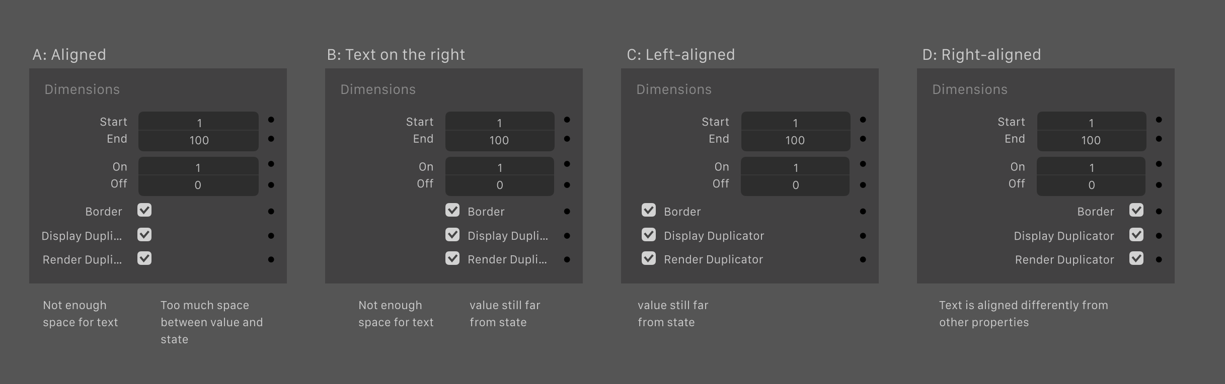
Which one do you prefer ? (At the moment it says that they are going for the C, but I think the D is better so that everything is right aligned)
1 Like
D: Right-aligned
A, as mentioned, this has not enough space for the text. So this is no option.
B is better, but the problem still exist. The only profit here is, that the visual lines doesn’t break.
C kills the visual lines and breaks the coherency a lot.
D fits pretty well and you have short access to setting up the keyframes.
You should only consider to break up the paragraph after a certain range to avoid unreadable text.
The main goal of text is to be readable - everything behind is optional.
Without, text has no meaning.
3 Likes
IMO I think B and C have the advantage of an “aligned text fields”, which for a lot of people is more readable, fast to search in a fast pace, and is almost mandatory for people having reading/sight disorder.
But the problem is that the text fields are easily cropped on B (and A), huge screenspace waste on C and A…
But with C, we can crop the pannel’s width to make it not waste. And if it gest cropped up to the point some text fields get cropped too, at least it’s only the end of the text fields, the start is still visible and I’m sure that keeping the beginning of a text field is smarter than the end.
So I’m going on C too.
@lsscpp yes, I’m one of the first upvotes actually 
I agree with you. D seems to be the best option for this.
1 Like
In animation, or in design, when we present shots/concepts to a supervisor, we are careful to have at least three, so that instead of trying to come up with an alternative you might not agree with, they will instead point at one of your three proposals and say “that’s the one I like best”.
…I like D best.
1 Like
yep D all the way
Hm… D looks right for single-column layout. But that might look a bit silly when it’s multi-column.
For that reason, if this alignment extends to both single- and multi-column, I choose B or C.
Actually, B might even work better for coherence when items are being shifted around when going multi-column.
Edit: It looks like they’re going with D? https://developer.blender.org/T54951
we think the best overall solution is D: Left aligned checkboxes.
“Left aligned checkboxes” for D? Am I the only one who’s confused?
 Looks like D won anyway, see:
https://developer.blender.org/rB861b0ec4170958814955eadf49c36109eacf9972
2 Likes
They really have no plans to put back the slider labels back into the sliders… 
It seems, I prefer the slider label in the slider.
5 Likes
I just want a solution that makes the gridflow layout usable. The way it is now if I want to have 3 columns I need a gigantic panel, cuz of those labels. ![]()
My main concern is about expanding the editor to have the 3 columns layout (as I’m against the single column layout)… The labels are in the wrong place, eating too much space. I talked about it before, and also suggested something here: Blender 2.8 User Interface/Usability