Good points for sure 
agree with all wath you said
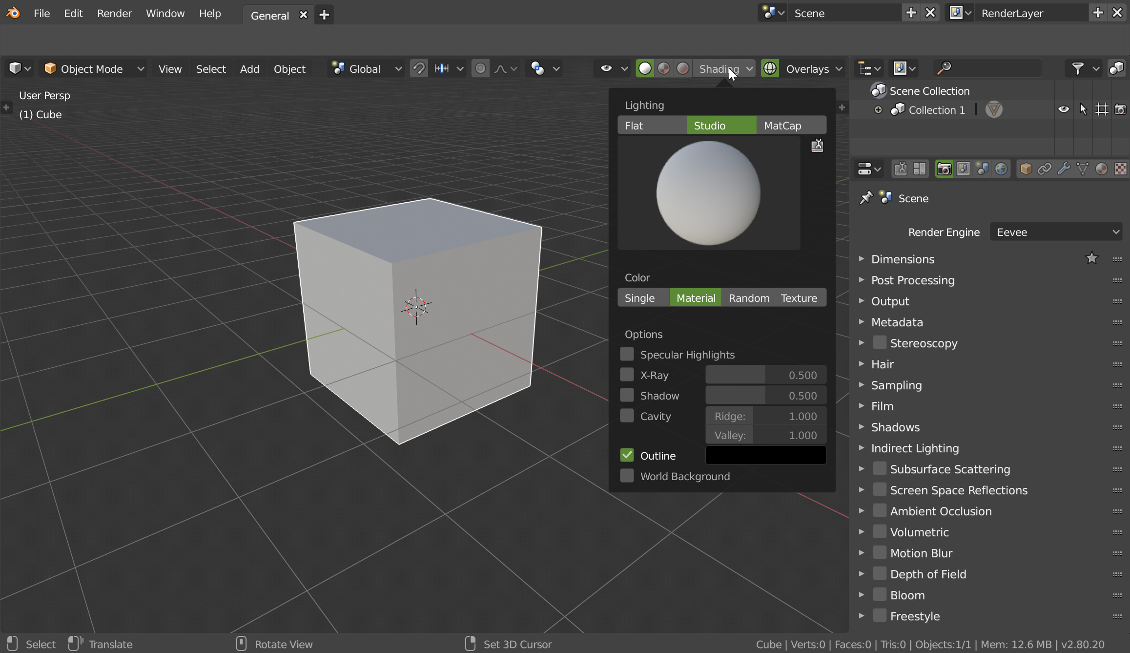
It makes sense for roughness to be per material in a per material color mode tbh, but an added global roughness settings next to the specular highlights checkbox in single color mode is also needed imo
2 Likes
Yes, I showed the material part only to have acces to the options.
1 Like
good points and I agree.
With secular and shadow maybe they try not to flood the overlay UI with to many detailed options
I could see a global specular setting but then use materials to overwrite it like individual matcaps on a per object basis
2 Likes
I agree that the shading options should be in one place, and I would like having the vert count in the 3d view, but I don’t think the rest of the status bar info should be there. The info concerning tool options would get annoying fast if it were displayed in the view port every time I use a tool. As a new user, I would try to hide that info sooner than I would with it in its current location if it were in my face while I was trying to learn blender.
They just updated it so now you can pick your engine for each material output in the graph. So, you can set the current to Cycles and copy it to have a second material output and set it for Eevee and have separate material graphs (within the same material) for each renderer. This is pretty awesome.

2 Likes
I was just about to say the same thing! It’s time for viewport presets now. 
I would LOVE to have a small row of buttons: ABCD or 1234 next to the shader options that can store preset setups. Transparent with wire, matcp with random colours, eevee with wire etc, In the old blender you had fewer ways to represent your work and I’d like to store and retrieve ‘look’ presets.
3 Likes
I really like in 2.79 using the hardops plug in… on alt v they have a small pop up with presets: minimal, full, matcap and normal map… 4 presets that are configurable would be ideal for most use cases with fast switching!
I agree with some of your points, but I am not sure about moving everything from the status bar to the view port, I agree with you for the mesh data infos part (vertices number, faces number, …), but for the modal shortcuts, it is a more general thing, a lot of editors use it, and for small monitors, I think it could occlude for some tools a big part of the 3D view (and I don’t think you want a bunch of text popping in your 3D view). Maybe we could have both and have options to choose what’s in the viewport, what’s in the status bar.
And IMO, even if it is a good point that some options for workbench (shadows, cavity, …) require additional actions from the user, having these options in the popover would increase drastically its size, and as you said it is already hiding a big part of the 3D view, and IMO it is not important option, and more than that, it is in the workbench, those shadows for example are only supposed to show the contacts between the objects, this is not a beauty option. If you want custom shadows it is better to use EEVEE.
I understand everything that you say, but I’m afraid that it is more complicated than that. 
1 Like
It’s always more complicated than that.
Like I said, put an arrow to hide the options ton not have a big popover should do the trick and yes, it’s useful to rotate the shadows.
Eeevee is great but not on big scene right now.
For the texts in the 3dview, yes, why not have it as option.
1 Like
Pablo sent commit with many of the changes required here by users.
Thanks devs!
https://developer.blender.org/rB55d44a3b6bab2bd91fd1a15de6a18db592b196b3
https://developer.blender.org/rB160959152ebc980130c2c56bab3471167257eece
https://developer.blender.org/rB78fc4b592aae07da3196c845b07764a08be779ba
Matcap list still covers a lot of 3d view, maybe more narrow list would be better?.
5 Likes


This makes me happy! Go Pablo!
Yes…
Thank you devs… 
Great work guys! Glad we were able to prove the importance of having the Shading/Overlay Pop-Overs on the right. And to bring back the View Object Type list grouped together with it. Weee! Thanks Pablo! 
Now lets all get together and brainstorm how we could clean-up the Status Bar. Move the scene info into an OSD in the 3D Viewport like @pitiwazou suggested. And also have a section in the Sidebar (N) Panel with settings to control what information we’d like to have visible. Color & Transparency of OSD Text, Etc.
If we present our suggestions in a constructive way and with good mock-ups and proof of functionality. They always listen & change it. It’s what I’ve come to love about the Blender Devvies. So let’s keep up the good work, All of Us. 
Don’t know if Pablo saw my video or my post on devtalk, I hope. But yes, the best is to make mockups with explainations about why it’s bad, how to fix it and post it on devtalk.
1 Like
