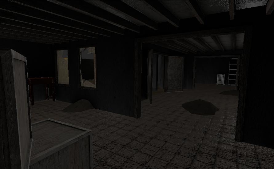
Reworking the Spitter
^ Wow that’s very beautiful. Great concept, great model, great textures. I like the rough iron and wood.
I’ll pass that on, thanks!
Hello Blenderartists!
I have a new chunk of information for you all!
As progress is coming along well, we are looking at all areas of the project.
Thus, it ought to have come to your attention that our (my) logo is looking a tad poor.
Therefore, i have come up with a master plan!!
I am opening a competition:
Design a new logo for Matter.
The Logo may be of any size (preferably as large as is possible, in terms of source files).
The logo must be set in the cold war timeperiod, but may have space age elements, such as the spitter.
The logo must include matter as some text.
If there is a logo that we like a lot, we shall use it as our emblem!
You can see your work in our game!
Of course, you shall be credited in the release.
Please do have a go, i’m dying to see some inspiration!
hi
i could help with some modelling and animations for this game
but i would also like some more info on it anything that can help me
so if you happen to have a planning let me know
and how far are you on this game
let me know,
DWL
If you wish to help, please show some of your work, so that we may judge if we have space!
Progess is shaping nicely!
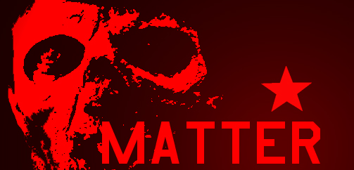
Still a bit of a WIP but is this the kind of thing you were looking for?
![]()
That is rather fantastic!!! Let me consult with my team!
Nothing particularly serious, just thought I’d have a play with Photoshop after all these years…
Are you able to keep working on it? we quite like it!
Thanks for your effort Rubbernuke!
I don’t think that we’ll use your logo, as it is quite serious, and we’re aiming in the direction of slightly comical.
I noticed that in your demo video - the gun was able to move THROUGH the table? Do you plan on fixing this?
You’ll notice most games have the weapon rendered as x-ray. Which means it is rendered in front of everything
Yes, i’d gathered that. I suppose that i have two courses of action; moving the gun within the collision box, or having it on an overlay scene (which i’d rather avoid)
yeah i can work on it ill do some work later 
Actually, Rubbernuke, keep going with that concept. I want to see it!
Nice logo rubbernuke that skull is awesome 
Thanks for the high praise! I’m currently using my wifes netbook (which is powered by a rubber band) so I am having to play with PowerPoint. Here is another rough concept (please forgive the white border on the right- MS Paint is rubbish at cropping stuff).
I feel slightly guilty as both these images are highly retouched pictures from the internet (i.e. they have been manipulated with filters, cropped, brightness adjusted) so although I think they are OK, I just wanted to warn you all (after all its difficult to find certain subject matter, if you excuse the pun).
So is this better?
EDIT: Here is another I’ve quickly done- just cropped the image properly and added an M to the forehead (and used a halftone filter, which on reflection I may take out next time).
Attachments

Nice one rubbernuke, you could definately improve it by making the black around the skull more grungy and maybe having some red, or blood or something. I think you could also get a better font for the text. These are just small things but the way its progressing is really good.
OK, what sort of font were you thinking about? I am using square, chunky fonts that emulate either militaristic type (my first red logo uses a USAF font) whilst the one above I thought might use a blocky ‘horror film poster’ typeface.
I will certainly play with the colours some more. Half of me likes the flat 2 colour look, but I will certainly try what I did with the first logo (that grungy look you describe).
Do you like the balance of type to picture, by the way?
But I’m glad you like what I’ve done so far! Will do some more soon (when I am on my main PC- using the netbook again).
