Monsters In My Milk

I just stumbled by this thread: man it looks great! The style, the chars are awesome, they tell a story by themselves without even kwoing their part in the book!

Anything you might need, let me know, I think everybody want to see this ook through!

Keep it up!

Are you any closer to finishing the tutorial on how to create a character? :slight_smile:

Aye! You’re at it again. So can you remind me, I thought this was supposed to be for a book or something of the sorts. Is that still going to be?

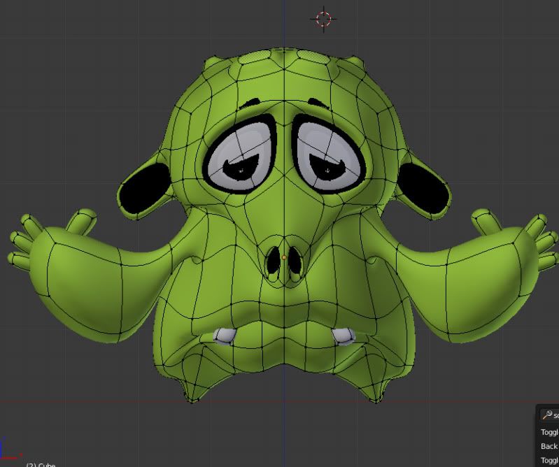
Thank you very much Khell, I will surely need some help/input when I start the layout for the book. It is a challenge creating a book with 3D illustrations I just hope it turns out good.

@esloc03 I am uploading them as we speak I will inbox you when they are up and running :slight_smile:

@GraphiX Yes So far these characters are created for 6 different children’s books am currently working on.
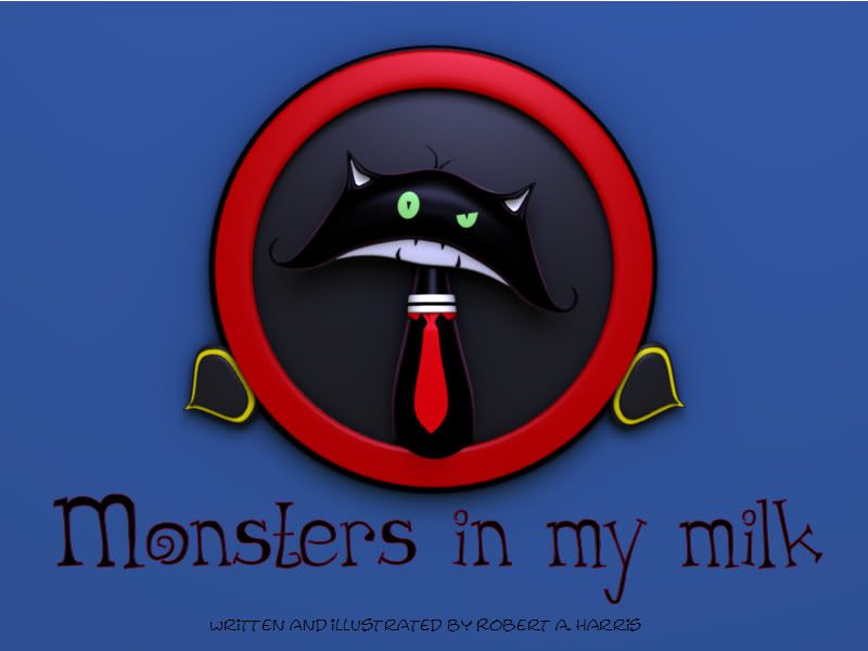
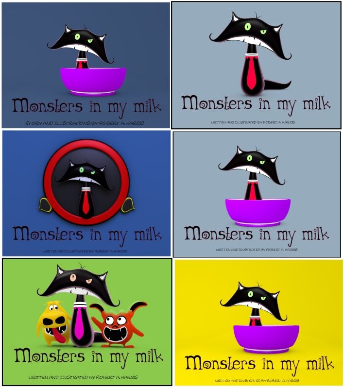
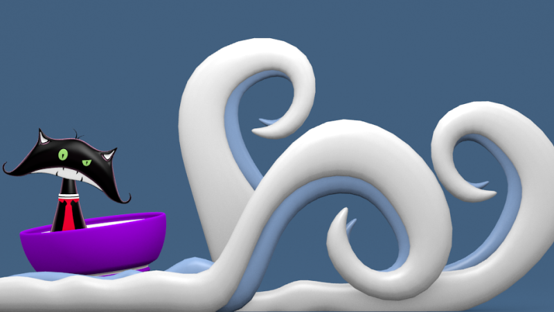
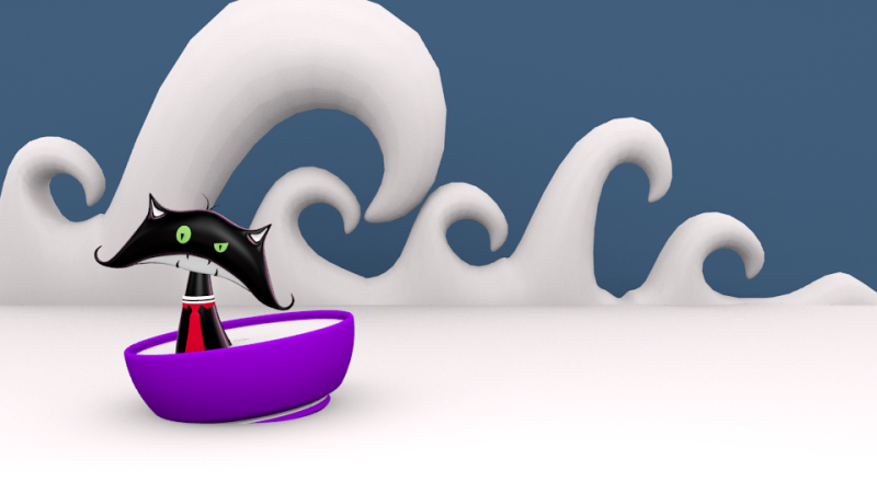
The new characters look great! I really the style. Cello the Slubber’s cool :smiley:

I thought I would try out cycles with my new character.

I am in the process of designing the book cover. I would like to know if these concepts are appealing or if I should go in a different direction.

I really like the second one and am leaning more in that direction.

yep, the second one!

Thanks Swirly.

This is one of the official monsters that will be in the book.

Here is a selection of book cover mock-ups I created so far. Feel free to share which one stands out/strikes you the most.

I love it, fantastic work!

I like the one with the round frame (middle left) better.

Wonderful stuff in here, keep it coming.

Ha, i like the cat.

Thanks guys.

I am playing with some abstract water/waves for the illustrations. Does this look ok?

Anyone has any suggestions feel free to share.

Another Test I think it’s starting to take form.

Hi guys, I would like to know your opinion no these illustrations. Does it look cheesy? or does it work.

Nice work once again :slight_smile: I like the first (top left) cover best. I think you should keep the bowl in there, it adds some context.

I think the waves look quite good, but the cat seems really alone in there. I don’t necessarily mean it needs more characters, but there’s too much “blank” space in my opinion (unless this is for the cover too, and there’ll be text in there).
Maybe make the character+bowl a bit bigger and a little closer to the center…?

Love the way the waves are! Totally into the chars style! Keep it comming!

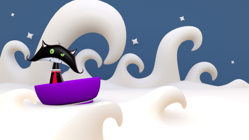
love it! clean, simple and fun. that last render (bowl in the swirly milk) has the biggest impact for me. not too sure about adding extra things into it, though if I had a suggestion - the stars might work with some distance, like blurring them.