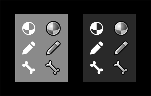
Why does it need to be a jump from coloured icons straight to flat-monochromatic?
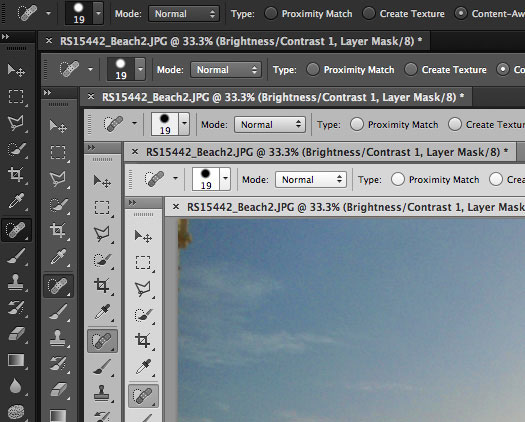
Photoshop uses monochromatic, shaded icons and it still looks “professional and clean”:
A shaded icon will always have more appeal than a flat one, imo. The shaded icons below are 16x16 (relatively speaking of course, they’re all upscaled).