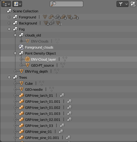
Look at this example in the outliner, with colors we can easily see the distinction between collections and objects. It’s similar to folders and files in file browsers, which also use distinct colors.
If there were only a handful of collections and objects, then just a shape might work well. But we are dealing with many collections and objects, and there is no way for the brain to quickly distinguish the shape of dozens of icons, while for colors we can see at a glance what’s what. Shape and color are not perceived the same way, they each have their own strengths.
That doesn’t mean we have to use colored icons everywhere in the interface, but perhaps the outliner and a few other places should do color coding still.