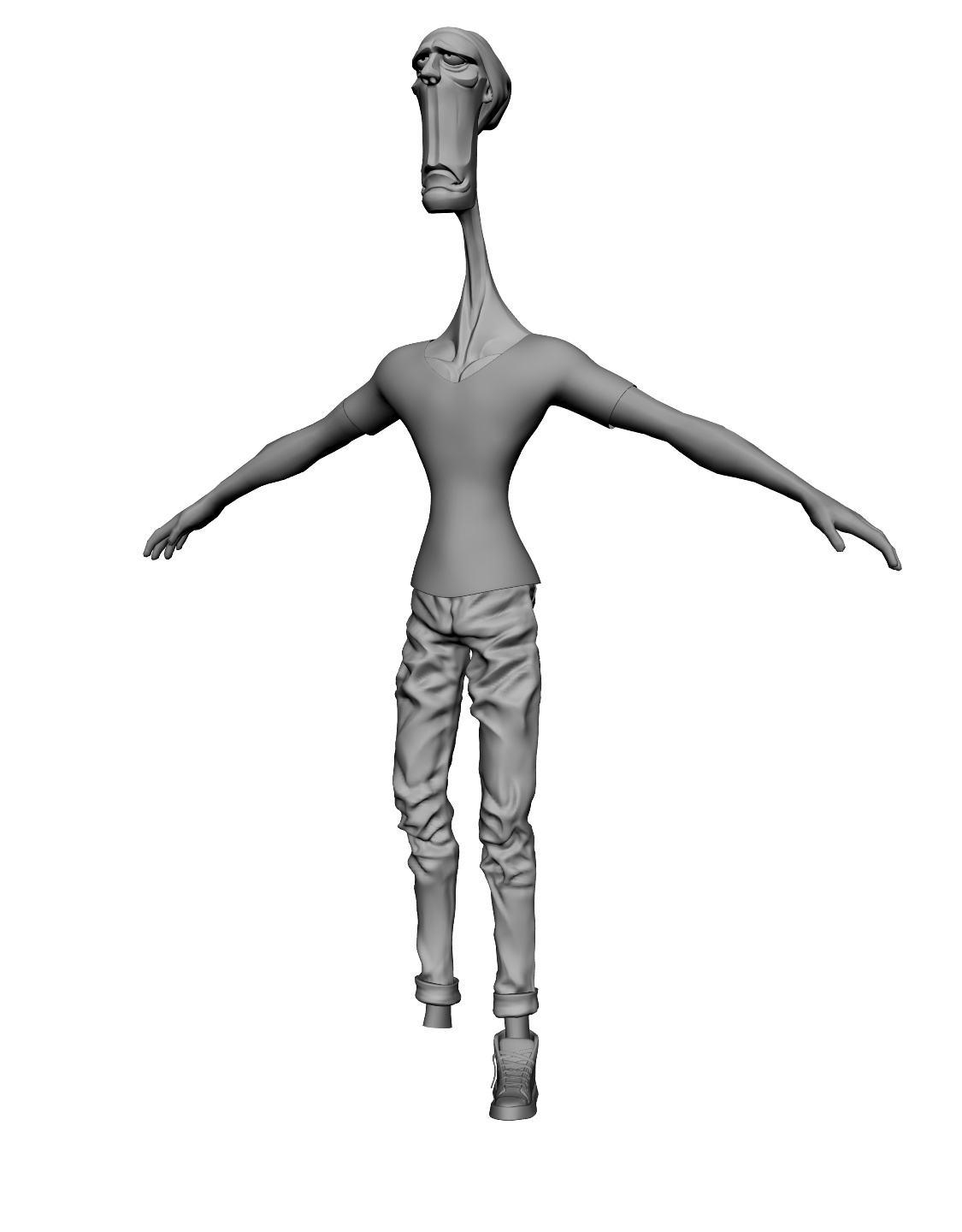
Sorry for not being too active here the last week, I blocked things in, though there is still a long way to go: At least three layers of clothing, a bag, probably a complete jeans rework becuase originally they were meant to be a lot skinnier:
Hipster? Where’s his Macbook Air? He should be about to enter a coffee shop too, probably locking up his single speed bike outside. 
Sadly two of those apply to me.
Anyway, very good work so far!
As for colours, how about a mauve neck thing?
Haha nice story idea! I think an iPhone Color should work just fine, I mean, he’s on the hop and probably worried that people might reckon him to be just a pseudo-alternative snob if he carries his macbook around? 
Joking aside, thanks for the tip, the mauve seems to fit the overall color scheme better.
It’s not sad man, just making fun of the cliche of these people who try so hard to be unlike the others and achieve the opposite 
Hehe, yes iPhone colour might be more appropriate.
Looking forward to seeing where you take this ![]()
p.s. no offence will be taken if any or all of my thoughts are discarded lol ![]()
lol, looks good to me. All you need to do now is apply the hot pink holdout shader and then copy and paste to scene of your choice. Easy!
On a side note - I find that I get far too much joy out of my own user errors. The other day I was applying a displacement modifier to a sculpt and it turned into this giant dimpled mass of grotesque…and I got some funny looks when I was finding it way too entertaining whilst sitting by myself in the coffee shop.
There is actualy a much deeper meaning behind this, but you narrow-minded philistines just wouldnt get it anyways…pff…
But seriously, having fun is the only reason for me to make CG- All these failures are at least as enjoyable as success…especially if you spent like 3hours sculting and then subdivide and discover suddenly there are nasty long tris poking out all over the place and undo just wont fix it…These are the moments when I dont know whether i should cry or laugh
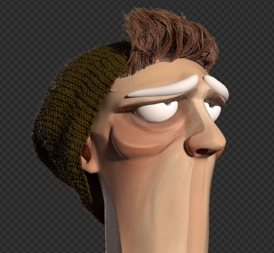
Facial Hair Tests:
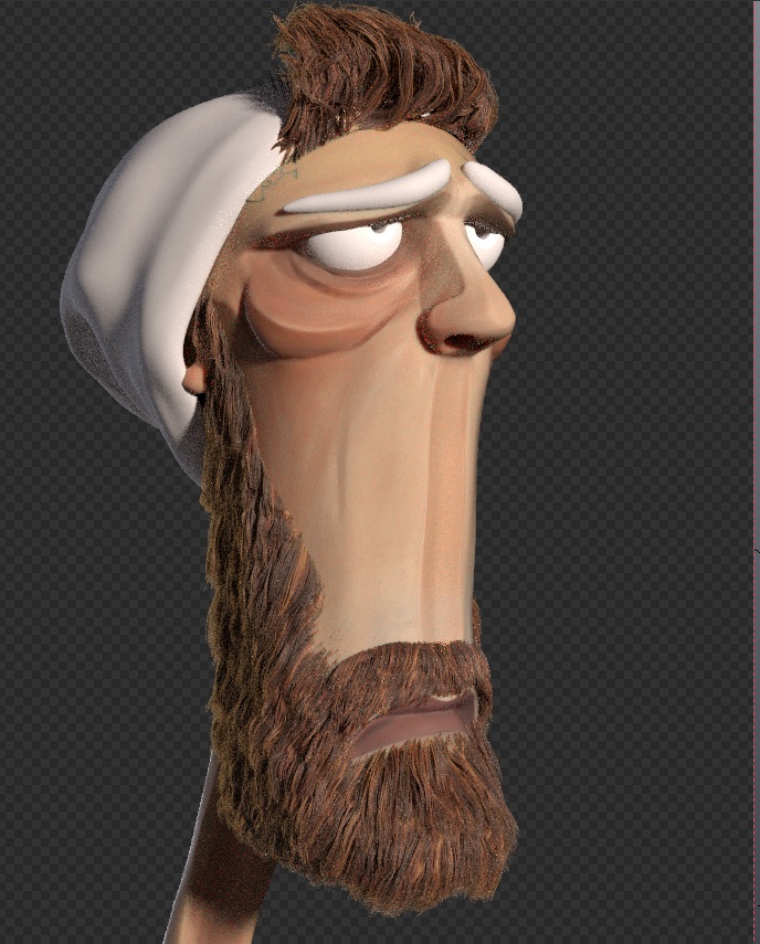
I quite like the outcome of the front hair so far, but the beard looks odd in my eyes, do you have any tips?
Great work, great nick, great thread !! But - comon - a good moustache reaches to the nose;).
Looks good. I am no Blender hair expert so I will not try to make any technical suggestions. As for real beards…well I am not an expert on that either. Anyway, from having seen a few beards before, I can make the observation that they are not always exactly the same colour as the head hair…often there seems to be a hint more red when the person has otherwise blonde or brown hair. Occasionally it is darker than the head hair. The beard hairs themselves are sometimes more wirey…I’m not sure if they are actually thicker, but the hairs often look like they have a bit more of a random kink to them which may give the illusion that they are thicker. I’m sure you have seen beards before, so all that is probably useless info. 
P.s. Agreed with Ulliroyal. You could hide a small dog on that upper lip.
Haha you guys got my imagination going Now that i see it, the problem with this beard seems to be that I didnt push the style too far, so an overall shape change could help with his ridiculousness…need to try that mustache!
Thanks for the advice Matt, i wasnt aware of the color difference-one of these things you see everyday and dont even notice.
:(Actually my beard is way more grey than my scalp, So I shave it … And yeah, Matt mine feels thicker, but in that character the texture in all hair is gorgeous, like an old real puppet, a colour variation could bring to perfection. I can imagine him in Life of Brian II
Thanks, good to hear that the texture works-in the beginning it kind of looked like had sticked a piece of leopard fur to his face
Life of Brian, that movie is legendary!
Eye.
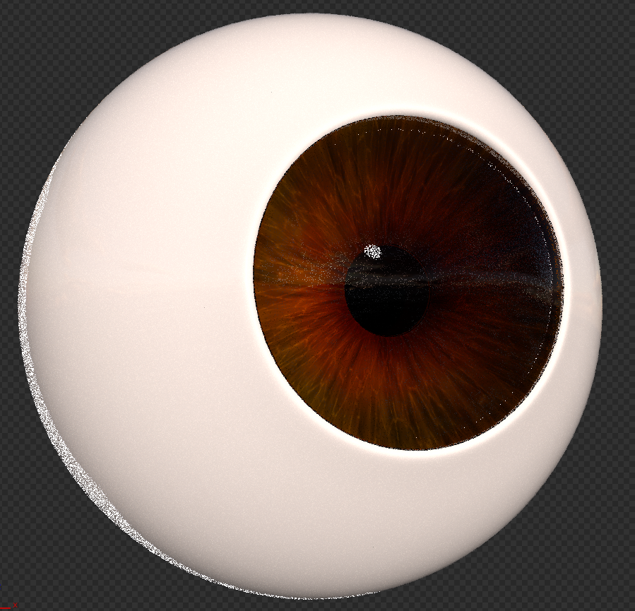
I already spent like three hours on this but didnt get much further than finishing the iris texture ( all procedural), everything goes so painfully slow

Something in the materials makes this eye eat my cpu for breakfast, but i haven’t figured out why. It’s a cartoony character anyway, so I should probably stop craving to make it look realistic- that inner perfectionist

That’s a pretty cool texture for procedural? Is it some kind of radial voronoi + RGB curves and a few other radial noise functions?
Yeah, you got it! I did the texturing in BI, i think you have more control over the precedurals than in cycles (not quite sure tho) and i could bake it out later. Basically its really just a voronoi, I bended it by tweaking the uvs so that they were straight and not circular anymore. For the fine "“strands”"i used voronoi crackle instead and screened it on top, the last step was some color variance with a tinted cloud texture overlay.
Using the material nodes I added the radial gradient and modified the color a bit, thats about it.
Thanks for the info - it’s a great result!
Thanks-I just can’t photosource any random pic google spits out without bad conscience, so I tried this