The honorable Mr. Scent

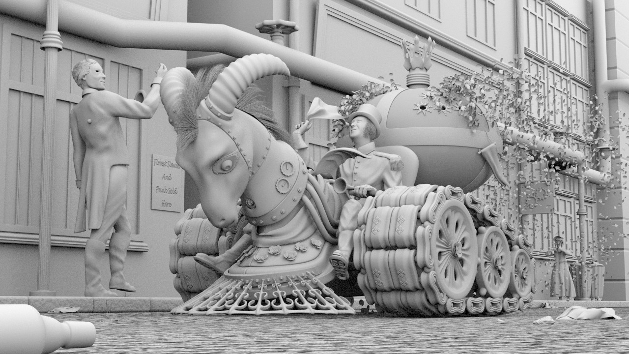
All that beautiful modeling and you still persist in showing the top of the foreground street lamp that kills the perspective and forced you to shrink the man on the street (midgetize him) out of proportion with the driver. And, I hear you yelling, “But I want that street lamp to show!”

HaHa, you got me, Payntr :wink: I’m curious to learn what makes you realizing it, though, because i put some effort into it to hide the fact that they aren’t of the same scale.

Is there any chance that maybe the driver is scaled too large? Either way, the two human figures need to be scaled consistently with each other.

Yes, you are right also, Harleynut. They have a different size. But it’s the passerby who is scaled down.

I’m honestly not getting this difference in scale between the figures. One is a much larger man. That could be the difference between 5-6 and 6-2 Imperial of course. :slight_smile: No one mentioned the second (Right) street lamp being raised which is now perspective in reverse.

Thanks, Ghost, this tells me that it isn’t that obvious. And thanks for the heads up on the reverse scale of the street lamps.

But this left part of the composition is worrying me since I put the passerby in. I thought I could get away with that after I scaled the head of the driver down. That was because of the remark that Shaun made about the proportions earlier.

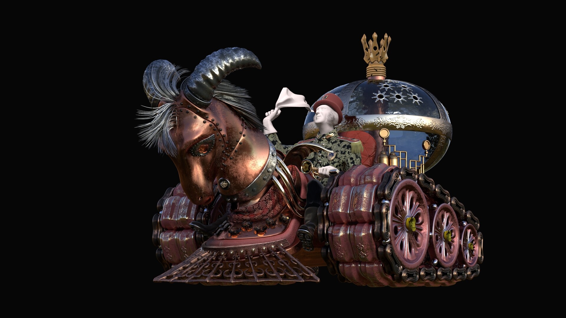
Behind all that is a problem that I don’t really understand. The driver is 1.8 meter tall (5’ 11’‘) and the girl in the background is 90 cm (3’ 0’‘). The window frame behind the pedestrian is 1.3 meter tall (4’ 3’‘) , which is a regular size in my opinion. If I put the passerby to an appropriate scale, let’s say 1.75 meter (5’ 9’'), you will see something like that.


Huh, right? :slight_smile:

Now the pedestrian appears to be gigantic. That - and the fact that I didn’t want him to be taller than the horns - led me to scale him down. Now you might say: “Hey, that’s fake. You can’t do that.” But imho the whole CG thing is about faking, if you look closely at it :slight_smile: I just faked not good enough :wink: But of course I know that there is a reason for having everything on a real life scale, which lies in the render engine!

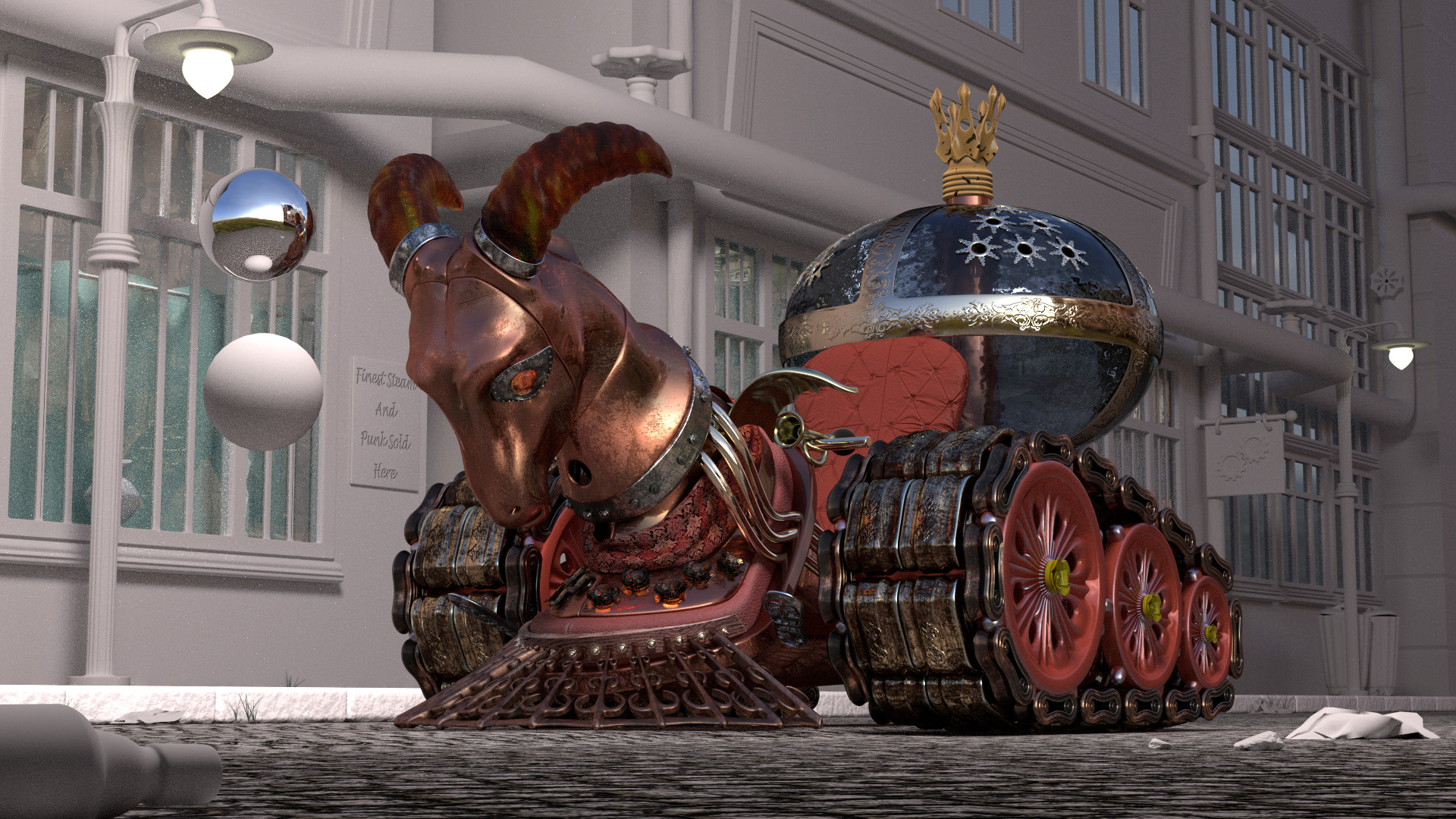
Now that they are both on the same scale we have an optical disparity. This has perhaps two reasons. One reason could be my focal lens, which is set to 57mm and which shortens the distances somewhat. The second reason is that the width of the sidewalk is out of scale. Let me try what happens when I keep the scale, make the sidewalk wider, and put him a bit further away from the driver.

@Ghost, regarding the legs of the driver I guess we see a lot of camera produced foreshortening. But let’s see what happens when I revisit the scaling.

@minoribus, really excited to see this being textured, how long do you think it will take you?

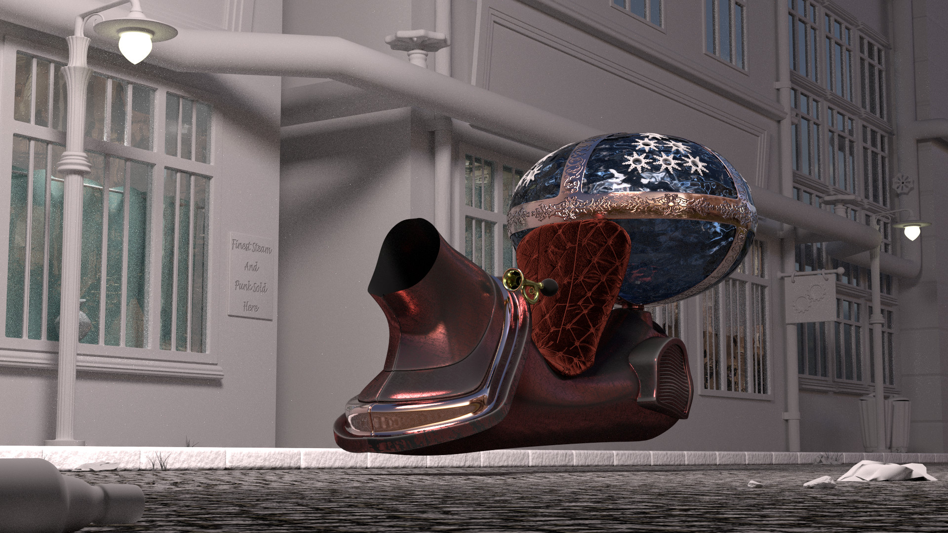
Thanks, Shaun. Here are the first results of the shading.


I hope that I’m through with that in the middle of the next week.

A special thanks to Shaun, who went into Photoshop between this and my latest post and created a good suggestion with a possible solution. Thank you very much for that, Shaun. I appreciate that. I hope for your understanding that I want to keep all the characters. :slight_smile: The man with his hat off is too important for the story telling aspect. He shows that the driver is an accepted member of a society. A society which is strange on the one hand but seems to have habits close to our own habits.

Now I need your opinion again, dear followers. Back at home and at my main computer I put everything into the right scale, made the sidewalk wider, moved the windows and the piping upwards in Z and the buildings further away from the vehicle. Then I adjusted the camera to keep the perspective and as much as possible of the framing that I had worked out previously. Here is what I have now.


The poles in the scene are to check the size. Each of them is 2 meter tall and each square is 10x10 cm. As you see, now the scaling should be right.

Here is a comparison of the former and the actual state, each as AO render.

Not bad. But is the difference that huge? Looking at them I still favor the “before” version. What I like - from my not so highly developed and humble artistic POV - is the better framing in the previous version, which was consequently built from the camera view and constructed around the vehicle. I like that everything is so close together. In my opinion this gives an appealing dense atmosphere. A little bit alienating perhaps, because there are some things which look slightly different than in real life. But that’s a good thing. And it makes you more intimate with the main subject.

I’m sure I could get closer to that again with some tweaking. But honestly I don’t see that much of a difference in the character scaling. If you see a great difference it would be nice if you teach me to see that too.

@Payntr, the top of the left street light is still there :wink: 
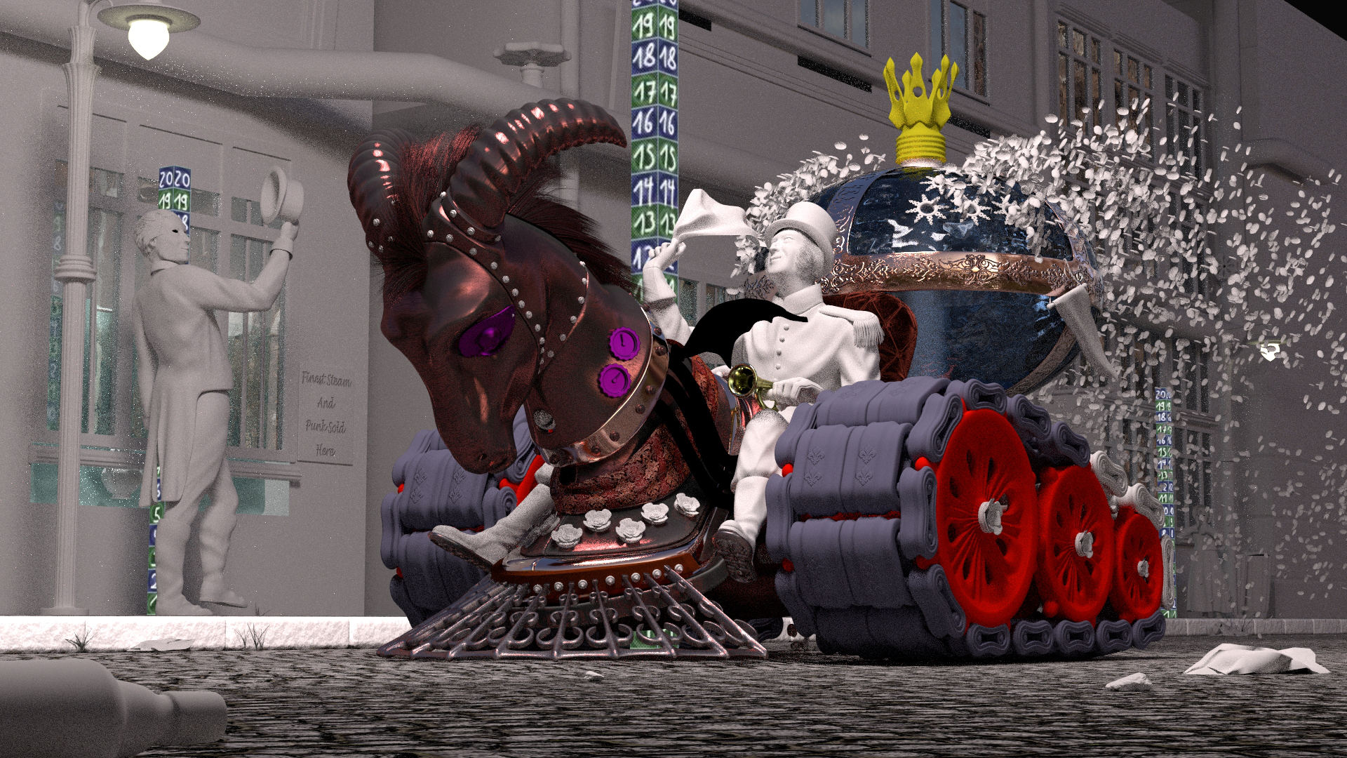
But that does not mean that I’m not willing to change that. At least in the “after” version they both have the same size and the reverse scale that Ghost had mentioned is eliminated.

Hard to explain why, but the before looks better to me.

Thank you, Photox. As I said I have the same feeling about it. And I’m curious what others may think about it. In the meantime I revisited some of yesterdays shaders and I made some new ones.


I too like the before. And, you brought up a point here. Fine artist and illustrators have bent perspective and proportions since the beginning of time. And, this genre is not about mimicking a camera from what I’ve seen. Hell, make the second character three foot tall and put goggles on him. Take the entire background and reverse the perspective if that’s what you want to do.

In a much earlier thread you commented: ‘I’m a technician and not a artist.’ Well a strange thing has happened on the way to the forum. You have become a self taught artist my blender buddy. And, in this Steampunk genre you can run with that. I’d like to see more of these. You have here realized perspective and proportions can be spot on and still need to be fine tuned. Or, can defy the rules all together.

And, it seems that technician photorealistic side has fought throughout this entire project. I’d like to see a old whore passed out in the foreground with goggles on and that bottle x3 in scale reflecting the center of the composition. But, this belongs to you. To do any and everything you might imagine and the rules be damned. And, that too is a learning curve.

Thank you, Ghost. I think Ill stay with the original composition and fiddle with the first street light, the pedestrian and the driver’s left leg :smiley:

And the technician in me starts worrying about the scene size. 8 million vertices and 3.5 GB on the GPU RAM. Thanks to instancing the viewport is still responsive. But I guess that the GPU RAM won’t be sufficient a lot longer.


Amazing what textures do! When I looked at the larger view, the only thing I think can be improved is the material for the horns. It’s a personal opinion, but I think you can find / create a better material for the horns.

Thinking the after looks better only because it gives the driver emphasis, larger than life look consistent with the theme. But, at this point both work-now its your artistic aesthetic judgement that has to decide.

You guys are all just awesome, doing all this stuff! Speechless. As said by others, I feel the horns need improvement. Also, in my opinion the face of the “ram” connects quite weird to the rest of the head. If it’s not meant to be removable, I’d expect it to be all one piece. Still, a very good image! I love the tracks, but the arms (not sure if it’s the right word, those things the tracks stay on) look a tidbit wooden-y or plastic-y. Not sure why, but I feel they are off just by so much.

Also, I have been searching for that ideal proportion sheet, I know there is also one of the head separately. If I may ask, where could I find it? The one for the head and for the body. Also, does such a sheet exist for women too? Thanks!

wow! I love the concept of this and composition!!! Love all of your decorative elements! forward following your process…Keep up!!!

Whoa, let’s back the damn truck up. minoribus can we talk. I thought Steampunk was about materials of the time. Bronze, brass, copper, sheet metal, rolled steel and even gold. And, they had no metal plating as such back then. I once worked in a electrical controller shop and did metal plating. And, the wheels driving the tracks look like a plated metal. Anodized or even powder painted. Suffice it to say not Steampunk.

And, you are the virtual master of Cycles materials. Also be advised your old Blender buddy has had a few cold ones. I don’t like the horns nor that material on the wheels wherever it appears. The actual tank tracks are interesting but maybe the chains could be more separated from them material wise. IMHO the tank is looking nice but the distinctive German symbol on the top… well, that might be a case for pure gold. Hopefully you will have most of Sunday on this. But, then again I was once married and… :slight_smile: 
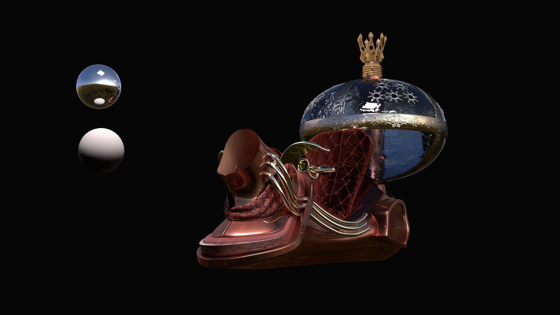
Hello Fräulein and I hope your weekend is going well. With a husband addicted to Blender as we all are.

minoribus this is picture by consensus in a way. And, just maybe the part of WIP I have never understood. Especially for a single frame traditional picture. Hell, Google up Steampunk Art as you have no doubt done and take your best shot. Only lose those damn wheels.

You could do worse than use the MakeHuman app - just Internet search it, then you will get well proportioned humans or at least models you can copy dimensions from. You can bring ready rigged humans into Blender, with or without clothes, hair, etc and then use some of the MakeHuman addons in Blender. Either that or go on a Human Painting Art course - you will then know exactly how to make humans.

Cheers, Clock.

Whoa, let’s back the damn truck up. minoribus can we talk. I thought Steampunk was about materials of the time. Bronze, brass, copper, sheet metal, rolled steel and even gold. And, they had no metal plating as such back then. I once worked in a electrical controller shop and did metal plating. And, the wheels driving the tracks look like a plated metal. Anodized or even powder painted. Suffice it to say not Steampunk.

You could argue however that steampunk is based on the idea of victorian science fiction, rather than actual historical fact, when Jules Verne wrote 20,000 leagues under the sea, in 1869 they didn’t have submarines either, yet his machine would give a trafalgar class a run for it’s money, I think it is more about victorian sensibilities rather than the actual technology.

On a personal note, I wish I could create materials like these.

Hey minoribus

Is it too late to add my vote to the before. :smiley:

This is looking really really GREAT, but must agree about the horn texture, sure it is just a placeholder at the moment.

Looking forward to tonight’s update.

@theoldghost:D:D:D drunk whore with goggles, nearly fell off my chair :D:D:D.

Shaun

I kind of see what theoldghost is going on about with the wheels. I’m not sure what you are going for but to me seelms something like Cat Iron with an enamel coating. this would work for the outer surfaces that do not contact the tracks but would get worn through pretty quickly where it does contact the tracks and leave either black iron look if it was regularly oiled.

So My suggestion would be to go even glossier on the red parts and perhaps add some wear marks where the tracks would make contact.

here is an example of red porcelain on cast iron.

I must say though that this is is really impressive work.

Thanks for all your feedback, while I’m working my way through the materials. You guys are wonderful, you put your fingers on every weakness :wink: Thanks for pushing me. It helps a lot!

Most of you mentioned the horns, at first Harleynut. The horns have been my attempt to create amber, which I thought would fit to the steampunk / victorian color scheme. But in my struggle to make it not distracting it became too dark. I replaced it by a metal shader in the meantime.

And there is a discussion about the wheels. I was inspired by the wheels of old steam locomotives, which had red paint on them. But perhaps I didn’t went back far enough. While I loved that idea I replaced the wheel material also. Thanks for the heads up on that, Ghost. I see your point, Carel, and you have a valid point also. But I decided to minimize every potential irritation on that.

Reading your comment on the before/after question I can see what you mean, Payntr. In the after version it is as if the whole center of the image is pushed against the viewer. That’s interesting. The more I look at it the clearer I see it, now that you said it. But time is running and there is so much more texturing to do. I’ll seek for ways to put more emphasis on the driver when I come to the lighting step in the workflow.

AkiraOkihu, thank you very much. I put a second line of rivets around the face and the neck. I hope the connection of the face part is better now. If you search for “loomis ideal proportions” you’ll find the proportion sheets on Google. Mr. Loomis is well known for these and there are also sheets for women and children, including child heads. Again “loomis child head” will lead you to some of them. As clockmender says, MakeHuman can be a good start if you want to have a human figure quickly and they are also a good resource to study the topology. The makers of MH did a very good job on the topology. While I’m not using Make Human for this project I used it a lot in the past.

Mycatnameistux, thank you also and thanks for your kind words :slight_smile:

Ghost, thank you for your input! The wheels have already been changed and I separated the middle tracks from the outer tracks by using a slightly different material. A note on the tank. Pure gold work work well with the steampunk theme. You are absolutely right in that. But because of the story line I want to gain a resemblance with a perfume bottle. And my technical ambition keeps whispering in my ear: “Fluid, there must be fluid in there! Have you thought about fluid? How about some fluid in there?” :wink:

Carel, thanks for your thoughts about it. I agree with you, and it’s an interesting thought that steampunk is depicting a Victorian feeling. I mean they conquered the world of technology with the new steam power. And more than in any period before that must have been a feeling of mightiness and “anything will be possible”. Must have been an interesting time. And there is no mystery behind the materials. They are mainly texture based. Good textures of an appropriate resolution, a texture to control the roughness, fresnel and control curves for the fresnel, and occasionally the new pointiness feature of 2.74. Especially the metal parts benefit from the pointiness method. If there is a wish for it I can show some of the node setups later.

Now that was a long winded post. And therefore here is the current development, which you are waiting for, Shaun :wink: Thank you also.


Edit: tomtuko, you posted while I wrote my reply. Therefore I missed your post.

Thank you very much for the reference image. That is close to what I had in mind when I started with the wheels. Maybe I’ll find time to revisit the wheel’s material at a later stage. But for now I must move on with the untextured parts. Thanks again!

SIMPLY LOOKING FANTASTIC, we need a clapping smiley here on the forum for art like this.

I think the change you made to the horns works perfectly. As the head is a metalic texture, it makes good sense that the horns would be also. The contrasting color metal works perfectly I feel. I’ll be interested in what others think of the change.

I’m not completely sold on the uniform shirt coloring, in some ways it gets a little lost in the scene The right color/contrast could very easily be used to help draw the viewer to the character. But I’m loving the shoulder decor you added to the uniform.

Brilliant! I agree with Harley about the uniform, I’d chose a stronger base colour, and use thhe pattern as a watermark,(if at all).
The rest looks bloody amazing!

Well damn the perfume bottle has completely eluded me until you mentioned it. So much for my amazing powers of observation. Liquid if possible by all means. I thought maybe the uniform and hat would be a good place for pure almost saturated colors. Here I am offering advice and I thought that was just a tank back there. DAMN! :slight_smile: