Thorn | sketchbook

Summary

So… sketchbooks. What to say, what to post, how to even start the thread…

In a lifetime far many years ago, my 3D experience started with pursuing the photoreal route… chasing better texturing, better caustics, perfect beveling, dense beautiful volumetrics. One day in my office, I finally achieved near perfection (or, what passed for it in that era) of some object sitting on a desk. I can’t recall if it was a model of Wacom pen, or my coffee mug. Either way, I rendered and stared at it for a few moments and then a thought occurred to me for the first time: I’d spent months learning to do something in software, that I could have accomplished in moments by just taking a snapshot of that mug, on my desk, with an actual camera.

Suddenly 3D became a bit… hollow? Boring? Something that wasn’t as exciting as it had been an hour before, anyway. In any case, it just became another tool to make graphical elements for TV commercials.

Then a few interesting things happened - I saw others creating things in 3D that I’d never considered. Terrence Walker’s short film “Understanding Chaos”, made in Lightwave. Blood: The Last Vampire, a combination of 3D and traditional. Appleseed, made in XSI.

I’ve never been much of an pencil illustrator, but doing 2D art in 3D - wow. Ok, now things got interesting again. A plot line I’d had in my head for awhile seemed possible; it felt like hearing music again for the first time.

I stopped using one software package, tried another for awhile, and finally settled on a third. Weeks and months later, I was figuring out how to model characters, rigging basics, shading in new ways. Youtube tutorials weren’t really a thing - it was a book, or a magazine article, or a written webpage with image examples (I still prefer those, to youtube vids…)

As life happens, life changed in the real world - and I gradually had less time each week, to pursue personal art. Finally, I wasn’t doing it at all any longer… all my graphic work was purely commercial for my company, and after work I wasn’t in the mood to paint pixels; spending time at the bar with friends became my focus.

Fast-forward to Dec 2022. I was on vacation, and for some reason (still can’t remember why), I came across Blender, and brilliant artists using it. I downloaded it, cursed a few times an hour (seriously, this program is … different. And that’s not always a compliment)… but kept going, as that small flame of “create” was alive again.

I suppose it’s time to shut the hell up, and post an image. I guess I’ll start with this one, which is - like the others that will follow - a work in progress.

And if you read this far - thanks for reading. :slight_smile:

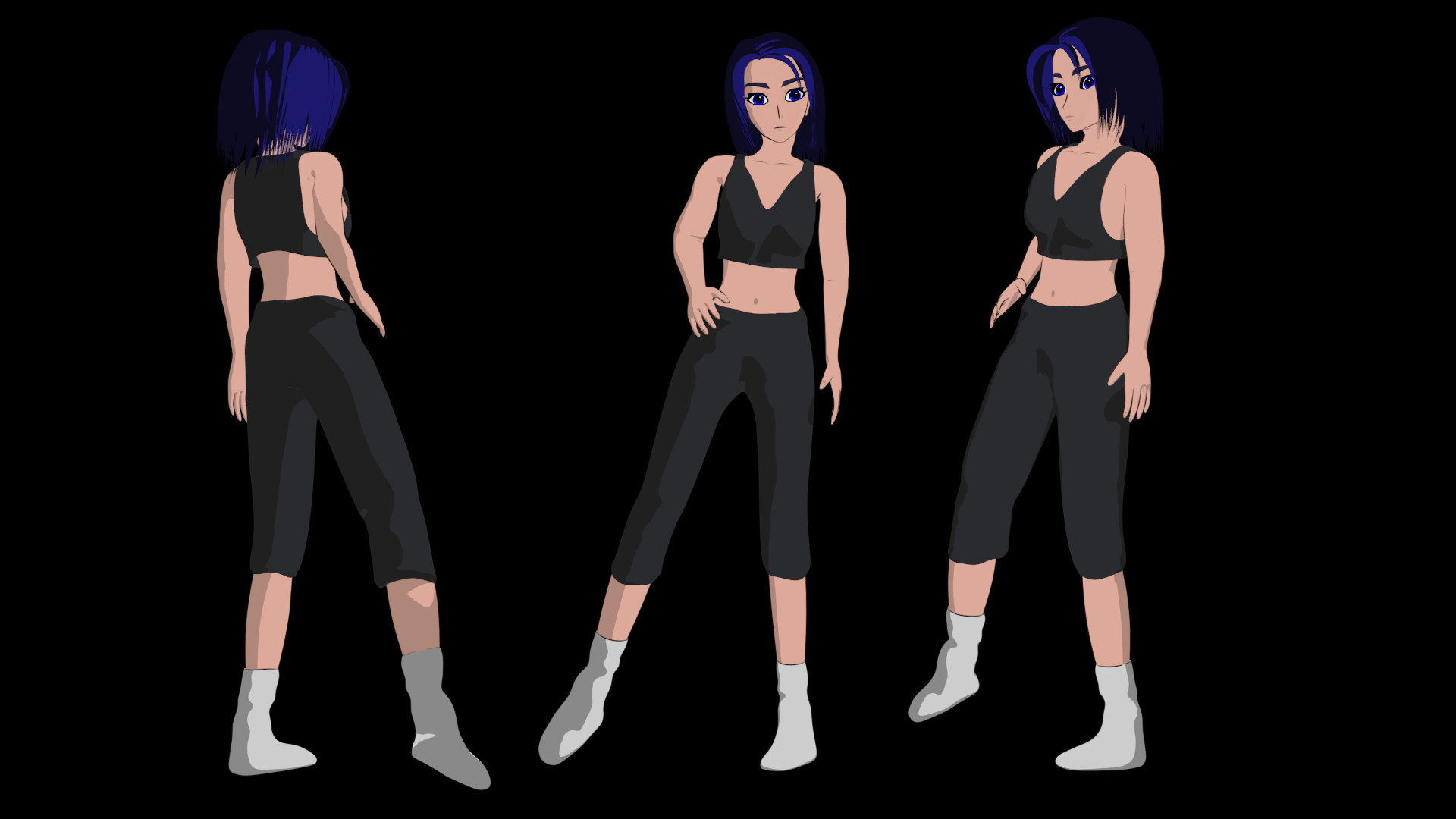
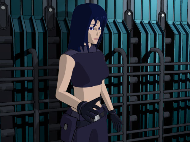
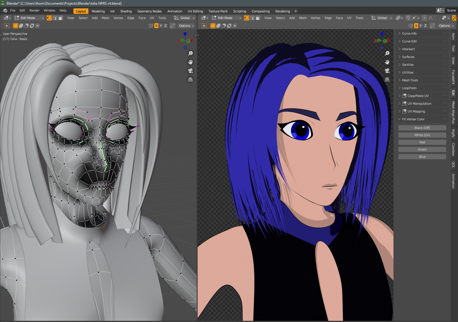
Originally, modeled in 3DSMax … I imported the very old OBJ into Blender; it hadn’t aged well, and some of the topology was rather odd. Import problem? Artist problem? No idea, but in any case - a lot of time spent in redoing some things, changing angles, tweaking proportions.

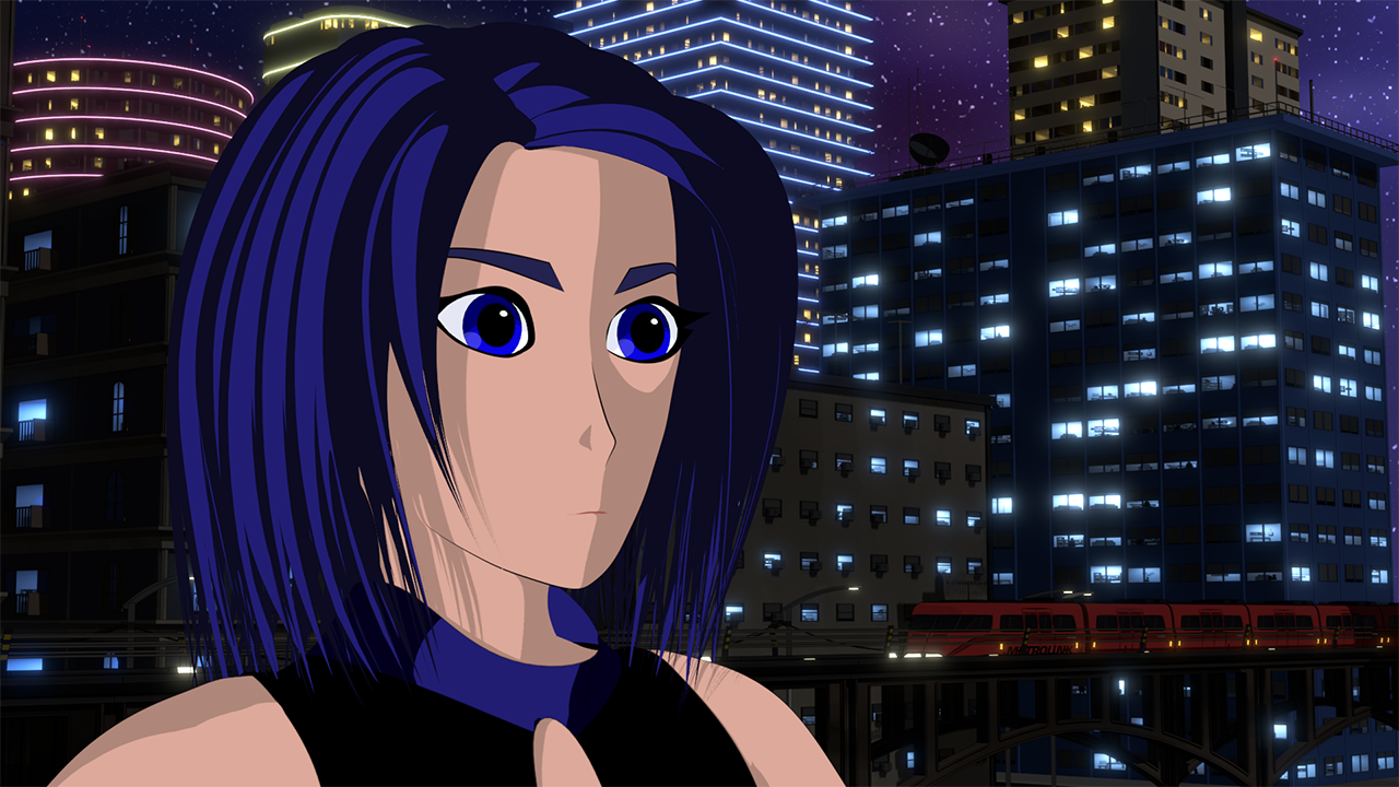
Original scene, from “back then” - rendered in Max, using David Gould’s Illustrate plugin. It seems like this render took around 2-3 mins; currently, my frames take about 3 seconds.

talia_original

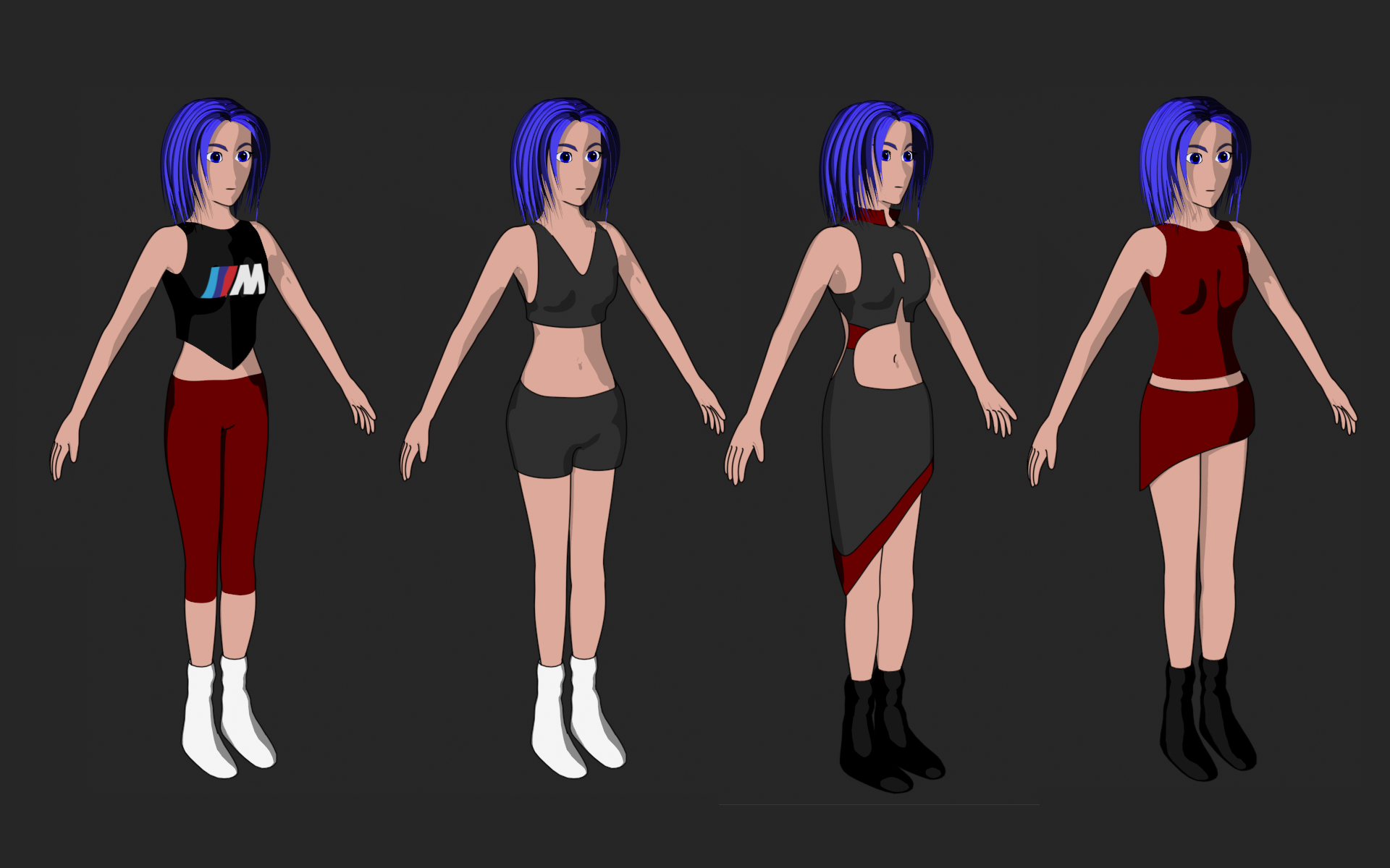
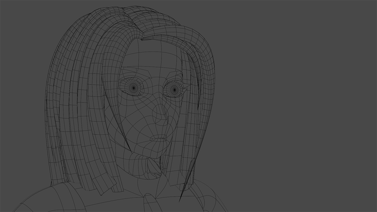
Obviously fashion changed along the way; most of it was sort of … where am I going with this look. Hair was always a challenge back then, as well… editing multiple splines simultaneously wasn’t even possible, so ‘full mesh’ was the approach I went with. It’s so much easier in 2023…

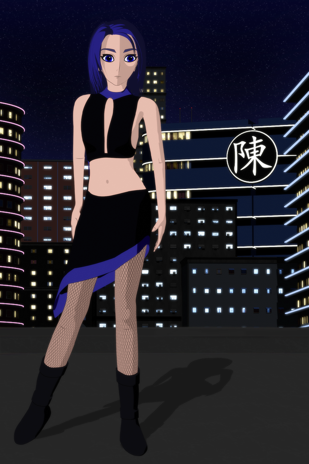
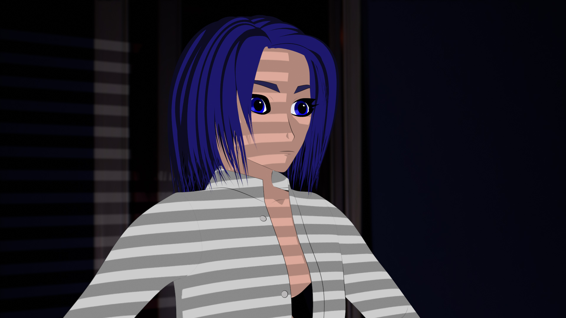
Fashion changed as well… haven’t decided on a particular look, but in any case - I’ll not be recreating the “tactical purse” accessory…

11 Likes

you and me both. :slight_smile:

2 Likes

Wireframes… nothing particularly “wow” about these, but I always like seeing them from other artists… so in that spirit:

Standard poly modeling, vertex by vertex, poly by poly. Hair is simply curve objects with spline profiles; I prefer to not collapse everything to a mesh, if I can avoid it…

Buildings are all generated with a geometry node setup, which I came up with after not being satisfied with a couple of generators that I purchased from gumroad… wasn’t anything particularly wrong with their setups, but I wanted more control and flexibility on certain things, and I didn’t like having to make all the panels a 1x1 tile. Solved a lot of problems that popped up when I didn’t want the windows to be a perfect square (and not the same architecture layout on all 4 sides of the building.)

6 Likes

Nice. :grinning: Eevee?

Are you planning on an animation?

1 Like

Thanks so much :slight_smile:

Eevee, yes - and more specifically, I use the Goo Engine fork of Blender (which is Eevee + their custom code). Ink lines are done with Pencil+ 4. I composite in Blender, Photoshop, After Effects, or a combo depending on various things.

Long term - yeah, planning on character animation. I’ve set up some basic shape keys to learn how the system works, and done a bit of experimenting on making the hair move; haven’t done a full rig yet, as I’m still tweaking the model a bit and don’t want to have to undo/redo things based on something that might change. (Have already done that so many times… I think I’m done, then realize I’m not happy with something, which now means I had to redo something else.)

I’ve done various test animations on the city scene, just to get a basic feel for seeing what would work and what could be improved. Here’s one of those from early summer; it’s a bit darker than I want, as I went too far with the exposure controls in comp… but, it’s easy to adjust it in post next time around.

6 Likes

You’re going to convince me to try Pencil+ 4 yet… maybe if it goes on a massive sale at some point

1 Like

Join Us, we have perfectly anti-aliased cookies :wink:

One thing I like about Pencil+ is that it’s rather easy to mark particular edges as a Freestyle Edge, which of course you can also do with Grease Pencil. Sometimes with both Pencil and GP, overlapping geometry creates a stroke that is correct - according to math - but doesn’t look nice.

Pencil+ also has the feature to use vertex colors to override the auto stroke appearance; you can basically tell it “no matter what, don’t put a line here”. Or make part of the stroke something other than fully on/off. I found it a bit tedious to keep going into edit mode, selecting points, vertex paint mode, change color, shift k, then back to edit, check the result, the do all over again… so, I wrote a quick addon.

Select points in edit mode, and you’ll see a FX Vertex Color appear in the Npanel > Edit Tab. Just click the color you want. Another user requested that I add buttons for Red/Green/Blue … something about masking materials with separate RGB. I’ve no idea how that works, but nonetheless added the buttons and I think he’s happy with it.

Anyway, sharing the addon here in case it’s of use to anyone else. I’m not a very good coder, so please don’t send me hate mail if it catches your house on fire. Use at your own level of risk assessment…

FX_VertexColor.zip (1.1 KB)

5 Likes

Another day (or a few), another stage of testing…

For the past few weeks, I’ve been working with a new addon created by fellow artist EmuMan. It goes a long way in solving some of the problems with celshading - which is basically how to get highlight and shadow to appear a way that isn’t physically correct.

A lot of artists approach this with using custom normals; either on the base mesh itself, or via a data transfer method from a proxy. I was using that method as well, but it has a few downsides. It takes a lot of time to get all the normals perfect, and deforming the mesh (bones, shape keys) risks making all those lovely normals now point in directions you don’t want.

A second technique involves using texture maps, to control the normal appearance. It looks quite nice, but a lot of time is involved in painting texture maps, UVs, splicing lots of bordered images together, etc etc etc.

The addon handles both, in a rather cool way. The normals are default, not custom/edited. The addon overrides the default normals, allowing the artist the “draw” the highlight and shadow areas where they should be placed with grease pencil lines - or, if you have a texture map already, it can use that too. Then the shader node tracks your lighting, and adjusts the mapping automatically.

He’s made it available both on Gumroad, and on Github… it’s highly worth a donation. (This probably reads like a paid endorsement… no, I’m just thrilled to have such a tool now.)

Random tip of the day: Proportional Editing works in Object Mode. Say that out loud, and remember it the next time it looks like all your parenting got corrupted, instead of yelling at the wall for 30 mins like I did.

PS: I added the link to the addon just now, forgot to include that.
PSS: I promise, one day I’ll do rigging so that she’s not always in a T-pose…

4 Likes

I know this, and I read this tip, but I know next time it happens I’m still going to spend that 30 mins yelling at the wall, because for some reason I never think to check it.

3 Likes

Yay. I sort of figured out Rigify…

So many steps of “opps, don’t do that”. And “What the hell is going on?” But on the whole, took far less time than it took in Max a long time ago; the default joints are far cleaner, as well… needs a tweak here and there, but feels like the basic topology is solid for the most part.

6 Likes

Spent most of the morning… afternoon… (hm, nearly all day I guess?) working with Rigify and learning how the pose library works. 3.6 is my first exposure to the pose library, so whether it’s better or worse than the previous incarnation - at least I’m not having to unlearn habits. I think the feature set needs refinement; do a step or two at the wrong time, and suddenly you’ve just replaced something you didn’t mean to with another thing.

Tip for today: When you’re updating your saved pose, you don’t want to be on Frame 1 of your scene - this is sort of contrary to most of the tips I was finding online, and it wasn’t working as I expected. You want to be on the first frame on your scene. (Many artists start at Frame 1, but due to my video background I prefer Frame 0.)

I had been dreading the point at which I would have to attach clothing, and wondering how difficult that was going to be… double rigging, double weight painting, ugh… so much work.

Transfer Mesh Data - oh my word, that feature completely rocks. Clothing is attached with just a couple of clicks, and often doesn’t require more than a quick tweak or two. Major kudos to the Blender team for that one.

Had some time to kill tonight, as we’re waiting to watch the Japan Gran Prix live - that will be around 1am. Red Bull will likely be victorious, but I’m hoping that Ferrari will be able to give McLaren a serious challenge for the podium. Where was I … Oh, so… to pass the time, I tweaked some UVs, made some new materials, and asked her to strike a pose.

5 Likes

I prefer frame 20. It gives the simulations time to settle before the animation starts, since I get weirdness with sims if I use negative number frames.

Are the fishnets modeled, or a texture?

Ha - for sims (i’ve only done a couple tests), i think i allowed negative frames and started on something like -60. Which I forgot to turn off until yesterday, which did cause a moment of wonder.

Fishnets are an image map (actually a chain link fence repeating tile i had from years ago), alpha multiplied over the base skin shader. Not sure if I like the fashion look or not? I’ll keep it until I see something I like more; it was good UV practice, though.

They do have a similar shape.

I like it, but I don’t know anything about fashion, so take that with as many pinches of salt as you please.

It works in the file, like it simulates properly and all, but then if I close the file and reopen it, the sim is all manner of screwed up.

1 Like

Have spent a lot of the last week trying to get more comfortable with blender rigging and poses. It feels like the workflow requires a certain rhythm… you can’t just click anywhere you want and do whatever you like. Sometimes hide a modifier, sometimes make it active no matter what mode you’re in. It’s like any software, there’s a designed procedure flow and you need to learn to flow with it.

I tend to work on one thing for a while, then shift to something else entirely different. This stops progress on one thing, of course… but it helps keep me from getting a) bored and annoyed with a thing b) gives me a fresh perspective when I return to it. I’ll see flaws that I didn’t see before, or will have learned a new technique since the last session with a scene that now easily solves a problem I was previously having.

So on that note, I’ve started working on interiors. Modeling imperfection is something I enjoy - making cushions and pillows NOT perfectly symmetrical is sort of a zen thing for me.

For reference, I’ve mainly used my own furniture for basics; the room layout and colors are sort of a take on a condo I used to share with my brother. He’s an interior designer, who loves nothing more than to take a boring white wall/floor/anything and give it some colorful flair with paint and lighting. So while I lack his raw talent in picking fabrics and shapes - that should not match, but do!? - it’s feeling more like a scene to me, than simply a collection of assets.

So many things to add, to do, to model… but, for now:

Today’s tip: If you model to scale as I do, always model to scale. Resist the temptation to just sketch things out in a random size, build the entire room, then swear at yourself when you link the scene and realize everything - lights, objects, EVERYTHING - has to be rescaled and relit to compensate.

4 Likes

Very true.

I don’t model to real world scale, but once I decided on the size of my characters relative to a default cube, I model everything to that scale. And had several weeks of annoyance adjusting all the things I had made before deciding on that scale.

That’s an intense expression looking at that book. What’s she reading?

I like the tealights and the fuzziness of the green blanket.

The lampshade feels more detailed/realistic than the rest of the scene.

1 Like

On the book… i sort of imagined it might be a photo album of snapshots, or a journal from a long-past relative. Something a bit personal, not just the latest novel. Ultimately it was solving a problem of - I knew I wanted that seated pose, but couldn’t decide what to do with her hands. A bottle of bourbon would be in-character, but without context I think it would have looked cliche’.

The tealights - that was a happy accident; i kept not getting the ‘wavy’ foil look I wanted, then wondered what would happen if I used a noise input into a color rap… and boom, suddenly we had wavys in the light/shadow that matched the color base. Lots of proportional edge moves on the blanket, creating little ridges; the end result turned out better than I expected, honestly…

Nicely spotted on the lampshade - it’s a texture image/photo of the actual lamp ;). On my todo list is to actually model and color the stained glass pieces, so that it will (hopefully) match the rest. (And as much time as I spend getting the UVs to work, I should have just modeled it…)

thanks for your thoughts :slight_smile:

2 Likes

As sketchbooks go, I think this one is sort of my actual “3D scene sketchbook”. It started as a file just throw random assets into, so that I could just have a file with props and objects… barrels, boxes, etc to append to whatever else I was working on.

Over time, it’s turned into it’s own WIP scene. I’m not sure I have a use for it yet, in the grand plan of 3D storytelling. But every week or two I’ll pick it up, use it to test a new technique for lighting or materials and then incorporate that into another scene. Most of the shaders are Goo Engine, but I’m slowly changing my approach a bit to incorporate more “flat” BSDF shaders into my palette; the GE shaders are really great for characters, but for objects and environments they tend to limit dynamic range (which is by design.)

Hat tip to Joseph; the subtle edgewear on some of the metal shaders comes from a great nodegroup he created, which takes the GE curvature shader node and kicks it into awesome.

6 Likes

I… don’t remember creating this, but hats off to me, I guess :sweat_smile: scene looks fantastic!

1 Like

It feels like I’ve been working on this file forever, and I guess that’s true… but, despite it feeling (or looking) like a never-ending tweak project, I do actually have a final sort of goal in my mind. Geometrically, it’s not much different that where I was a month ago, but I’ve now completely changed my approach with shading and lighting.

My first round with this new look was the post above, in the warehouse scene. Somewhat satisfied with that, I’m now applying it to other files. One thing that had bothered me for months was the look of the windows; they didn’t seem to match the celshaded look of everything else. I knew the reason why, but kept putting off correcting it as it meant a lot of time and … well, sort of grinding drudgery.

But a weekend or three ago, I finally decided it was time to redo the shaders; I’m much happier with it now. The contrasts seem more distinct, and the interiors less “out of key”.

Normally I output a few layer passes and comp, to get the neon brighter and the glow more glowy… but this one is just a straight render.

6 Likes